
What Is Control Charts In Google Sheets?
Control charts in Google sheets is a chart type used for data analysis. It helps users analyze and monitor the changes in the spreadsheet. Control chart in Google sheets is not a default function in Google sheets or Excel.
But, fortunately, we can create Control chart in Google sheets with the help of add-ons. Remember that, we need to find the average (mean), standard deviation, UCL – Upper control Limit and LCL – Lower Control Limit.
Use this Control Charts In Google Sheets Template to follow along with the examples in this article.
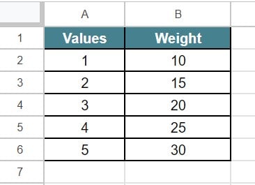
Download Excel TemplateFor example, consider the below table showing values and weight in columns A and B, respectively.
Now, let us learn how to create control chart in Google sheets with the help of the following steps.
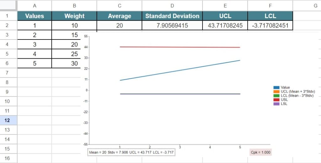
To start with, select cell C2 and insert the formula, =AVERAGE(B2:B6) & =STDEV(B2:B6). Next, find the UCL and LCL for the given data. Finally, we need to click on the extension and click on Control Chart.
We will be able to see the control chart in Google sheets, as shown in the below image.
Likewise, we can create control chart in Google sheets for the given data.
In this article, let us learn how to create Google sheets control charts with detailed examples.
Key Takeaways
- Control charts in Google sheets helps users analyse the data and monitor the variations in a dataset.
- Remember, we need to find the mean (average), standard deviation, UCL and LCL in Google sheets to create control chart in Google sheets.
- Unfortunately, control charts in Google sheets is not an inbuilt chart type in Google sheets.
- Users need to install an extension or add-ons to create control charts.
- We can use this chart to track expenses, marks or inventory and analyse data.
How To Control Charts In Google Sheets?
To create control charts in Google sheets, we need to install an add-on.
The steps to insert the ChartExpo extension are:
Step 1: First, open a spreadsheet in Google sheets. Click on Extensions.
Step 2: Next, select Add-ons. Click on Get add-ons option.
Step 3: In the Google Workspace Manager, search for ChartExpo extension and install the extension.
Step 4: Now, we can use the extension. It is to create control charts in Google sheets.
Examples
Let us learn how to create control charts in Google sheets with the help of the following examples.
Example #1 – Track Inventory Levels
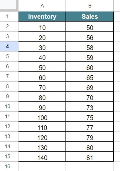
For example, consider the below table showing inventory and sales in columns A and B, respectively.
Now, let us learn how to create control chart in Google sheets with the help of the following steps.
The steps are:
Step 1: To start with, we need to enter the data in the spreadsheet. In this example, the data is available in the cell range A1:B15.
Step 2: Now, we need to find the Average and Standard Deviation.
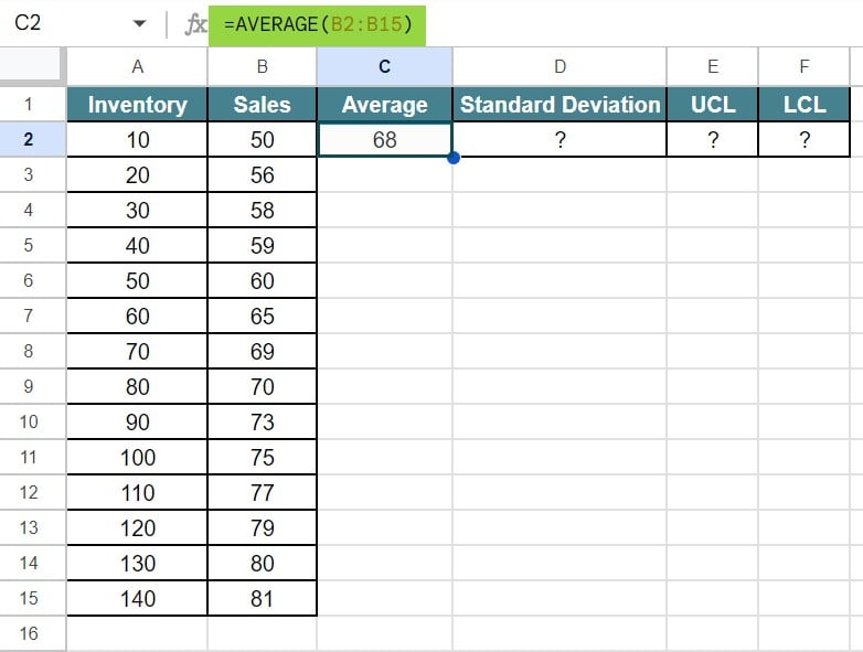
So, let us select the cell C2 and insert the formula, =AVERAGE(B2:B15).
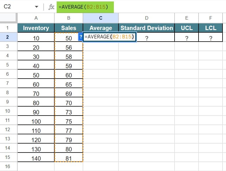
Press Enter key. We will be able to see the result of average (mean) in Google sheets, as shown in the below image.
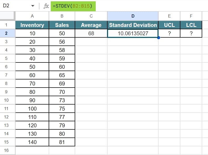
Step 3: Similarly, select the cell D2 and insert the formula, =STDEV(B2:B15).

Press Enter key. We will be able to see the result of standard deviation in Google sheets, as shown in the below image.
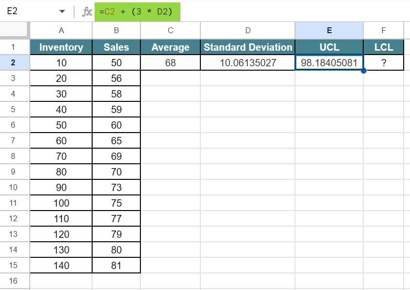
Step 4: Next, we need to find the UCL and LCL for the given data. To find the UCL, insert the formula, =C2 + (3 * D2)
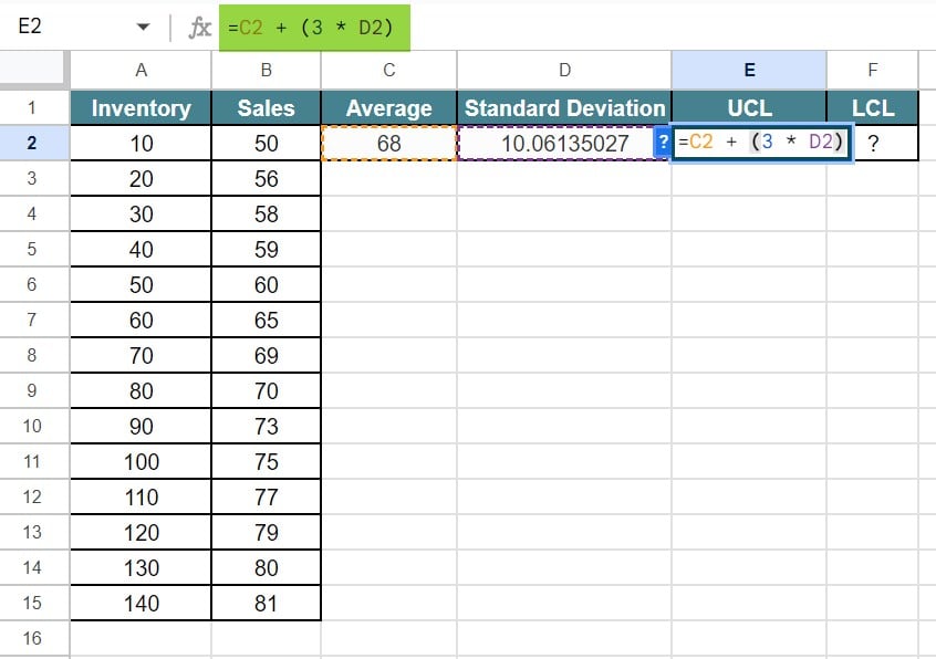
Press Enter key. We will be able to see the result of UCL in Google sheets, as shown in the below image.
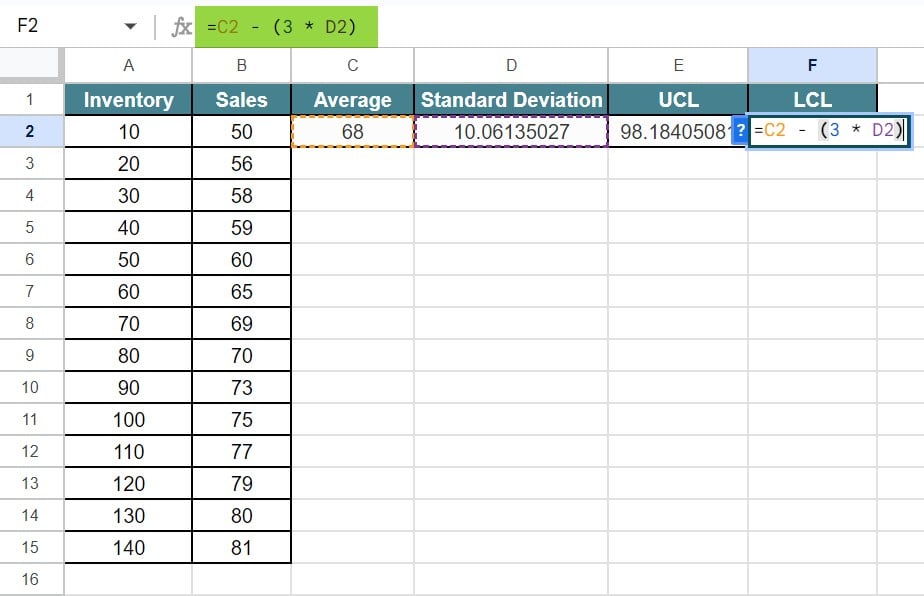
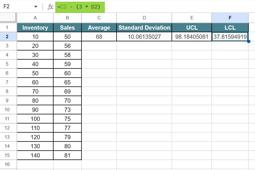
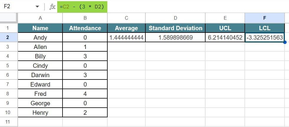
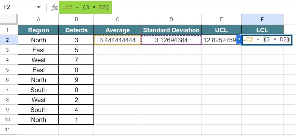
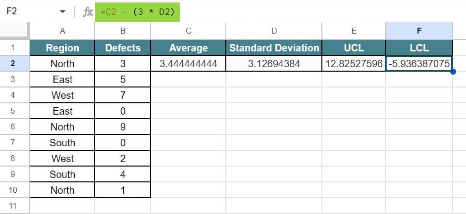
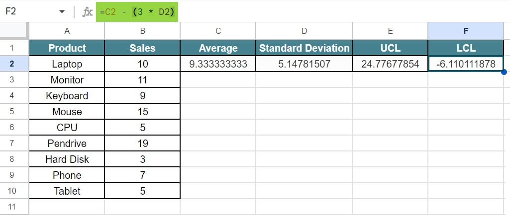
Step 5: Now, to find the LCL, we need to insert the formula, =C2 – (3 * D2).
Press Enter key. We will be able to see the result of LCL in Google sheets, as shown in the below image.
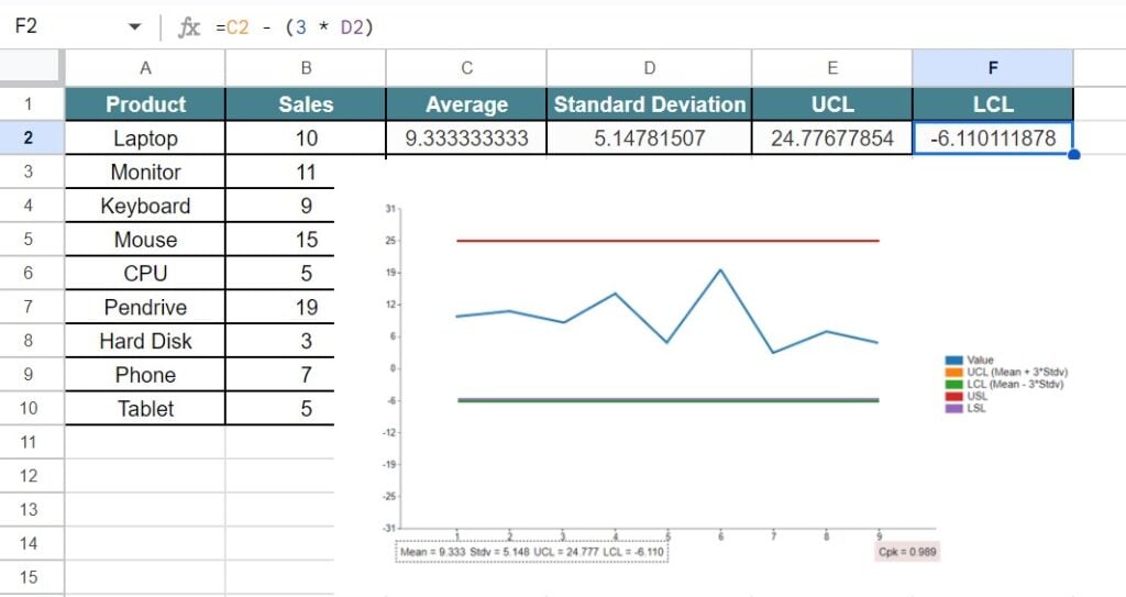
Step 6: Now, we need to click on the extension and search for Control Chart.
We will be able to see the control chart in Google sheets, as shown in the below image.
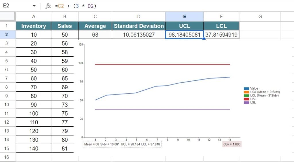
Likewise, we can create control chart in Google sheets to track inventory levels.
Example #2 – Track Employee Absenteeism
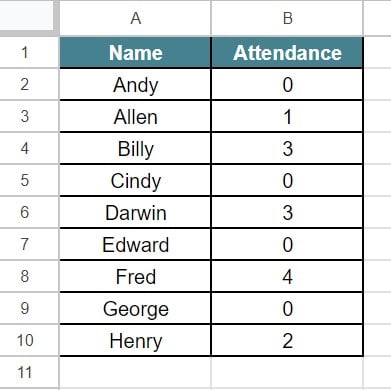
For example, consider the below table showing name and attendance of employees in an organization in columns A and B, respectively.
Now, let us learn how to create control chart in Google sheets with the help of the following steps to track employee absenteeism.
The steps are:
Step 1: To start with, we need to enter the data in the spreadsheet. In this example, the data is available in the cell range A1:B10.
Step 2: Now, we need to find the Average and Standard Deviation.
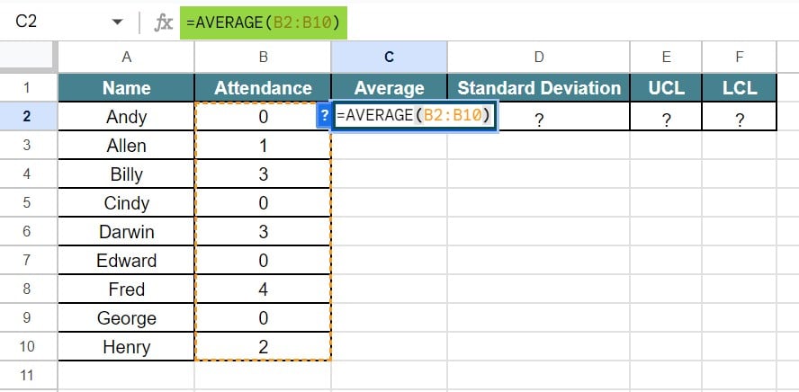
So, let us select the cell C2 and insert the formula, =AVERAGE(B2:B10).
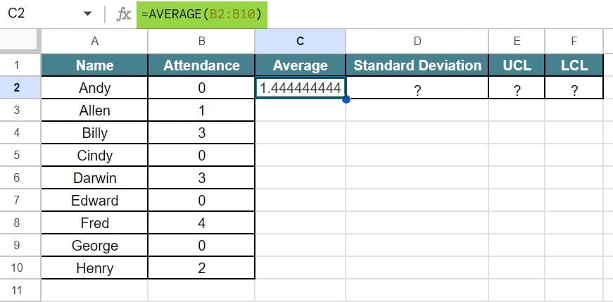
Press Enter key. We will be able to see the result of average (mean) in Google sheets, as shown in the below image.
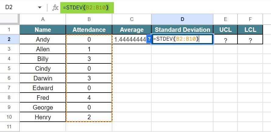
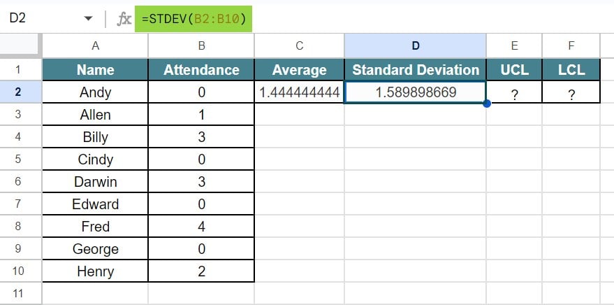
Step 3: Similarly, select the cell D2 and insert the formula, =STDEV(B2:B10).
Press Enter key. We will be able to see the result of standard deviation in Google sheets, as shown in the below image.
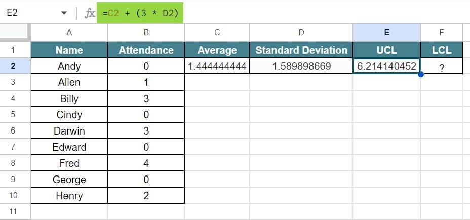
Step 4: Next, we need to find the UCL and LCL for the given data. To find the UCL, insert the formula, =C2 + (3 * D2)
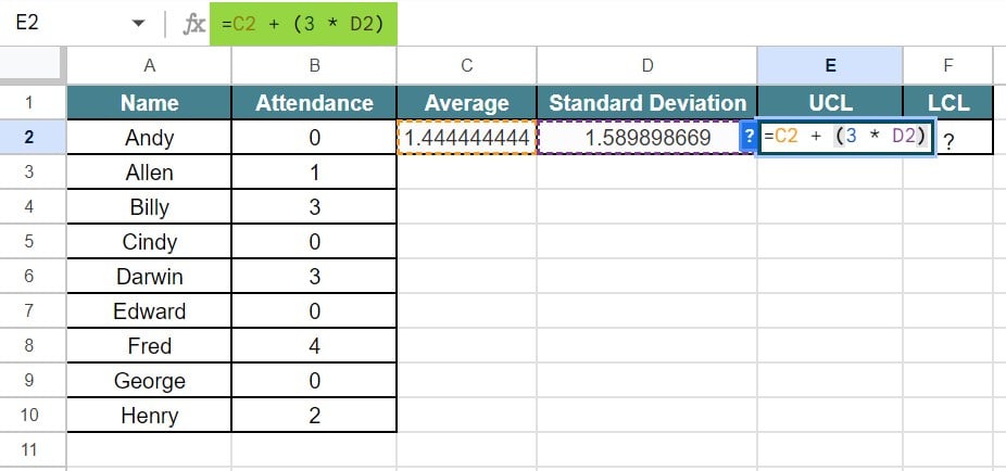
Press Enter key. We will be able to see the result of UCL in Google sheets, as shown in the below image.
Step 5: Now, to find the LCL, we need to insert the formula, =C2 – (3 * D2).
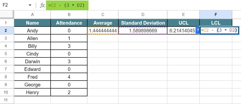
Press Enter key. We will be able to see the result of LCL in Google sheets, as shown in the below image.
Step 6: Now, we need to click on the extension and click on Control Chart.
We will be able to see the control chart, as shown in the below image.

Likewise, we can create control chart in Google sheets to track employee absenteeism.
Example #3 – Track Production Defects
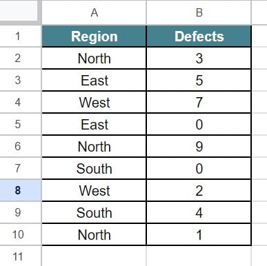
For example, consider the below table showing region and defects of various products in an organization in columns A and B, respectively.
Now, let us learn how to create control chart in Google sheets with the help of the following steps to track production defects.
The steps are:
Step 1: To start with, we need to enter the data in the spreadsheet. In this example, the data is available in the cell range A1:B10.
Step 2: Now, we need to find the Average and Standard Deviation.
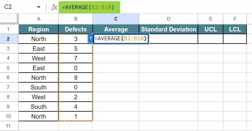
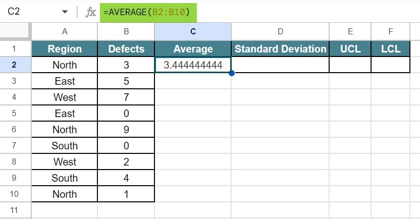
So, let us select the cell C2 and insert the formula, =AVERAGE(B2:B10).
Press Enter key. We will be able to see the result of average (mean) in Google sheets, as shown in the below image.
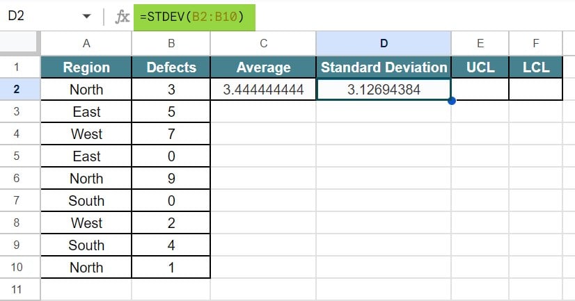
Step 3: Similarly, select the cell D2 and insert the formula, =STDEV(B2:B10).
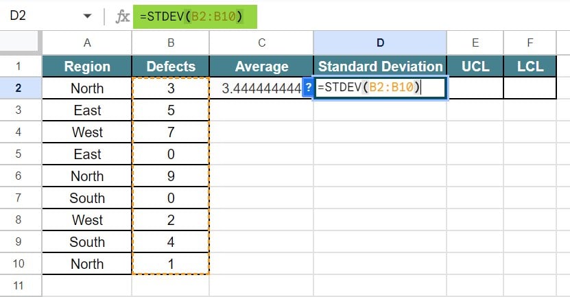
Press Enter key. We will be able to see the result of standard deviation in Google sheets, as shown in the below image.
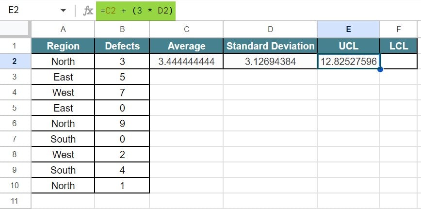
Step 4: Next, we need to find the UCL and LCL for the given data. To find the UCL, insert the formula, =C2 + (3 * D2)
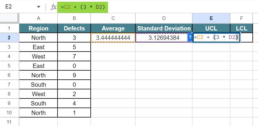
Press Enter key. We will be able to see the result of UCL in Google sheets, as shown in the below image.
Step 5: Now, to find the LCL, we need to insert the formula, =C2 – (3 * D2).
Press Enter key. We will be able to see the result of LCL in Google sheets, as shown in the below image.
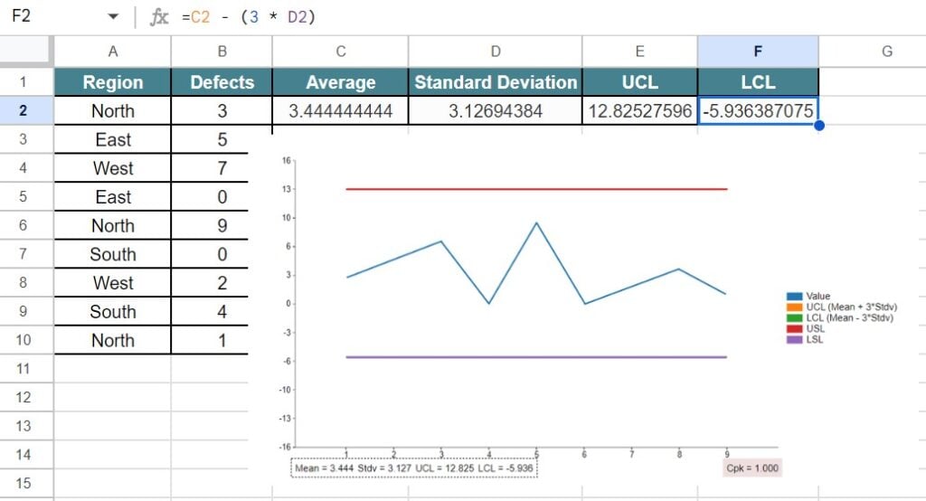
Step 6: Now, we need to click on the extension and click on Control Chart.
We will be able to see the control chart in Google sheets, as shown in the below image.
Likewise, we can create control chart in Google sheets to track employee absenteeism.
Example #4 – Track Sales Revenue
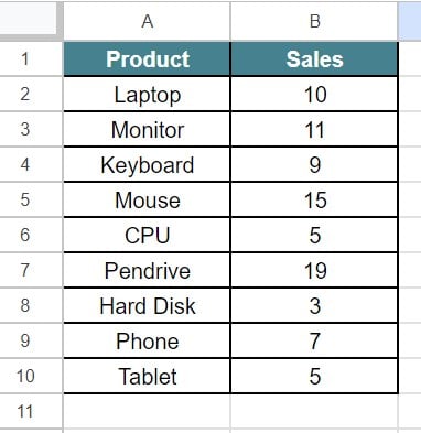
For example, consider the below table showing product and sales of a company in columns A and B, respectively.
Now, let us learn how to create control chart with the help of the following steps to track sales revenue.
The steps are:
Step 1: To start with, we need to enter the data in the spreadsheet. In this example, the data is available in the cell range A1:B10.
Step 2: Now, we need to find the Average and Standard Deviation.
So, let us select the cell C2 and insert the formula, =AVERAGE(B2:B10).

Press Enter key. We will be able to see the result of average (mean) in Google sheets, as shown in the below image.
Step 3: Similarly, select the cell D2 and insert the formula, =STDEV(B2:B10).

Press Enter key. We will be able to see the result of standard deviation in Google sheets, as shown in the below image.

Step 4: Next, we need to find the UCL and LCL for the given data. To find the UCL, insert the formula, =C2 + (3 * D2)
Press Enter key. We will be able to see the result of UCL in Google sheets, as shown in the below image.
Step 5: Now, to find the LCL, we need to insert the formula, =C2 – (3 * D2).
Press Enter key. We will be able to see the result of LCL in Google sheets, as shown in the below image.
Step 6: Now, we need to click on the extension and click on Control Chart.
We will be able to see the control chart in Google sheets, as shown in the below image.
Likewise, we can create control chart in Google sheets to track employee absenteeism.
Example #5 – Track Student Test Scores
For example, consider the below table showing name and marks obtained in Physics subject in columns A and B, respectively.

Now, let us learn how to create control chart in Google sheets with the help of the following steps to track student test scores.
The steps are:
Step 1: To start with, we need to enter the data in the spreadsheet. In this example, the data is available in the cell range A1:B10.
Step 2: Now, we need to find the Average and Standard Deviation.
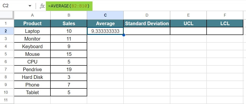
So, let us select the cell C2 and insert the formula, =AVERAGE(B2:B10).

Press Enter key. We will be able to see the result of average (mean) in Google sheets, as shown in the below image.

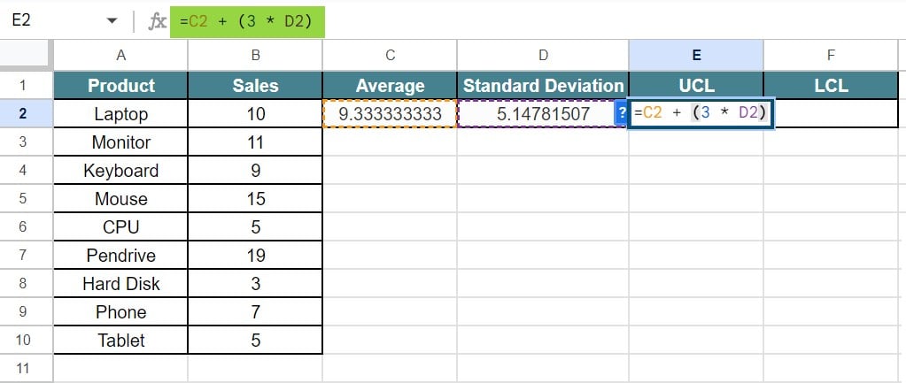
Step 3: Similarly, select the cell D2 and insert the formula, =STDEV(B2:B10).

Press Enter key. We will be able to see the result of standard deviation in Google sheets, as shown in the below image.

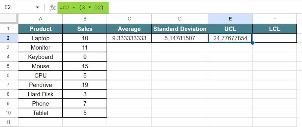
Step 4: Next, we need to find the UCL and LCL for the given data. To find the UCL, insert the formula, =C2 + (3 * D2)

Press Enter key to see the result of UCL in Google sheets.

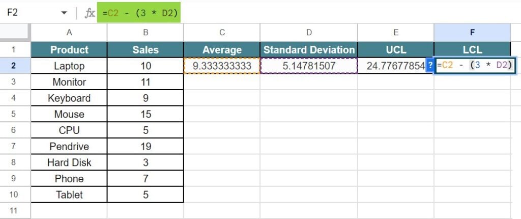
Step 5: Now, to find the LCL, we need to insert the formula, =C2 – (3 * D2).

Press Enter key. We will be able to see the result of LCL in Google sheets, as shown in the below image.

Step 6: Now, we need to click on the extension and click on Control Chart.
We will be able to see the control chart in Google sheets, as shown in the below image.

Likewise, we can create control chart to track employee absenteeism.
In this article, we have learned how to use control chart in Google sheets with examples.
Important Things To Note
- Control charts in Google sheets is not a default chart like line chart or column charts.
- Users need to install an add-on or extension available in Google Workspace Manager.
- Remember, to calculate UCL and LCL before creating control chart in Google sheets.
Frequently Asked Questions (FAQs)
For example, consider the below table showing values and weight in columns A and B, respectively.
Now, let us learn how to create control chart in Google sheets with the help of the following steps.
The steps are:
Step 1: To start with, we need to enter the data in the spreadsheet. In this example, the data is available in the cell range A1:B6.
Step 2: Now, we need to find the Average and Standard Deviation.
So, let us select the cell C2 and insert the formula, =AVERAGE(B2:B6).
Step 3: Similarly, select the cell D2 and insert the formula, =STDEV(B2:B6).
Step 4: Next, we need to find the UCL and LCL for the given data. To find the UCL, insert the formula, =C2 + (3 * D2)
Step 5: Now, to find the LCL, we need to insert the formula, =C2 – (3 * D2).
Step 6: Now, we need to click on the extension and click on Control Chart.
We will be able to see the control chart in Google sheets, as shown in the below image.
Line charts or other charts in Google sheets show the visual representation of the chart. Whereas, control charts in Google sheets shows the differences in the value and helps is data analysis.
Google sheets control charts require users to find UCL and LCL. UCL stands for Upper Control Limit and LCL stands for Lower Control Limit. We need these values to read the variations in the data.
Use this Control Charts In Google Sheets Template to follow along with the examples in this article.
Download Excel Template