What is the Tableau Waterfall Chart?
Tableau Waterfall Chart is a data visualization tool for displaying the cumulative effect of sequentially introduced positive and negative values. It is often used to show the breakdown of a particular measure or financial data over time or across categories. Such charts are useful for understanding how individual factors contribute to a final result or cumulative total, making them valuable for business analysis and financial reporting.
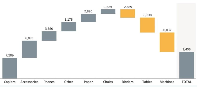
A typical Tableau waterfall chart is shown below. As you can see, the chart shows both positive and negative values on a cumulative basis, showing the breakdown over time.
📥Download the ready-to-use Excel template to practice this tutorial yourself.
Tableau Waterfall Chart Excel TemplateTable of contents
Key Takeaways
- Tableau Waterfall Chart is a data visualization tool for displaying the cumulative effect of sequentially introduced positive and negative values.
- It is often used to show the breakdown of a particular measure or financial data over time or across categories.
- Tableau waterfall chart has many features involving Positive and Negative Values, Running Total, and user customization for a visually appealing chart.
- You can create a these chart make custom visualization, apply reference bands, and add interactivity to the chart.
- It supports data drill down for your data analysis.
Features
The key features of the Tableau waterfall chart are outlined below:
- Positive and Negative Values
- They displays both positive and negative values in the form of bars
- Running Total
- Tableau displays a cumulative total throughout the chart
- You can also add the subtotals to the chart
- Visualization
- Flexibility to customize the visualization in terms of colors, size, label, and details
- You can also add a tooltip with the required information
- Interactivity
- Tableau waterfall chart supports user interactivity by offering features such as parameters, actions to the chart
How to create a waterfall chart with Tableau?
To create a waterfall chart with Tableau, follow the instructions outlined below:
Step 1: Navigate to the Data Source tab. Use the File Navigator to import the desired data source into Tableau.
Step 2: Click on the New Worksheet icon to open a new worksheet in Tableau.
Step 3: Drag Dimension (Year) and Measure (GDP growth (real)) to Columns and Rows section, respectively.
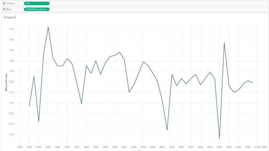
Step 4: Click on the down arrow next to the Measure in Rows section. Select Quick Table Calculation and then choose the Running Total.

It will change the view as below.

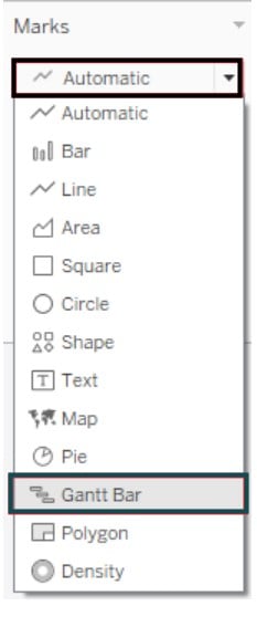
Step 5: Click on the Marks Type drop-down menu and select Gantt Bar.
It will change the view of Gantt Bar.
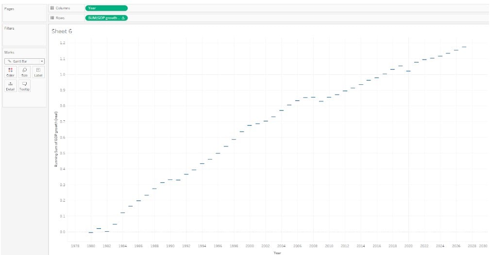
Step 6: Drag the GDP growth (real) to Size and Color on the Marks card.
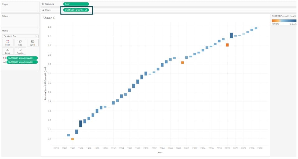
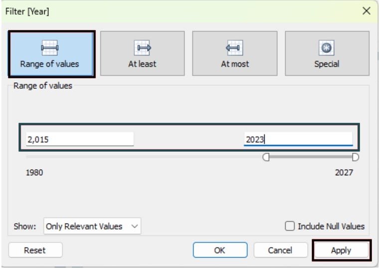
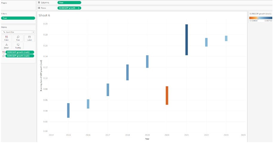
Step 7: Drag the Year to the Filters shelf and apply the filter conditions.
It will change the view to the below format.
Step 8: Drag the GDP growth (real) to Label on the Marks card.
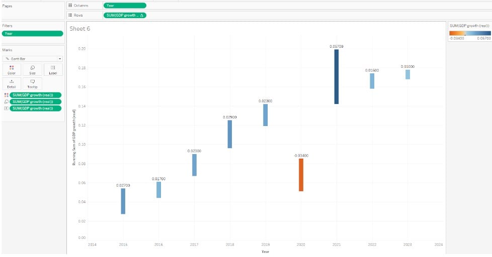
Now your chart is ready for view.
Note: The Tableau waterfall chart with multiple measures is currently not supported. However, you can implement the same by creating multiple waterfall charts side-by-side to create the view.
Similarly, you can create a Tableau waterfall chart year over year by creating two calculated fields, i.e., Running total for the current year and Running total for last year. Use these fields in your chart for the visualization.
Let’s now look at different examples involving the Tableau waterfall chart in detail for better understanding.
Examples
In this section, we will go through different examples that demonstrate the Tableau waterfall chart.
Example #1 – Highlighting the Tableau Waterfall Chart Using User Selections
In this example, we will highlight a Tableau waterfall chart using user selections. For this demo, we will use the US S&P 500 Stock Index dataset. The US S&P 500 Stock Index dataset contains the stock performance of 500 of the largest companies listed on stock exchanges in the United States. It is considered a key indicator of market performance.
To create a waterfall chart, follow the instructions below:
Step 1: Navigate to the Data Source tab. Click on File – Open. Use the File Navigator to import the US S&P 500 Stock Index dataset into Tableau.

Step 2: Click on the New Worksheet icon and navigate to a new worksheet.
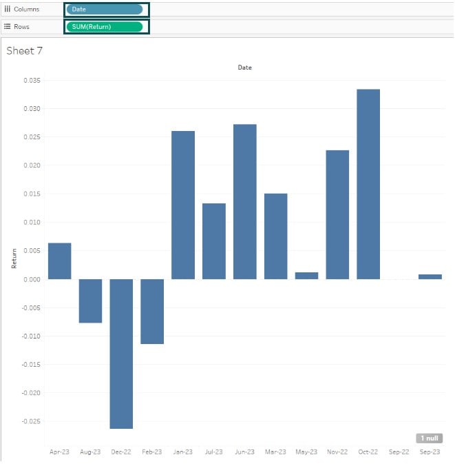
Step 3: In the new worksheet, drag Date and Return to the Columns and Rows section, respectively. Tableau will create a chart as shown below.
Step 4: Click on the down arrow next to the SUM(Return), and from the context menu, choose Quick Table Calculation – Running Total.

Tableau will create a running total value of S&P500 stock returns in the vertical axis, as shown below.

Step 5: On the Marks card, change the Marks Type from Automatic to Gantt Bar.

You will see a Gantt chart in the view.

Step 6: Drag the Return measure to the Size, Color, and Label on the Marks card.

Step 7: Click on the sort date descending by the Running Sum of Return icon to sort the data.

Step 8: Navigate to Analysis – Totals – Show Row Grand Totals.

It will add a Total to the view.

Step 9: Now, click on any of the waterfall chart bars. You can either Keep only that particular bar or exclude that bar and others will continue to be displayed in the view.

Click on Keep Only.

Similarly, if you choose to exclude it, then that bar will no longer be visible in the view.

Note: You can also apply additional filters to the date dimension to create a Tableau waterfall chart between two dates.
Example #2 – Making Custom Visualization for Tableau Waterfall Chart Totals
Now in this example, we will demonstrate how to create a custom visualization for the Tableau waterfall chart totals using the US Organization Employee Sales dataset. The US Organization Employee Sales dataset contains the Sales targets attributed, sales achieved, and salary applicable to different role hierarchies in a US organization.
To create a custom visualization for Tableau waterfall chart totals, follow the step-by-step instructions below:
Step 1: Import the US Organization Employee Sales in Tableau using the File – Open. Once the file is successfully imported, you shall be able to view it in the Data Source tab.
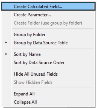
Step 2: Navigate to the New Worksheet tab. On the Data pane, right-click and select Create Calculated Field.
Step 3: Create a calculated field and specify the logic for the same. Click on OK to save the changes.
Here we have created a calculated field, “Sales Variance.”
[Target Sales]-[Sales Achieved]

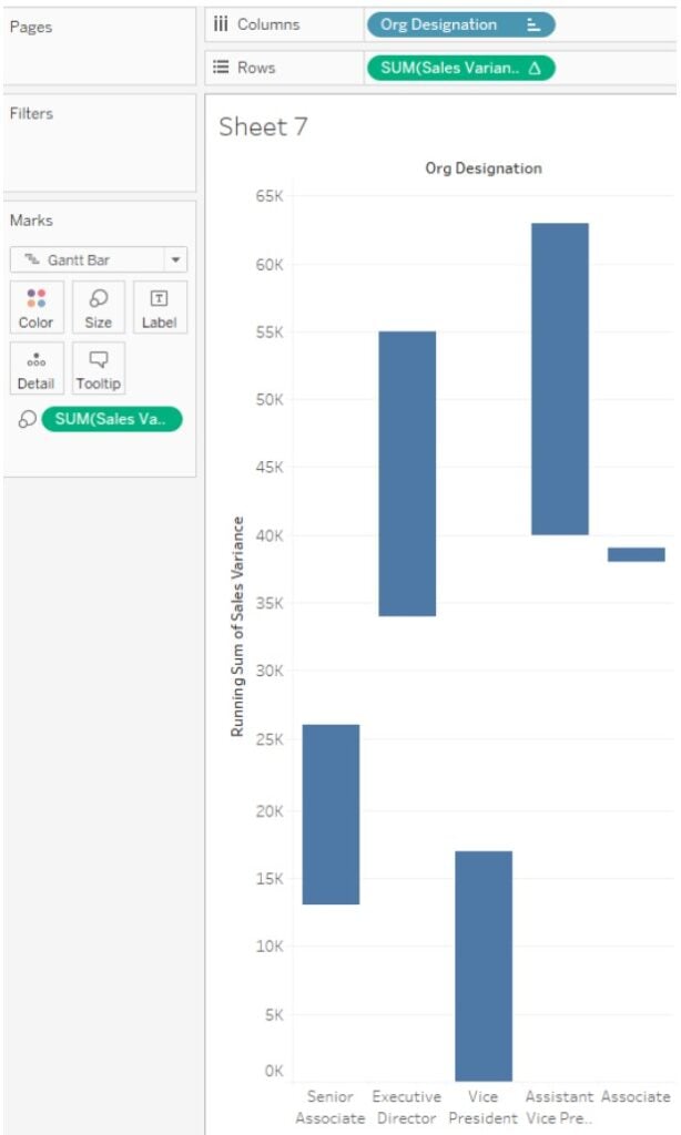
Step 4: Drag the Org Designation and Sales Variance to the Columns and Rows sections, respectively.

Step 5: Create a Running Total by selecting the Quick Table Calculation 🡪 Running Total.

It will create a Running Total of Sales Variance.

Step 6: change the Marks Type from Automatic to Gantt Bar on the Marks card.

You will see a Gantt Bar in the view.

Step 7: Drag Sales Variance to the Size on the Marks card.
Step 8: Drag the Sex dimension to the Columns section.

Step 9: Drag Sex to the Color and Sales Variance to the Label on the Marks card.

Step 10: Add a Total bar by navigating to Analysis – Totals – Show Row Grand Totals.

Note: You can also create a Tableau waterfall chart with subtotals for your visual requirements.
Step 11: Sort the waterfall chart as per your visual requirements. Now your waterfall chart is ready in the view.

Step 12: Navigate to the Format tab. Click on the Borders and adjust the Level.

This will remove the visible column borders.

Example #3 – Creating Custom Range Highlighters Using the Reference Bands
In this example, we will create custom range highlighters using the reference bands for the Tableau waterfall chart using the US GDP Growth Historical Data dataset. The US GDP Growth Historical Data contains the GDP growth rate based on historical data of the United States economics.
To create a Tableau waterfall chart with a custom range of highlighters using the reference bands, follow the steps outlined below:
Step 1: Navigate to the Data Source tab and import the US GDP Growth Historical Data using File – Open functionality.
Step 2: Open a new worksheet in Tableau.
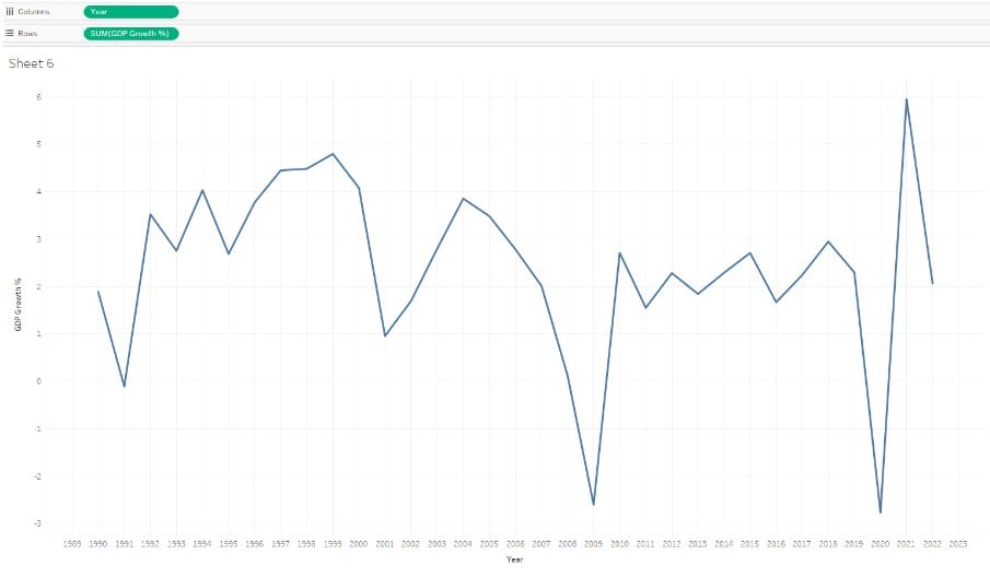
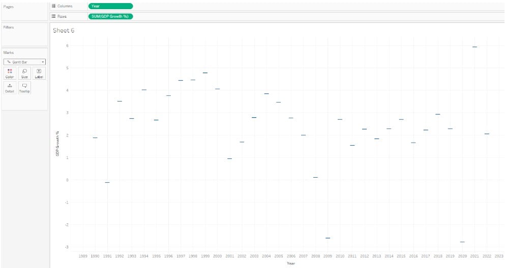
Step 3: In the new worksheet, drag the Year to Columns and GDP Growth % to Rows section.
Step 4: Change the Marks type from Automatic to the Gantt Bar on the Marks card.

It will create a Gantt Bar in the view, as shown below.
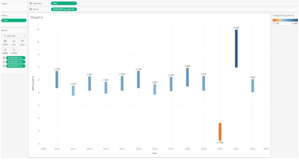
Step 5: Drag the GDP Growth % to Color, Size, and Label on the Marks card.

Step 6: Drag the Year field to the Filters shelf and specify the values for the filter conditions.
Here, we have provided the Range of values for the filter conditions to create a Tableau waterfall chart between two dates.

This will apply the filter condition to the view.
Step 7: Click on the down arrow next to the SUM(GDP Growth %) and select Quick Table Calculation – Running Total. It will create a total waterfall chart that is running in view.


Step 8: In the Analytics pane, drag the Reference Band to the view and drop it on the model type. Choose the model type as Pane.

It will open a pop-up window. Specify the scope, i.e., Entire Table or Per Pane or Per Cell. Click on OK.

Now, your final waterfall chart is ready for visualization. You can notice the reference band added to your waterfall chart.

Important Things to Note
- Tableau waterfall charts can be complex for complex data structures and may create challenges in data interpretation.
- Be careful when using multiple categories, as they may clutter the chart, making it difficult to read.
- While the Tableau waterfall chart provides a degree of customization, there are limitations on the number of options available.
- There is limited interactivity, i.e., filtering and highlighting applicable to waterfall charts.
- Ensure that the Tableau waterfall chart is simple and easy to read for the end users for effective visualization.
Frequently Asked Questions (FAQs)
Yes, you can drill down into the data behind a Tableau waterfall chart. To drill down into the data, follow the instructions below:
• Select a bar in the view in the waterfall chart.
• Click on the View Data icon to view the underlying data for your analysis.
• Alternatively, you can also use the explain data icon to get more data insights.
Some of the key limitations to using Tableau waterfall charts include:
• Such charts can be complex for complex data structures and may create challenges in data interpretation
• Be careful with using multiple categories as it may clutter the chart making it difficult to read
• While the Tableau waterfall chart provides a degree of customization, however, there are limitations on the number of options available
• There is limited interactivity i.e. filtering and highlighting applicable to Tableau waterfall charts
There are a few alternatives to Tableau waterfall charts including:
Tableau Stacked bar chart, Power BI waterfall chart, Python or R libraries for data visualization
Yes, you can create a dynamic or interactive Tableau waterfall chart. Once you have created a waterfall chart, you can add Color, Size, Label, Tooltips, and Filters to the chart. You can also add parameters and create actions to the views.
Download Template
📥Download the ready-to-use Excel template to practice this tutorial yourself.
Tableau Waterfall Chart Excel TemplateRecommended Articles
This has been a guide to What Is Tableau Waterfall Chart. Here we explain how to create waterfall chart with features, examples and points to remember. You can learn more from the following articles –

Leave a Reply