
What Is Bubble Chart In Google Sheets?
The Bubble Chart in Google Sheets is a visual representation of data points in the form of bubbles, with an added dimension of the given values denoted by the size of the bubbles.
With the help of the Google Sheets Bubble Chart, we can display three variables, i.e., the value-based X and Y axes and another axis (Z) to represent the sizes. It enhances the plot’s data comparison capabilities to visually highlight numbers given in a financial dataset as bubbles of different sizes based on their values.
Use this Bubble Chart In Google Sheets Template to follow along with the examples in this article.
Download Excel TemplateFor example, the table below shows a list of items, units sold, prices, and market share data. We will create a Bubble Chart for the given data.
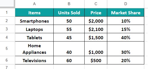
Select cell range A1:D6 and insert the Bubble Chart. The generated chart is shown below.

We can see that the top-selling items are, the Laptops with the maximum number of units sold. On the other hand, Smartphones bubble is the smallest in size, which indicates that it has the least market share, even though the units of Smartphones sold exceeded that of Tablets.
Since the above Bubble Chart is market share based, the bubble representing Tablets is the biggest, indicating that its market share is the highest among the five products.
Key Takeaways
- The Bubble Chart in Google Sheets represents a data point as a bubble with three dimensions. While the X and Y axes help fix its position, the third dimension (Z) indicates the data point size based on its value.
- The size of the bubbles helps us visually comprehend the highest and the lowest values.
- With the help of the Bubble chart, we can analyze the keyword density in SEO, ROI from digital marketing campaigns, and sales reports in the finance domain.
- We can use the critical data elements, such as data labels, axis and chart titles, and bubbles in subtle colors, to make the chart more presentable.
Types
Unlike Excel that has different types of Bubble Chart, such as two and three-dimensional Bubble Charts, Google Sheets does not have that option, but we can change the alignment of the bubbles.
By default, the generated Bubble Chart in Google Sheets will be horizontally aligned. However, by organizing the dataset, and the X, Y and Z axes, we can change the bubbles to align vertically.
How To Create Bubble Chart In Google Sheets?
A bubble in the Bubble Chart represents a single data point with three dimensions. While its horizontal and vertical positions are on the X and Y axes, the third dimension (Z-axis) represents its size.
Therefore, when we createa Google Sheets Bubble Chart based on a factor such as profitability and market share, the bubble size indicates the specific entity’s contribution to the factor. Thus, we can perform a comprehensive data comparison and understand the relationships between the given numeric variables.
We can create the Bubble Chart in Google Sheets as follows:
- First, organize the dataset in a way so that we know which variable needs to appear as a bubble.
- Next, choose the entire dataset 🡪 select the “Insert” tab 🡪 choose the “Chart” option.

- A default chart gets generated and the “Chart editor” window opens on the right-side.

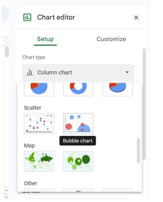
- Finally, select the “Setup” menu, click the “Chart type” drop-down and select the “Bubble Chart” under the “Scatter” section, as shown below.
Finally, we will have the default chart turned into the selected Bubble Chart. We can then customize it as per our requirements.
Examples
We will consider some examples to understand the Bubble Plot in Google Sheets.
Example #1 – Customize the Bubble Chart 🡪
We have the following data that consists of different ad categories, the number of ads created, the cost per ad, and the total revenue generated from each ad category. We will visually review the total revenue generated from the different ad categories by creating a Bubble Chart with labels and bubbles in distinct colors.

The steps to create the Bubble Chart for the above data are,
Step 1: Choose the dataset cells A1:D6 🡪 select the “Insert” tab 🡪 choose the “Chart” option and the “Chart editor” window opens on the right-side, as shown below.

Step 2: Select the “Setup” menu, click the “Chart type” drop-down and select the “Bubble Chart” under the “Scatter” section, to generate the chart, as shown below. Now, let us customize the chart as per our requirement.

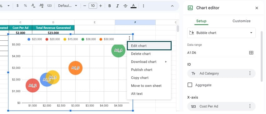
Step 3: First, we will update the chart titles. Please check if the “Chart editor” window is open else we can click the chart to activate, click the 3 dots on the top-right corner of the chart and select the “Edit chart” option to open the “Chart editor” window, as shown below.
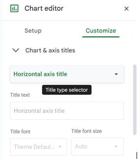
Step 4: Select the “Customize” menu and click the “Chart & axis titles” right arrow, as shown below.

Step 5: Click the “Title type selector” drop-down and select each option to update the title as follows:
- First, select the “Chart title” option, type “Total Revenue Generated” in the “Title text” field, select “Bold” and “Center alignment” in the “Title format” field and color Black in the “Title text color” field, as shown below.

- Next, select the “Horizontal axis title” option, type “No of Ads Created” in the “Title text” field, select “Bold” and “Center alignment” in the “Title format” field and color Black in the “Title text color” field, as shown below.

- Finally, select the “Vertical axis title” option, type “Cost Per Ad” in the “Title text” field, select “Bold” in the “Title format” field and color Black in the “Title text color” field, as shown below.

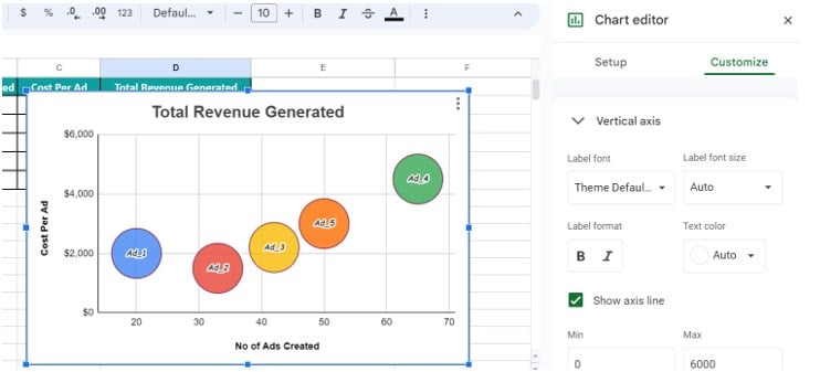
Step 6: After we update the chart titles, let us check the visibility of the variable. We see that few of the Bubbles are almost out of the chart gridline because the Vertical axis’ values. Therefore, select the “Customize” menu and click the “Vertical axis” right arrow and enter the Min and Max values as 0 and 6000, respectively. Now, we can see all the Bubbles clearly, as shown below.
[Note: We can also change the Horizontal axis’ Min and Max values as 0 and 100, respectively.]
Step 7: The necessary customization is done. However, one thing we notice is that all the bubbles are of the same size. Let us fix that according to the values.
Go to the “Setup” menu in the “Chart editor” and we will see the Size field as “Add size”, as shown below.

Here, select the “Total Revenue Generated” option, as shown below.

The final Bubble Chart is shown below. We can either stop here, or customize further by exploring the options available in the “Customize” menu in the “Chart editor”.

We can see that the Green bubble is the largest among all the bubbles in size. Further, it is the farthest along the horizontal axis and the highest point along the vertical axis. Thus, we can infer from the above Bubble Chart that the number of Ad_4 category ads created topped the list, and they generated the highest revenue. Also, the cost involved was high for Ad_4 category ads.
Likewise, the Yellow bubble is the smallest in size. It indicates that the Ad_3 category ads generated the lowest revenue, though the total number of ads created under this category and the cost incurred were nominal.
Example #2
The below table shows the expenses, sales, and profits of a set of products. We will compare the profits of the six products visually using the Google Sheets Bubble Chart.

The steps to create the Bubble Chart for the above data are,
Step 1: Choose the dataset cells A1:D7 🡪 select the “Insert” tab 🡪 choose the “Chart” option and the “Chart editor” window opens on the right-side, as shown below.

Step 2: Select the “Setup” menu, click the “Chart type” drop-down and select the “Bubble Chart” under the “Scatter” section, to generate the chart, as shown below. Now, let us customize the chart as per our requirement, as shown in the image below.

Step 3: Follow the steps learnt in Example 1 to update the titles, min and max values to display the bubbles within the chart, etc. Then, the final Bubble Chart is shown below.

The above chart shows that the Product_6 bubble is the biggest, indicating that its profit is the highest compared to the other products. And its position indicates that its sales and expenses are also the highest.
Likewise, the Product_5 bubble is the smallest size-wise, denoting that the profit from Product_5 is the least. Also, it is the closest to the zero units of the axes, implying that its sales and expenses are the lowest.
Example #3
The following table contains a list of projects, their costs, profits, and profit rates. We will review the profit rates of the projects visually using the Google Sheets Bubble Chart, where the data includes three variables, Cost, Profit, and Profit Rate.

The steps to create the Bubble Chart for the above data are,
Step 1: Choose the dataset cells A1:D6 🡪 select the “Insert” tab 🡪 choose the “Chart” option and the “Chart editor” window opens on the right-side, as shown below.

Step 2: Select the “Setup” menu, click the “Chart type” drop-down and select the “Bubble Chart” under the “Scatter” section, to generate the chart, as shown below. Now, let us customize the chart as per our requirement, as shown in the image below.

Step 3: Follow the steps learnt in Example 1 to update the titles, min and max values to display the bubbles within the chart, etc. Then, the final Bubble Chart is shown below.
Thus, the required Bubble Chart will be as follows:
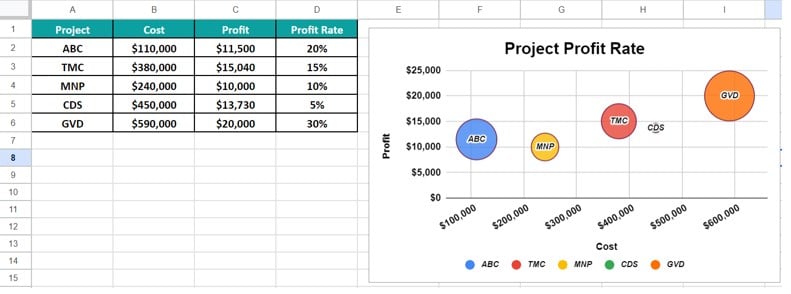
As we can see the GVD project represented by the Orange bubble has given more profit and the CDS project represented by the Green bubble has provided the least profit.
Advantages And Disadvantages
The advantages of the Bubble Chart are:
- We can plot three-dimensional datasets.
- The distinct bubble colors and sizes make the chart a good tool for visual analysis.
The disadvantages of the Bubble Chart are:
- The Bubble Chart requires prior knowledge to understand it effectively.
- In some scenarios, the bubbles overlap if their coordinates are close or the same. And this might hide a few data points in the plot, leading to incorrect analysis. Therefore, it is not advised for large datasets.
Important Things To Note
- Before creating the Bubble Chart in Google Sheets, ensure the source data contains the x values in the first column or row. And the corresponding y and z values should be in the adjacent columns or rows.
- A Bubble Chart works well when the source data contains at least three variables (columns). And each column or row of data should include three numeric values.
- Ensure not to include the column or row headings when selecting the data range to plot the Bubble Chart. Otherwise, the plotted graph might be incorrect.
Frequently Asked Questions
An alternate way to insert a Bubble Chart in Google Sheets is,
First, select the dataset 🡪 click the “More” option on the toolbar, as shown below
Next, click the “Insert chart” icon, as shown below, to open the “Chart editor” and we know the rest.
A few reasons the Google Sheets Bubble Chart may not work are,
a. The dataset used to generate the chart is modified or deleted.
b. If the axis details are not organized in the dataset, then, the chart will be incorrect.
c. The minimum and maximum values for the chart range are not updated. Therefore, the bubbles are displayed half-way or almost outside of the chart layout.
The uses of the Bubble Plot in Google Sheets are as follows:
1. Present sales insights visually in the form of a chart.
2. Analyze employee attendance, company revenue, and customer base growth.
3. Compares marketing strategies to determine the most cost-effective option.
4. Review the impact of ad campaigns and promotions.
5. Assess the effect of superior CPC rates on aspects such as website conversions.
Use this Bubble Chart In Google Sheets Template to follow along with the examples in this article.
Download Excel Template