
Introduction
Many finance teams and data analysts still treat Power BI dashboards as static snapshots that require manual refresh and manual commentary. As data volumes grow and stakeholders demand real‑time insights, the manual approach becomes a bottleneck. Power BI AI visuals smart charts solve this by letting AI generate, choose, and update visualizations that respond to data changes and user filters with minimal effort. These AI powered Power BI visuals can auto‑summarize data, highlight outliers, and refresh narratives as slicers change, turning a passive dashboard into an active analytics partner.
This guide shows how to configure Power BI smart charts that update using builtin AI features such as Smart Narrative, Key Influencers, and Q&A, and how to design them for Power BI AI data visualization in finance and operational reporting. Recent Power BI releases emphasize automatic refresh and AI‑driven text summaries, which can reduce the need for manual documentation and ad‑hoc analysis. For analysts, that means spending less time adjusting charts and more time acting on the insights they reveal.
What Power BI AI Visuals Can Do
Power BI includes several AI powered Power BI visuals that augment traditional charts with automated insights. The most relevant for smart, self‑updating dashboards are:
- Smart Narrative (AI Narrative):
Generates plain‑English text summaries of the current view, such as “Sales increased by 12% in Q2, driven by Region X.” When filters or slicers change, the narrative updates automatically if auto‑refresh is enabled. This is a core example of Power BI AI visuals that update automatically. - Key Influencers:
Uses machine‑learning models to show which factors drive a selected metric (for example, “Customer segment and price tier explain 70% of variance in revenue”). The visual recalculates as filters change, providing dynamic, drillable insights without manual statistics work. - Decomposition Tree and Q&A Visual:
These let users drill down hierarchies or ask natural‑language questions directly on the report canvas. The visuals update their structure and content in real time, making them useful for exploratory finance analysis.
These tools go beyond standard bar or line charts by embedding machine‑learning logic directly into the visual. For finance dashboards, they can flag unusual cost trends, explain profit‑margin shifts, or summarize regional performance in a way that is easy for non‑technical stakeholders to grasp.
How to Set up Power BI Smart Charts that Update
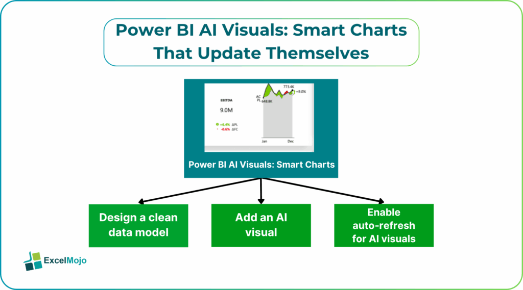
Creating Power BI AI visuals smart charts that update themselves follows a simple reporting pattern: prepare the model, add the AI visual, and enable auto‑refresh where supported. Below is a practical walkthrough.
Step 1: Design a Clean Data Model
AI visuals work best when the underlying model has clear measures, consistent dimension hierarchies, and sensible time grain. For example, a revenue dashboard should have:
- A date table with year, quarter, and month.
- Clean dimensions such as “Region,” “Product,” and “Customer Segment.”
- A measure for “Revenue” and, optionally, “Growth Rate” or “Variance vs prior period.”
Step 2: Add an AI Visual
From the “Visualizations” pane, select an AI‑enabled visual such as Smart Narrative or Key Influencers. Drag the target measure (like “Revenue”) into the visual and apply the same filters that drive the main charts.
For Smart Narrative, the default behavior is to generate a short, data‑driven summary. The user can then tweak the language or add context through the “Customize” options.
Step 3: Enable Auto‑Refresh for AI Visuals
Power BI has introduced an Auto refresh toggle for the AI Narrative visual. In the “Visualizations” pane, turn on the auto‑refresh option so the narrative updates whenever slicers or filters change. This is a direct example of Power BI visuals AI that updates automatically and gives stakeholders a live commentary alongside the charts.
For other AI visuals such as Key Influencers and Decomposition Tree, the content updates as filters change even without a separate toggle, provided the report is published and the data source supports refresh.
Practical Example: A Self‑Updating Revenue Dashboard
Suppose a finance team builds a monthly revenue dashboard that tracks sales by region and product. The report includes:
- A line chart for “Revenue by Month.”
- A stacked bar chart for “Revenue by Region.”
- A Smart Narrative visual that summarizes the top‑level trends.
Using the AI‑visual workflow above, the team can:
- Build measures such as Revenue LY (last year) and Growth % to feed the AI visuals.
- Add a Smart Narrative visual and point it to the revenue measure and period filter.
- Enable the auto‑refresh toggle so that when a user selects “Q2” or “North Region” via slicers, the narrative updates to reflect the new context.
This pattern qualifies as Power BI smart charts that update because the combination of slicers, core charts, and AI visuals reacts as a unit to user interaction.
Pitfalls and How to Avoid Them
Even powerful AI powered Power BI visuals can introduce pitfalls if not designed carefully.
One common issue is overloading the narrative. If the Smart Narrative or Key Influencers tries to explain too many dimensions at once, the text becomes dense and hard to follow. Analysts should limit the number of context dimensions (for example, Region and Date, but not full Product‑SKU) and keep the audience in mind.
Another risk is misleading or shallow insights. AI models may highlight statistically strong factors that are not practically relevant if the training data or filters are poorly defined. For example, a factor that appears important in isolation may not change the business outcome. To avoid this, users should cross‑check AI‑generated insights against manual summaries or known business rules.
Finally, performance and refresh can become issues. Auto‑refreshing AI visuals on large datasets or complex models can slow down the report. Analysts should test the dashboard with realistic data volumes, tune underlying DAX measures, and consider using summarized views instead of raw transactional data where possible.
Frequently Asked Questions (FAQs)
Yes, Power BI AI visuals smart charts can be used without coding. Users configure them through the Visualizations pane and model design, not through custom scripts. Knowledge of DAX and modeling helps, but it is not mandatory for basic use.
Many AI powered Power BI visuals update automatically as filters change, but the behavior depends on the visual and the data‑refresh regime. For example, Smart Narrative can auto‑refresh when slicers change, but the underlying data must still be refreshed periodically from the source.
Traditional charts require manual axis adjustments, calculated fields, and commentary, while Power BI smart charts that update use built‑in AI to generate summaries, influencers, and Q&A responses that adapt to filters. This reduces manual setup and documentation effort.
AI powered Power BI visuals should augment, not replace, human‑generated commentary. They provide a strong first‑draft analysis, but analysts still need to validate assumptions, add context, and tailor the narrative for executive audiences.