
What Is Stacked Area Chart In Google Sheets?
The Stacked Area Chart in Google Sheets graphically represents the rate of change of one or multiple entities over a specific time period. The trends are displayed with line segments and the areas between them and the X-axis, are highlighted with different colors.
In simple terms, the Google Sheet Stacked Area Chart graphically displays the relationship of each variable in a dataset with the whole data. For example, the table below contains three firms’ sales data from 2018-22. We will create a Stacked Area Chart for the dataset.
Use this Stacked Area Chart In Google Sheets Template to follow along with the examples in this article.
Download Excel Template
Select the cell range A1:D7 and insert the Stacked Area Chart in Google Sheets. We get the generated chart, as shown below.

Output Observation: The Stacked Area Chart shows the values as the sum of the data points and highlights the total values across the trend associated with each firm.
- Consider the 2018 data. Firm A’s sales in 2018 were $24.50 million. And the plot starts the first line segment from this point.
- Next, Firm B’s sales value gets added to Firm A’s sales value, which becomes $54.70 million ($24.50 million + $30.20 million). So, the plot shows this value with a line segment starting from the $54.70 million value.
- Likewise, Firm C’s sales figure adds to $54.70 million, making the final sales value $80.19 million. And the plot shows this value using the topmost line segment starting from the $80.19 million mark.
Key Takeaways
- The Stacked Area Chart in Google Sheets helps to visually analyze the rate at which variables change over a given period. And the trend for each variable is a line segment formed using the corresponding data points, with the area from the line segment to the X-axis shaded in color.
- Users can use the Stacked Area Charts when required to analyze trends, review collective data, and compare the relationship of a data series to the whole data.
- Whenever we see that the trend lines are not clearly visible, we can change the Min and Max values, for the Horizontal and Vertical axis, in the Chart editor window accordingly.
How To Create A Stacked Area Chart In Google Sheets?
We can create a Stacked Area Chart in Google Sheets as follows:
Select the cell range containing the required data to plot à select the “Insert” tab à click the “Charts” option. A default chart generates and the “Chart editor” window opens at the right, as shown below.

In the “Chart editor” window, select the “Setup” menu and choose the “Stacked area chart” from the “Chart type” drop-down, as shown below.

The Stacked Area Chart generates and then we can customize it accordingly.
Examples
We will consider some scenarios using the Stacked Area Chart in Google Sheets examples.
Example #1
The below table contains the monthly Mathematics test scores of five students. The requirement is to analyze each student’s performance in the monthly tests visually using a Stacked Area Chart.

The steps to create a Stacked Area Chart are shown below,
Step 1: Choose the dataset cells A1:D7 à select the “Insert” tab à choose the “Chart” option and the “Chart editor” window opens on the right-side, as shown below.

Step 2: Select the “Setup” menu, click the “Chart type” drop-down and choose the “Stacked area chart” to generate the following chart. Now, let us customize the chart as per our requirement.

Step 3: First, we will update the chart titles. Please check if the “Chart editor” window is open else we can click the chart to activate, click the 3 dots on the top-right corner of the chart and select the “Edit chart” option to open the “Chart editor” window, as shown below.

Step 4: Select the “Customize” menu. Click the “Chart & axis titles” right arrow, as shown below.

Step 5: Click the “Title type selector” drop-down. Select each option to update the title as follows:

- First, select the “Chart title” option, type “Mathematics Monthly Test Scores” in the “Title text” field, select “Bold” and “Center alignment” in the “Title format” field and color Black in the “Title text color” field, as shown below.

- Next, select the “Horizontal axis title” option, type “Student” in the “Title text” field, select “Bold” and “Center alignment” in the “Title format” field and color Black in the “Title text color” field, as shown below.

- Finally, select the “Vertical axis title” option, type “Monthly Scores” in the “Title text” field, select “Bold” in the “Title format” field and color Black in the “Title text color” field, as shown below.

Step 6: Select the “Customize” menu. Click the “Vertical axis” right arrow. We can check/tick “Show axis line” checkbox, enter the values as 75 and 100 in the Min and Max fields, as shown below.

[Note: We see now the chart above looks different from the one in step 5.]
Step 7: Finally, select the “Setup” menu and click the “Stacking” drop-down and select the “None” option, as shown in the images below.


We get the final Stacked Area Chart, as shown below. We can either stop here, or customize further by exploring the options available in the “Customize” menu in the “Chart editor”.
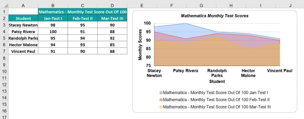
Output Observation: The plot shows a line segment for each monthly test. And the shaded areas from each trend line overlap with the area from the lowest trend line to the X-axis, shown in front.
- The Feb monthly test trend, the second line segment formed by data points 95, 91, 94, 93, and 90. And the area from this trendline to the X-axis is in Red.
- Likewise, we get the first and third trendlines for January and March monthly tests, with the respective areas below them shaded in Blue and Yellow.
So, now using the above plot, we can review how each student has performed in the monthly tests.
Example #2
The below table shows a monthly inventory data of a firm for the months April to August on the units ordered for the Smartphones, Laptops and Desktops. We will create a Stacked Area Chart.

The steps to create a Stacked Area Chart are as follows:
Step 1: Choose the dataset cells A1:D7 à select the “Insert” tab à choose the “Chart” option and the “Chart editor” window opens on the right-side, as shown below.

Step 2: Select the “Setup” menu, click the “Chart type” drop-down and choose the “Stacked area chart” to generate the following chart. Now, let us customize the chart as per our requirement.

Step 3: Follow the steps learnt in Example 1 to update the titles, min and max values to display the values within the chart, etc. Then, the final Stacked Area Chart is shown below.

Output Observation:
- The first trend line with the area below it shaded in Blue represents the Smartphone units ordered data.
- Next, the Laptop units ordered get added to the first trendline data points every month to form the second trendline, with the area below it being in Orange.
- Finally, the Desktop units get added to the second trendline data points every month to form the third trendline, with the area below it being Yellow. And the shaded areas from each trend line overlap with the area from the lowest trend line to the X-axis, shown in front.
Thus, we can review the total units of all items ordered each month and the overall and item-wise trends. And we can analyze the proportion of the units of each item order in the overall inventory order.
Example #3
We will plot a Stacked Area Chart for negative values. Consider the dataset given below that consists the profit and loss figures at various firm branch offices from 2015-18.

The steps to create a Stacked Area Chart to graphically show the positive and negative data points are,
Step 1: Choose the dataset cells A1:E6 à select the “Insert” tab à choose the “Chart” option and the “Chart editor” window opens on the right-side, as shown below.

Step 2: Select the “Setup” menu, click the “Chart type” drop-down and choose the “Stacked area chart” to generate the following chart. Now, let us customize the chart as per our requirement.

Step 3: Follow the steps learnt in Example 1 to update the titles, min and max values to display the values within the chart, etc. Then, the final Stacked Area Chart is shown below.

Output Observation:
- While the branch offices BO_1, BO_2, and BO_4 show profits in all the specified years, the branch office BO_3 shows losses from 2016-18. And thus, we get trends for the branch offices BO_1, BO_2, and BO_4.
- But in the case of the branch office BO_3, the plot gradually shifts towards the negative Y-axis. The reason is that the negative data points in the BO_3 data series get added with each year’s trendline.
In this way, the Stacked Area Chart plots the negative values relative to the remaining data points in the corresponding data series.
Important Things To Note
- Ensure our source data includes only a few categories to avoid clutter in the plotted chart.
- Organize the dataset in a way that the highly variable data appear at the top of the Area plot, to make it easy to understand.
- First, confirm if the Stacked Area Chart variant has the data trends overlapping or stacked on top of each other. And then, accordingly, perform the analysis.
Frequently Asked Questions (FAQs)
The uses of a Stacked Area Chart are as follows:
Trend Review – It shows a trend based on the magnitude, not data points. So, the graph is useful to analyze an entity’s performance, whether it is trending individually or as a group.
Collaborative Data Review – It groups data points that helps analyze a section of the required line segment instead of reviewing different line segments of the specified data points.
Quick Data Comparison and Summary – If the source data is time-series oriented, it is useful to visually analyze the relationship of each dataset to the whole data.
An alternate way to insert Google Sheets Stacked Area Chart is,
First, select the dataset – click the “More” option on the toolbar, as shown below.
Next, click the “Insert chart” icon, as shown below, to open the “Chart editor” and we know the rest.
A few reasons the Google Sheets Stacked Area Chart may not work are,
a) The dataset used to generate the chart is modified or deleted.
b) If the axis details are not organized in the dataset, then, the chart will be incorrect.
c) The minimum and maximum values for the chart range are not updated. Therefore, the trend lines might be half-way through the chart.
The pros of Stacked Area Chart are:
a) It helps create a simple graphical representation of the given data with a few categories.
b) It is a good option to display trends over the specified period and compare the data series as trends instead of values.
c) It enables one to represent positive and negative data points visually.
The cons of the Stacked Area Chart are:
d) It takes time and effort to create the Chart, because there are a lot of steps involved, especially if we have a slightly larger dataset. Hence, it is recommended for a smaller dataset.
e) In some scenarios, when the data overlap then it is challenging to comprehend the chart as we will have the trend lines and the colored part in-between the lines.
Use this Stacked Area Chart In Google Sheets Template to follow along with the examples in this article.
Download Excel Template