What is the Tableau Line Chart?
The Tableau Line Chart is a data visualization tool that allows you to join different data points or series of data points in a view using a line. This chart is represented in a 2-dimensional view through a horizontal axis (x-axis) and a vertical (y-axis). These axes represent a series of sequential movements of values and corresponding metrics for each of those values, respectively. A Tableau Line chart is handy for displaying a pattern or trends over a time interval. Using these charts, you can also create a forecast or prediction over future time intervals. One of the advantages of using the line chart is you can create multiple lines to compare different categories or segments within a dimension.
A typical Tableau Line chart is shown below.

Key Takeaways
- The Tableau Line Chart joins different data points or series of data points in a view using a line.
- It is highly useful to display a pattern or trends over a time interval and also to create a forecast or prediction over future time intervals.
- You can create a line chart in Tableau using the in-built Marks Type as Line.
- Tableau supports combining multiple line charts, changing the other charts such as Bar chart to line, and formatting the chart options.
How to create a Line Chart in Tableau?
To create a Line chart in Tableau, follow the steps below:
Step 1: Import your dataset into Tableau by navigating to the Data Source tab and using the File Navigator, i.e., File – Open.
Step 2: In the new worksheet, drag the date (dimension) to the Columns and measure to the Rows shelf.
Tableau will create two different line charts, i.e., one for Profit and the other for the Discount.
Note that Tableau aggregates the date field by year.

Step 3: Drag the SUM(Discount) measure from Rows to the Profit measure. This will create a blended axis.
As you can see, when you drag the SUM(Discount) to the Profit measure, you will notice two pale green parallel bars. This indicates that both Profit and Discount will use a blended axis.

Once you release the mouse, the view will be updated to a blended axis, as shown below:

Step 4: Now, click on the drop-down arrow next to Year(Order Date) in the Columns shelf and select Month from the context menu.

Now, you can see the detailed line chart in the view.

Step 5: Navigate to Analytics – Forecast.

Step 6: Drag Forecast to the view and drop it on the Add a Forecast.

Tableau applies forecast to the view displaying the trend.

Note: It is possible to create a Tableau line chart without date by dragging a categorical dimension to the Columns shelf.
Examples
In this section, we will go through different examples demonstrating the Tableau line chart.
Example #1 – Line Charts in Tableau with Multiple Measures
In this example, we will create a Tableau line chart with multiple using the Alibaba Retail Sales dataset. The Alibaba Retail Sales dataset contains various details covering sales details, geography, product categories, user details, and many more across multiple dates.
To create a line chart with multiple measures, follow the instructions below:
Step 1: Connect with Alibaba Retail Sales to Tableau using the File Navigator i.e. File – Open. Once the import is successful, you will be able to view the data by navigating to the Data Source tab in Tableau.

Step 2: Drag Order Date (Dimension) and Sales, Profit, and Quantity (Measures) from the Data pane to the Columns and Rows shelf, respectively.
Tableau will create three different line charts, as shown below.

Step 3: Drag the SUM(Profit) measure from Rows to the Sales measure to create a blended axis. You can see the two pale green parallel bars in the view.

Now, you can see Tableau has created a blended axis for both Sales and Profit measures.

Step 4: Drag the SUM(Quantity) measure from Rows to the blended axis, similar to the above step. You can see the two pale green parallel bars in the view, similar to step 3.

Now, you can see all the three measures blended into a single axis.

Step 5: Click on the down arrow next to the Order Date in the Columns shelf. Choose Month from the context menu.

You will see a multiple lines in the view.

Step 6: Drag the measures, i.e., SUM(Profit), SUM(Quantity), and SUM(Sales) to the Tooltip in the Marks card.
Now your Tableau line chart multiple lines along with multiple measures is ready.

Example #2 – Year over year Line Chart in Tableau
In this example, we will demonstrate creating a year-on-year line chart in Tableau using the Netflix content by Year dataset. The Netflix content by Year dataset contains different details such as Genre, Premiere, Runtime, IMDb, Language, and Year.
To create year over year line chart in Tableau, follow the below steps:
Step 1: Connect the Netflix content by Year dataset to Tableau. You can see the imported data in the Data Source tab below.

Step 2: In a new worksheet, drag Premiere (Dimension) and Runtime (Measure) in Columns and Rows, respectively.
Tableau will automatically create a line chart, as shown below.

Step 3: Click on the down arrow next to YEAR(Premiere) and select Month from the context menu.
You may also choose other date options that are appropriate for your chart.

Tableau will expand the line chart as per the months’ dimension chosen above.

Step 4: Drag the YEAR(Premiere) to Color in the Marks card. You will see a chart multiple lines in the view, as shown below.

Step 5: Drag the SUM(Runtime) to the Label in the Marks card. You can see the color-coded chart in the view.

Step 6: Drag the Premiere dimension to the Filters shelf.

Step 7: Specify the filter conditions in the Filter window.

Tableau will display the line chart showing year-on-year Runtime over three years, i.e., between 2019 and 2021.

Example #3 – Line chart with dots in Tableau
Here we will demonstrate how to create a line chart with dots in Tableau using the Electric Vehicle Population dataset. The Electric Vehicle Population dataset contains the Battery Electric Vehicles (BEVs) and Plug-in Hybrid Electric Vehicles (PHEVs) that are currently registered through the Washington State Department of Licensing (DOL).
To create the line chart with dots in Tableau, the following steps can be applied:
Step 1: Connect to the Electric Vehicle Population dataset and import it into Tableau using File Navigator.

Step 2: Drag Model Year (Dimension) and Count(Vin (1-10)) to the Columns and Rows shelf.

Step 3: Drag Vin(1-10)) to the Rows shelf and change the measure to Count.

Step 4: Click on the down arrow next to CNT(Vin(1-10)) and Dual Axis in Tableau from the context menu.

Step 5: Expand the 2nd CNT(Vin(1-10)) and change the Marks Type to Circle.
Tableau will add dots to the view as shown below.

Step 6: Expand the CNT(Vin(1-10)) and drag CNT(Vin(1-10)) to the Color in the Marks card.

Step 7: Right-click on the axis and select Synchronize Axis from the context menu.

Step 8: Right-click on the axis and select Edit Axis from the context menu.

Step 9: On the Edit Axis window, remove the Title on the General tab.

Step 10: On the Edit Axis window, click on the Tick Marks tab and choose the None option for both Major Tick Marks and Minor Tick Marks.

Now, your Tableau visual is ready for display.

Example #4
Let’s look at another example where we will demonstrate creating Tableau Line charts using the Europe Sales Records Dataset. The Europe Sales Records contains detailed information about the region, country, item type, order priority, and sales information.
To create a Line chart, follow the below step-by-step instructions:
Step 1: Import the Europe Sales Records dataset into Tableau.

Step 2: Drag Order Date (Dimension) to Columns and Total Cost, Total Revenue, and Total Profit (Measures) to Rows shelf.
Tableau has created 3 different line charts as shown below.

Step 3: Drag the SUM(Total Revenue) measure from Rows to the Total Cost measure to create a blended axis. You can see the two pale green parallel bars in the view.

Tableau will display the blended axes in the view, as shown below.

Step 4: Repeat the same process as Step 3 to drag the SUM(Total Profit) to the blended axes.

Now, Tableau has created a blended axis combining all three 3 line charts into a single view.

Step 5: Click on the down arrow next to the Order Date in the Columns shelf. Choose Month from the menu.

Tableau has updated the view as shown below.

Step 6: Click on the down arrow next to Order Date – More – Custom.

Step 7: Select Month/Year from the Detail drop-down menu.

Tableau will display the line chart with an x-axis showing Month/Year in the view as shown below.

Important Things to Note
- The Tableau line chart requires a continuous dimension or date on the x-axis and measures on the y-axis. Format your dataset appropriately before creating the chart.
- Consider chart customization, such as proper data labeling and adding colors to the data points to ensure better clarity to the line chart.
- Ensure the axis labels, details, and titles are correctly specified to make your chart visually appealing.
- If you observe your line chart not connecting, then consider troubleshooting measures such as data aggregation or sorting your data in the desired order.
- Similarly, for the Tableau line chart connect missing values, you may handle null values or consider excluding the null values in your chart.
Frequently Asked Questions (FAQs)
To combine 3 line charts in Tableau, follow the steps below:
• Drag 3 different measures to the Rows shelf to create 3 line charts
• Drag 2nd measure from the Rows shelf to the target line chart in the view. This will create a blended axis.
• Similarly, drag the 3rd measure from the Rows shelf to the target line chart in the view.
Now you will see all the 3 charts combined into a single line chart in Tableau
To change the bar chart to a line chart in Tableau, you may follow the below steps:
• Create a bar chart using the dataset in Tableau
• Navigate to the Marks card. Under the Marks Type drop-down, select the Line option from the context menu.
This will change the bar chart to the line chart in Tableau.
To combine line and bar chart in Tableau, follow the below steps:
• Create a bar chart in Tableau
• Drag a measure to the Columns shelf
• Click on the drop-down arrow next to the measure and select the Marks Type as Line.
• Apply the formatting options such as Color, Axis synchronization, and other options as needed.
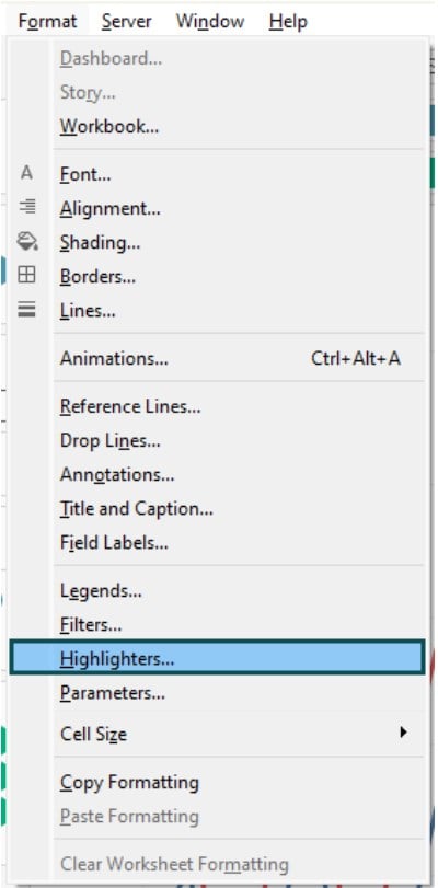
To format a line chart in Tableau, you can use the below options
• Navigate to the Format tab in Tableau.
• Select the worksheet where you want to apply formatting.
• Choose the formatting options from the context menu. It includes Font, Alignment, Shading, Borders, Animations, Filters, Highlighters, Title and Caption, and many more.