
Introduction
Many finance professionals and data analysts spend disproportionate time selecting chart types, tweaking axes, and adjusting colors instead of focusing on insight. In the current era of AI powered data visualization Excel, that work can be reduced by letting AI propose or draft complete charts from simple prompts. The goal of this guide is to show how to build AI generated charts in Excel that are accurate, readable, and aligned with common reporting standards.
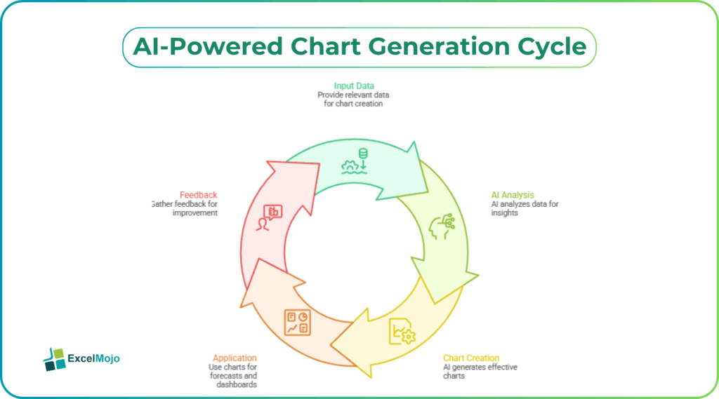
By the end of this article, you will understand how to use AI features embedded in Excel and in add‑ins to accelerate chart creation. The workflow is built around creating charts with AI in Excel patterns that work for forecasts, K‑PI dashboards, and more.AI‑assisted charting can cut time spent on visualization setup by roughly 40–60% when paired with clean data. This guide walks through practical steps, real‑world examples, and common pitfalls, tailored for Excel users in finance and analytics.
How Modern Excel Tools Support AI‑Driven Charts
Excel already includes several AI powered data visualization Excel features that help users create charts from natural language. The most relevant ones for beginners are the Analyze Data pane and Copilot‑style suggestions in Microsoft 365. These tools can propose visualizations based on selected ranges. When a user highlights a table of sales figures by month, for example, the AI might suggest a line chart to show trends, a bar chart to compare regions, or a waterfall to highlight variances.
Excel evaluates the structure of the selected data (number of rows, columns, and data types), then applies standard visualization rules when combined with AI. Dates and time periods typically trigger line charts; categories with one numeric series suggest bar or column charts; two numeric series may prompt a scatter plot. For finance users, the key benefit is not just speed but consistency. AI‑suggested charts tend to follow default styling rules that align with standard financial dashboards.
To get the most out of these tools, analysts should first ensure data is well‑structured. Understand that AI cannot fully compensate for poor data layout; clean tables are a prerequisite for reliable AI‑driven charts.
How to Build AI Generated Graphs Excel Step by Step
Turning a table into an AI generated graph Excel output does not require coding, but it does benefit from a clear workflow. The following pattern can be applied to forecasts, K‑PIs, or variance reports.
Step #1 – Prepare a Clean Data Table
Start with a simple table that has:
- A column for time or category (e.g., “Month,” “Region,” “Product”)
- One or more numeric columns (e.g., “Revenue,” “Budget,” “Actuals”)
If the data is messy, clean it first using filters, UNIQUE, or XLOOKUP‑style logic to remove duplicates or inconsistencies. AI tools work best when the table is dense and structured because they can then infer the right chart type from context.
Step #2 – Use AI to Suggest a Chart
In Excel 365, select the data range, then open the Analyze Data feature (Data tab > Analyze Data) or the AI assistant pane. Write a prompt like: “Show me a chart that compares revenue and budget by month.” Excel may respond with:
- A line chart with revenue as a solid line and budget as a dashed line
- Optional markers for actuals versus forecast gaps
- Axis labels already formatted as currency and dates
Review the chart to confirm that the series and labels match your intent. For example, verify that the x‑axis uses “Month” and the y‑axis shows “Revenue” in the correct units. This is a create chart with AI in Excel pattern that works for most standard timeseries and category comparisons.
Step #3 – Refine the Chart Manually
Once the AI‑generated base chart appears, refine it using standard Excel charting tools:
- Adjust colors and fonts to match company style guides
- Add data labels or trendlines where needed
- Modify the chart type (e.g., from bar to column) if the AI selection is not ideal
Manual tuning is still necessary because AI does not always know the audience or context. For example, a board‑level slide may need a simpler, bolder chart than what Excel suggests by default.
Practical Example: AI‑Generated Variance Chart
Suppose a finance team maintains a monthly variance report with three columns: “Month,” “Budget,” and “Actuals.” They want an automated chart using AI Excel that highlights where actuals fall short of budget.
The user can:
- Select the three‑column table.
- Activate the AI assistant and ask: “Create a clustered column chart that shows Budget and Actuals by Month, with a line for variance.”
- Excel may generate a mixed chart:
- Clustered columns for Budget and Actuals
- A line series for variance (Actuals minus Budget)
- Axis labels formatted as currency
The AI‑generated logic follows classic variance‑chart best practices: column charts for comparing values across time and line charts for tracking a single metric that evolves. The user can then add a title such as “Monthly Revenue Variance vs Budget” and hide the legend for the variance line if it is clearly labeled in the caption.
Over time, analysts can standardize this workflow into a template so that every new month’s data triggers the same AI‑driven charting pattern, reducing manual setup.
Pitfalls and How to Avoid them with AI Charts
AI generated charts are fast, but they are not foolproof. Common issues include:
- Misleading scales: AI‑chosen axis ranges may exaggerate or compress trends. For example, setting the y‑axis from 95% to 105% of the data range can make small variances look dramatic. To avoid this, always check the axis bounds and consider using percentage‑based scaling when comparing growth rates.
- Wrong chart types: AI may default to bar charts for continuous data or line charts for categorical data. If the x‑axis labels are not truly sequential, a line chart can imply a continuous trend where none exists.
- Overloading visuals: AI‑suggested charts sometimes add too many series or labels, which can confuse readers. For finance dashboards, it is usually better to split complex views into two charts (e.g., one for trends and one for variances) rather than one crowded graphic.
To mitigate these risks, analysts should treat AI‑generated charts as first drafts and apply domain knowledge. For example, in a cost‑of‑sales analysis, a stacked column chart might be clearer than a multi‑series line chart, even if AI suggests the latter. Regularly comparing AI‑generated outputs against traditional best practices for business charts helps reinforce good design habits.
When to Use AI vs Traditional Charting
AI is most valuable for routine or standardized charts: time‑series trends, category comparisons, and simple variances. For those use cases, AI generated graphs Excel can cut setup time significantly and enforce consistency across reports. In more complex scenarios, such as waterfall charts for acquisition‑driven revenue or multi‑panel dashboards, analysts often need to start with AI‑suggested elements and then customize them manually.
A practical rule of thumb is:
- Use AI‑driven charts when the data structure is simple and the question is standard (e.g., “What is the trend by month?”).
- Use traditional charting when the story is nuanced and the audience needs precise control over layout, annotations, or storytelling flow.
This hybrid approach keeps the workflow scalable while preserving the analytical rigor finance teams need.
Conclusion
Building AI generated charts in Excel is no longer a niche skill; it is a practical way for finance professionals to compress preparation time and focus more on interpreting results. By learning how to create charts with AI in Excel, users can produce professional‑looking, automated charts using AI Excel that align with common reporting standards. The key is to treat AI as a drafting assistant, not a final arbiter of design, and always validate both logic and presentation against known best practices.
For readers who want to go further, the next step is to pick one recurring report, such as a monthly P&L or K‑PI dashboard. They can rebuild it using AI‑generated charts in Excel, then document the prompts and refinements as a reusable template.
Frequently Asked Questions (FAQs)
Yes, beginners can create AI generated charts in Excel by using natural‑language prompts and built‑in analysis features. They do not need advanced design skills, but they must understand basic chart types such as line, bar, and column charts.
AI generated graphs Excel are reliable for routine reporting when underlying data is clean and the chart logic is reviewed. Analysts should always double‑check series assignments, axis ranges, and labels to ensure they match the intended message.
Yes, many AI powered data visualization Excel tools can automate dynamic charts, especially when connected to structured tables or shared data sources. When new rows or columns are added, refreshing the data often triggers the AI to regenerate or update the chart.
AI generated charts Excel work well for ad‑hoc analysis and internal reports, but Power BI remains better for large‑scale, interactive dashboards. Finance teams often use AI‑generated Excel charts for quick views and static reports, then Power BI for enterprise‑level visualizations with drill‑down capabilities.
Recommended Articles
Continue with these related resources when you want the next practical step in this topic.
- How To Use AI With Excel
- How AI Is Transforming Data Analysis In Excel (2026 Complete Guide)
- Excel AI And Machine Learning: Beginner’s Guide For 2026
- The Most Useful AI Features in Excel: Unlock Smarter Spreadsheets in 2026
- Top Skills for AI-Enabled Excel in 2026 (Must-Master List)
Explore the full Excel AI Automation and Analysis guide or browse Excel Resources.