
What Is Box Plot In Excel?
A Box Plot in Excel is a graphical representation of statistical data. It compares multiple datasets using quartiles and indicates how the values or numeric data get distributed. We can create a Box Chart in Excel, vertically or horizontally. A Box Plot in Excel represents the five-number summary technique of the dataset, indicating the Median and the degree of dispersion of the data from the center.
For example, the following table shows the number of Smartphone units sold from January to March.
Use this Box Plot In Excel Template to follow along with the examples in this article.
Download Excel Template
When we create a Box Plot in Excel for the above table, using the Box and Whisker Plot in Excel, we get the following output.
- The top-most and bottom-most points in each Box Chart in Excel show the maximum, and the minimum number of smartphone units sold each month, respectively.
- The remaining data points denote the units sold between the highest and lowest points.
- The entire plot highlights the data set distribution based on the five-number summary of the dataset.

Key Takeaways
- A Box Plot in Excel helps us visualize large dataset’s distribution using the five-number summary technique. It enables users to quickly determine the Mean, the data dispersion levels, and the distribution skewness and symmetry.
- We can create a Box Chart in Excel using the Stacked column [Horizontal Box Plot in Excel] or Bar chart [Vertical Box Plot in Excel].
- We can also create a Vertical Box Plot in Excel as follows, select the “Insert” tab > go to the “Charts” group > click on the “Insert Statistic Chart” drop-down > select the “Box and Whisker” option.
Understanding Box Plot (also known as Box and Whisker Plot)
In the Box Plot in Excel, we see stacked boxes, each indicating a quartile. And the lines drawn at the end of the box look like whiskers. Hence, the name Box and Whisker Plot in Excel. We can create a Vertical or Horizontal Box Plot in Excel.
The Plot Elements of the Box Plot in Excel, shown in the below image, are as follows:

- First Quartile
The First Quartile, or Q1, is the lower quartile since it gets evaluated at the 25th percentile point, the lower quartile limit. Mathematically, it is the product of one-fourth of the value and one.
The syntax of the First Quartile is:

The arguments of the First Quartile are:
- array – The cell range for which we must find the First Quartile.
- quart – It is 1 because it is the First Quartile.
- Median or Second Quartile – Median is the value at the center of a dataset when the values are in ascending or descending order.
The syntax of the Median() is:

The arguments of the Median() are:
- number1, [number2], … – The cell range of the dataset.
The Median is the second quartile because it represents the 50th percentile, and the Median [the midpoint of the dataset] also indicates the same. Hence, we must determine the Median as the function argument in a cell range of the dataset.
- Third Quartile –
The Third Quartile, or Q3, is the upper quartile, which calculates the 75th percentile point, the upper quartile limit. Mathematically, it is the product of one-fourth of the value and three.
The syntax of the Third Quartile is:
The arguments of the Third Quartile are:
- array – The cell range for which we must find the Third Quartile.
- quart – It is 3 because it is the Third Quartile.
- Interquartile Range –
It is the difference between the First Quartile and the Third Quartile and is a superior measure of the data distribution.
- Outliers
Outliers are the points lying outside the whiskers.
- Minimum
It is the least non-outlier point in the dataset. Therefore, in a Box Chart in Excel, it is identified as it is the lowest point of the lower whisker.
- Maximum
It is the highest non-outlier point in the dataset. In a Box Chart in Excel, it is the highest point of the upper whisker.
How To Create Box Plot In Excel?
We will create a Horizontal Box Plot in Excel for the company’s data.
In the below table, the data is as follows:
- Column A contains Months.
- Column B shows 2019-Sales.

The steps to create a Horizontal Box Plot in Excel are,
Step 1: In the dataset, determine the Minimum, Q1, Median, Q3, and Maximum. Enter the values in cells B17:B21 and apply their respective formulas in cells C17:C21, as shown below.

Step 2: Calculate the differences between the five parameters in cells B17:B21. The differences are in cells B26:B29, with the minimum value in cell B25 being the same as in cell B17. And the formulas to apply are in cells C25:C29.

Step 3: Next, to create a Horizontal Box Plot in Excel, select the cell range B24:B29 > select the “Insert” tab > go to the “Charts” group > click on the “Insert Column or Bar Chart” drop-down > select the “2-D Bar” option, as shown below.

The stacked bar chart will appear as depicted below.

Step 4: The above plot automatically takes the cell range B25:B29. To create an accurate Box Plot in Excel, right-click on the chart and click on the “Select Data” option.

Step 5: The “Select Data Source” window pops up > click on the “Switch Row/Column” option > click on the “OK” button.

Once we reverse the axes to stack the boxes horizontally, we see the following chart.

Step 6: Now, choose the first segment of the chart from the left and right-click to select the “Format Data Series” option.

Step 7: The “Format Data Series” pane opens on the right > click on the “Fill” option > select the “No fill” option > next, click on the “Border” option > select the “No line” option.

The first segment in the chart gets hidden. Now, we shall create the whiskers.
Step 8: Choose the first segment from the right in the chart and right-click to select the “Format Data Series” option > The “Format Data Series” pane opens on the right > click on the “Fill” option > select the “No fill” option.

Step 9: Keep the first segment from the right, which is selected, and click on the ‘+’ icon. The “Chart Elements” window pops up > “check/tick” the “Error Bars” checkbox > click on the arrow next to it > click on the “More Options…”, as shown below.

Step 10: The “Format Error Bars” pane will appear on the right side > set the “Horizontal Error Bar” as follows, “Direction” as Minus, “End Style” as Cap, and the “Error Amount” as Percentage with its value as 100% in the respective field.

After we set the selections, the chart will appear with the top whisker.

Step 11: Select the left-most segment in orange, then select the “Design” tab > go to the “Chart Layout” group > click on the “Add Chart Element” drop-down > click on the “Error Bars” arrow option > select the “More Error Bars Options…” option, as shown below.

Step 12: Choose the same settings as done in step 10. [The “Format Error Bars” pane will appear on the right side > set the “Horizontal Error Bar” as follows, “Direction” as Minus, “End Style” as Cap, and the “Error Amount” as Percentage with its value as 100% in the respective field].
Step 13: Hide the currently chosen segment as explained in step 7. [The “Format Data Series” pane opens on the right > click on the “Fill” option > select the “No fill” option > next, click on the “Border” option > select the “No line” option]. The box plot will appear as shown below.

Step 14: Next, choose each segment, one at a time, and right-click to select the “Format Data Series” option. In the “Fill & Line” section of the “Format Data Series” pane, select “Solid fill” and set the required colors. Also, choose “Solid line” as the Border.

Step 15: Click on the chart area and set the “Chart Title” and the horizontal axis title using the “Chart Elements” option. Also, select the vertical axis to delete the term “Values”.

Once we apply all the settings, the box plot will appear as shown below:

Interpretation
In the above example, the interpretation of the Box Chart in Excel are as follows:
- The top-most data point in the upper whisker is between 60000 and 70000. Thus, it equals the Maximum value of the dataset, 65350.
- The bottom-most data point in the lower whisker is close to 30000. And it equals the Minimum value of the dataset, 27540.
- The bottom-most horizontal line, forming the first box in the plot, shows the First Quartile, with the value 38135.
- The second horizontal line in the plot shows the Median, with the value being 42650. And, since it does not run through the middle of the box, it indicates a skewed data distribution.
- The top-most horizontal line, forming the second box in the plot, shows the Third Quartile, with the value being 54222.5.
- Since there are no Outliers, the box plot does not highlight such data points.
- The tiny ‘x‘ in the middle of the box represents the dataset’s Mean. If you apply the AVERAGE() to the dataset, you will get the value 45044.166.
Thus, the plotted Box Chart in Excel is accurate and on par with the five-number summary technique.
In conclusion, we read a Box Chart in Excel as follows:
- 25% of the monthly sales are below $38135, and 75% are below $54222.5.
- 50% of the monthly sales are between $38135 and $54222.5.
- The Median appears to be closer to the First Quartile. It indicates a positively-skewed distribution, showing that the data contains a higher frequency of higher sales values.
[Special Note: Alternatively, if we want to create a Vertical Box Plot in Excel, or the default Box Plot, for the same 2019 sales data. Here are the steps:
Step 1: Select the cell range B1:B13 > select the “Insert” tab > go to the “Charts” group > click on the “Insert Statistic Chart” drop-down > select the “Box and Whisker” option, as shown below.

We get the following Vertical Box Plot in Excel.

Step 2: Update the Chart Title, and using the Chart Elements, insert the vertical axis title. Also, delete the term 1 in the horizontal axis and change the segment colors.

The final Vertical Box Plot in Excel is shown in the above image].
Important Things to Note
- We must calculate the five plot elements first, i.e., the Minimum and Maximum values, the First Quartile and Third Quartile, and the Median of the dataset.
- The Median is also the Second Quartile which denotes the data’s 50th
- We cannot consider the Outliers while determining a dataset’s Maximum and Minimum
Frequently Asked Questions (FAQs)
The Box and Whisker Plot in Excel is in the “Chart” group of the “Insert” tab.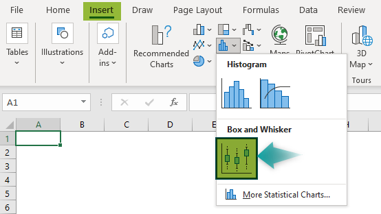
We can create a Horizontal Box Plot in Excel using the following steps:
1. First, calculate the Minimum and Maximum values, the First and Third Quartile, and the Median of the dataset.
2. Next, calculate the differences between the above five-number summary statistical values, and plot a 2-D stacked bar chart.
3. Then, change its Shift Row/Column data settings to reverse the axes and get a horizontally stacked bar plot.
4. Adjust the plot segments and error bars to include whiskers, and create a Horizontal Box Plot in Excel.
A Box and Whisker Plot in Excel shows the data distributed into quartiles, highlighting the Median and Outliers. Additionally, the boxes have lines extended from their borders, known as whiskers. They represent the data variableness outside the quartiles.
Use this Box Plot In Excel Template to follow along with the examples in this article.
Download Excel TemplateRecommended Articles
Continue with these related resources when you want the next practical step in this topic.
- Charts In Excel
- Graphs And Charts In Excel
- Chart Wizard In Excel
- Line Chart in Excel
- Column Chart In Excel
Explore the full Excel Charts guide or browse Excel Resources.