
What Is Box Plot In Google Sheets?
A Box Plot in Google Sheets is a graphical representation of statistical data that compares multiple datasets using quartiles and explains the distribution of the values or numeric data.
A Google Sheets Box Plot helps us visualize the five-number summary technique of the dataset, indicating the Median and the degree of dispersion of the data from the center.
Use this Box Plot In Google Sheets Template to follow along with the examples in this article.
Download Excel TemplateFor example, the below table shows the number of Cars sold in January.

When we create a Box Plot in Google Sheets, we first find the five-summary data, as shown below.

Then using the Box and Whisker Plot in Google Sheets or the Candlestick chart, we get the output as shown in the image below.
The remaining data points denote the units sold between the highest and lowest points. The top-most and bottom-most points of the Box Plot in Google Sheets shows the maximum and minimum number of cars sold, respectively. The entire plot highlights the data set distribution based on the five-number summary of the dataset.

Key Takeaways
- A Box Plot in Google Sheets helps us visualize a large dataset’s distribution using the five-number summary technique. It enables users to quickly determine the Mean, the data dispersion levels, and the distribution skewness and symmetry.
- We can customize the Box Plot in Google Sheets as seen in FAQ 2. The options available in the Customize Tab are Chart Style, Chart & axis titles, Horizontal axis, Vertical axis and Gridlines & ticks.
- In the Customize Tab there is the Chart Style option, where we can change the background color, theme or border colors for better presentation.
Understanding Box Plot or Candlestick Chart (also Known as Box and Whisker Plot)
In the Box Plot in Google Sheets, we see stacked boxes, each indicating a quartile. The lines drawn at the end of the box look like whiskers. Hence, the name Box and Whisker Plot in Excel and in Google Sheets it is also known as the Candlestick Chart.
The Plot Elements of the Box Plot in Google Sheets, shown in the below image, are as follows:

- First Quartile –
The First Quartile, or Q1, is the lower quartile since it gets evaluated at the 25th percentile point, the lower quartile limit. Mathematically, it is the product of one-fourth of the value and one.
The syntax of the First Quartile is:

The arguments of the First Quartile are:
- data -The cell range for which we must find the First Quartile.
- quartile_number à It is 1 since it is the First Quartile.
- Median or Second Quartile –
The Median is the value at the center of a dataset when the values are in ascending or descending order.
The syntax of the Median() is:

The arguments of the Median() are:
- number1, [number2], … à The cell range of the dataset.
The Median is known as the second quartile because it represents the 50th percentile, and the Median [the midpoint of the dataset] too indicates the same. Hence, in a given cell range, of the dataset, we have to determine the Median as the function argument.
- Third Quartile –
The Third Quartile, or Q3, is the upper quartile, which calculates the 75th percentile point, the upper quartile limit. Mathematically, it is the product of one-fourth of the value and three.
The syntax of the Third Quartile is:

The arguments of the First Quartile are:
- data -The cell range for which we must find the Third Quartile.
- quartile_number -It is 3 since it is the Third Quartile.
- Interquartile Range –
It is the difference between the First Quartile and the Third Quartile and is a superior measure of the data distribution.
- Outliers –
Outliers are the points lying outside the whiskers.
- Minimum–
It is the least non-outlier point in the dataset. Therefore, in a Box Plot in Google Sheets, it is identified as it is the lowest point of the lower whisker.
- Maximum –
It is the highest non-outlier point in the dataset. In a Box Plot in Google Sheets, it is the highest point of the upper whisker.
How To Create Box Plot In Google Sheets?
We can Create Box Plot In Google Sheets as follows:
- First, we must have the raw data, either in ascending to descending order or vice versa.
- Next, we must find the five-summary data, i.e., the minimum, maximum, first and third quartile values using the precise formulas. We must have the five parameters to plot the chart. Or else the chart will not get generated.
- Then, select the derived data as a cell range, along with the variable name à select the “Insert” tab -click the “Charts” option, as shown below.

- The top-most and bottom-most points of the Box Plot in Google Sheets shows the maximum and minimum number of cars sold, respectively.
- The remaining data points denote the units sold between the highest and lowest points.
- The entire plot highlights the data set distribution based on the five-number summary of the dataset.
A chart will be generated with the default chart type. Simultaneously, the “Chart editor” window appears on the right. Here, select the “Setup” menu and click on the “Chart type” drop-down, as shown below.

- Finally, to get the Box plot, select the “Candlestick chart” from the “Chart type” drop-down, as shown below.

Interpretation
We can interpret the Box plot, the five-summary, and the details of the data with a real-time example. Let us see the same in the following section.
Examples
Let us consider some examples to create Box Plot In Google Sheets.
Example #1
We will create a Box Plot in Google Sheets for the company’s data.
In the below table, the data is as follows:
- Column A contains Months.
- Column B shows 2019-Sales.

The steps to create a Box Plot in Google Sheets are,
Step 1: In the dataset, determine the Minimum, Q1, Median, Q3, and Maximum. Enter the values in cells C17:G17 and apply their respective formulas in cells C18:G18, as shown below.

- Step 2: Next, to create the Box Plot, select the cell range B17:G17 à select the “Insert” tab – click the “Charts” option, as shown below.

- Step 3: A chart will be generated with the default chart type. Simultaneously, the “Chart editor” window appears on the right. Here, select the “Setup” menu, click on the “Chart type” drop-down and select the “Candlestick chart” option, as shown below.

Finally, the Box Chart or the Candlestick Chart gets generated, as shown below.

Interpretation of Example 1
In the above example, the interpretation of the Box Chart in Google Sheets are as follows:
- The top-most data point in the upper whisker is between 60000 and 70000. Thus, it equals the Maximum value of the dataset, 65350.
- The bottom-most data point in the lower whisker is close to 30000. And it equals the Minimum value of the dataset, 27540.
- The bottom-most horizontal line, forming the first box in the plot, shows the First Quartile, with the value 38135.
- The second horizontal line in the plot shows the Median, with the value being 42650. And, since it does not run through the middle of the box, it indicates a skewed data distribution.
- The top-most horizontal line, forming the second box in the plot, shows the Third Quartile, with the value being 54222.5.
- Since there are no Outliers, the box plot does not highlight such data points.
Thus, the plotted Box Chart in Google Sheets is accurate and in par with the five-number summary technique.
In conclusion, weread a Box Chart in Google Sheets as follows:
- 25% of the monthly sales are below $38135, and 75% are below $54222.5.
- 50% of the monthly sales are between $38135 and $54222.5.
- The Median appears to be closer to the First Quartile. It indicates a positively-skewed distribution, showing that the data contains a higher frequency of higher sales values.
Example #2
We will create a Box Plot using the below given data of the smartphones sold in a month.

The steps to create a Box Plot in Google Sheets are,
Step 1: In the dataset, determine the Minimum, Q1, Median, Q3, and Maximum. Enter the values in cells C11:E11 and display their respective formulas in cells C12:E12, as shown below.

- Step 2: Next, to create the Candlestick chart, select the cell range A11:E11 – select the “Insert” tab – click the “Charts” option, as shown below.

- Step 3: A chart will be generated with the default chart type. Simultaneously, the “Chart editor” window appears on the right. Here, select the “Setup” menu, click on the “Chart type” drop-down and select the “Candlestick chart” option, as shown below.

Finally, the Box Chart or the Candlestick Chart gets generated, as shown below.

Important Things To Note
- Always ensure to calculate the five summary values first, i.e., the Minimum, Maximum, First, Second/Median and Third Quartile of the dataset.
- The Median is also the Second Quartile which denotes the data’s 50th percentile.
- The Outliers are not considered while determining a dataset’s Maximum and Minimum points.
Frequently Asked Questions (FAQs)
A few reasons the Box and Whisker Plot in Google Sheets do not generate are,
1. One or more of the five-summary values are missing.
2. The cell range of the dataset is deleted.
3. The cell range is modified and the chart is not refreshed.
We can customize the Box Plot in Google Sheets using the following steps:
• First, click on the generated Box Plot.
• Next, click on the 3 dots on top-right of the chart, which will give us some options, Here, click the “Edit Chart” option, as shown in the below image.
The “Chart editor” pane appears on the right which has the “Setup” and the “Customize” tabs. Click the “Customize” tab where we get the following options, as shown below.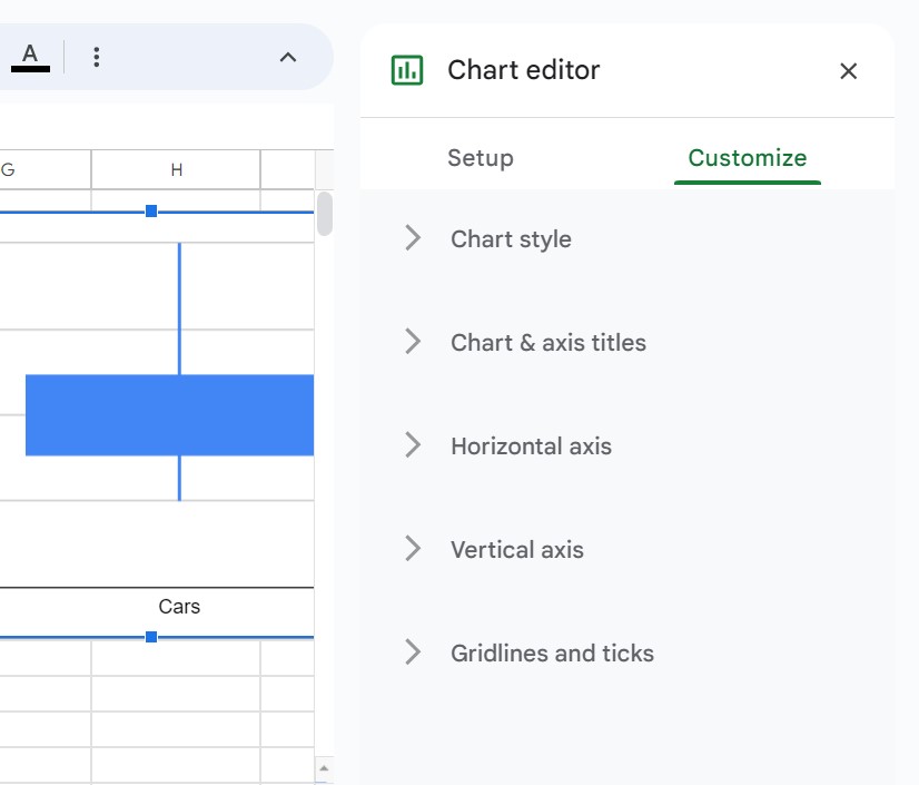
We can select the options as desired and improvise the Candlestick chart.
A Box and Whisker Plot in Google Sheets shows the data distributed into quartiles, highlighting the Median and Outliers. Additionally, the boxes have lines extended from their borders, known as whiskers. They represent the data variableness outside the quartiles.
Use this Box Plot In Google Sheets Template to follow along with the examples in this article.
Download Excel Template