What is Bubble Chart in Tableau?
A Bubble chart is a chart type in Tableau that allows you to visualize high-level comparisons between the members of a data field. Such charts are effective tools for understanding how the members within a data field compare. They are typically displayed in the form of bubbles that vary in size as per the values of the categories or members within a field. The number of bubbles in a bubble chart is dependent on the number of categories in a data field. Bubble charts can be displayed with different color-coding to provide insights and can have different stylized approaches where the bubbles can be superimposed over other bubbles.
A typical bubble chart looks like the one provided below. The below chart displays how each of the values stack up in comparison to the other values.
📥Download the ready-to-use Excel template to practice this tutorial yourself.
Tableau Bubble Chart Template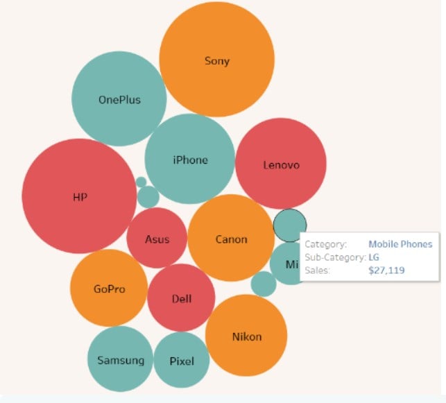
Table of contents
Key Takeaways
- A Bubble chart allows you to visualize high-level comparisons between the members of a data field.
- These charts are valuable tools for understanding how the members within a data field compare. They are typically displayed in the form of bubbles that vary in size as per the values of the categories or members within a field.
- Tableau interface provides a built-in packed bubble chart type under the Show Me toolbar that you can use to create a packed bubble chart in Tableau.
- You can customize the appearance of the bubbles in Tableau such as Color-coding, Size of the bubbles, Tooltips, or Labels in the chart.
- Follow the best practices for creating effective bubble charts in Tableau.
- Consider the limitations of the Bubble chart before you recommend it for use in Tableau.
How to create a Bubble Chart in Tableau?
To create a Bubble chart in Tableau, you may follow the instructions provided below:
Step 1: Connect your dataset to the Tableau interface using File Navigator.
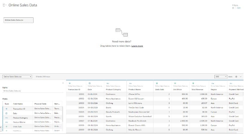
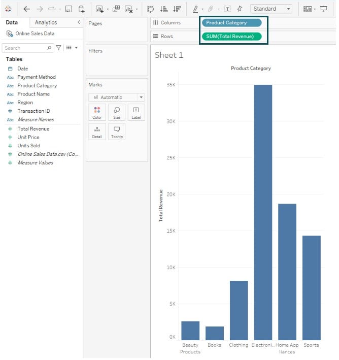
Step 2: In the new worksheet, drag the Product Category dimension to the Columns shelf. Similarly, drag the Total Revenue measure to the Rows shelf.
Tableau will automatically create a bar chart, as shown below.
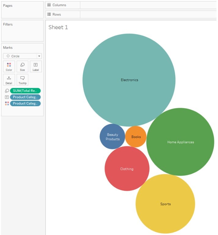
Step 3: Click on Show Me on the toolbar in the right-side upper corner and then select the packed bubbles chart type from the available chart options to create a packed bubble chart in Tableau.
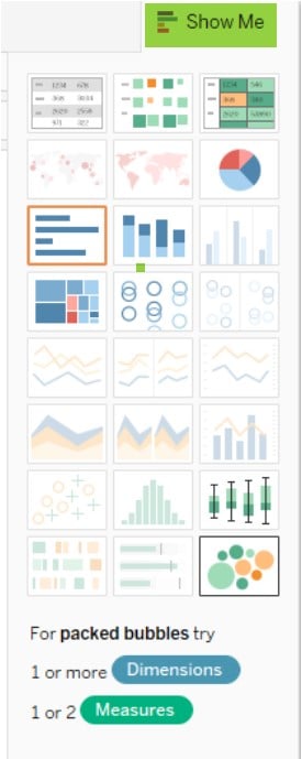
Note: You need at least one dimension and measure to create a packed bubble chart. You get a packed bubble chart in Tableau, as shown below.
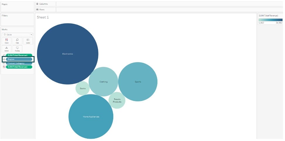
Step 4: Drag the Region field to Detail on the Marks card to include more bubbles in the view.
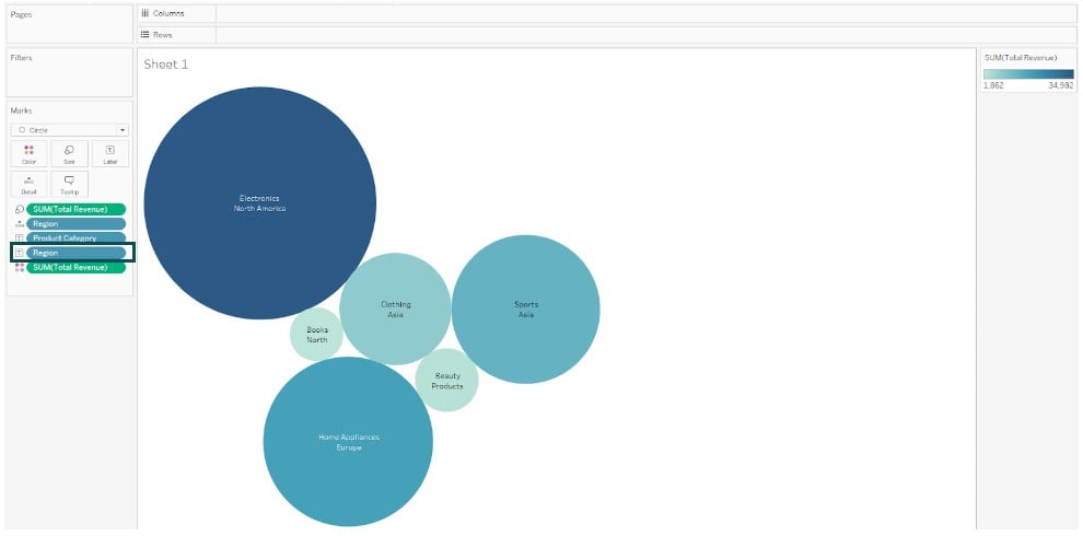
Step 5: Drag the Region field to Label on the Marks card. Now, your bubble chart is ready for visualization in Tableau.
As you can see, the highest revenue is generated for the Electronics category in the North America region, while the lowest revenue is generated for Books in North America.
Note: Bubble chart in Tableau map is not natively supported in Tableau. However, you can apply some workarounds to create bubble chart in Tableau map.
In the next section, we will look at a few examples to understand more about the bubble chart in Tableau.
Examples
In this section, we will demonstrate different scenarios where you can use the bubble chart in Tableau.
Example #1 – Bubble Chart with Multiple Measures
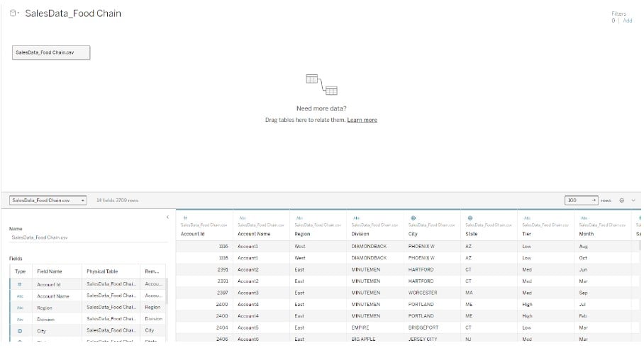
In this example, we will demonstrate creating a bubble chart with multiple measures in Tableau public using the SalesData_Food Chain dataset. The SalesData_Food Chain dataset contains sales details such as Account ID, Account Name, business division, region, geographical information, Tier and sales details, etc.
To create a bubble chart with multiple measures in Tableau Public, follow the steps outlined below:
Step 1: Connect the SalesData_Food Chain to the Tableau interface using the File – Open. The imported dataset can be viewed in the Data Source tab, as shown below.
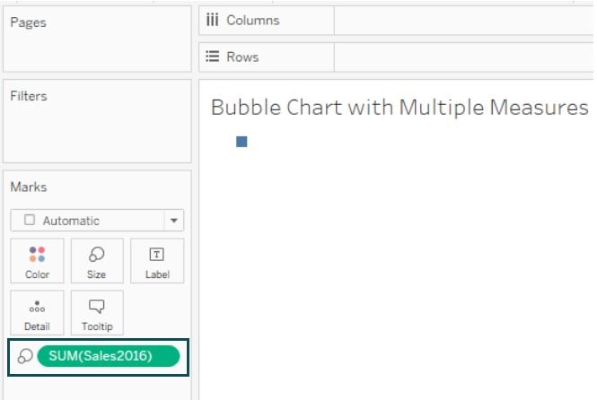
Step 2: Click on a new worksheet tab in Tableau public. In the new worksheet, drag and drop the Sales 2016 to the Size on the Marks card.
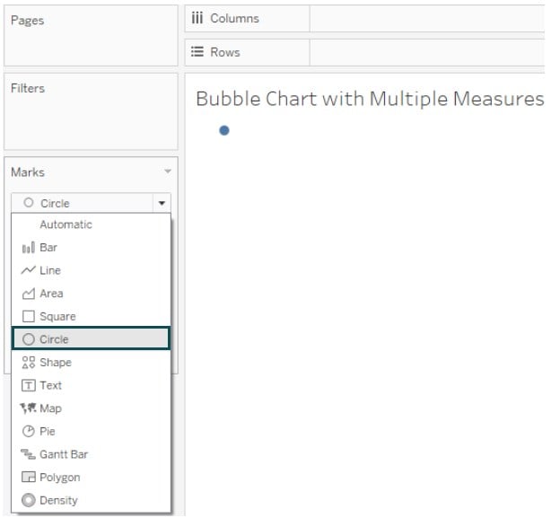
Step 3: Change the Marks Type from Automatic to Circle on the Marks card. It will change the visual to a circle.
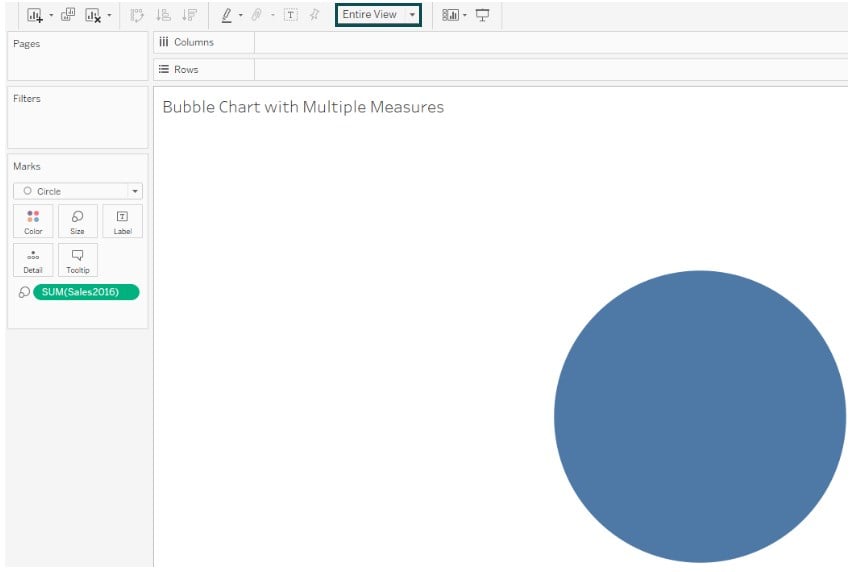
Step 4: Change the visual from the Standard View to the Entire View. Tableau will adjust the circle to the entire view, as shown below.
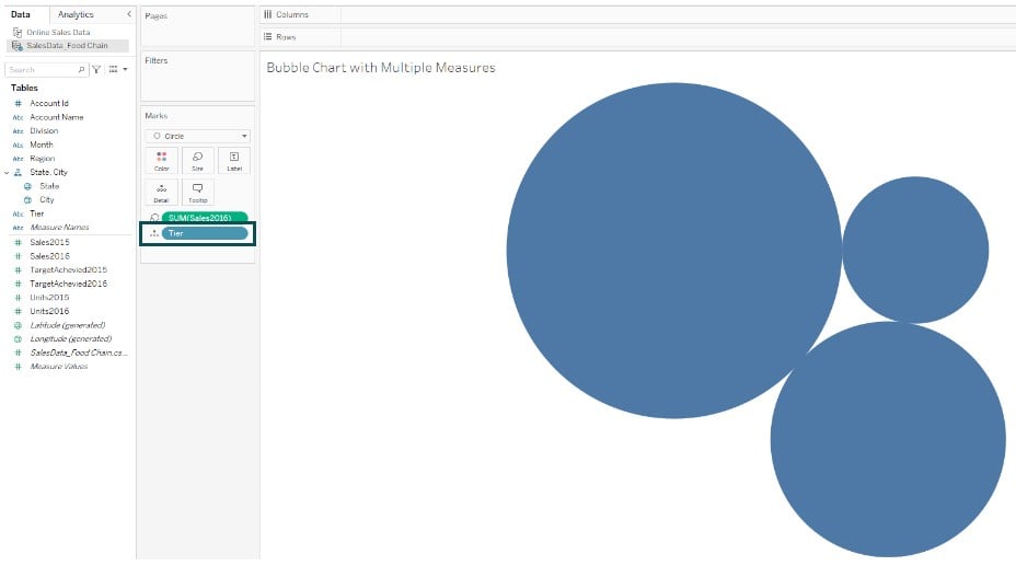
Step 5: Drag the Tier dimension to Detail on the Marks card.
Step 6: Drag and drop another measure Units2016 to the Color on the Marks card.
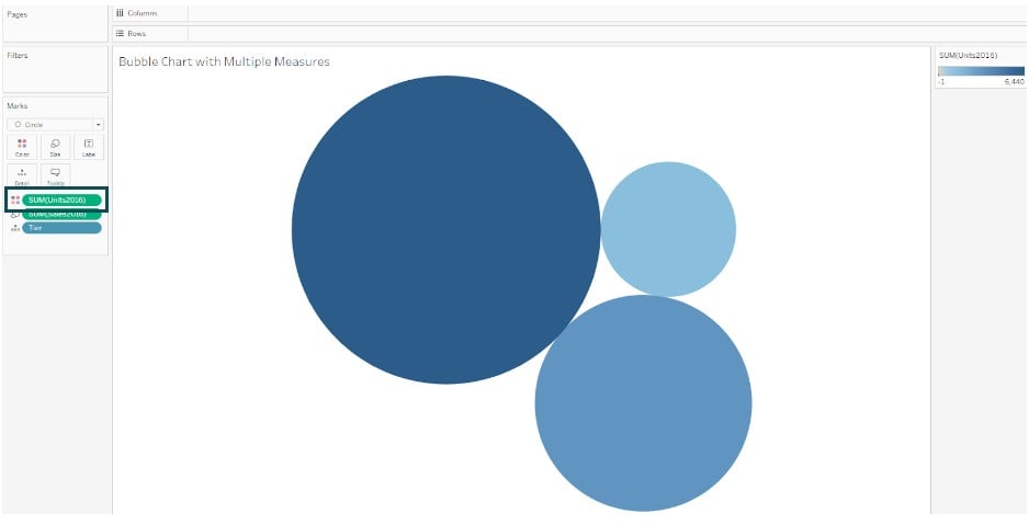
Step 7: Drag and drop the Region dimension to the Label on the Marks card.
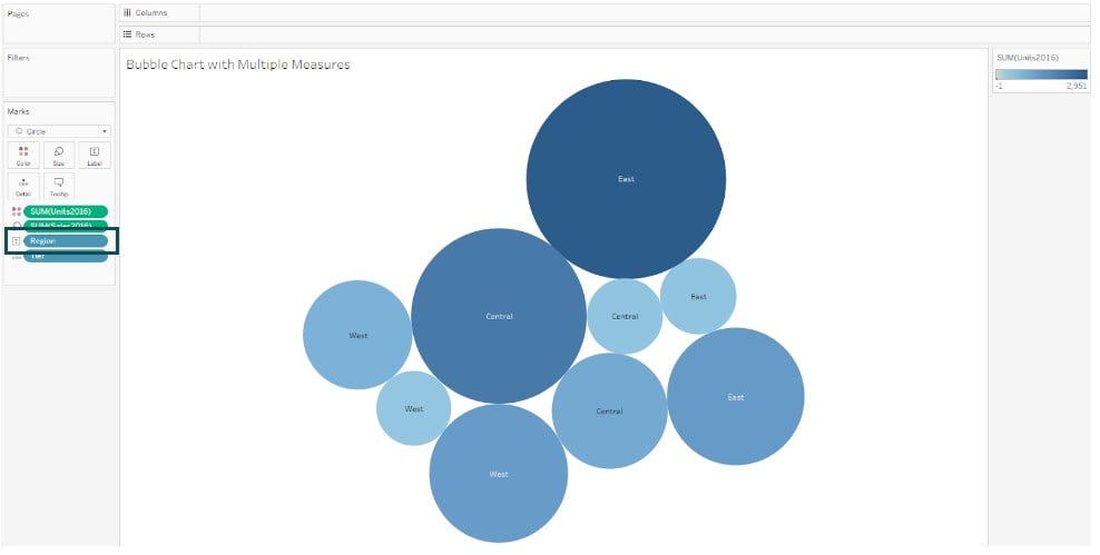
Tableau will automatically change the view as shown below.
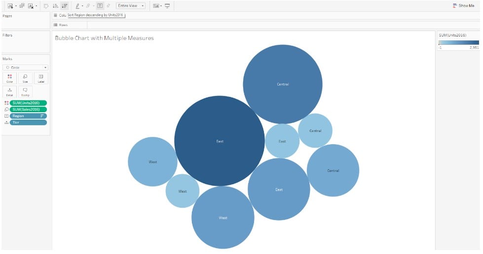
Step 8: Drag and drop another measure TargetAchieved2016 to Detail on the Marks card. Now, your bubble chart with multiple measures is ready to be visualized in Tableau public.

Example #2
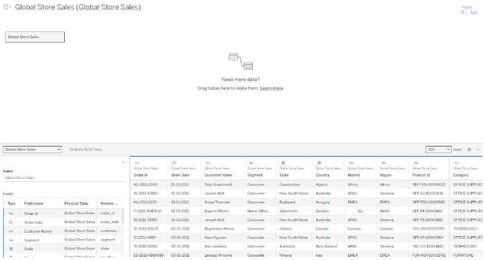
In this example, we will demonstrate creating a stacked bubble chart on Tableau for public use using the Global Store Sales dataset that contains the order details, including product segment, category, sub-category, market, and sales details such as revenue, expenses, and quantity.
Step 1: Connect to the Global Store Sales dataset from the Tableau interface using File Navigator.
Step 2: In a new worksheet, drag and drop the Revenue measure to the Size on the Marks card. Select Marks Type from Automatic to Circle. Rename the header in the worksheet.
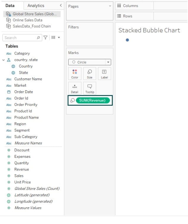
Step 3: Change the view from Standard View to Entire View. Tableau will automatically change the view as shown below.

Step 4: Drag and drop the Category to the Color on the Marks card. You will see the bubble chart color-coded with legends shown to the right of the view.

Step 5: Drag and drop the Country dimension to the Details on the Marks card. You will see a stacked bubble chart in the view.

Step 6: Click on the Sort category descending icon to sort the bubble chart by Revenue in descending order.

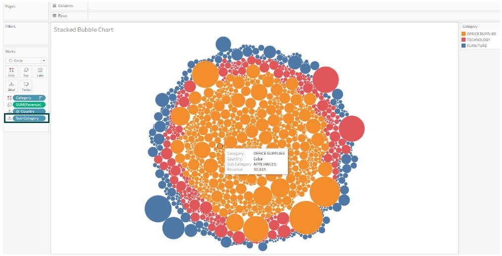
Step 7: Drag the Sub Category dimension to the Detail on the Marks card. Tableau will further change the view as shown below. Now, your stacked bubble chart is ready for visualization. As you can see, the bubbles are stacked one over the other in the view.
Example #3
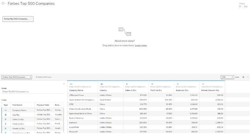
In this example, we demonstrated the creation of a bubble chart using the Forbes Top 500 Companies dataset. The Forbes Top 500 Companies dataset contains the financial details of the top 500 companies ranked by Forbes, such as Market value, sales, profit, and other details.
To create a bubble chart, follow the instructions outlined below:
Step 1: Connect the Forbes Top 500 Companies dataset to the Tableau public. The imported dataset can be viewed under the Data Source tab.
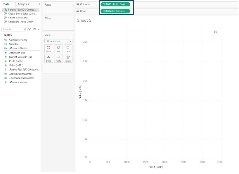
Step 2: Drag and drop Profit (in Bn) to the Columns shelf and Sales (in Bn) to the Rows shelf.
Step 3: Drag the Market Value (in Bn) to the Size on the Marks card.
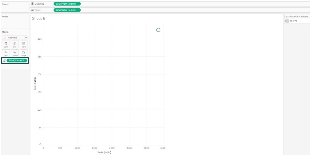
Step 4: Drag the Company Name field from the Data pane to Detail.
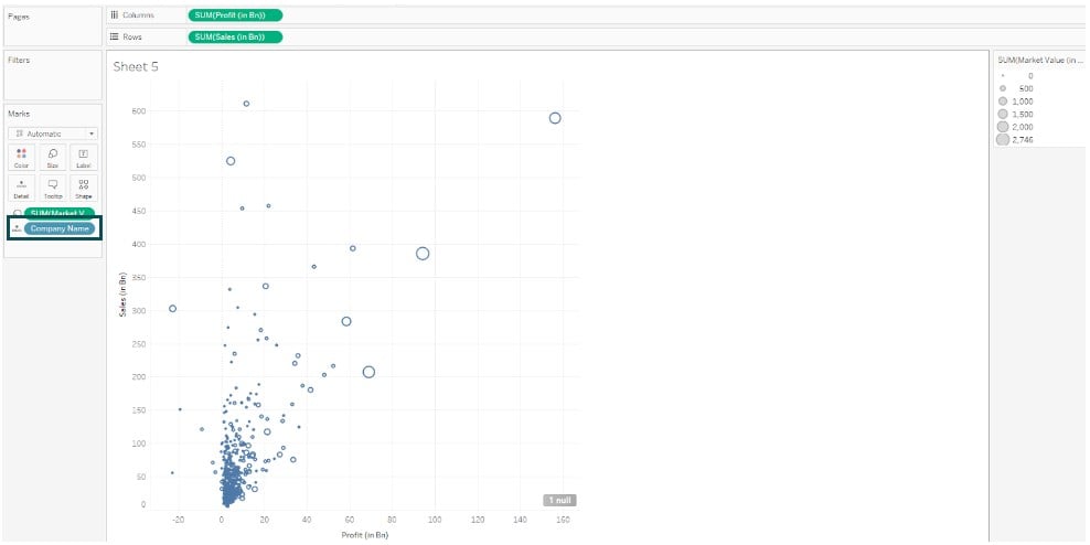
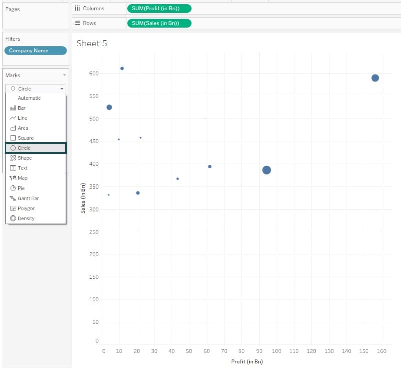
Step 5: Drag the Company Name to the Filters card. Navigate to the Top tab and specify the filter criteria. Click on OK to save the changes.

Step 6: Change the Marks Type to Circle. You will see the data points represented in circles in the view.
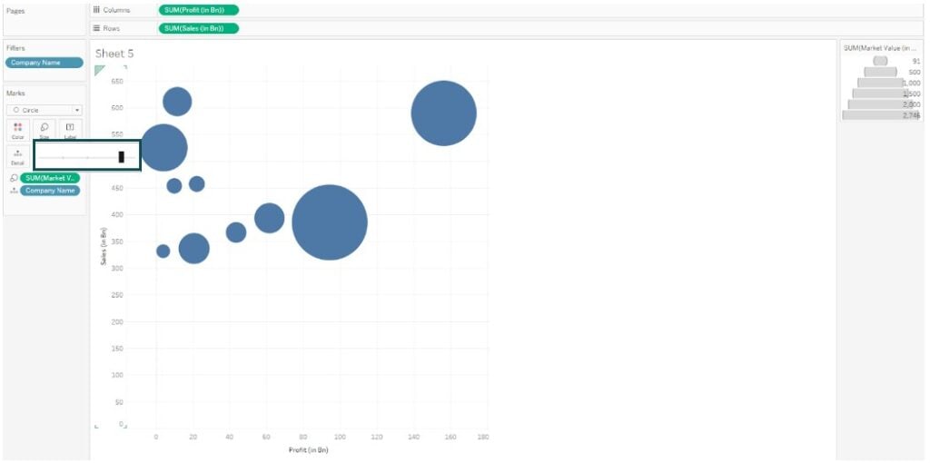
Step 7: Adjust the Size of the bubbles on the Marks card.
Step 8: Drag the Company Name to the Color on the Marks card.
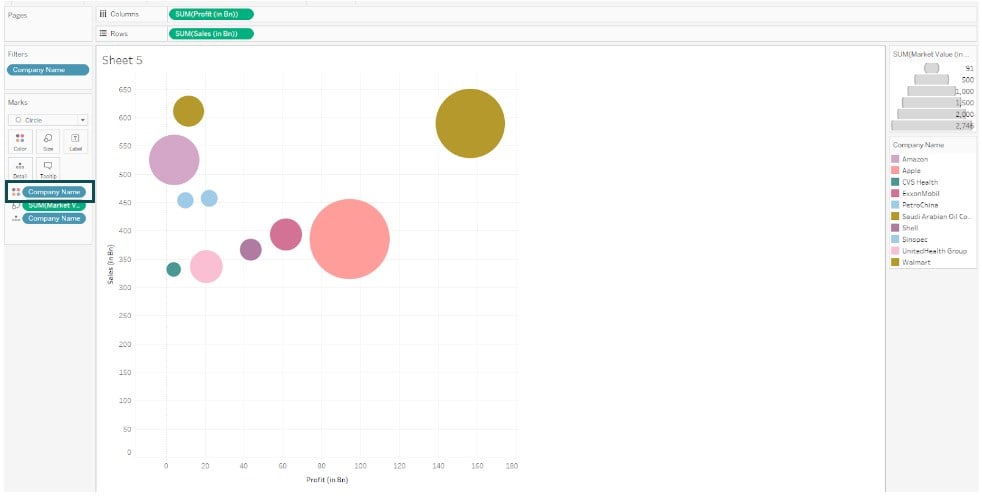
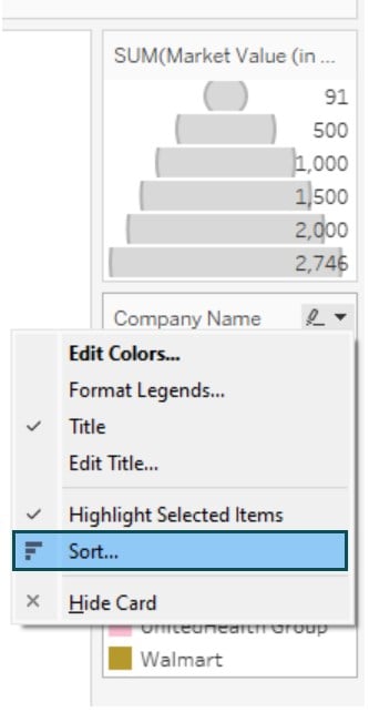
Step 9: Click on the Company Name legend card available on the right-side corner of the view and choose Sort.
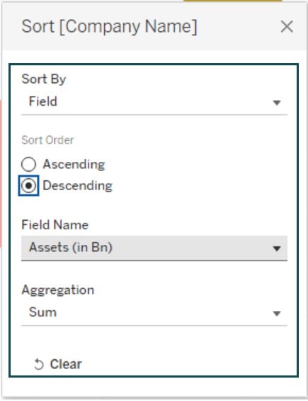
Step 10: In the Sort dialog box, specify the sorting logic based on the Assets as shown below.
Step 11: Click on the Company Name legend card available on the right-side corner of the view and choose Edit Colors.
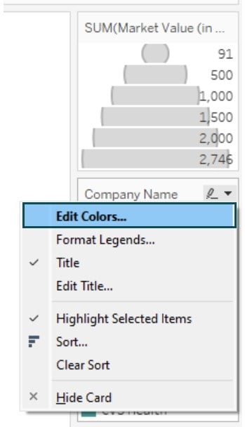
Step 12: Specify the color choices in the Color Palette for each of the company name. Tableau will update the color coding as per the choices.
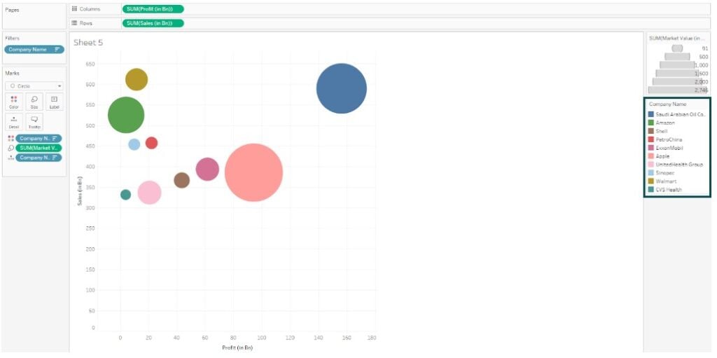
Step 13: Right-click on the vertical axis and choose the Edit Axis option.
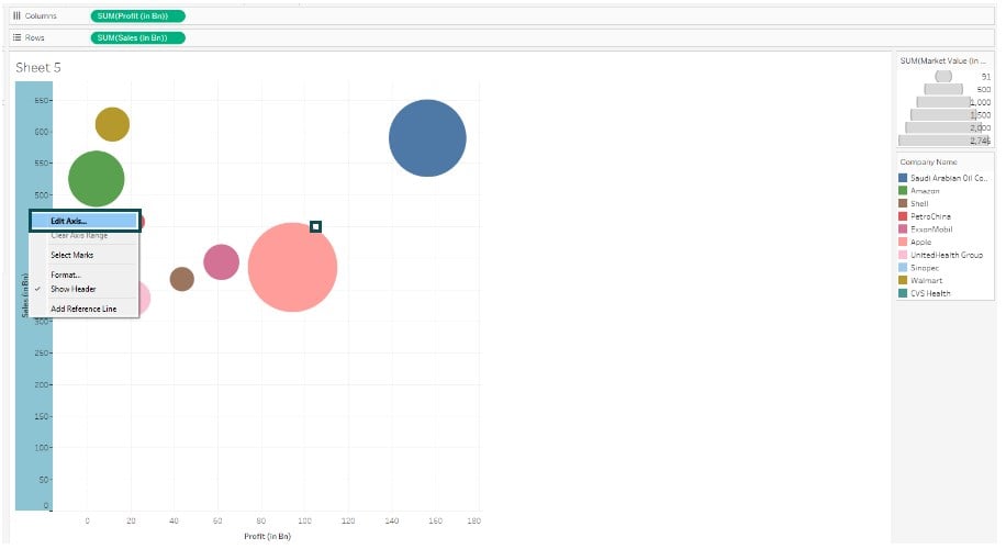
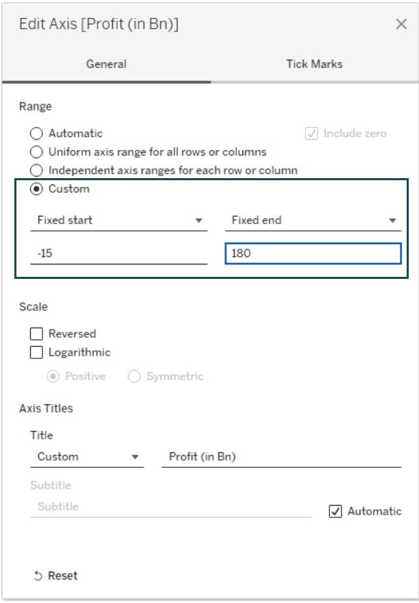
Step 14: In the Edit Axis screen, choose Custom Range and provide the values for Fixed start and Fixed end.
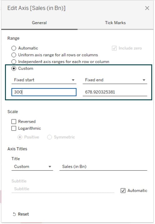
Step 15: Similarly, right-click on the horizontal axis and select Edit Axis to customize the scale.
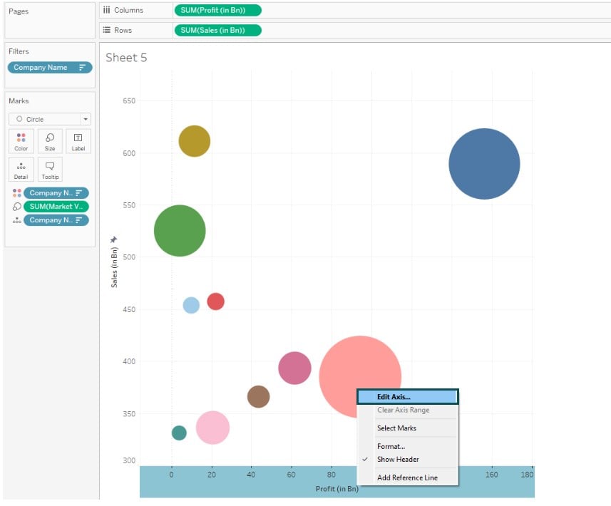
Step 16: Select the Range as Custom and specify the Fixed start and Fixed end values as per below.
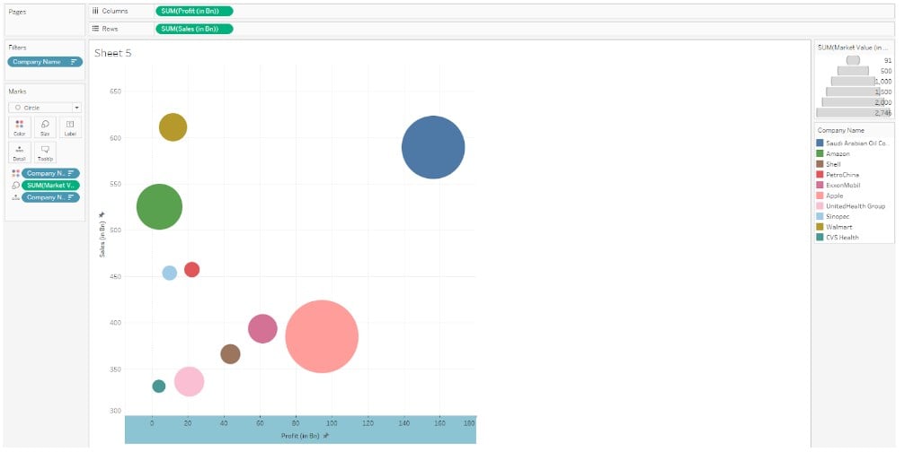
Post changes to the axis scale, and your Tableau view will look like the one highlighted below.
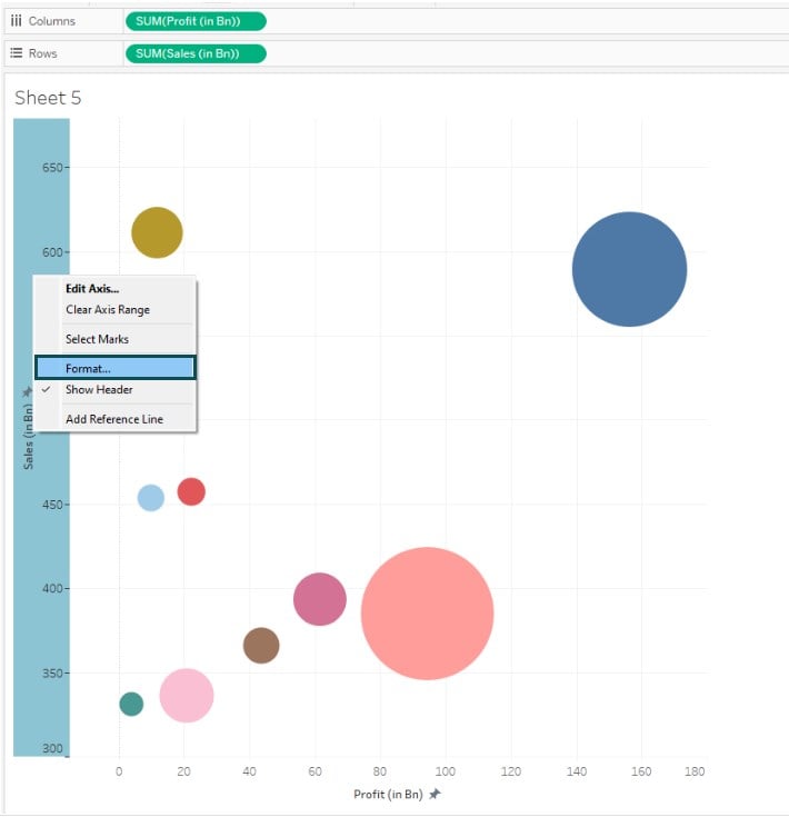
Step 17: Right-click on the vertical axis and choose Format from the context menu.
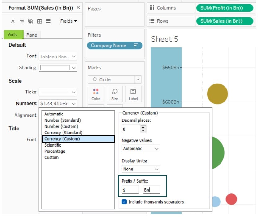
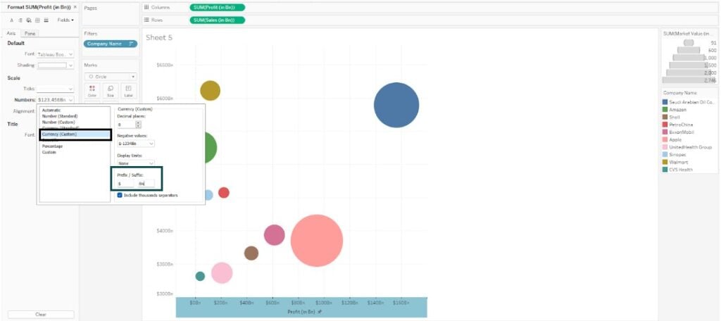
Step 18: Under the Axis tab, click on the Numbers dropdown and select Currency (Custom). In the Currency (Custom) screen, specify the choices such as Decimal places and Prefix/Suffix for axis customization.
Here, we have specified the Prefix as $ and Suffix as Bn.
Step 19: This will format your vertical axis as per the one shown below.
Now, right-click on the horizontal axis and select Format option to customize the x-axis.
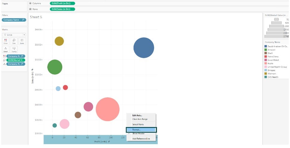
Step 20: Repeat the similar choices as specified in Step 18.
Now, you can see both of your bubble chart axes customized in the format you specified.
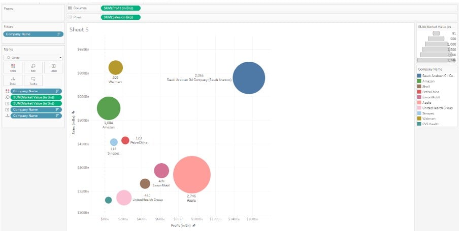
Step 21: Click on Label on the Marks card and customize the appearance of the Label as shown below.
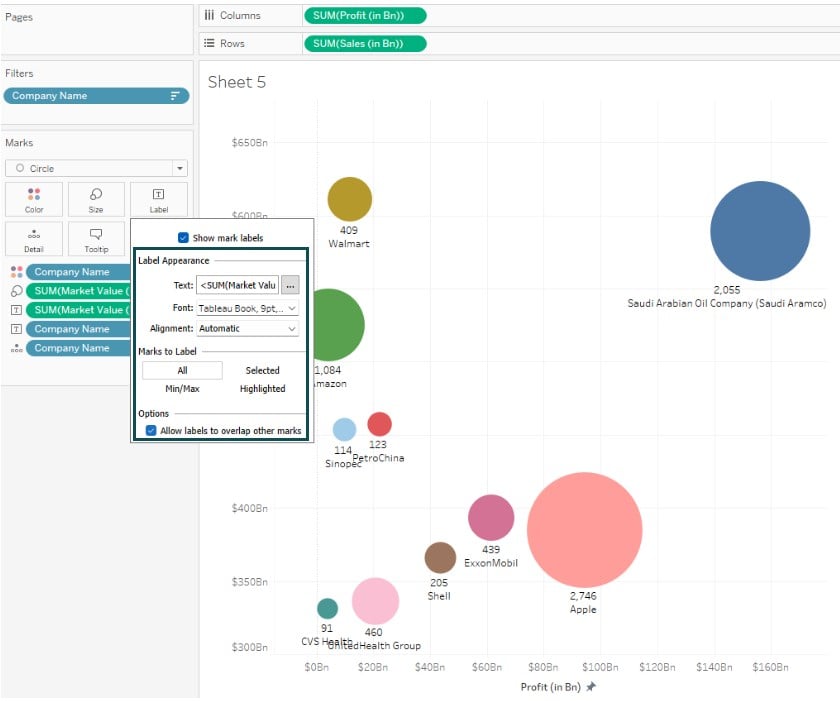
Step 22: Right-click on the Tableau view and choose the Format option.
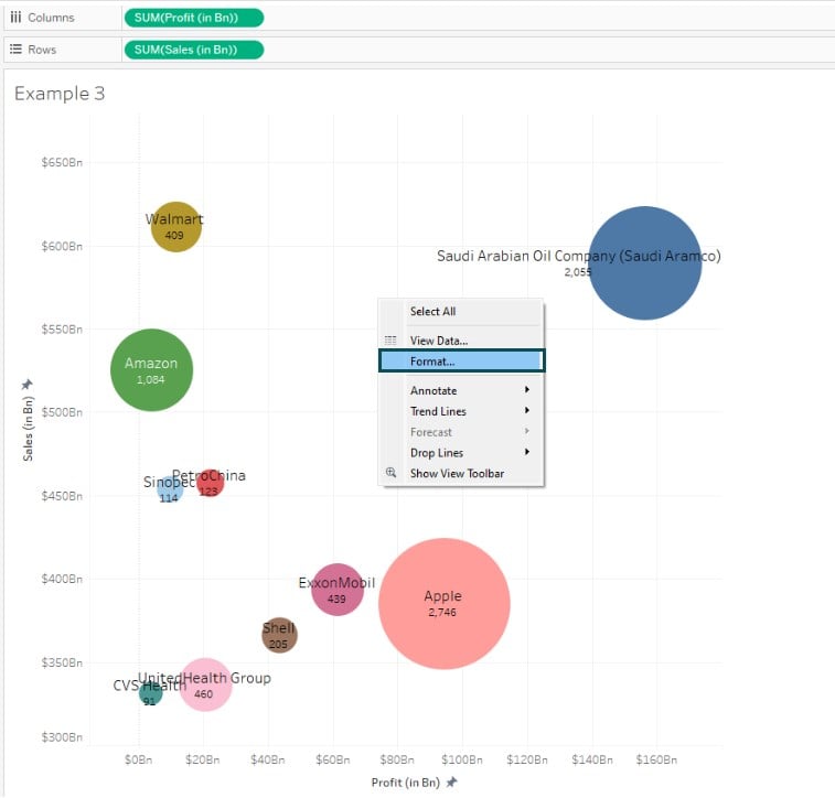
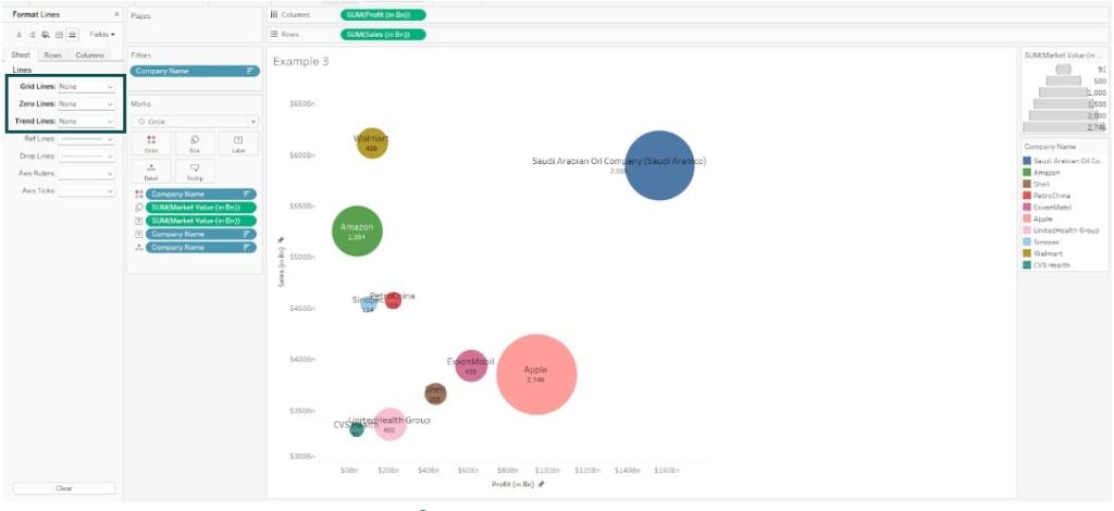
Step 23: In the Format Lines pane, click on the Line icon and then set Grid Lines and Zero Lines as None.
Now your bubble chart is ready for visualization in Tableau.
Important Things to Note
- A bubble chart may not be an efficient tool if you intend to display specific values or comparisons, given the difficulties associated with circles, especially for same-sized circles.
- Ensure that you use color-coding for your bubble chart that is easy to differentiate, clearly labeled, and user-friendly for interpretation.
- Ensure that you don’t clutter your bubble chart with too many bubbles, as it would make data analysis challenging to read.
- Bubble charts may only be recommended if the bubbles are bigger to view.
Frequently Asked Questions (FAQs)
Yes, you can customize the appearance of the bubbles in Tableau. Some of the customizations you can do include:
• Changing the size of the bubbles in the Marks card.
• Apply customized color coding to the bubbles by choosing the color option.
• Add Labels by dragging the fields on the Marks card.
• You can also apply tooltips to the chart.
Some of the best practices for creating effective bubble charts in Tableau include:
• Always use a clear and limited set of colors that can be easily differentiated.
• Label the bubbles and sort the bubbles by size to make easy interpretation
• Avoid too many bubbles or cluttering of the chart.
• Consider alternative charts if the bubble sizes are too small or equal in size.
No, you can’t add trend lines or reference lines to your bubble chart in Tableau. You will notice that the trend lines or reference lines options are disabled under the Analytics tab for a bubble chart.
To handle large datasets with a bubble chart in Tableau, follow some of the tips below:
• Apply data filters to reduce the number of categories for the bubble chart
• Perform data aggregation to reduce the bubbles
• Use alternative charts if the data size is too large for bubble charts
Download Template
📥Download the ready-to-use Excel template to practice this tutorial yourself.
Tableau Bubble Chart TemplateRecommended Articles
This has been a guide to Bubble Chart in Tableau. Here we learn how to create bubble chart with examples, points to note and downloadable template. You can learn more from the following articles –

Leave a Reply