
What Is Pareto Chart In Google Sheets?
Pareto chart in Google sheets is a chart type used to represent the data and see the scope of growth. It uses bar chart showing individual categories or frequencies and a line to show cumulative data. It is a powerful visualization tool used to show the growth or problematic areas in a given data. Pareto chart is not an inbuilt chart like line chart but we can use combo chart to create pareto chart in Google sheets.
For example, consider the below table showing region and data in columns A and B, respectively.

Now, let us create a pareto chart for the given data.
Use this Pareto Chart In Google Sheets Template to follow along with the examples in this article.
Download Excel TemplateTo begin with, we need to find the cumulative data by using the formula =SUM($B$2:B2)/SUM($B$2:$B$5). Using AutoFill, we need to find the cumulative data for other cells and then, click on Insert and Chart to create a combo chart.
Then, by doing a few changes, we will be able to create the pareto chart in Google sheets, as shown in the below image.

In this article, let us learn how to create pareto chart in Google sheets with detailed examples.
How To Create A Pareto Chart In Google Sheets?
We can create a pareto chart in Google sheets using the below steps.
The steps are:
Step 1: To begin with, we need to insert the cell range in the spreadsheet.
Step 2: Next, we need to find the cumulative data as pareto chart shows the categories in bar chart format and the cumulative data in the line format.
To find it, we can use QUERY function or SUM function.
Step 3: To use the SUM function, insert the SUM formula with the cell reference divided by the SUM formula with the cell range and select Enter key.
Step 4: Now, we need to convert the data into percentage by clicking on the % option in the menu bar. We will be able to see the cumulative data in percentage.
Step 5: Next, select the entire cell range and click on Insert. Then, select the Chart option under the Insert tab.
The Chart Editor tab appears at the right end of the screen.
Step 6: Now, select Combo chart in the chart type and click on Customize tab under the Chart Editor window.
Step 7: Here, choose Cumulative under the Series option and then, choose 100% as Line opacity. Then, select the Right axis under Axis option.
We will be able to see the pareto chart in Google sheets.
Likewise, we will be able to create pareto chart in Google sheets.
Examples
Let us learn how to create Google sheets pareto charts with detailed examples.
Example #1 – Dynamic Pareto Chart In Google Sheets
For example, consider the below table showing subject and marks in columns A and B, respectively.

Now, let us learn how to create pareto chart in Google sheets.
The steps are:
Step 1: To begin with, we need to insert the cell range in the spreadsheet. In this example, the data is available in the cell range A1:B6.
Step 2: Next, we need to find the cumulative data. For this, we need to create a new column as Cumulative data.

Step 3: To use the SUM function, insert the SUM formula with the cell reference divided by the SUM formula with the cell range.
So, the complete formula is =SUM($B$2:B2)/SUM($B$2:$B$6)

Select Enter key. We will be able to see the result, as shown in the below image.

Using AutoFill option, we need to find the result in cells A3:A6.

Step 4: Now, we need to convert the data into percentage by clicking on the % option in the menu bar.

We will be able to see the cumulative data in percentage.

Step 5: Next, select the entire cell range and click on Insert. Then, select the Chart option under the Insert tab.

The Chart Editor tab appears at the right end of the screen.

Step 6: Now, select Combo chart in the chart type and click on Customize tab under the Chart Editor window.

Step 7: Here, choose Cumulative under the Series option.

And then, choose 100% as Line opacity. Then, select the Right axis under Axis option.

We will be able to see the pareto chart in Google sheets, as shown in the below image.

Likewise, we will be able to create pareto chart in Google sheets.
Example #2 – Product Categories Contributing The Most To Overall Revenue
For example, consider the below table showing product and sales showing revenue in columns A and B, respectively.

Now, let us learn how to create pareto chart in Google sheets.
The steps are:
Step 1: To begin with, we need to insert the cell range in the spreadsheet. In this example, the data is available in the cell range A1:B6.
Step 2: Next, we need to find the cumulative data. For this, we need to create a new column as Cumulative data.

Step 3: To use the SUM function, insert the SUM formula with the cell reference divided by the SUM formula with the cell range.
So, the complete formula is =SUM($B$2:B2)/SUM($B$2:$B$6)

Select Enter key. We will be able to see the result, as shown in the below image.

Using AutoFill option, we need to find the result in cells A3:A6.

Step 4: Now, we need to convert the data into percentage by clicking on the % option in the menu bar.

We will be able to see the cumulative data in percentage.

Step 5: Next, select the entire cell range and click on Insert. Then, select the Chart option under the Insert tab.

The Chart Editor tab appears at the right end of the screen.

Step 6: Now, select Combo chart in the chart type and click on Customize tab under the Chart Editor window.

Step 7: Here, choose Cumulative under the Series option.

And then, choose 100% as Line opacity. Then, select the Right axis under Axis option.

We will be able to see the pareto chart in Google sheets, as shown in the below image.

Likewise, we will be able to create pareto chart in Google sheets.
Example #3 – Investment Sectors Driving Portfolio Growth
For example, consider the below table showing investment sectors and profit in columns A and B, respectively.

Now, let us learn how to create pareto chart.
The steps are:
Step 1: To begin with, we need to insert the cell range in the spreadsheet. In this example, the data is available in the cell range A1:B5.
Step 2: Next, we need to find the cumulative data. For this, we need to create a new column as Cumulative data.

Step 3: To use the SUM function, insert the SUM formula with the cell reference divided by the SUM formula with the cell range.
So, the complete formula is =SUM($B$2:B2)/SUM($B$2:$B$5)

Select Enter key. We will be able to see the result, as shown in the below image.

Using AutoFill option, we need to find the result in cells A3:A6.

Step 4: Now, we need to convert the data into percentage by clicking on the % option in the menu bar.

We will be able to see the cumulative data in percentage.

Step 5: Next, select the entire cell range and click on Insert. Then, select the Chart option under the Insert tab.

The Chart Editor tab appears at the right end of the screen.

Step 6: Now, select Combo chart in the chart type and click on Customize tab under the Chart Editor window.

Step 7: Here, choose Cumulative under the Series option.

And then, choose 100% as Line opacity. Then, select the Right axis under Axis option.

We will be able to see the pareto chart, as shown in the below image.

Likewise, we will be able to create pareto chart.
Example #4 – Expense Categories Consuming The Most Of The Budget
For example, consider the below table showing expenses and amount in columns A and B, respectively.

Now, let us learn how to create pareto chart in Google sheets.
The steps are:
Step 1: To begin with, we need to insert the cell range in the spreadsheet. In this example, the data is available in the cell range A1:B5.
Step 2: Next, we need to find the cumulative data. For this, we need to create a new column as Cumulative data.

Step 3: To use the SUM function, insert the SUM formula with the cell reference divided by the SUM formula with the cell range.
So, the complete formula is =SUM($B$2:B2)/SUM($B$2:$B$5)

Select Enter key. We will be able to see the result, as shown in the below image.

Using AutoFill option, we need to find the result in cells A3:A6.

Step 4: Now, we need to convert the data into percentage by clicking on the % option in the menu bar.

We will be able to see the cumulative data in percentage.

Step 5: Next, select the entire cell range and click on Insert. Then, select the Chart option under the Insert tab.

The Chart Editor tab appears at the right end of the screen.

Step 6: Now, select Combo chart in the chart type and click on Customize tab under the Chart Editor window.

Step 7: Here, choose Cumulative under the Series option.

And then, choose 100% as Line opacity. Then, select the Right axis under Axis option.

We will be able to see the pareto chart in Google sheets, as shown in the below image.

Likewise, we will be able to create pareto chart in Google sheets.
Important Things To Note
- Pareto chart in Google sheets helps users show the scope of cumulative values in a data.
- It is usually created with a combo chart.
- We can use SUM or the QUERY function to create the cumulative data.
Frequently Asked Questions (FAQs)
For example, consider the below table showing location and data in columns A and B, respectively.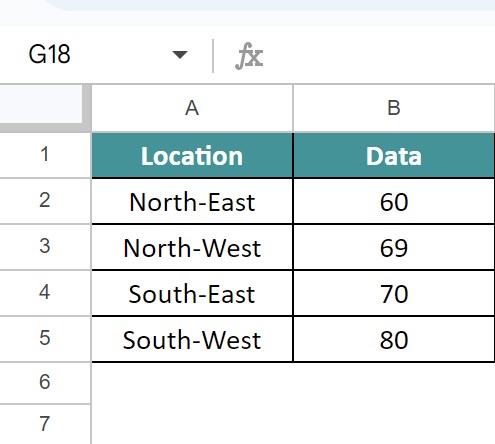
Now, let us create a pareto chart for the given data.
To begin with, we need to find the cumulative data by using the formula =SUM($B$2:B2)/SUM($B$2:$B$5). Using AutoFill, we need to find the cumulative data for other cells and then, click on Insert and Chart to create a combo chart.
Then, by doing a few changes, we will be able to create the pareto chart in Google sheets, as shown in the below image.
Likewise, we will be able to create pareto chart in Google sheets to analyze the data.
The actual SUM function in Google sheets is =SUM(value1,[vale2],…) where value1 and value2 shows the cell references or cell range for which we want to find the sum or total.
But for the purpose of creating a pareto chart in Google sheets, we need to use the SUM function such that the cell reference in absolute reference is in the numerator and sum function with the entire cell range of data is in the denominator.
We can customize the pareto chart by using the Customize tab under Chart Editor window. Users can change the color, density, thickness and line opacity.
Use this Pareto Chart In Google Sheets Template to follow along with the examples in this article.
Download Excel Template