What is Power BI Scatter Chart?
A Power BI Scatter Chart is a data visualization tool that displays data points in a 2-dimensional plot, i.e., x-axis (horizontal) and y-axis (vertical). This chart represents the correlation between the numerical values that are plotted in the horizontal and vertical axes. Hence, it is a preferred visualization tool to perform data analysis on identifying relationships between the two numerical variables. Each data point in the scatter chart represents the intersection of both horizontal and vertical numerical values combined into a single value.
Power BI Scatter charts are an excellent choice in the below scenarios:
- Displaying the relationship between two variables having numerical values.
- Plotting data points in a 2-dimensional plane in horizontal and vertical axes.
- Projecting data patterns using a large volume of datasets.
- Use cases where you need to convert horizontal (x-axis) into a log scale.
- Data point comparison across large datasets regardless of any time variables.
- Comparing paired data points or grouped sets of values.
- Use as a replacement for line charts with the flexibility of converting the x-axis.
Table of contents
Key Takeaways
- Power BI Scatter charts are an excellent choice of data visualization tools for identifying relationships between two numerical variables.
- It is plotted in a two-dimensional plane with horizontal (X-axis) and vertical (Y-axis) axes.
- You can create a scatter plot using large datasets and use different formatting options to display trend lines, categorical data, and different quadrants.
- You can use intuitive and user-centric features such as filters, slicers, cross-highlights, etc. to create an engaging experience for your end users.
- It is always recommended that you consider the limitations of Scatter charts before using this visual chart for your reporting and analysis.
📊 Unlock Advanced DAX Skills in Power BI!
Take your Power BI skills to the next level with our Advanced DAX in Power BI Training Course. Dive deep into advanced DAX functions, complex calculations, and optimization techniques to enhance your data analysis and reporting capabilities.
How to Create Power BI Scatter Chart?
To create a Power BI Scatter chart, follow the instructions outlined below.
Step 1: Open the Power BI Desktop in your system and load the datasets into Power BI using the Get data option
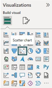
Step 2: Navigate to the Visualizations pane and choose the Scatter chart visual icon.
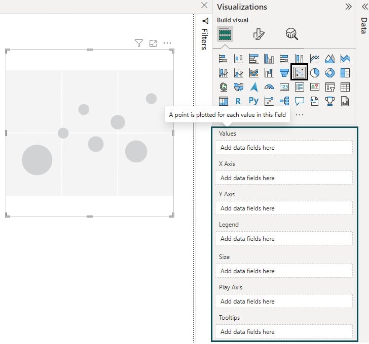
Step 3: Drag and drop the data fields from the Fields pane to the different sections applicable to the Power BI scatter chart. These include Values, X Axis, Y Axis, Legend, Size, Play Axis, and Tooltips.
- Values – A point is plotted for each value in this field
- X Axis – Values to place on the horizontal axis
- Y Axis – Values to place on the vertical axis
- Legend – The categorical field to show the Power BI scatter chart color based on value
- Size – The measure to use for relative bubble size
- Play Axis – To display changes over time
- Tooltips – Use additional information to be displayed when you hover your mouse over the visual
Step 4: Configure customization and formatting options for your scatter chart. These include look and feel, titles, formatting axes, colors of the bubble, markers, etc.
Step 5: Save the changes and then publish the report to Power BI Service for collaboration and sharing it with other users.
In the next section, we will see how you can create a Power BI Scatter chart through different examples.
Examples
Let us look at some examples of how to implement the Scatter chart.
Example #1 – Animating the Scatter Plot
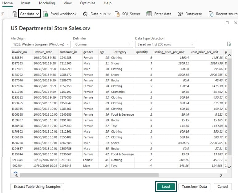
In this example, we will demo an animated scatter plot in Power BI using US Departmental Store Sales data. US Departmental Store Sales contain data on orders placed by customers on a grocery delivery application.
To plot an animated Power BI Scatter chart, follow the instructions below:
Step 1: Import the US Departmental Store Sales in Power BI Desktop using the Get data option and load it into Power BI.
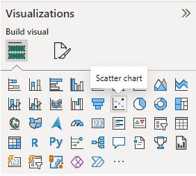
Step 2: Navigate to the Visualizations pane and select the Scatter chart visual icon.
Step 3: Drag and drop the fields from the Fields pane to the different sections applicable to the scatter chart. In this case, we have mapped Values with gender, the X-axis to selling price per unit, the Y-axis to cost price per unit, Legend with category, and Size to the quantity fields as per the screenshot shown below.
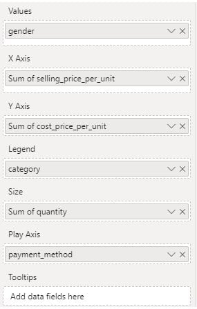
It will create a scatter plot in the report canvas.
Step 4: Select the scatter chart, and navigate to the Format your visual tab in the Visualizations pane. Customize the chart by choosing the options under the Visual tab.

Similarly, you can also apply the look and feel and other formatting options by navigating to the General tab.

Step 5: Save the changes. It will create a Power BI Scatter Chart with customized formatting options.
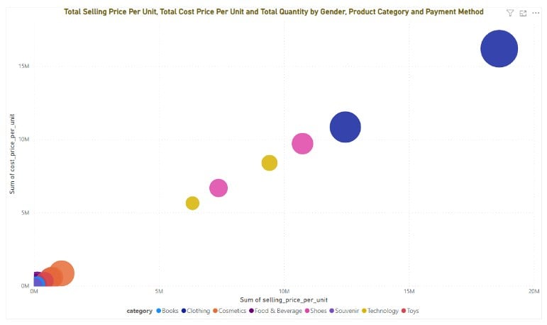
Step 6: Now, map the payment method field to the Play Axis to animate the Scatter plot you have created in the above steps. Power BI scatter chart play axis will add a play slider of different payment method variations.
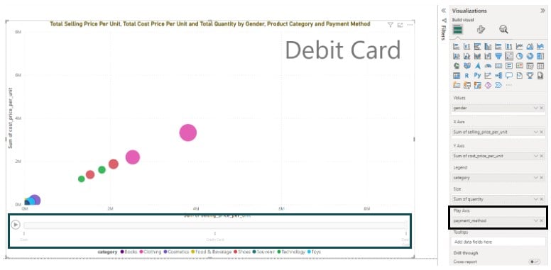
Step 7: Click on the play button to run the animation for different payment methods.

Example #2 – Creating Quadrants and Trend Lines
In this example, we will plot the Power BI Scatter chart with quadrants and trend lines using the Big Mart Sales dataset. Big Mart Sales contains 2013 sales data for 1559 products across 10 stores in different cities.
To plot this chart, follow the instructions highlighted below:
Step 1: Import the Big Mart Sales dataset into Power BI using the Get data option. Click on Load to load data into Power BI.

Step 2: Choose the Scatter chart icon from the Visualizations pane. Drag and drop the data fields into the Visualizations pane.
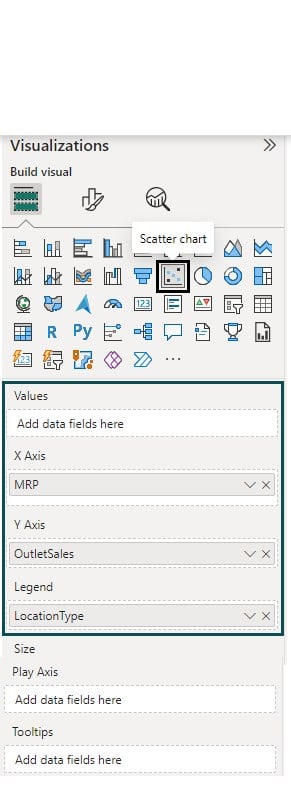
Step 3: Navigate to the Add further analyses to your visual tab under the Visualizations pane. Toggle the Trend line slider on and expand it. Choose the color, transparency, and Line style.

It will add a Power BI scatter chart trend line to the visual.
Step 4: Expand the X-Axis Constant Line (1), and click + Add line. Expand the Line and configure the Quadrant details. Toggle the Power BI scatter chart Data labels slider on.

Step 5: Repeat the process in Step 4 to define the Y-Axis Constant Line (1). Toggle on the Power BI scatter chart Data labels slider.

Step 6: Navigate to Format your visual tab to configure chart visual options to make it visually appealing. Once you save the changes, you will see the scatter chart in the report canvas.

Example #3 – Adding Filters and Slicers to a Scatter Chart in Power BI
In this example, we will demo the plotting of the Power BI Scatter chart with slicers and filters using the vgsales dataset. The vgsales dataset contains the list of video games with sales greater than 100,000 copies.
To create this scatter chart, follow the steps outlined below.
Step 1: Import the vgsales dataset into Power BI Desktop and load it into the Power BI.
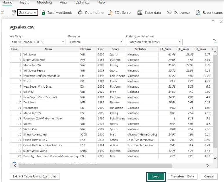
Step 2: To plot the scatter chat, follow the steps outlined in previous examples.
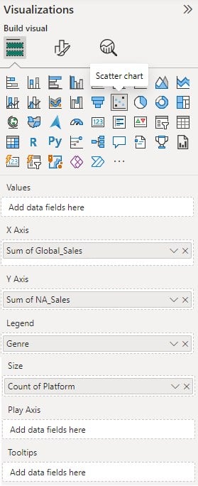
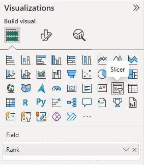
Step 3: To add a slicer to the chart, navigate to the Visualizations pane, choose the Slicer, and map the data field to the Field section.
Step 4: To add a filter, expand the Filters pane, choose the Filter type, and specify the filter conditions.

Once the changes are applied, the scatter chart will look as below.

Important Things to Note
- Power BI Scatter Chart requires only numerical values to be plotted against the x-axis and y-axis.
- The maximum number of data points allowed to be plotted in a scatter plot is limited to 10000. Beyond this limit, the performance of the scatter plot may not be optimal.
- The chart visual performance with multiple data points is sub-optimal, i.e., the load time decreases as you increase the data points and hence requires load testing of your visually rich report to ensure the performance is up to the mark.
- For chart visuals with a single data point, you can use the Values option.
- Power BI scatter chart play axis feature can display variation over the time horizon.
- You can also plot high-density scatter charts by establishing a live connection to Power BI service-based models, using DirectQuery, or even with imported datasets.
- Use intuitive and user-centric features such as drill down in Power BI, cross filter, highlight, slicers in Power BI, etc., to make the charts more interactive and engaging.

Frequently Asked Questions (FAQs)
Yes, you can use categorical data in a Power BI Scatter chart. To use it, you can use the Legend option. Then, you can drag and drop the categorical data field to the Legend section and display it in a unique color in your Power BI Scatter chart.
Yes, you can customize the appearance of a Power BI Scatter chart. Some of the customize options are highlighted below:
• Chart Plot Options: Use different plot options such as Tooltips, Legend, Size, etc. to provide additional and concise information on the Scatter chart.
• Chart Visual Options: You can apply different visual options that include Chart
◦ Axes Formatting
◦ Markers Options
◦ Legends
◦ Gridlines
◦ Category labels
◦ Plot area background
• Chart General Options: Additionally you can change the generic formatting options such as look and feel, font, colors, titles, etc.
• Analytical Options: You can add analytical options to your chart by including Min line, Max line, Average line etc.
The key significance of the size and color options in a Power BI Scatter chart is outlined below:
• Size: Represents the numerical value in your visual. As the size increases, it shows the larger values of your data point.
• Color: Represents a categorical field in your dataset. You can configure Power BI scatter chart color based on value and using different colors, you distinguish different categories or highlight specific data points in your Power BI Scatter chart visual.
Power BI Scatter charts have certain limitations which are highlighted below:
• The scatter chart requires only numerical values to be plotted against the x-axis and y-axis.
• The maximum number of data points allowed to be plotted in a scatter plot is limited to 10000.
• The chart visual performance with multiple data points is sub-optimal i.e. the load time decreases as you increase the data points.
• While it provides different user interactivity features, they are limited in comparison to the other available visuals in Power BI.
Recommended Articles
This has been a guide to Power BI Scatter Chart. Here we explain how to create scatter chart in power bi, with features, examples and points to remember. You can learn more from the following articles –

Leave a Reply