What is a Power BI radar chart?
A Power BI radar chart is a data visualization tool that displays multivariate data in the form of a two-dimensional chart. You can create this chart with three or more numerical variables that can be represented on different axes. Each of these axes has the same starting point. Radar charts are also referred to as Spider charts due to their resemblance to a spider shape.
Radar charts in excel are quite helpful in comparing the different variables across multiple categories, displaying the overall comparative patterns or trends in the dataset. It also allows you to plot multiple measures over a categorical axis. A radar chart has a series of radii that have equal distances between each other and represent a different variable.
- Each variable is provided an axis that originates from the center. All the axes are arranged outwardly and maintain a scale between them.
- Some gridlines connect from axis to axis and are often used as a guide. Each variable value is plotted along its axis, and all the variables in a dataset are connected to form a polygon.
A sample radar chart is provided below:
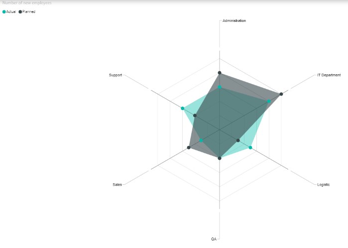
Table of contents
Key Takeaways
- Power BI Radar Charts are effective data visualization tools for displaying multivariate variables.
- They allow you to plot multiple measures over a categorical axis and enable visualiing overall patterns and trends in data.
- Power BI doesn’t natively support radar charts and you need to download the custom visual from AppSource.
- It is recommended that you periodically review and optimize chart visualization for effective data analysis and comparison.
- You can customize the radar chart in Power BI by adjusting the data colors, data labels, and other formatting options.
📊 Unlock Advanced DAX Skills in Power BI!
Take your Power BI skills to the next level with our Advanced DAX in Power BI Training Course. Dive deep into advanced DAX functions, complex calculations, and optimization techniques to enhance your data analysis and reporting capabilities.
Features
Some of the key features of the Power BI radar chart include:
- Ability to plot multiple measures/variables: With a radar chart, you can display multivariate data in a 2-dimensional chart of 3 or more variables at a time.
- Attributes comparison: It can compare the attributes across different categorical variables.
- Pros and Cons: It highlights the variables scoring high or low performance.
- Patterns and trends: This enables you to visualize overall patterns and trends in data.
- Interactive: It can be used in Power BI dashboards for interactive data exploration.
- Data Exploration: Provides a clear representation of the relationships between variables.
How to Create A Power BI Radar Chart?
Power BI doesn’t provide a native radar chart visual in the Visualizations pane. However, you can download a custom radar chart from Appsource as per your requirements.
To create a radar chart in Power BI, follow the steps outlined below:
Step 1: Open Power BI Desktop on your system. Load the dataset into the Power BI using the Get data option.
Step 2: Navigate to the Visualizations pane and click on the ellipsis (…).

Select Get more visuals from the menu context.

Step 3: Search for radar in the search bar in the Appsource screen and choose the Radar Chart visual.

Step 4: Click on the Add button to import the Radar chart to Power BI Desktop. You can also click on the Download sample for the Radar chart.
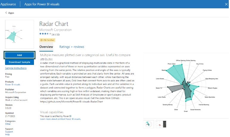
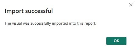
It will import the visual in Power BI to your Power BI Desktop.
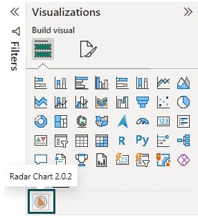
Step 5: Navigate to the Visualizations pane and select the Power BI radar chart visual icon.
Step 6: Drag and drop the fields from the Data pane to the Category and Y Axis section in the Visualizations pane.
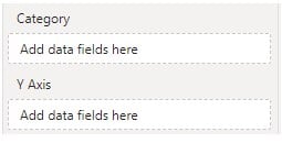
It will create a radar chart in the report canvas.
How to customize the Power BI radar chart?
The below steps provide basic guidance on the different formatting options. The actual customization choice may change based on the visual you choose for your reporting requirements.
You can customize the radar chart by following the instructions outlined below:
Step 1: Open the Power BI radar chart on the Power BI Desktop.
Step 2: Select the Radar chart and navigate to the Format your visual tab in the Visualizations pane.
Step 3: Turn on the Legend slider to add the title to the chart. Customize the legend by specifying the position, color, and text formatting.
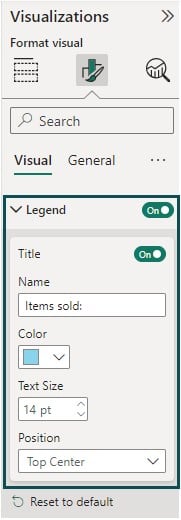
Step 4: Expand the Data colors to specify the choice of colors for your visual.
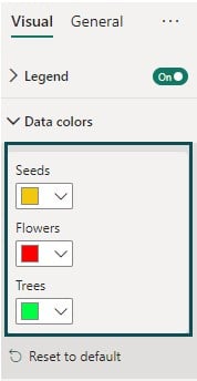
Step 5: Turn on the Draw Lines slider to customize the line.
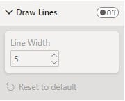
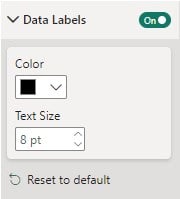
Step 6: Turn on the Power BI radar chart data labels slider to customize the color and text formatting.
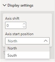
Step 7: Format the axis, such as shifting the axis and starting position as per your requirements.
Note: Some of the customization options for the radar chart may vary depending on what custom. Some of the custom visuals have the feature of specifying radar charts in Power BI fixed scale for radar chart axes. However, it varies for different custom visuals.
Examples
In this section, we will demo different Power BI radar charts using different datasets. The pre-requisite is to install the radar chart through AppSource.
Example #1
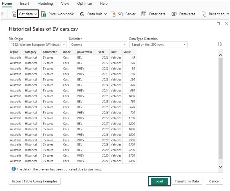
In this example, we will demo a radar chart in Power BI Desktop using the Historical Sales of EV cars dataset. Historical Sales of EV cars dataset contains the Historical sales of EV cars across the world.
To create a Power BI radar chart, follow the instructions below:
Step 1: Import the Historical Sales of EV cars dataset in Power BI Desktop using the Get data option and load it into Power BI.
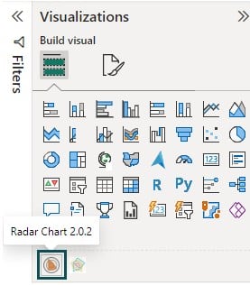
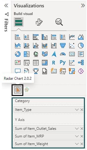
Step 2: Navigate to the Visualizations pane and select the Radar chart 2.0.2 visual icon.
Drag and drop the data fields from the Data pane to the Category and Y-Axis sections.
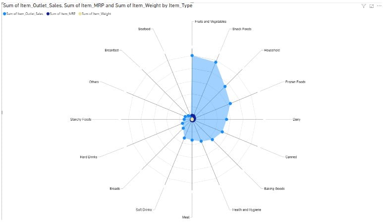
Here we have mapped Item_type as a categorical variable and mapped outlet sales, MRP, and Weight to the Y Axis. Note the Radar chart we are using here is offered by Microsoft Corporation.
Step 3: Navigate to the Format your visual tab to customize the radar chart.

Step 4: Specify the customization and formatting options in terms of data labels, color combinations, and Legend. Save the changes. It will create a radar chart in the report canvas, as shown below.
Example #2
In this example, we will create a radar chart in Power BI Desktop using the Student_marksheet dataset. The Student_marksheet dataset contains the marks secured by the students in different subjects such as Maths, History, etc.
To create a Power BI radar chart, follow the instructions below:
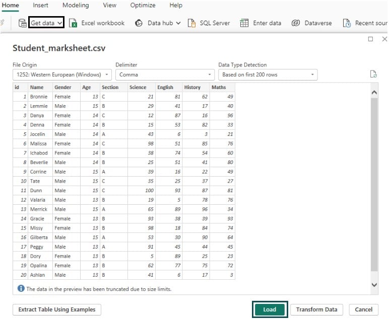
Step 1: Import the Student_marksheet dataset in Power BI Desktop using the Get data option. Click on the Load button for data load into Power BI.
Step 2: Navigate to the Visualizations pane and select the Radar chart 2.0.2 visual icon.
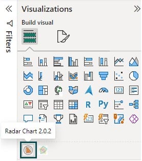
Drag and drop the data fields from the Data pane to the Category and Y Axis sections.
Here, we have mapped Section as a categorical variable and mapped Maths, Science, History, and English total scores to the Y-Axis.
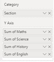
Step 3: Navigate to the Format your visual tab in Visualizations to customize the Power BI radar chart.

Step 4: Apply chart customization and formatting as per your reporting requirements. This will create a Power BI radar chart in the report canvas as shown below.

Example #3
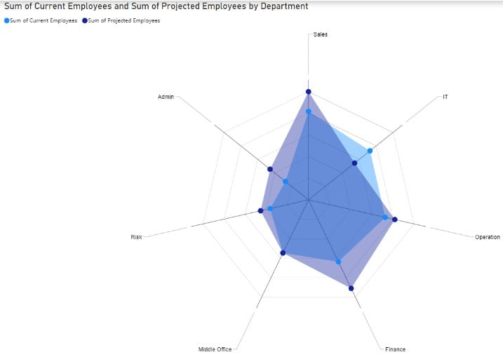
In this example, we will demo a radar chart in Power BI Desktop using the Employee Projection Dataset dataset. The Employee Projection Dataset dataset contains the actual vs projected employees across various departments in a financial institution.
To create a Power BI radar chart, follow the instructions below:
Step 1: Import the Employee Projection Dataset dataset in Power BI Desktop using the Get data option.
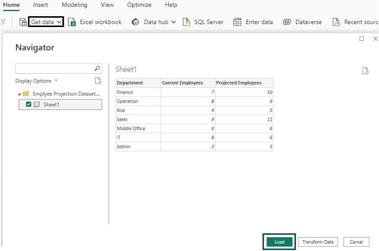
Step 2: Navigate to the Visualizations pane and select the Radar Chart 2.0.2 visual icon.
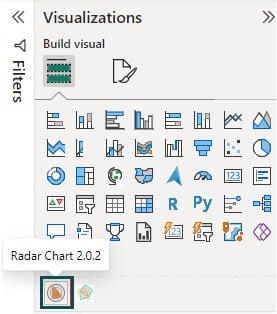
Drag and drop the data fields from the Data pane to the Category and Y Axis sections.
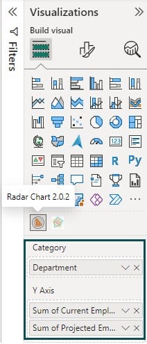
Step 3: Navigate to the Format your visual tab to customize the Power BI radar chart, such as Data colors, Data Labels, Legend, etc.

Step 4: You can also define other customization tips, such as Title, Effects, etc., by navigating to the General tab.

After the customization, you can view the Power BI radar chart in the report canvas for your visualization.
Important Things to Note
- While a radar chart is ideal for multivariate data, introducing too many variables will reduce the overall readability of the chart and be highly scattered.
- Ensure that the radar chart is appropriately color-coded and formatted to provide better comparative outcomes.
- If you are using variables with different scales, data normalization can help you with meaningful data visualization.
- For missing or null values, additional steps must be taken for data quality handling and quality checks.
- Ensure that you have chosen the right radar chart for data visualization requirements, as some of the visualization features may be limited to specific third-party visual charts.
- Always label the axes with a clear color code and text formats along with legends to make a distinction.

Frequently Asked Questions (FAQs)
Yes, you can use categorical data in a Radar chart in Power BI. However, note that Power BI does not natively support the radar chart and you have to download the radar chart visual from the Appsource. Once you have installed the radar chart custom visual in Power BI Desktop, drag and drop the categorical data to the Category section in the Visualizations pane.
Some of the best practices for using Radar Charts in Power BI involve:
• Optimize your radar chart with a limited number of variables to make it easy to interpret and a good user experience. Any number of variables beyond 7 is not recommended.
• Use proper color coding, clear axis labeling, and consistent formatting across the chart to optimize the chart’s readability and visualization.
• Remediate data quality issues and handle the null or blank values appropriately before exposing the data for chart visualization.
• Apply tooltips and customization wherever possible to make the information fluid.
In general, the Power BI radar chart will ignore any missing or null values. However, you can further customize this missing values handling by using DAX functions such as ISBLANK() or ISNULL() to replace missing values with a specific value (e.g., 0 or blank).
Yes, you can add tooltips to a Radar Chart in Power BI. However, it depends on what third-party radar chart visual you are using. If you are using the Radar chart by MAQ software which you can download from Appsource then it provides you with the option to add tooltips to the chart. Once you have downloaded this visual chart in your Power BI, follow the instructions below to add the tooltips:
• Click on the Radar Chart visual on your report.
• In the Visualizations pane, navigate to the General tab and turn the Tooltips slider on
• Configure the tooltips information you want to display on your radar chart.
For other radar chart visuals such as the one provided by Microsoft, you may not have the option to add tooltips to your visual.
Recommended Articles
This has been a guide to Power BI radar chart. Here we explain how to create it in Power BI, with examples, features, customization, and points to remember. You may learn more from the following articles –

Leave a Reply