
What is the Waterfall Chart in Power BI?
A Waterfall chart is a visualization tool in Power BI used to display the cumulative effect of sequentially introduced positive and negative values. It is often used to show the breakdown of a particular measure or financial data over time or across categories. Waterfall charts help understand how individual factors contribute to a final result or total, making them valuable for business analysis and financial reporting.
Key Takeaways
- A Waterfall chart in Power BI visually represents sequential positive and negative values.
- Ensure your data is structured correctly, and your chart effectively communicates the desired insights.
- Power BI Waterfall chart starting value sets the initial point from which positive and negative changes or contributions are shown.
- You will always have a Power BI Waterfall chart with start and end bars representing positive or negative changes.
How to Create a Waterfall Chart in Power BI?
To create a Waterfall chart in Power BI, follow the steps highlighted below:
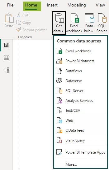
Step 1: Open your Power BI Desktop application. Load or import your data source into Power BI.
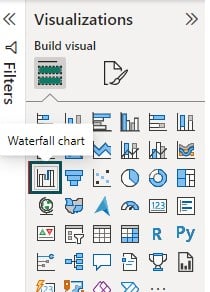
Step 2: Navigate to the Visualizations pane and select the Waterfall chart visual icon on the Visualizations pane.
Step 3: Navigate to the Fields pane, select the data fields you want to use for your Waterfall chart and drag and drop these fields into the relevant sections of the Waterfall chart. These sections include Category, Breakdown, Y-axis, Tooltips, etc.
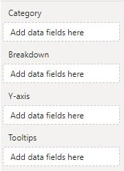
- Category – Each field is a stage in the waterfall.
- Breakdown or Power BI waterfall chart breakdown – Explore changes between categories based on these fields.
- Y-axis – The numeric amounts to plot
- Tooltips – Additional data fields that people can see in the tooltips when they hover over the part of this visualization.
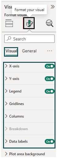
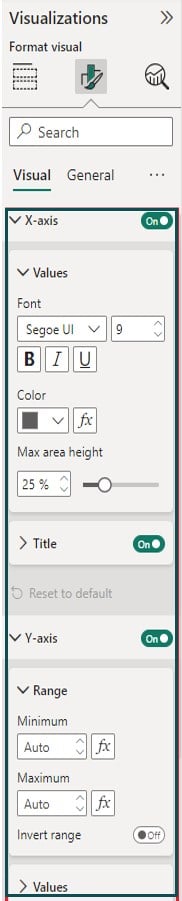
Step 4: Navigate to the Format your visual tab to apply formatting to the Waterfall chart visual. You can apply formatting to various areas such as the X-axis, Y-axis, Legend, Gridlines, Data labels, etc.

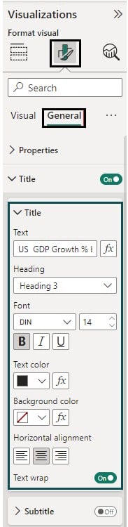
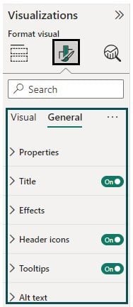
Step 5: Navigate to the General tab under Format your visual tab in the Visualizations pane to apply other formatting options such as Title, Headers, etc.

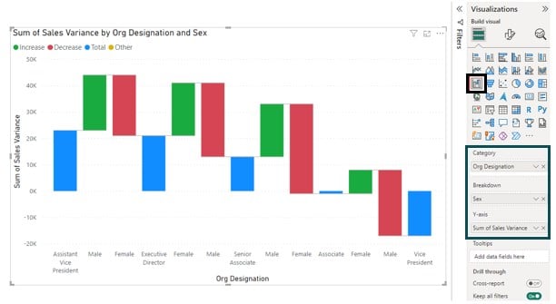
You can use the Power BI Waterfall chart breakdown to explore changes between the categories. Here, we have added the Sex attribute to the Power BI Waterfall chart Breakdown to view the changes in Sales variance by Organization Designation and Sex.
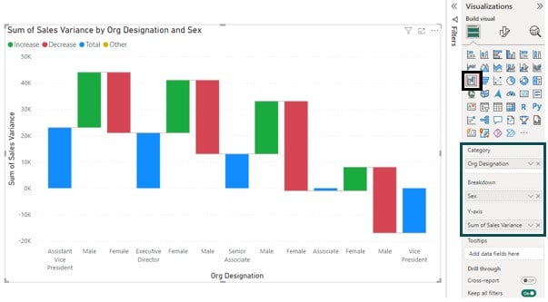
We always have a Power BI Waterfall chart with Start and End values, which is evident in terms of bars and they have a baseline of 0. The Power BI Waterfall chart starting value sets the initial point from which positive and negative changes or contributions are shown. For example, the Power BI Waterfall chart starting value for the below scenario is Sales Variance for AVP designation.
Note: You can use the Power BI Waterfall chart with multiple measures to display the effect on the chart.
The next section will use examples to demonstrate how to create a Waterfall chart in Power BI.
Examples
This section will demonstrate how to create a Waterfall Chart in Power BI step-by-step with two examples.
Example #1
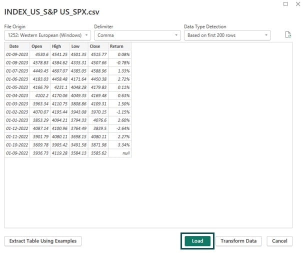
In this example, we will create a Waterfall chart in Power BI showing the return on the S&P 500 Index over 1-year horizon using the INDEX_US_S&P US_SPX dataset. S&P 500 Index is a stock market index tracking the stock performance of 500 of the largest companies listed on stock exchanges in the United States.
To create a Waterfall chart in Power BI, follow the steps highlighted below:
Step 1:
- Open the Power BI Desktop.
- Import the INDEX_US_S&P US_SPX dataset using the Get Data option.
- Click on the Load button.
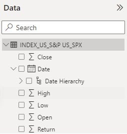
Once the data is loaded, you can view it by navigating to the Fields pane.
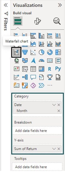
Step 2: Navigate to the Visualizations pane and click on the Waterfall chart visual icon.
Step 3: Navigate to the Fields pane, select the data fields you want to use for your Waterfall chart and drag and drop these fields into the relevant sections of the Waterfall chart.
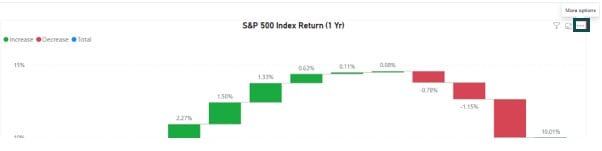
Here, we have added the Month field to Category and Sum of Return in the Y-axis.
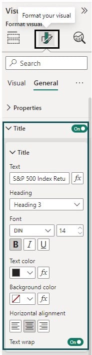
Step 4: Navigate to the Format your visual tab in the Visualizations pane to format the appearance, font, and other properties for the report.
We have formatted the Waterfall chart’s Title, alignment, and Font size.
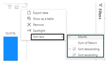
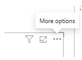
Step 5: Select the Waterfall chart, and click on the More options (…) option on the right top corner of the Waterfall chart visual on the report canvas.
Step 6: Choose the Sort axis option in the More options menu and then the field you want to apply sorting. You can choose the Sort descending or Sort ascending option.
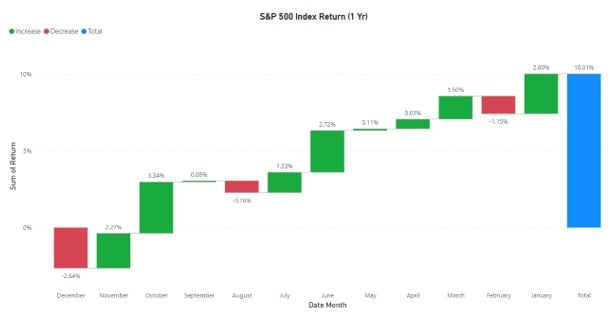
Here, we have sorted the Waterfall chart based on Month.
Post-sorting, the Waterfall chart will be sorted based on Month, as shown below.
Example #2
In this example, we will create a Waterfall chart in Power BI showing the percentage growth of US GDP between 1990 to 2022 using the US GDP Growth % dataset. US GDP Growth % dataset contains the percentage of GDP growth over 32 years in the United States.
To create a Waterfall chart in Power BI, follow the steps highlighted below:
Step 1: Open the Power BI Desktop, import the US GDP Growth % dataset using the Get Data option, and click on the Load button.
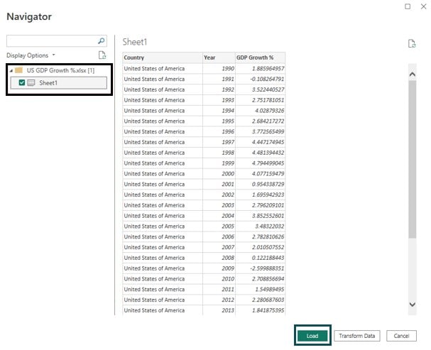
You can also use the Transform Data option to apply any data transformation or cleaning.
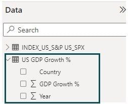
Once the data is loaded, you can view it by navigating to the Fields pane.
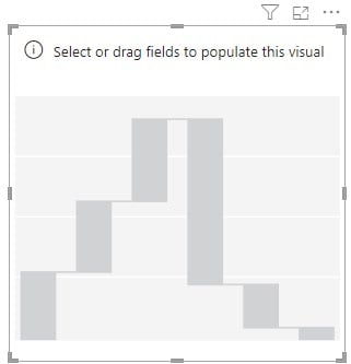
Step 2: Navigate to the Visualizations pane and click on the Waterfall chart visual icon.
It will create a dummy Waterfall chart in the report canvas in Power BI Desktop.
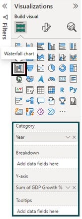
Step 3: Navigate to the Fields pane, select the data attributes to be used for the Waterfall chart in Power BI, and drag and drop these fields into the relevant sections of the Waterfall chart.
Here, we have added the Year field to Category and Sum of GDP Growth % in the Y-axis.
Step 4: Navigate to the Format your visual tab in the Visualizations pane to apply various formatting options to the report.
Here, we have formatted both the axes (X-axis and Y-axis), Legend to the Waterfall chart. We have also added the Data labels to show values on the chart.
Step 5: Navigate to the General tab under Format your visual tab in the Visualizations pane to apply formatting on Title and other options.
Step 6: Select the Waterfall chart, and click on the More options (…) option on the right top corner of the Waterfall chart visual on the report canvas.
Step 7: Choose the Sort axis option in the More options menu and then the field you want to apply sorting. You can choose the Sort descending or Sort ascending option.
Here, we have sorted the Waterfall chart based on Year.

Post-sorting, the Waterfall chart will be sorted based on Month, as shown below.

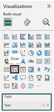
Step 8: Navigate to the Visualizations pane and click the Slicer visual icon.
Step 9: Navigate to the Fields pane, select the data attribute for the Slicer in Power BI, and drag and drop the field into the Field section of the Slicer.
Here, we have added the Year field to the Field section of the Slicer visual.
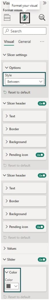
Step 10: Navigate to Format your visual tab in the Visualizations pane and apply formatting options to the Slicer per the requirements.
Here, we have used the Slicer style as Between for the date range and specified the color for the Slicer. You can also define the Title for the Slicer as per your requirements.
Post these changes, you can view the Waterfall chart with the Slicer option, as shown below.
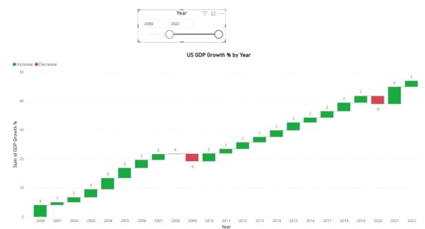
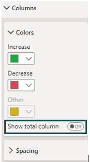
Note that we have toggled off the Total column displayed in the Waterfall chart. You can switch off this option by navigating to the Column section in the Visualizations pane and toggle off the Show Total column option.
Formatting of Waterfall Chart in Power BI
After creating a Waterfall chart in Power BI, you can format it to make it more visually appealing and informative. Here are some common formatting options that you can apply to your Waterfall Chart in Power BI:
#1 – Formatting options under the Visual tab
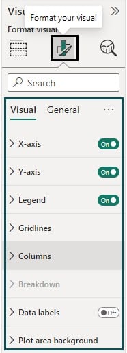
- Axis formatting: You can format the X-axis and Y-axis, such as Font size, appearance, color options, and Title, as shown below. You can also define a range of values for the Y-axis.
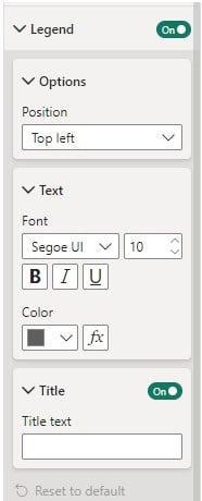
- Legend: You can add a legend to the chart to show different categories or series.
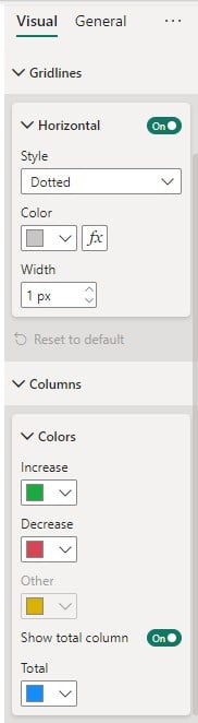
- Gridlines and Columns: You can specify Gridlines and colors for the columns as per requirements.
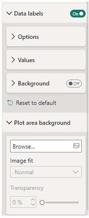
- Data labels and Plot area backgrounds: You can use the Data labels option to specify the Orientation and position of the data and show the exact values at each stage of the waterfall chart.
#2 – Formatting options under the General tab
You have various options, such as adding a Title, applying various Effects, and displaying Header icons to your Waterfall chart. You can configure tooltips to display additional information when users hover over the chart.
Important Things to Note
- Ensure that your data source is properly prepared with the necessary fields (category, value, variance) before creating a Waterfall chart.
- Waterfall charts are most effective when used to show changes or contributions over time, such as monthly revenue changes or cost breakdowns.
- Power BI provides various customization options, so experiment with formatting to convey your data effectively.
Frequently Asked Questions (FAQs)
By default, Power BI includes a total column at the end of a Waterfall chart. If you want to remove this total column, follow these steps:
Step 1: Select your Waterfall chart on the report canvas in Power BI Desktop.
Step 2: Navigate to the Visualizations pane and click on the Columns section to expand the options.
Step 3: Toggle off the Show total column option under the Colors menu. This will remove the total column from your Waterfall chart.
Power BI does not provide a built-in option to create a stacked waterfall chart. A standard waterfall chart in Power BI is designed to display the cumulative effect of sequentially introduced values, typically showing positive and negative changes. However, if you need to create a chart that resembles a stacked waterfall, you might consider using other chart types, such as stacked column charts or area charts, to achieve a similar visual effect. Keep in mind that these alternatives won’t have the same functional characteristics as a traditional waterfall chart.
Sorting a Waterfall chart in Power BI can be important for visual clarity. To sort a Waterfall chart, follow these steps:
Step 1: Select the Waterfall chart for which you want to apply sorting in Power BI Desktop.
Step 2: Click on the More options (…) option on the right top corner of the Waterfall chart visual on the report canvas.
Step 3: Choose the Sort axis option in the More options menu and then the field on which you want to apply sorting (For ex: Sum of Return). You can choose the Sort descending or Sort ascending option.
Remember that sorting your Waterfall chart can help you present your data in a more meaningful and insightful way, making it easier for your audience to interpret the information.
Recommended Articles
Continue with these related resources when you want the next practical step in this topic.
Explore the full Power BI Visuals and Reports guide or browse Power BI Resources.