What are Power BI Visuals?
Power BI Visuals are the graphical representations of data used to create compelling and interactive data visualizations within the Power BI platform. Power BI offers many built-in visuals, including bar charts, line charts, pie charts, maps, tables, cards, and more. These visuals help users gain insights from their data by presenting it in a visual format that is easy to understand and analyze.
Power BI provides multiple visual options that you can use for data visualization and analytical purpose. Broadly they can be segregated into three categories.
- Core Power BI visuals that are already available in the Visualization pane.
- Visuals that you can either download or import from a Power BI visuals marketplace called Microsoft Appsource or other communities such as GitHub or R.
- Creating custom visuals in Power BI.
The next section will show how to create custom visuals in Power BI.
Table of contents
Key Takeaways
- Power BI Visuals are graphical representations used to visualize and analyze data within Power BI reports and dashboards.
- Power BI provides a variety of visual options for your reporting needs. However, you can customize these visuals through multiple means to use them in your reports and dashboards.
- You can create Power BI custom visuals by importing the visuals from file or Appsource or sources such as GitHub or R or even develop on your own using specific technical tools
- When creating visuals, consider the data being presented and the story you want to tell, as well as the preferences and needs of the target audience. Clear and effective visuals are essential for data-driven decision-making.
📊 Unlock Advanced DAX Skills in Power BI!
Take your Power BI skills to the next level with our Advanced DAX in Power BI Training Course. Dive deep into advanced DAX functions, complex calculations, and optimization techniques to enhance your data analysis and reporting capabilities.
How to Create Custom Visuals in Power BI?
You can build custom Power BI visuals that can be used in your reports and shared across your organization and external users. There are multiple ways you can create these visuals.
- Create a custom visual, and package it as a .pbiviz file that can then be imported into a Power BI report
- Download the visuals from repositories such as GitHub, WebGL, or R and use them in your reports.
- Develop a custom visual and publish it to the Power BI visuals marketplace, i.e., Appsource.
For importing a visual into the Power BI report, you can navigate to the Visualization pane to import any custom visual.

You can download the advanced Power BI visuals from the Power BI marketplace, i.e., Appsource. To download these, follow the steps highlighted below.
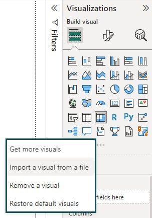
Step 1: Navigate to the Visualization pane in Power BI Desktop
Step 2: Click on ellipsis (…) and choose Get more visuals.
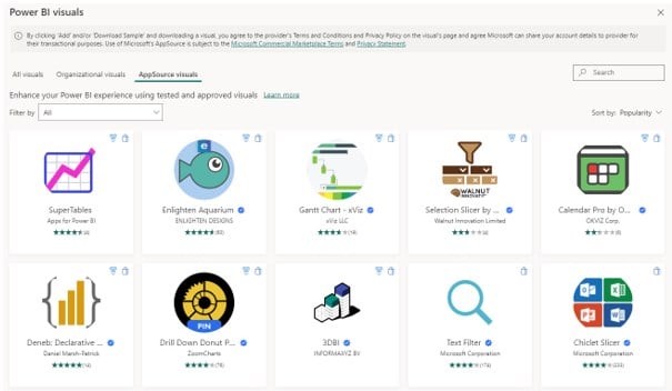
It will open a Power BI visuals pop-up window with all the advanced features.

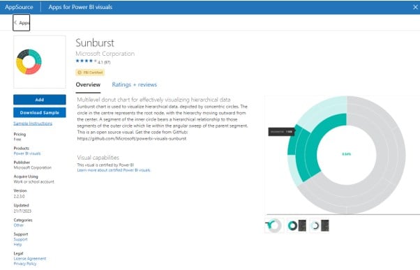
Step 3: Choose a visual and click on Add button. It will download Power BI visuals to the Desktop tool.

Post successful import, you will see the visual in the Visualization pane.

If you want to develop a Power BI custom visual, you follow the below steps:
Step 1: Validate that you have the required prerequisites. It includes,
- A Power BI Pro or Premium Per User (PPU) account.
- Visual Studio (VS) code, an ideal Integrated Development Environment (IDE) for developing JavaScript and TypeScript applications.
- Windows PowerShell (Latest Version for Windows) or Terminal (for OSX).
- Development environment to build the Power BI visual.
Note: You can also use other IDEs for creating custom visuals
Step 2: Set up Development Project to create a visual
It involves writing code using VS Code and Windows PowerShell to create a custom visual and save it in .pbiviz format.
Step 3: View the customer visual in the Power BI service
Once the visual is created, test it in the Power BI service. You can further add or modify visual elements and any text to make it visually appealing.
You can refer to the Microsoft Power BI visuals tutorial and documentation if you need to learn how to develop custom visuals in Power BI in detail. However, this article will focus on customizing the core visuals such as Cards, Donut Charts, and Tables.
Visual #1 – Cards
Cards are simple visuals that display a single value or multiple data points. To create a card visual in Power BI, follow the steps highlighted below:
Step 1: Import the dataset using the Data Connection in Power BI. For this illustration purpose, we have used the World Data Set file.

Step 2: Navigate to the Visualization pane and drag the Card visual to the report canvas.

Step 3: Choose the desired field or measure from your dataset that you want to display as a card value and drag and drop them to the Fields section in the Visualization pane.
Step 4: Now navigate to the Format your visual tab under the Visualization pane to customize the looks and appearance of the Card visual.
Turn the Category label in the Visual tab to Off.

Turn the Title On and provide a suitable Text to the Card visual by navigating to the General tab.

Repeat these steps for all the Card visuals to view the customized Card visual in Power BI.

Visual #2 – Donut Chart
A Donut chart is a pie excel chart variation with a hole in the center that helps compare each category’s proportion in the total. To create a Donut chart visual in Power BI, follow the steps below:
Step 1: Import the dataset and Load it into the Power BI Desktop using Data Connection. Apply Transform Data if needed.

Step 2: Select the Donut excel chart from the Visualizations pane to the report canvas.

Step 3: Add the required fields to the Legend, Values, and Details sections in the Visualizations pane to represent the data segments.

Step 4: Navigate to the Format visual tab under the Visualizations pane to customize the Donut chart visual.
Customize the Slices section under the Visual tab to define the colors for each slice.

Customize the Title under the General tab by adding Text and Horizontal Alignment.

Similarly, you can customize other details, such as Effects, by choosing the appropriate option for the visual.

Once you have completed all the required customization, you can create a custom in the report canvas.

Visual #3 – Table
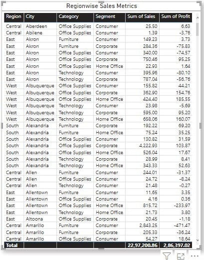
A Table visual displays data in a tabular format. To create a table visual in Power BI, follow the steps below:
Step 1: Select the Table visual from the Visualization pane and drag and drop the appropriate data fields from the Fields pane.

Step 2: Navigate to the Format visual tab and customize the Table visual. Choose a style presets from the available list of options in the dropdown.

Customize the header by adding Text to the Title.

You can customize the Table visual by adding the appropriate effects such as Shadow and Visual border options.

Once you have added the appropriate customization, you will be able to see the Power BI custom table visual in the report canvas.

Important Things to Note
- Power BI Visuals are an essential part of creating meaningful and insightful reports and dashboards. Choosing the right visualizations can significantly impact how well the data is understood and utilized.
- Custom visuals provide flexibility in data representation and can be especially useful for specific business needs or unique data presentations.
- When designing visuals, consider the audience and the insights you want to convey to ensure the visuals are clear and effective.

Frequently Asked Questions (FAQs)
There are multiple ways you can create custom visuals in Power BI. They include
• Customizing the Core Power BI visuals that are already available in the Visualization pane
• Customizing the visuals that you can either download or import from a Power BI visuals marketplace called Microsoft Appsource or other communities such as GitHub or R
• Developing your custom visuals in Power BI
To copy visuals from Power BI to PowerPoint, follow these steps:
Step 1: Open the Power BI report that contains the visuals you want to copy.
Step 2: Take a screenshot of the visual you want to copy.
Step 3: Open PowerPoint and go to the slide where you want to paste the visual.
Step 4: Paste the screenshot onto the PowerPoint slide using Ctrl + V (Windows) or Command + V (Mac).
You can group visuals such as images, buttons, shapes, or other visuals in Power BI Desktop as follows.
Step 1: Select the visuals from the canvas you want to group.
Step 2: Navigate to the Format tab, select Group, and again select Group from the submenu.
This will group the visuals in the report canvas.
To hide a visual in Power BI, follow these steps:
Step 1: Select the visual you want to hide in a group of visuals.
Step 2: Navigate to the Format tab, and click on Selection. Find the “Visibility” icon (eye icon) at the top of the Selection pane.
Step 3: Click on the eye icon to toggle the visibility of the visual. The visual is hidden when the eye icon is crossed out (closed). When it’s open, the visual is visible.
Hidden visuals will not appear in the report or dashboard when it’s viewed by others, but they are still part of the report and can be unhidden later if needed.
Recommended Articles
This has been a guide to Power BI Visuals. Here we look into the customization of core visuals such as cards, Donut chart, and tables with examples. You can learn more from the following articles –

Leave a Reply