What Is Doughnut Chart In Excel?
The Doughnut Charts in Excel represents the share of data divided in percentages where the total percentage adds up to 100%. Similar to a pie chart, except hollow in the middle, it is a modified version. We can only use the data in rows or columns to create this chart.
Since Excel Doughnut Chart is an inbuilt chart, we can insert it for a selected cell range using the Charts group.
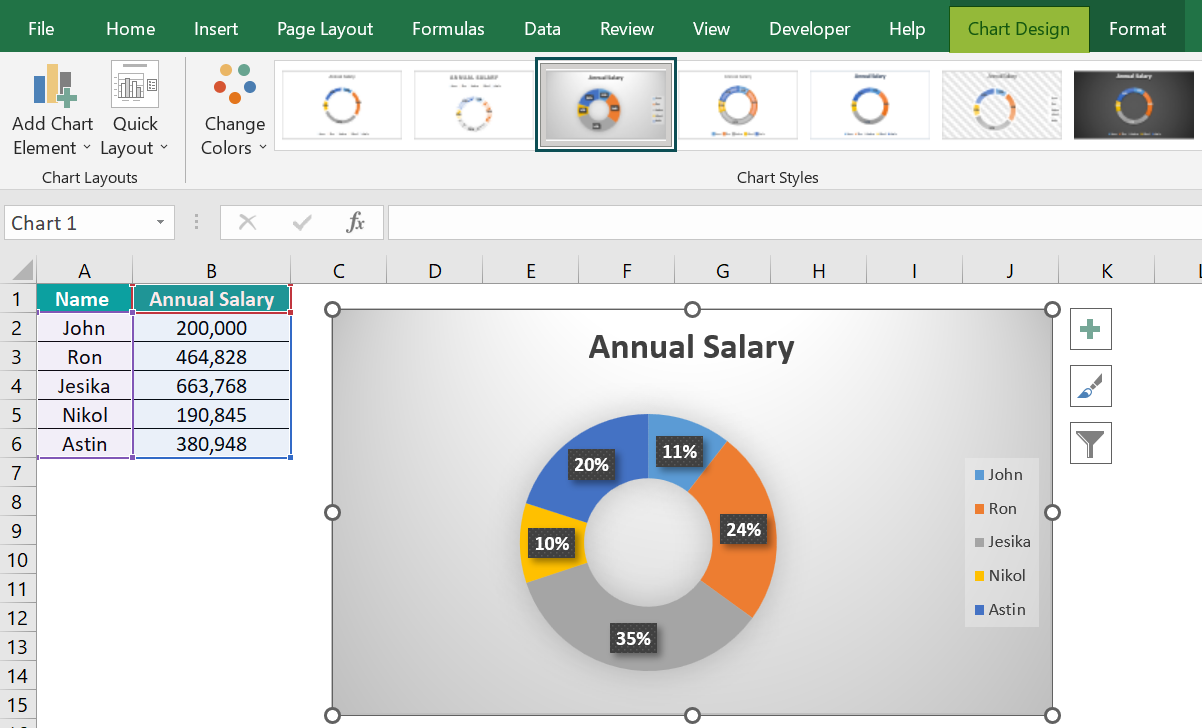
For example, the image below shows the salary of the company’s people, and we will create a Doughnut Chart from the given data.
📥Download the ready-to-use Excel template to practice this tutorial yourself.
Doughnut Chart in ExcelIn the table, the data is,
- Column A shows the Name.
- Column B contains the Annual Salary.

Select cell range, A1:B6, and select the Doughnut Chart option from the “Charts” group.

The above Doughnut Chart is generated for the Employees Annual Salary.
Table of contents
Key Takeaways
- The Doughnut Chart in Excel is an inbuilt circular chart that represents the dataset in the percentage form divided as slices.
- They are similar to Pie charts but with a hole in the center, which can be utilized to add data for chart readability.
- It creates a chart for 100 percent matrices. Also, it helps to create a visualization with single matrices, double and multiple matrices, known as single-Doughnut, double-Doughnut, and multiple-Doughnut charts, respectively.
- The Doughnut Charts data values are simple to modify or replace in real-time to our needs.
Explanation And Uses Of Doughnut Chart In Excel
Explanation of a Doughnut Chart
- It is a chart type that appears in a Doughnut shape that represents data in the form of rings for a supplied data set.
- The charts are an extended version of the Pie Charts in excel.
- They don’t require the size or area of the slices to measure, but are measured based on the arc length in a ring.
- They are preferred over pie charts because,
- They have a better data intensity ratio and space efficiency.
- The space in the middle of a Doughnut Chart is used to store data such as the data slice labels, the total number of data arcs, desired text, etc.
- We can simultaneously use more than one data series in these charts.
Uses of a Doughnut Chart
- They show the proportions of categorical data, each piece representing the proportion of each category.
- It is created using a string field and a count of features, number, rate, or ratio field.
- Special formatting features represent data clearly within Excel and make the chart easier to read.
How To Create Doughnut Chart In Excel?
We can create the Doughnut Chart as shown below,
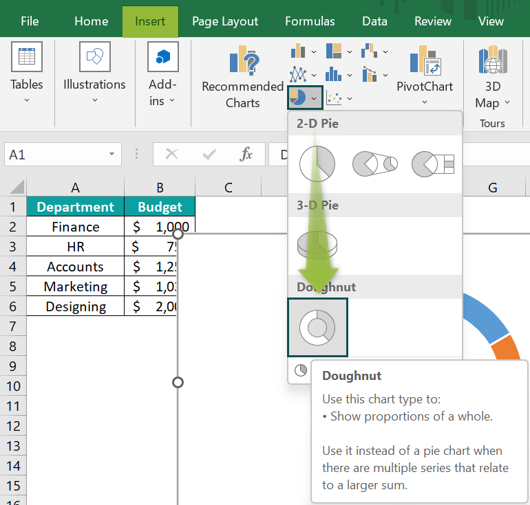
Choose the cell range → select the “Insert” tab → go to the “Charts” group → click the “Insert Pie or Doughnut Chart” option drop-down, as shown below.

Then, select the “Doughnut” type from the “Doughnut” category, as shown below.

Let us take an example –
The image below shows the Company’s monthly sales, and we will create the Doughnut Chart in Excel from the given data.
In the table, the data is,
- Column A shows the Company Name.
- Column B contains the Sales.

The steps to create a Doughnut Chart in excel are as follows:
- Choose the cell range, A1:B13 → select the “Insert” tab → go to the “Charts” group → click the “Insert Pie or Doughnut Chart” option drop-down, as shown below.

- Then, select the “Doughnut” type from the “Doughnut” category, as shown below.

- We get the following Doughnut Chart.

Examples
We will see some different scenarios to create the Doughnut Chart in Excel.
Example #1 – Doughnut Chart with Double Data Series
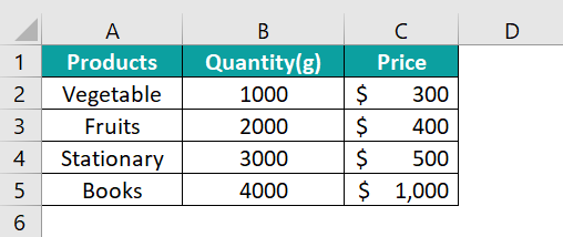
The image below shows the quantity and price of the products, and we will create the Doughnut Chart in Excel from the given data.
In the table, the data,
- Column A shows the Product.
- Column B contains the Quantity.
- Column C contains the Price.

The steps to create the Excel Doughnut Chart are as follows:
- Step 1: Choose the cell range, A1:C5 → select the “Insert” tab → go to the “Charts” group → click the “Insert Pie or Doughnut Chart” option drop-down, as shown below.

- Step 2: Then, select the “Doughnut” type from the “Doughnut” category, as shown below.

- Step 3: We get the following Doughnut Chart.
We can further format it as follows: Click the chart to get 2 new tabs, “Design” and “Format” → select the “Design” tab → go to the “Chart Styles” group → select the desired chart style, here, “Style 3”.

Example #2 – Doughnut Chart with Multiple Data Series
The image below shows the company’s purchases, sales, and turnover, and we will create the Doughnut Chart in Excel from the given data.
In the table, the data is,
- Column A shows the Company Name.
- Column B contains the Purchase.
- Column C contains the Sales.
- Column D contains the Turn Over.

The steps to demonstrate the Excel Doughnut Chart are as follows:
- Step 1: Choose the cell range, A1:D5 → select the “Insert” tab → go to the “Charts” group → click the “Insert Pie or Doughnut Chart” option drop-down, as shown below.

- Step 2: Then, select the “Doughnut” type from the “Doughnut” category, as shown below.

- Step 3: We get the following Doughnut Chart.
We can further format it as follows: Click the chart to get 2 new tabs, “Design” and “Format” → select the “Design” tab → go to the “Chart Styles” group → select the desired chart style, here, “Style 3”.

Example #3
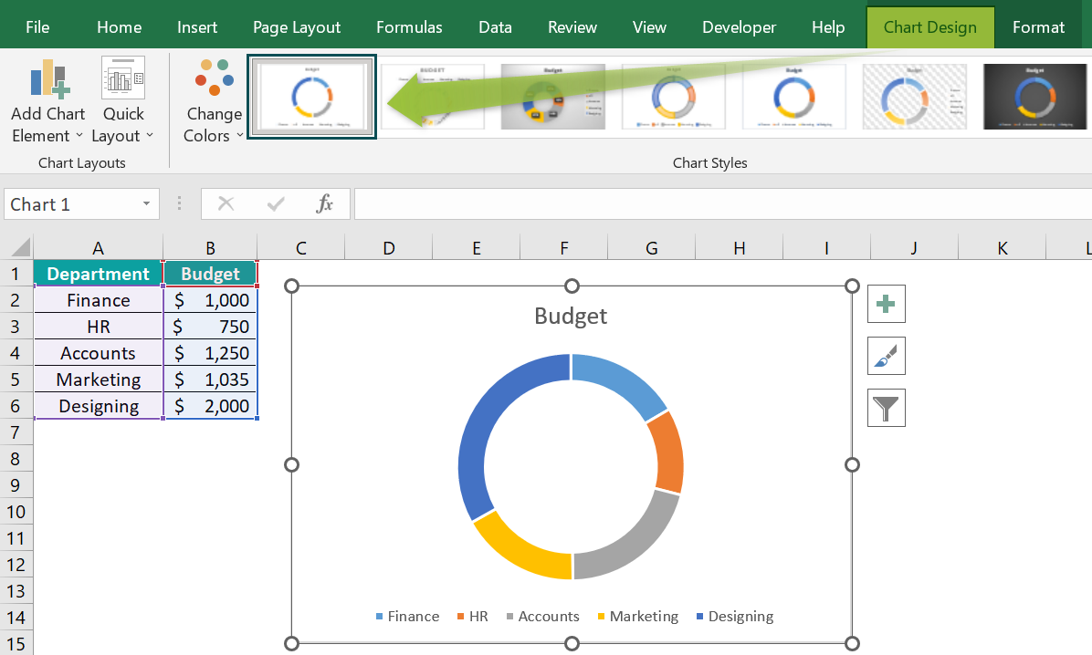
The image below shows the budget of the departments of the Company, and we will create the Doughnut Chart in Excel from the given data.
In the table, the data is,
- Column A shows the Department.
- Column B contains the Budget.

The steps to demonstrate the Excel Doughnut Chart are as follows:
- Step 1: Choose the cell range, A1:B6 → select the “Insert” tab → go to the “Charts” group → click the “Insert Pie or Doughnut Chart” option drop-down, as shown below.

- Step 2: Then, select the “Doughnut” type from the “Doughnut” category, as shown below.

- Step 3: We get the following Doughnut Chart.
We can further format it as follows: Click the chart to get 2 new tabs, “Design” and “Format” → select the “Design” tab → go to the “Chart Styles” group → select the desired chart style, here, “Style 1”.

Important Things To Note
- The Doughnut Chart can work on only one dataset but not multiple data series.
- The categories must be limited to 5 or 8.
- Displaying the data labels as a percentage fit best within the Doughnut slice.
- The empty center space of the Doughnut can be used to display various values or calculations.

Frequently Asked Questions (FAQs)
• The Pie charts is a circular chart divided into segments. Each segment are parts of the whole chart put together. We cannot add more data here.
• The Donut charts are just like the Pie chart, but have a hole in the center. We can use the hollow space to add more data related to the given dataset, like labels, percentage, etc.
• On the whole both the charts, Pie and Doughnut, are simple and visually easy to comprehend.
For example, the image below shows the items and values, and we will create a Pie Chart and Doughnut Chart in Excel from the given data.
In the table, the data is,
• Column A shows the Item.
• Column B contains the Value.
The steps to generate the Pie Chart and Doughnut Chart in Excel are as follows:
• Step 1: Choose the cell range, A1:B4 → select the “Insert” tab → go to the “Charts” group → click the “Insert Pie or Doughnut Chart” option drop-down, as shown below.
• Step 2:
৹ Scenario 1 – Select the “Doughnut” type from the “Doughnut” category.
৹ Scenario 2 – Select the “Pie” type from the “2-D Pie” category.
The 2 generated charts, i.e., Pie Chart and Doughnut Chart, are shown in the image above.
We can create the Doughnut Chart as shown below,
Choose the cell range → select the “Insert” tab → go to the “Charts” group → click the “Insert Pie or Doughnut Chart” option drop-down → select the “Doughnut” type from the “Doughnut” category, as shown below.
The Doughnut charts are divide the categories in a dataset into slices, each piece representing the part of each category.
Download Template
📥Download the ready-to-use Excel template to practice this tutorial yourself.
Doughnut Chart in ExcelRecommended Articles
This has been a guide to Doughnut Chart in Excel. Here we learn how to create Doughnut Chart along with examples & downloadable excel template. You can learn more from the following articles –


Leave a Reply