
What Is Tally Chart In Excel?
The Tally Chart in Excel helps record data as a plot with vertical bars denoting every occurrence of an information piece. And four vertical bars with a slash through them make a group of five. Users can use the Tally Chart for a precise quantitative representation of data to ensure improved data comparison capabilities in Excel.
Excel does not provide an inbuilt Tally Chart. Therefore, we can create a Tally graph using formulas and a Bar chart in excel.
Use this Tally Chart In Excel Template to follow along with the examples in this article.
Download Excel TemplateFor example, the below table shows the count of students with 100% attendance in the listed subjects. We will create a Tally Chart to calculate Groups and Singles according to their respective symbols.
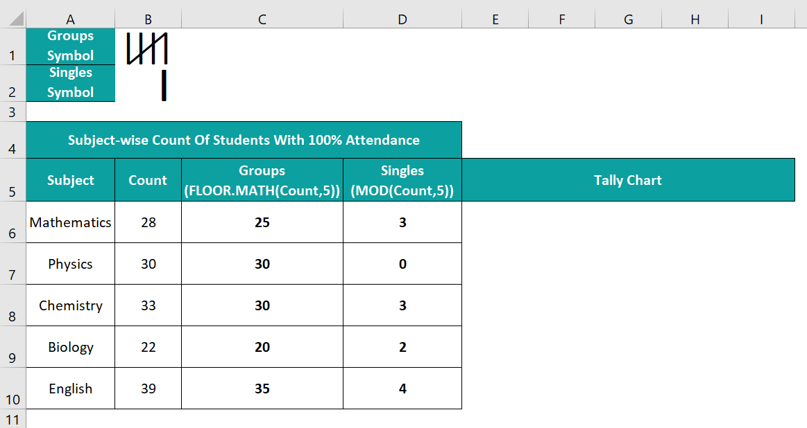
Now, we use the formulas mentioned in cells C5:D5. And based on the Groups and Singles data and their symbols (cells B1:B2), the Tally Chart will result in the following plot.
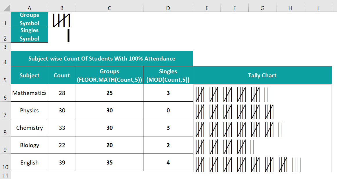
The FLOOR.MATH and MOD functions help create bars indicating the group and single Tally Marks. And then, we can replace the respective bars with the Groups and Singles symbols for making a Tally Chart in Excel (as shown above).
Let us see the plot for Mathematics. The total number of students with 100% attendance in Mathematics is 28. So, the FLOOR.MATH() rounds down 28 to the nearest multiple of 5, 25. And the MOD() divides 28 by 5 to return the remainder of 3.
And once we create a Bar chart using the Groups and Singles data, two bars will represent the values 25 and 3. Finally, replacing the bar representing 25 with the Groups symbol will show five groups of Tally Marks containing four vertical lines with a slash. And replacing the bar representing 3 with the Singles symbol will show the Tally Marks as three single lines.
Key Takeaways
- The Tally Chart in Excel helps display the given data points in the form of individual and groups of five vertical bars.
- We can create theCharts using the inbuilt functions, FLOOR.MATH and MOD, and the Stacked Bar chart.
- Users can use the Tally Chart for an accurate quantitative depiction of the given data, enhancing data comparison techniques. And it suits scenarios when we must show data, such as store inventory records and frequencies of matches played, in the form of a chart.
How To Create Tally Chart In Excel?
The steps to create a Tally Chart in Excel are as follows:
- Ensure the source data is accurate and the groups and single Tally Marks symbols are in separate cells.
- Introduce two columns, one for Groups and the other for Singles. Use the FLOOR.MATH() and MOD() to populate the Groups and Singles columns, respectively.
- Select the Groups and Singles columns and follow the path Insert → Column or Bar Chart → 2-D Stacked Bar chart to plot a Stacked Bar chart for the chosen data.
- Toggle the Y-axis scale, remove all the chart elements, and resize the chart according to our requirements.
- Reduce the spacing between the bars to zero.
- Copy the Groups symbol, right-click the Groups bar in the chart, and fill the image in the bars.
- Copy the Singles symbol, right-click the Singles bar in the chart, and fill the image in the bars.
- The resulting plot will appear as the required Tally Chart.
We will understand the steps better with the following example.
The table below contains a list of employees and the number of apples they collected, and we will prepare a Tally Chart.
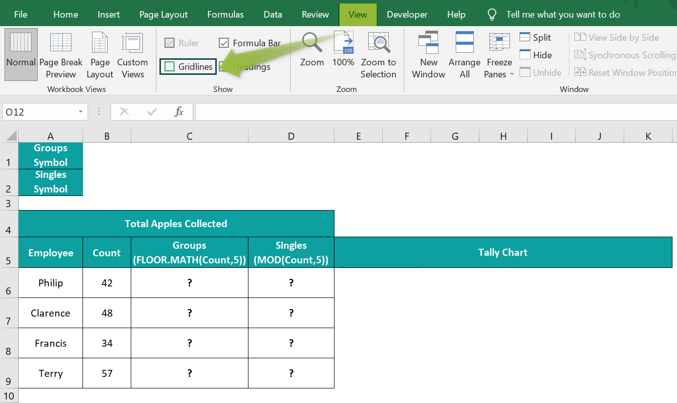
Also, we do not have the Gridlines box checked in the View tab, and cells B1:B2 do not have cell borders to ensure we achieve the desired Tally Chart.
The steps to create a Tally Chart are as follows:
- Select cells B1:B2, and set the Font and Font Size options in the Home tab, as highlighted in the image below.

- Press Shift + I four times to create the group Tally Mark symbol.

- Click outside cell B1, and select Insert → Shapes → Slanting Line shape.
Next, draw the slanting line across the four lines in cell B1, and set the following Format Shape Outline settings. - Select cell B2, press the Space Bar thrice, and enter Shift + I once to create the single Tally Mark symbol.

- Next, select cell C6, and enter the FLOOR.MATH() formula =FLOOR.MATH(B6,5)
- Press Enter to view the result.
- Using the fill handle, drag the formula from C6 to C9.

- Select cell D6, and enter the MOD() formula =MOD(B6,5).
- Press Enter to view the result.

- Using the fill handle, drag the formula from cell D6 to D9.
- Select cell range C5:D9, and follow the path Insert → Column or Bar Chart → 2-D Stacked Bar chart.

Clicking the above chart type will result in the below plot.
[Alternatively, we can select cell range C5:D9, and follow the path Insert à Recommended Charts to open the Insert Chart window.
Next, go to the “All Charts” tab, select Bar → 2-D Stacked Bar chart in the Insert Chart window, and select the required plot from the two given options.
And clicking OK will close the window and display the chosen chart.] - Check the option to reverse the category order under Axis Options in the Format Axis window. It will bring the first data point to the top, with the order following till the last data point represented at the bottom of the chart.

- Check the option to reverse the category order under Axis Options in the Format Axis window. It will bring the first data point to the top, with the order following till the last data point represented at the bottom of the chart.

- Right-click the chart area, and select the Format Chart Area option from the context menu.

- Set the Fill and Border settings as No fill in the Fill tab in the Format Chart Area window.

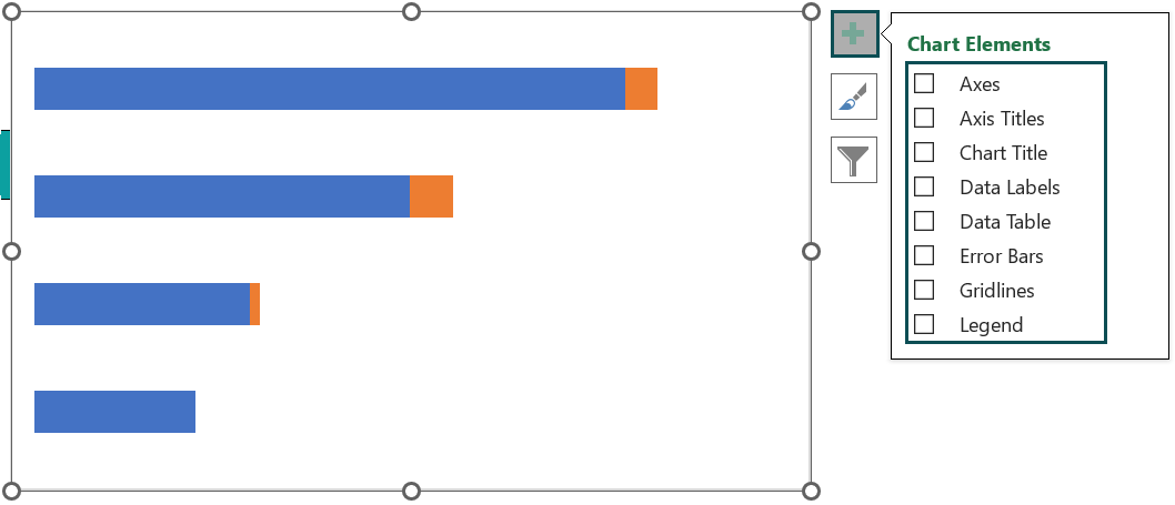
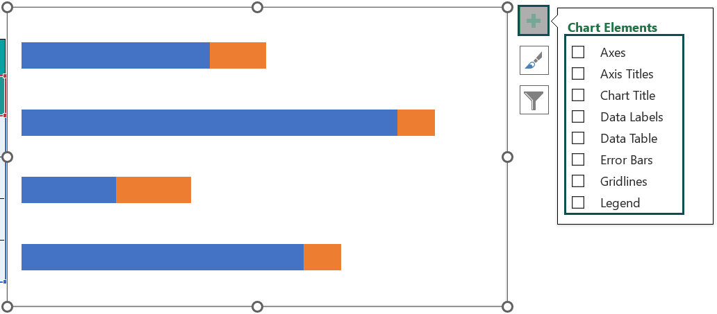
- Click the chart area to enable the Chart Elements option (‘+’ icon), and uncheck all the chart elements in the list.

Click the Chart Elements option again to close the window. - Drag the plot area borders to make the plot area equal to the chart area.


And resize the chart to the required size.
- Right-click a blue bar (Groups bar), and select Format Data Series from the context menu.

- Set the Gap Width under the Series Options as 0% in the Format Data Series window.

So, the plot will appear as shown below:
- Select cell B1, press Ctrl + C to copy the picture, and right-click on a Groups data series in the chart to select Format Data Series from the context menu.

- In the Fill tab in the Format Data Series window, select the fourth option under Fill and click Clipboard to fill the chosen Groups Tally Mark symbol in the Groups data series.

And set the Stack and Scale with to 5, to display the Groups Tally Marks symbol correctly. - Select cell B2, press Ctrl + C to copy the picture, and right-click on a Singles data series in the chart to select Format Data Series from the context menu.
- In the Fill tab in the Format Data Series window, select the fourth option under Fill, and click Clipboard to fill the chosen Singles Tally Mark symbol in the Singles data series.
And set the Stack and Scale with to 1, to display the Singles Tally Marks symbol correctly. - Right-click the chart area and select Format Chart Area from the context menu.

And set the Border setting as Automatic in the Fill tab.
Thus, the resulting Tally Chart will appear as depicted below:
Let us see the last bar in the chart representing Terry’s data.
Terry collected 57 apples. As we require apples in groups of five Tally Marks, we use the FLOOR.MATH() in cell C9 to round down 57 to the nearest multiple of 5, 55. We fixed the significance argument value as 5 because we require to split the given data point into groups of 5 marks.
Next, we must represent the remaining two apples in the Tally Chart. So, we use the MOD() to get the remainder of dividing 57 by 5, 2. We divide the given count by 5 because we require the remaining apples after splitting the total count into groups of five.
And then, we plot the Stacked Bar chart, select the respective data series, and fill them with the corresponding Tally Mark symbols. So, in the case of Terry, we see 11 Groups of Tally Mark symbols, denoting 55 apples. And then, we have 2 Singles Tally Mark symbols representing two apples. Thus, the Tally Chart shows 57 apples Terry collected in the form of group and single Tally Marks.


Examples
Check out the below Tally Chart in Excel examples to use the plot in other scenarios.
Example #1
The below table shows the number of paint tins per color.
The steps to create a Tally Chart in Excel for the above data are as follows:
- 1: Select cell C6, enter the FLOOR.MATH() formula =FLOOR.MATH(B6,5), and press Enter.

Using the fill handle, drag the formula from cell C6 to C9.

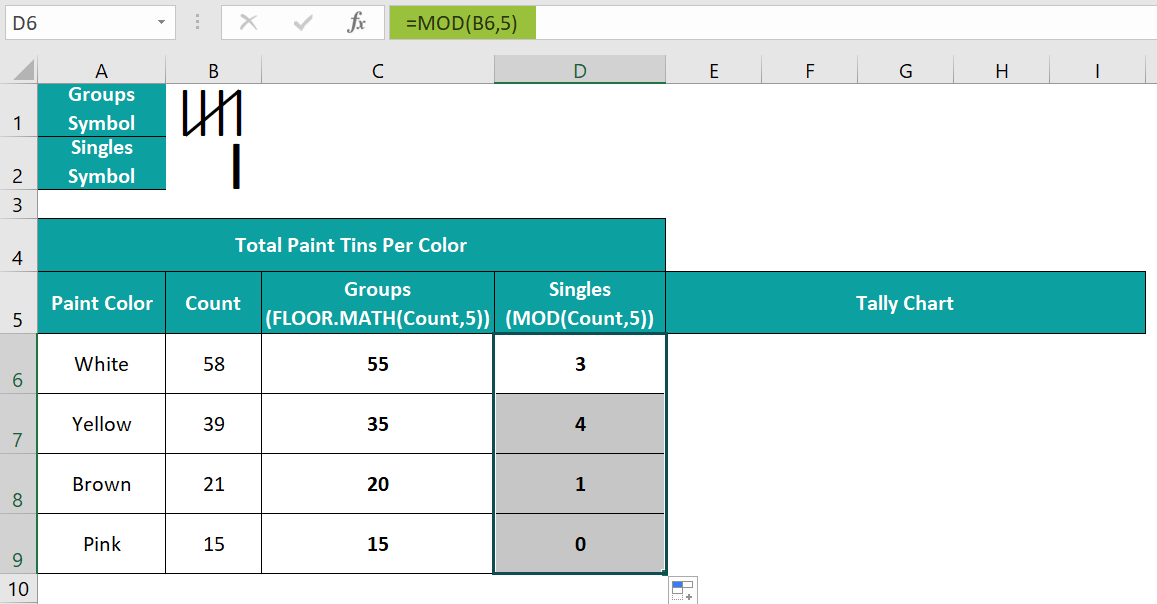
- 2: Select cell D6, enter the MOD() formula =MOD(B6,5), and press Enter.
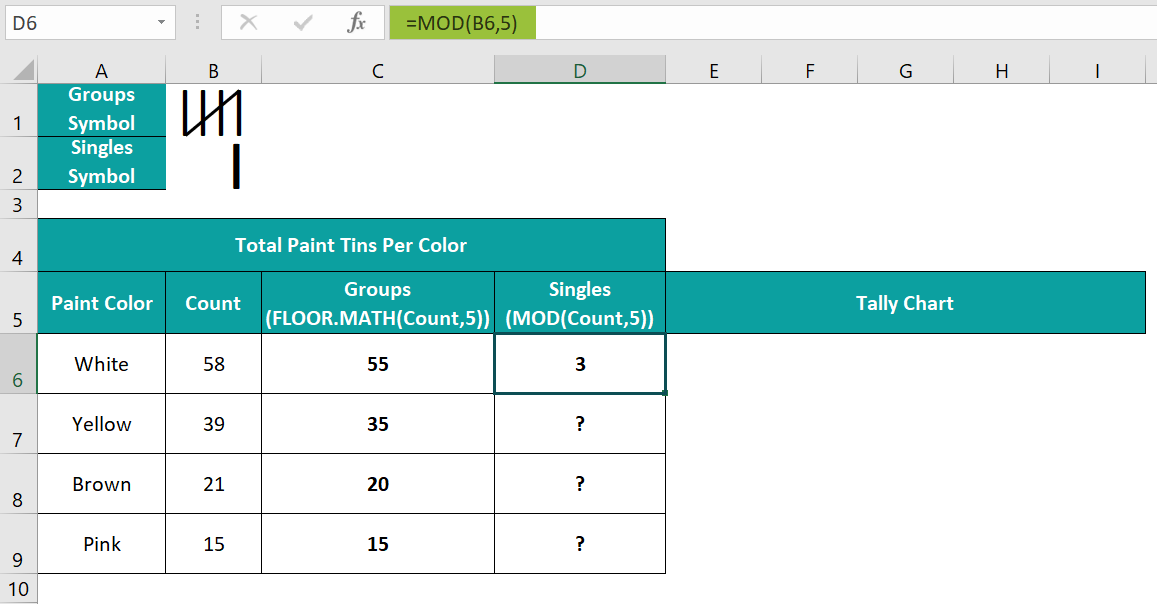
Using the excel fill handle, drag the formula from cell D6 to D9.
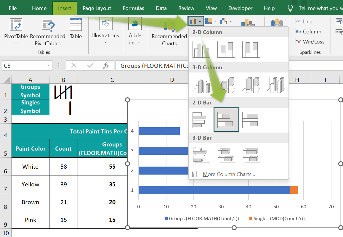
- 3: Select cell range C5:D9, and follow the path Insert → Column or Bar Chart → 2-D Stacked Bar chart to plot a chart for the chosen data.

- 4: Right-click the Y-axis, and select Format Axis from the context menu.
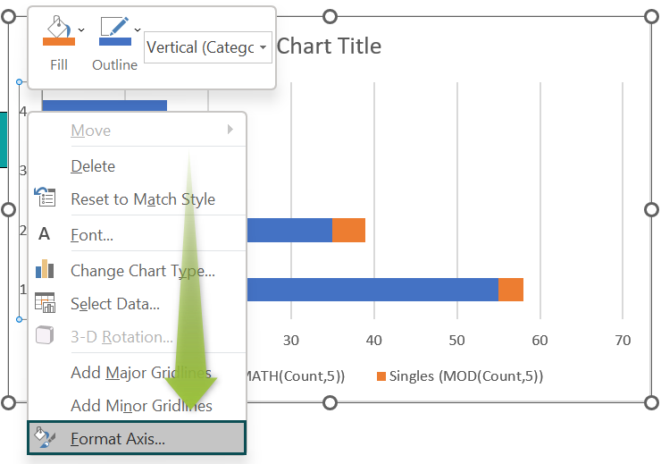
And check the box against the option to reverse the category order in the Y-axis.

- 5: Click the chart area to enable the Chart Elements option (‘+’ icon), and uncheck all the options in the list to remove all the chart elements.
- 6: Make the plot area equal to the chart area, and resize the chart to make it readable.


- 7: Right-click a Groups data series in the chart area, and select Format Data Series from the context menu.

And set the Gap Width under Series Options as 0%.

- 8: Select cell B1, and press Ctrl + C to copy the picture. And then, right-click on a Groups data series, and select Format Data Series from the context menu.

Next, select the fourth option as the Fill setting in the Fill tab, and click Clipboard to update the chosen image in the bars.
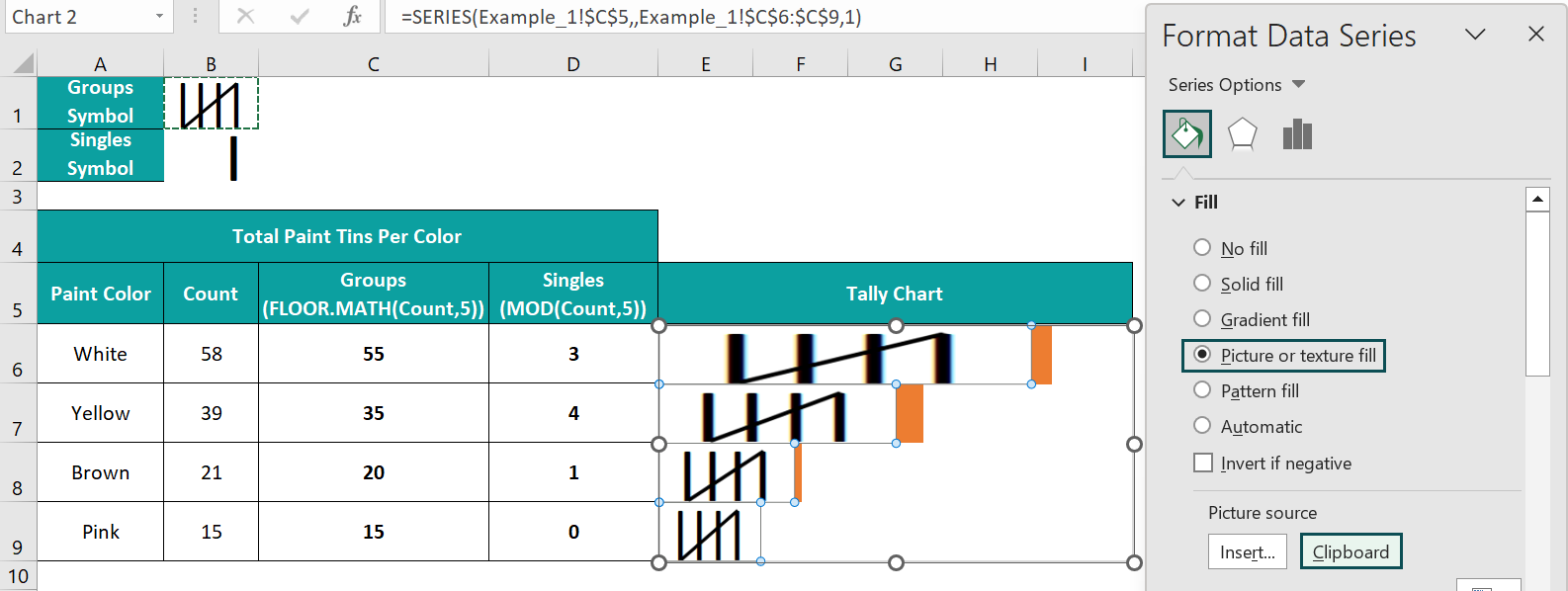
And set the Stack and Scale with to 5.

- 9: Select cell B2, and press Ctrl + C to copy the picture. And then, right-click on a Singles data series, and select Format Data Series from the context menu.
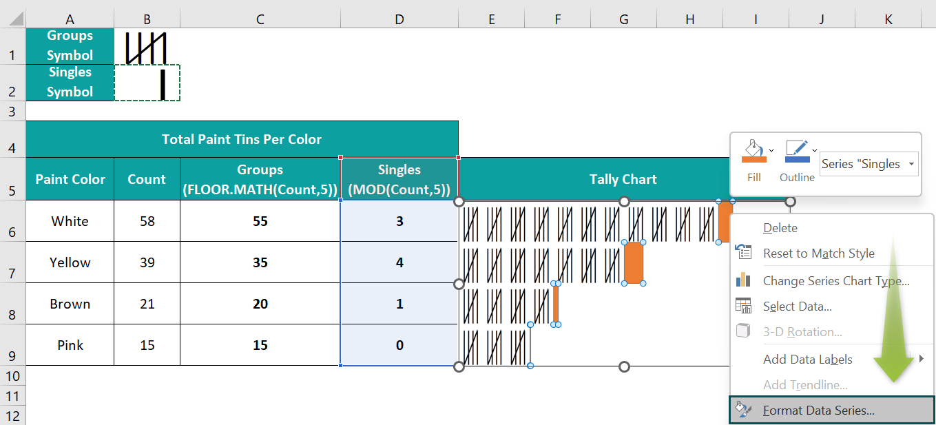
Next, select the fourth option as the Fill setting in the Fill tab, and click Clipboard to update the chosen image in the bars.

And set the Stack and Scale with to 1.

Thus, the final Tally Chart will appear as depicted below:

Example #2
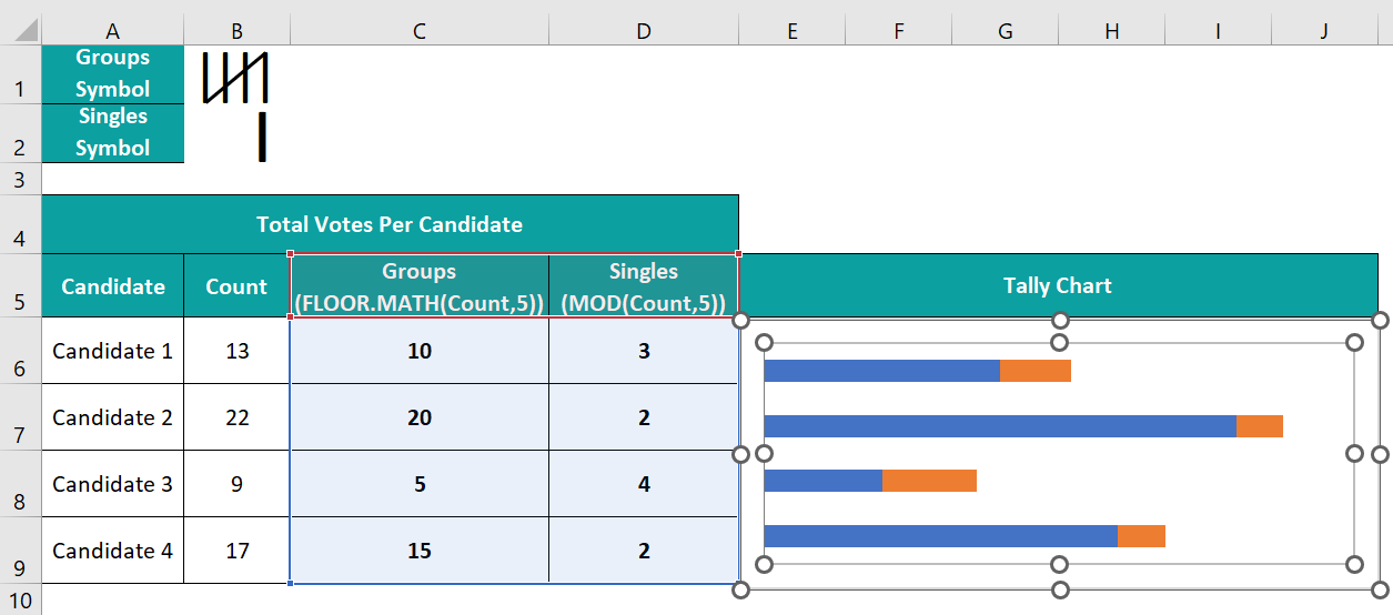
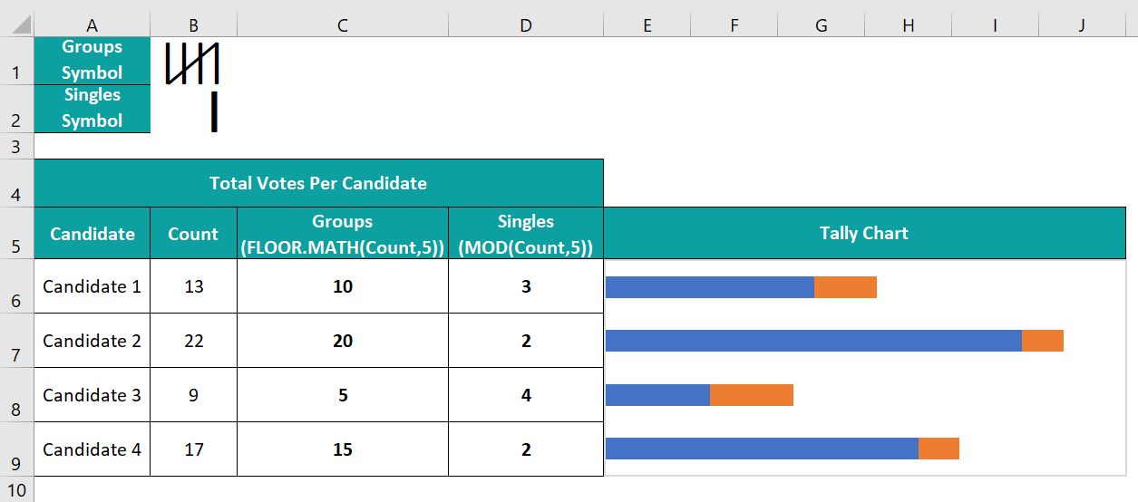
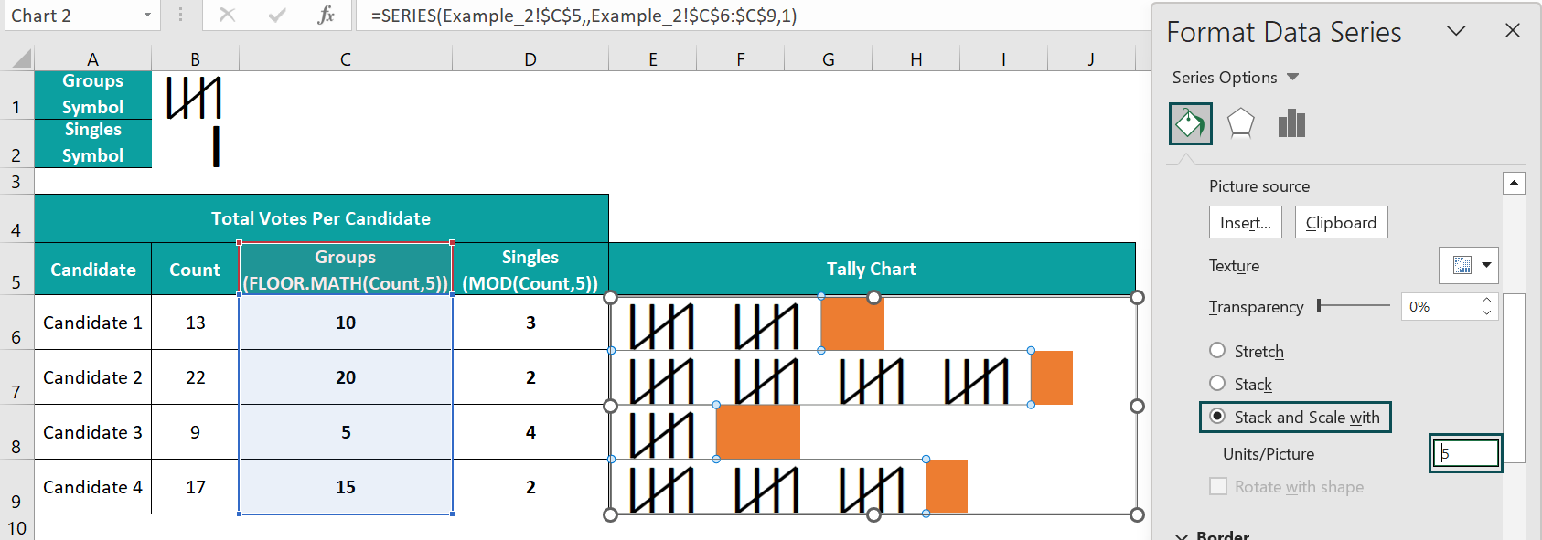
The below table shows the total votes per candidate.
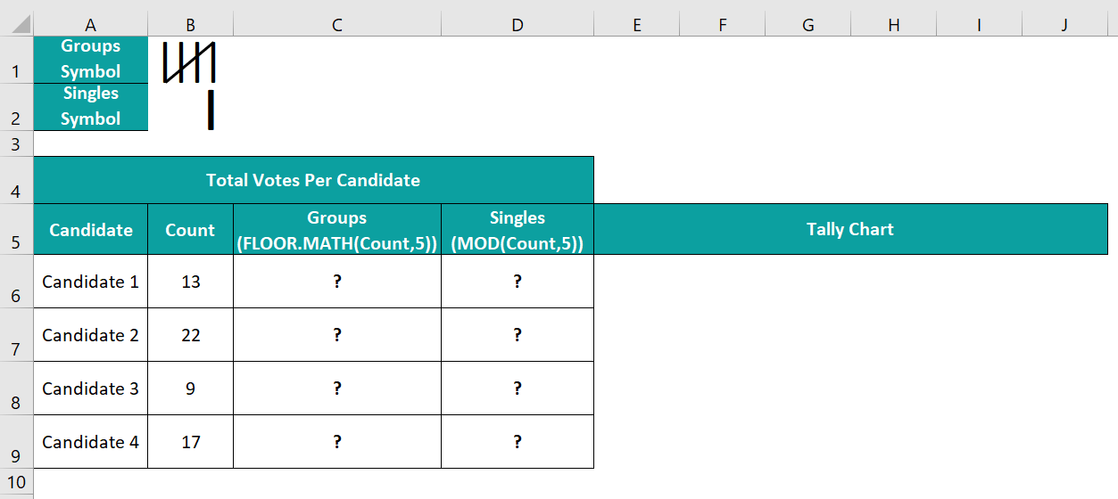
The steps to create a Tally Chart in Excel for the above data are as follows:
- 1: Select cell C6, enter the FLOOR.MATH() formula =FLOOR.MATH(B6,5), and press Enter.

Using the fill handle, drag the formula from cell C6 to C9.
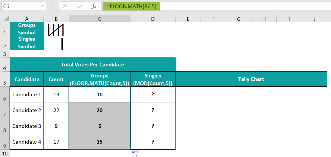
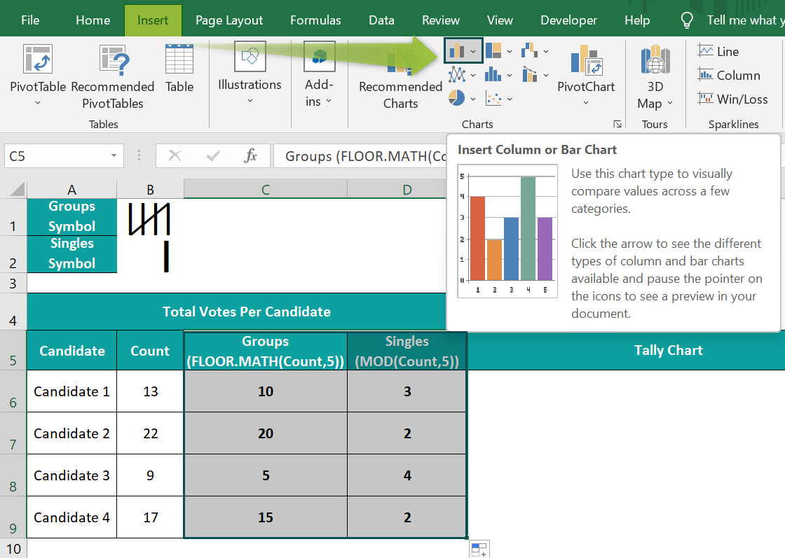
- 2: Select cell D6, enter the MOD() formula =MOD(B6,5), and press Enter.

Using the fill handle, drag the formula from cell D6 to D9.

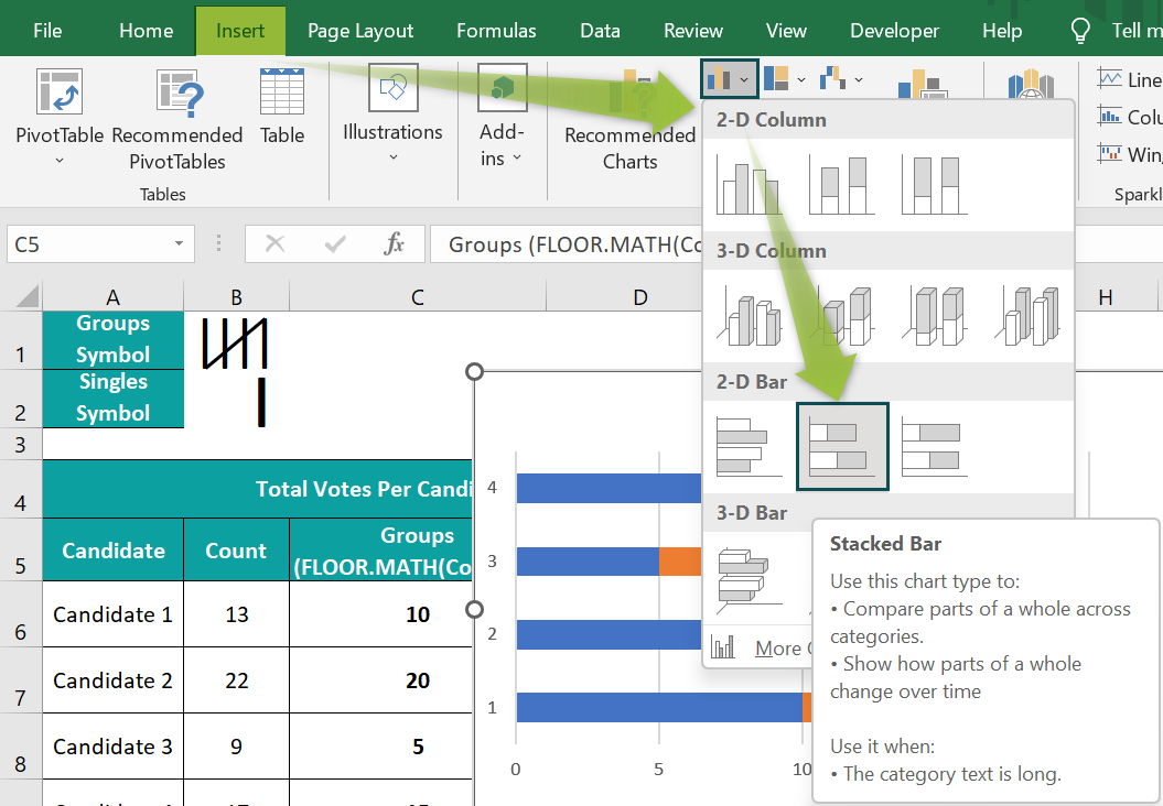
- 3: Select cell range C5:D9, and follow the path Insert → Column or Bar Chart → 2-D Stacked Bar chart to plot a chart for the chosen data.
- 4: Right-click the Y-axis, and select Format Axis from the context menu.
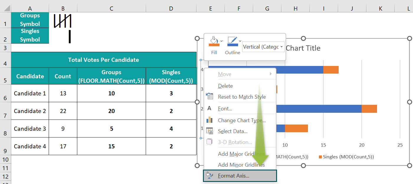
And check the box against the option to reverse the category order in the Y-axis.

- 5: Click the chart area to enable the Chart Elements option (‘+’ icon), and uncheck all the options in the list to remove all the chart elements.
- 6: Make the plot area equal to the chart area, and resize the chart to make it readable.
- 7: Right-click a Groups data series in the chart area and select Format Data Series from the context menu.

And set the Gap Width under Series Options as 0%.

- 8: Select cell B1, and press Ctrl + C to copy the picture. And then, right-click on a Groups data series, and select Format Data Series from the context menu.

Next, select the fourth option as the Fill setting in the Fill tab, and click Clipboard to update the chosen image in the bars.
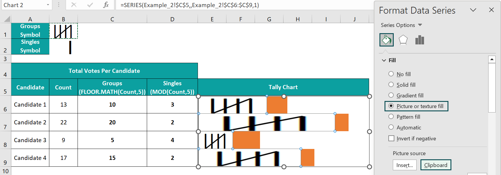
And set the Stack and Scale with to 5.
- 9: Select cell B2, and press Ctrl + C to copy the picture. And then, right-click on a Singles data series, and select Format Data Series from the context menu.
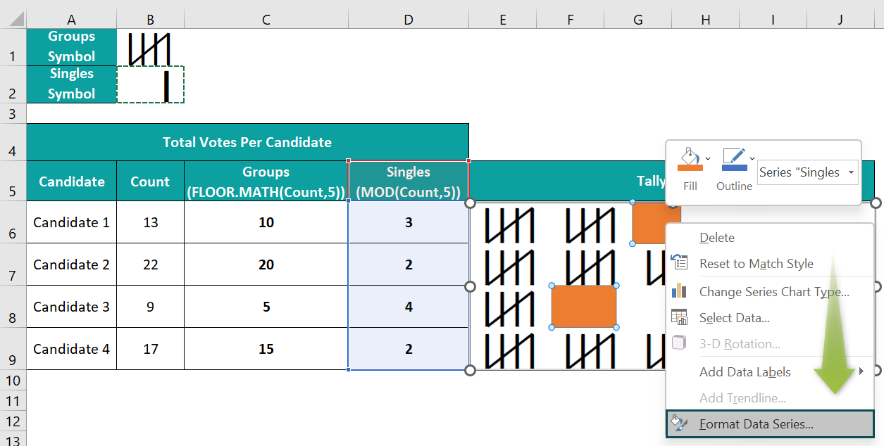
Next, select the fourth option as the Fill setting in the Fill tab, and click Clipboard to update the chosen image in the bars.
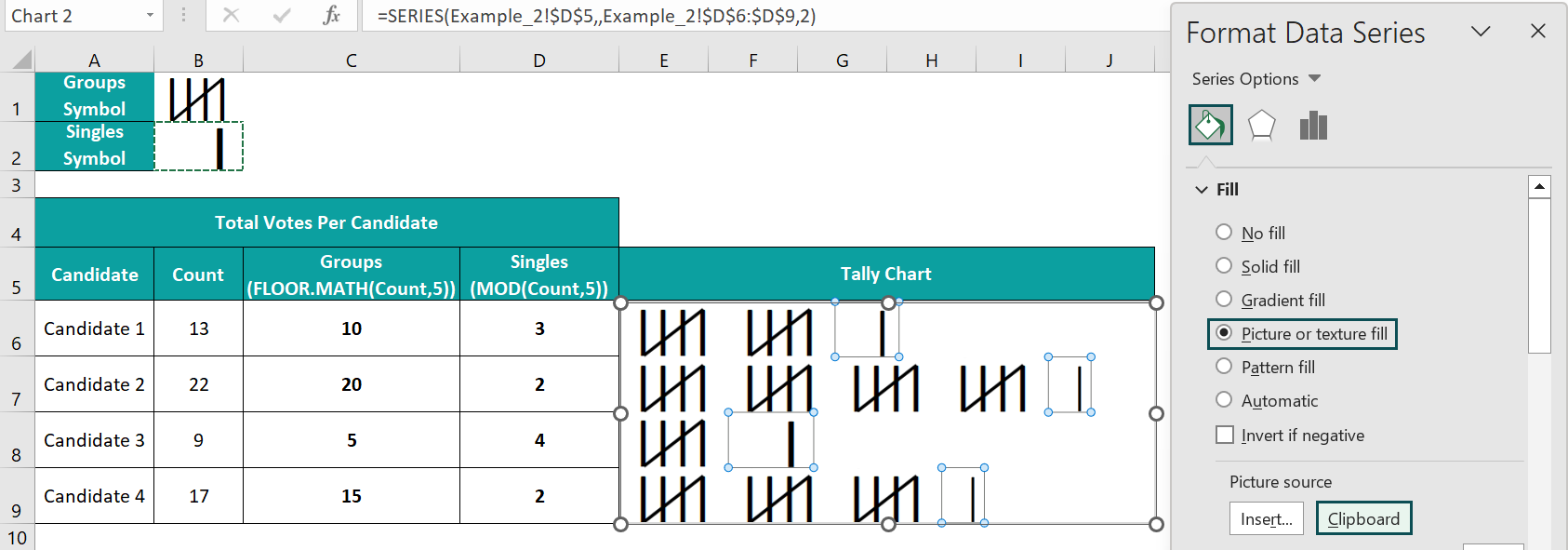
And set the Stack and Scale with to 1.
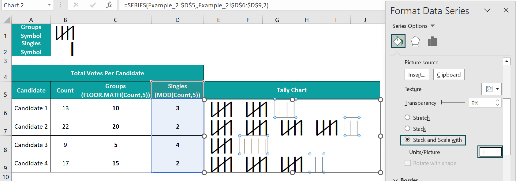
Thus, the final Tally Chart will appear as depicted below:

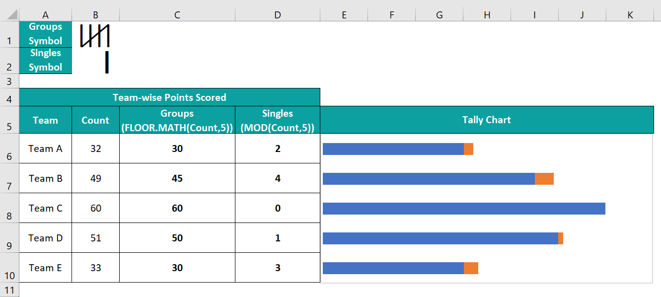
Example #3
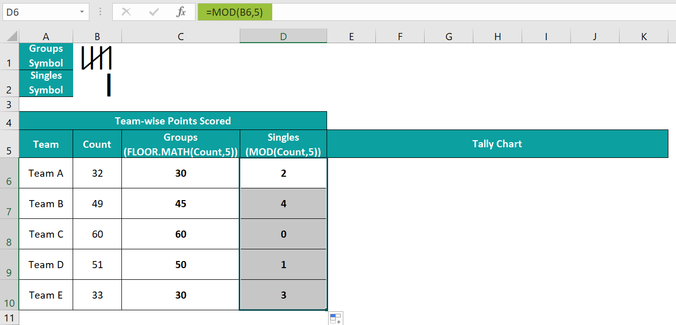
The below table shows the total points scored by each team.

The steps to create a Tally Chart for the above data are as follows:
- 1: Select cell C6, enter the FLOOR.MATH() formula =FLOOR.MATH(B6,5), and press Enter.

Using the fill handle, drag the formula from cell C6 to C10.
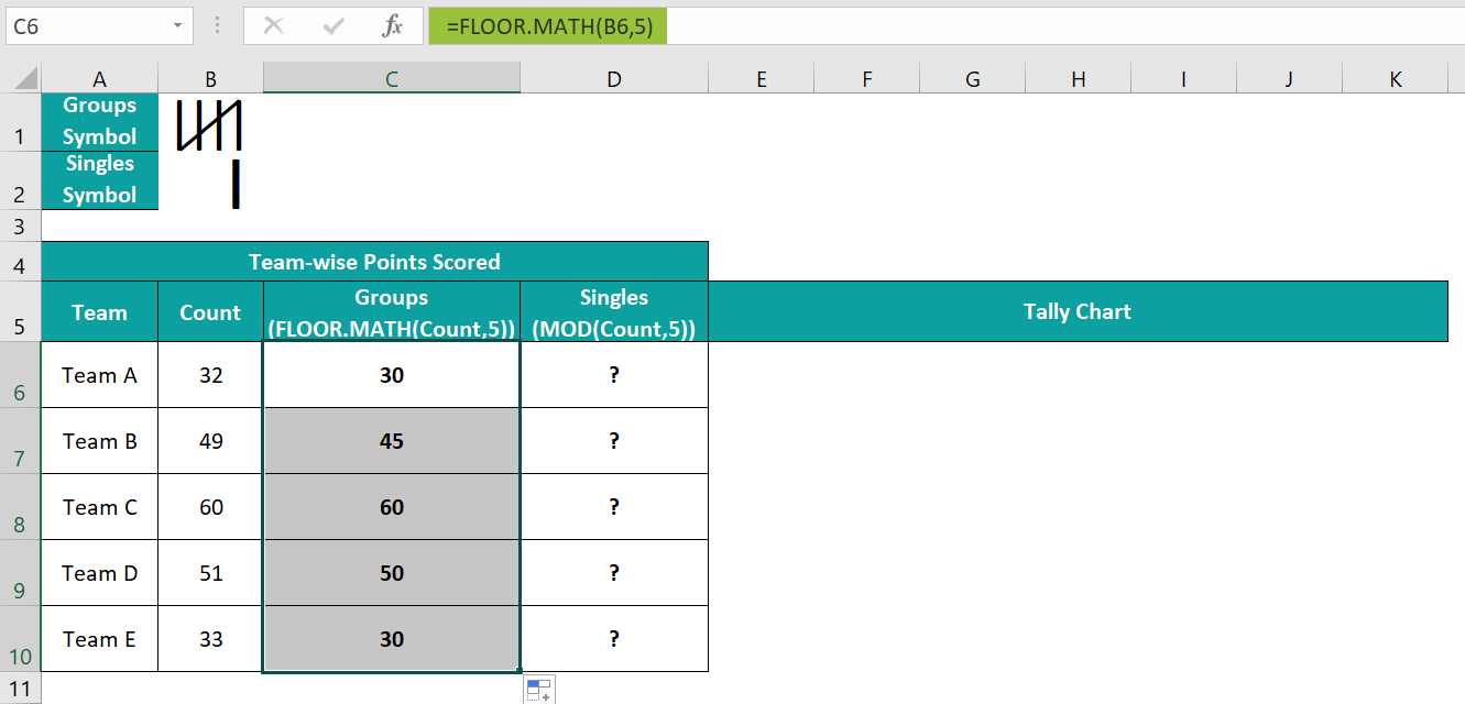
- 2: Select cell D6, enter the MOD() formula =MOD(B6,5), and press Enter.

Using the fill handle, drag the formula from cell D6 to D10.
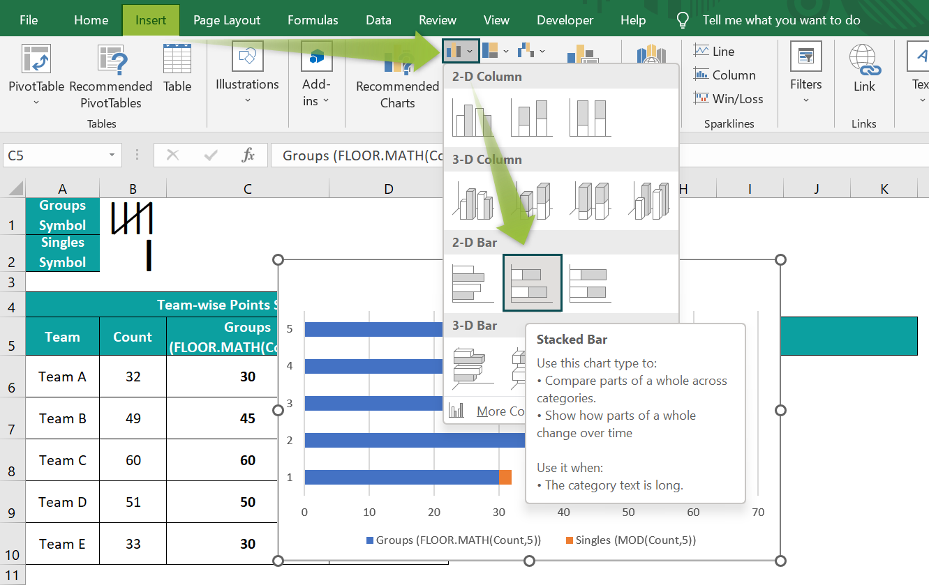
- 3: Select cell range C5:D10, and follow the path Insert → Column or Bar Chart → 2-D Stacked Bar chart to plot a chart for the chosen data.

- 4: Right-click the Y-axis, and select Format Axis from the context menu.

And check the box against the option to reverse the category order in the Y-axis.

- 5: Click the chart area to enable the Chart Elements option (‘+’ icon), and uncheck all the options in the list to remove all the chart elements.
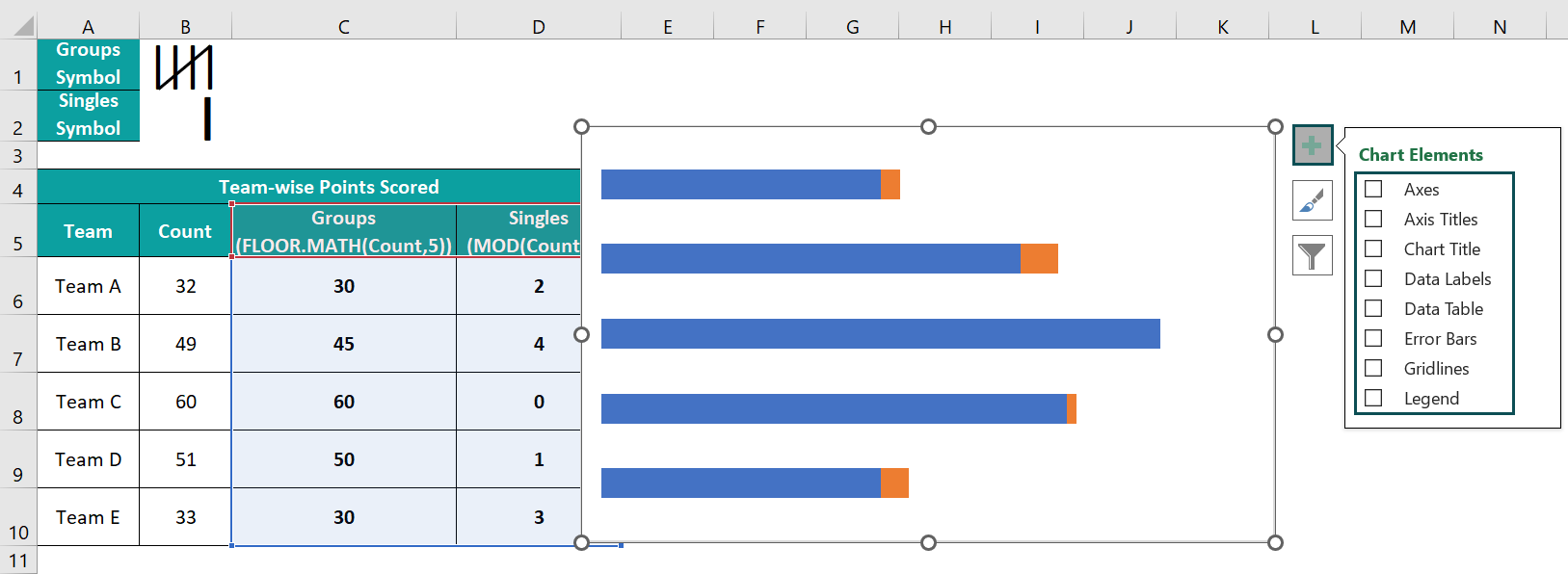
- 6: Make the plot area equal to the chart area, and resize the chart to make it readable.

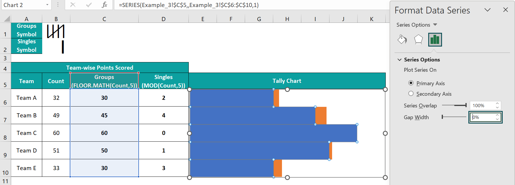
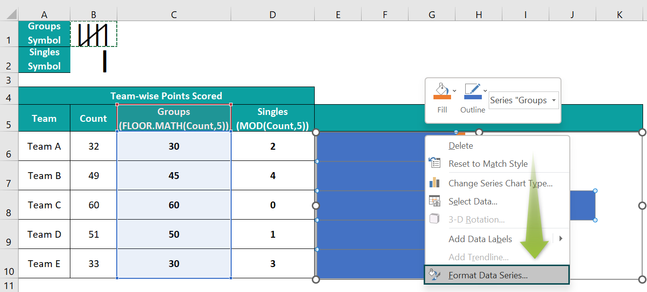
- 7: Right-click a Groups data series in the chart area, and select Format Data Series from the context menu.

And set the Gap Width under Series Options as 0%.
- 8: Select cell B1, and press Ctrl + C to copy the picture. And then, right-click on a Groups data series, and select Format Data Series from the context menu.
Next, select the fourth option as the Fill setting in the Fill tab, and click Clipboard to update the chosen image in the bars.

And set the Stack and Scale with to 5.

- 9: Select cell B2, and press Ctrl + C to copy the picture. And then, right-click on a Singles data series, and select Format Data Series from the context menu.

Next, select the fourth option as the Fill setting in the Fill tab, and click Clipboard to update the chosen image in the bars.

And set the Stack and Scale with to 1.

Thus, the final Tally Chart will appear as depicted below:

Explanation And Uses Of The Tally Chart In Excel
Explanation of a Tally Chart
- We can plot Tally Marks in a worksheet quickly and effortlessly. And the process involves automating the Tally Marks calculations using Excel inbuilt functions, and then plotting the chart using the Stacked Bar chart template.
- A Tally Plot typically contains two Tally Mark types, a group of four lines with a slash passing diagonally through them, representing five marks. And the other form is one line, denoting the remaining marks from the total after splitting it into groups of 5 marks.
Uses of a Tally Chart
- Keep a record of inventories in a worksheet.
- Maintain a record of employee payrolls.
- Formulate a frequency distribution in excel from the given source data.
Important Things To Note
- Set the Font as Calibri Light and the appropriate Font Size in the Home tab while creating the Tally Marks symbols. It will ensure the Tally Chart in Excel will be in the required format.
- Ensure to toggle the Y-axis to have the data points in the chart in the same order as the values in the source data. And maintain a zero-gap width between the bars in the plot to achieve the required Tally Chart.
- Removing all chart elements from the plotted chart area is best to make the Tally Chart more readable.
Frequently Asked Questions (FAQs)
Excel does not have a Tally function or chart.
However, using the FLOOR.MATH() and MOD(), we can create the single and group Tally Mark symbols. And then, we can use the Tally Mark symbols in the Stacked Bar chart to achieve the desired Tally Chart in Excel.
We can use Excel inbuilt functions other than the FLOOR.MATH() to create a Tally Chart.
For example, we can apply the ROUNDDOWN() and achieve the same results.
Let us see the steps with an illustration.
The below table shows the number of buckets of water required to fill four tanks.
The steps to create a Tally Chart using the ROUNDDOWN() are,
• Step 1: Select cell C6, enter the ROUNDDOWN() formula =ROUNDDOWN(B6/5,0)*5, and press Enter.
First, the formula divides the value of 6 by 5 to give the result of 1.2. Next, the ROUNDDOWN() rounds down the value of 1.2 to 0 decimal places to return a value of 1. Finally, the formula multiplies the ROUNDDOWN() output of 1 by 5 and returns the result as 5.
Using the fill handle, drag the formula from cell C6 to C9.
• Step 2: Select cell D6, enter the MOD() formula =MOD(B6,5), and press Enter.
Using the fill handle, drag the formula from cell D6 to D9.
• Step 3: Select cell range C5:D9, and follow the path Insert → Column or Bar Chart → 2-D Stacked Bar chart to plot a chart for the chosen data.

• Step 4: Right-click the Y-axis and select Format Axis from the context menu.
And check the box against the option to reverse the category order in the Y-axis.
• Step 5: Click the chart area to enable the Chart Elements option (‘+’ icon), and uncheck all the options in the list to remove all the chart elements.
• Step 6: Make the plot area equal to the chart area, and resize the chart to make it readable.

• Step 7: Right-click a Groups data series in the chart area, and select Format Data Series from the context menu.
And set the Gap Width under Series Options as 0%.
• Step 8: Select cell B1, and press Ctrl + C to copy the picture. And then, right-click on a Groups data series, and select Format Data Series from the context menu.
Next, select the fourth option as the Fill setting in the Fill tab, and click Clipboard to update the chosen image in the bars.
And set the Stack and Scale with to 5.
• Step 9: Select cell B2, and press Ctrl + C to copy the picture. And then, right-click on a Singles data series, and select Format Data Series from the context menu.
Next, select the fourth option as the Fill setting in the Fill tab, and click Clipboard to update the chosen image in the bars.
And set the Stack and Scale with to 1.
Thus, the final Tally Chart using the ROUNDDOWN() will appear as depicted below:
The significance and divisor arguments in FLOOR.MATH() and MOD() are 5, when using the functions to create a Tally Plot in Excel because of the following reasons:
• Each Tally Mark group contains five vertical lines. So, we require the FLOOR.MATH() to split the given data point into groups of 5 vertical lines.
• Splitting the given value into groups of five vertical lines can leave remainders. So, we require the MOD() to obtain the remainder value.
Use this Tally Chart In Excel Template to follow along with the examples in this article.
Download Excel Template