
What is Bullet Chart in Excel?
Bullet Chart is one of those advanced Excel charts used when you need to present the performance against a goal. It is a variation of the bar chart, developed by Stephen Few as a substitute for meter and gauge charts, especially when vast amounts of data are required. It hardly takes up any space in your dashboard. A bullet chart has the following components: A target marker, an achievement bar, and a comparison range.
Let us look at a brief example of how we can obtain information from a bullet chart in Excel. Here, we have the Qualitative Bands represented in a stacked form to identify the performance levels. Next, we have the horizontal bar in black, which is the Target Marker; here, 90% is the target value we have set. Finally, the Actual Marker in blue shows the actual performance achieved.
Use this Bullet Chart in Excel Template to follow along with the examples in this article.
Download Excel Template
Explanation and Uses
In a Bullet Chart, you have three components, as explained above.
- Comparison bars: These bars create a range of comparisons, like stages towards achievement. In the above example, we have the light green bar representing poor performance from 0-60%; fair is represented from 60-75% in orange, and 75-90% is good, represented in grey. Finally, 90-100% is excellent, represented by the orange shade.
- Target Marker: It shows the target value, and we represent it as a horizontal bar. For example, 90% is the target value in the above example.
- Achievement Bar: It represents the actual value achieved. It is represented by a solid bar, slightly narrower than the comparison bars. In the above example, the black bar indicates the target while the blue bar shows that performance is good, but it doesn’t meet the target.
Key Takeaways
- Bullet Chart is an advanced Excel chart that presents the performance level against a set goal. It takes many steps in Excel to create one. However, it is very compact and accurate.
- It contains three components: Qualitative bars, Target marker, and Actual performance. This helps evaluate the performance achieved immediately. Also, the target and actual values have to be mentioned for comparison.
- You can create horizontal and vertical bullet charts in Excel to represent an evaluation of performance against forecasts, a set goal, etc.
How To Create Bullet Chart in Excel?
Creating a bullet chart in Excel may be more complex than the other charts, which can be made directly in Excel. Still, once you learn to do it, it is highly efficient in compactly showcasing complex information.
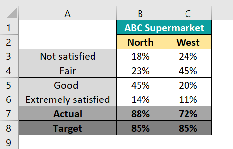
Below is a table which contains the details of customer satisfaction at two branches of a new supermarket. Here, the levels of performance that are set include “Not Satisfied,” “Fair,” “Good,” and “Extremely Satisfied.” Also, observe that both the branches’ target and actual values are mentioned at the bottom of the table.
To make bullet chart in Excel, perform the following steps:
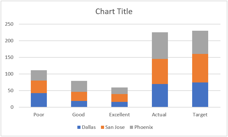
- First, select the data in the table. Next, click on Insert → Go to Charts group → Click on the drop-down arrow in “Insert Column or Bar Chart” → Select the Stacked Column option.

You get a chart as shown below.
- Select the chart by clicking on it, and go to the Chart Design tab. Now, opt for “Switch Rows/Columns.” Here, we get a chart with the bars combined for both the branches.

- Select the topmost bar in green representing the target in this chart. Right-click and choose the option “Change Series Chart Type.”

- In the pop-up window obtained, scroll down, and choose “Target.” Next, modify the chart type to “Stacked Line with Marker.” and check the Secondary Axis check box. Click OK.

You get two green dots joined by a line in the graph. - Click on the axis seen on the right side of the chart and remove it. Now, the chart changes as below.
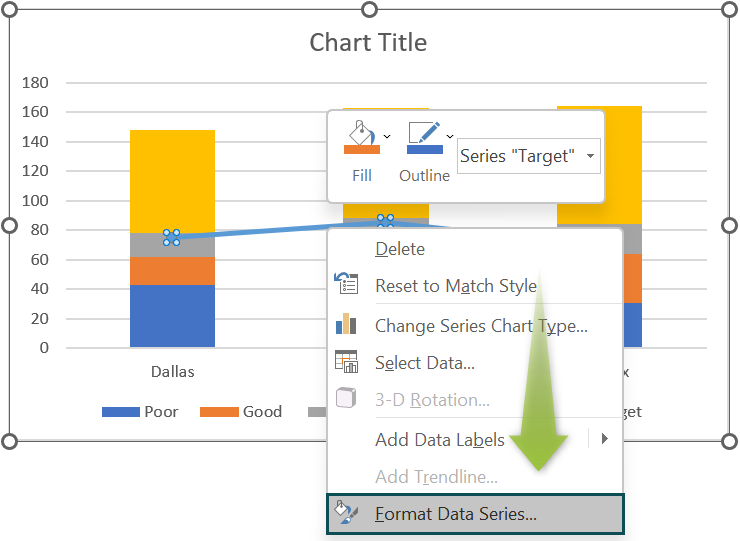
- Let’s create the horizontal bars representing the target values. Select the green markers on the bars and right-click and choose “Format Data Series.”

- In the side pane, Format Data Series, remove the lines connecting the markers as follows:
• Choose the “Line” icon.
• From the options available, select “No Line.”
- In the same pane, choose “Marker.”
• Here, under “Marker Options,” select “Built-in.” as shown in the first picture below.
• In the drop-down list, choose the “-,” and set the size to “20.”
Under Fill:
• Choose “Solid Fill,” click on the “Fill Color” icon, and choose the desired color as shown in the second picture.
• Scroll down to the Border section and select “Solid Line” and the color we have chosen in Fill Color as shown in the third picture.
- Now, select the Actual columns which are in light blue, as shown below. Right-click and choose “Format Data Series.”
- In the pane, choose “Series Option” as shown in the second picture. Choose “Secondary Axis” and set the “Gap width” at 500%. You can also change the color of the bars under the “Fill and Line” option as shown in the first picture.

- You get a graph as shown below:

- You can select each quantitative scale section and color them according to your choice. Series Options → Fill → Solid Fill → Color. After coloring, our chart looks as follows.

• Thus, you can observe at a glance that the North branch has met its target. Its performance is also in the “Extremely Satisfied” range.
• The West branch hasn’t met the target and lies in the range “Good.”


Examples
Let us look at a couple of examples below on how to add the bullet chart in Excel.
Example #1
Below are the revenue details of a business located in different cities. Let us analyze their performance and start building a bullet chart in Excel. Observe the target and actual values for all the cities.

- Step 1: To create a bullet chart in Excel, do the following steps:
First, select the data in the table. Select, click on Insert → Go to Charts group → Click on the drop-down arrow in “Insert Column or Bar Chart” → Select the Stacked Column option.

You get a chart as shown below.
- Step 2: Select the chart, and in the Chart Design tab, click on “Switch Rows/Columns.” Now we get a chart with the bars combined for all branches.

- Step 3: Select the topmost bar in blue representing the target in this chart. Right-click and choose the option “Change Series Chart Type.”

- Step 4: In the pop-up window obtained, scroll down to “Target.”. Next, modify the chart type to “Stacked Line with Marker.” and check the Secondary Axis check box.

You get three blue dots joined by a line in the graph.

- Step 5: Click on the axis on the right side of the chart and remove it. Now, the chart changes as below.

- Step 6: Let’s create the horizontal bars representing the target values. Select the blue markers by clicking on them and right-click and choose “Format Data Series.”
- Step 7: In the side pane, “Format Data Series,” remove the lines connecting the markers as follows:
- Choose the “Line” icon.
- From the options available, select “No Line.”

- Step 8:
- In the same pane, choose “Marker.”
- Here, under “Marker Options,” select “Built-in.”
- In the drop-down list, choose the “-,” and set the size to “20.”
- Under Fill:
- Choose “Solid Fill,” click on the “Fill Color” icon, and choose the desired color.
- Scroll down to the Border section and select “Solid Line” and choose the color chosen in Solid Fill.

- Step 9: Now, select the Actual columns in yellow, as shown below. Right-click and choose “Format Data Series.”

- Step 10: In the pane, choose “Series Option.” Choose “Secondary Axis” and set the “Gap width” at 500%. You can also change the color of the bars under the “Fill and Line” option.

- Step 11: You get a graph as shown below:

- Step 12: You can select each quantitative scale section and color them according to your choice. Series Options → Fill → Solid Fill → Color. After coloring, our chart looks as follows.

- Thus, you can observe from the graph that the Phoenix branch has met its target. Its performance is also in the “Excellent” range.
- The Dallas branch is almost set to meet its target, while the San Jose branch has to work on it as it is fairly away from its set target.
Example #2
Let us take another example of creating a horizontal bullet chart in Excel. Here, students are rated based on their performance. Those who scored between 76-100% are rated as outstanding, 51-75% as good, 26-50% as fair, and 0-25% as poor. The target and actual percentage values are also specified. Below is the table containing their details.

- Step 1: To create a bullet chart in Excel, select the above data and go to the following location.
- Insert → Charts → Insert Bar or Column Chart in excel .
- Select the option “Clustered Bar Chart” under 2-D.

- Step 2: You get a chart as shown.

- Step 3: Now, click on the “Switch Row/Column” option in the “Chart Design” tab.You get a chart as shown below.

You can add the Legends at a spot you like using the “Add Chart Element” option in the “Chart Design” tab.

- Step 4: Select the “Target” bar and choose the Format Data Point option after right-clicking.

- Step 5: Choose the options “No Fill” and “No line“; now, the bar is not visible.

- Step 6: Add an error bar. For this, go to “Add Chart Element” under the Chart Design tab. Choose the option Error Bar 🡪Percentage. You get a horizontal black line in the chart.

- Step 7: Right-click on the bar and choose “Format Error Bars.” Now, in the pane, under “Error Bar Options,” choose the following:
- Direction: Minus
- End style: No cap
- Error Amount → Percentage = 1%.
Under “Fill and Line,” choose Width as 25 pt as shown in the first picture.

- Step 8: You get a vertical line, as shown below in the chart.

- Step 9: Let us also add an Error bar for the Actual bar.
- Select the Actual blue bar.
- Right-click and choose Format Data Series as we did for the Target bar above. Here also, choose “No Fill” and “No Line” under the Fill and Border options, respectively. Therefore, the bar disappears.
- As done above, let us add an Error bar. Go to “Add Chart Element” under the Chart Design tab. Choose the option Error Bar → Percentage.
- You get a horizontal black line in the chart.

- Step 10: Right-click on the horizontal bar and choose “Format Error Bars.” Now, in the pane, under “Error Bar Options,” choose the following:
- Direction: Minus
- End style: No cap
- Error Amount → Percentage = 100%.
- Under “Fill and Line,” choose Width as 15 pt.
Change its color to dark black. You get the chart as follows:

- Step 11: Now, change the color of the Error bar of the Target line by clicking on it and transforming it in the Error Bar Options pane. This color change will help us distinguish it when the bars are merged.

- Step 12: Now, click on any of the comparison bars in different shades of grey. In the “Format Data Series” pane, choose Series Options. Then, change the Series Overlap option to 100%.

- Step 13: You get the following merger horizontal bullet chart in Excel.

Thus, the horizontal bullet chart in Excel gives you an accurate picture of the Actual value and how it is less than the Target in a compact pictorial representation.
Important Points to Remember
- Bullet charts are used in dashboards to compare the results and their performance against a set goal or target.
- They are used to show progress and showcase results against goal.
- Bullet Chart in Excel is compact and does not occupy much space on your dashboard.
Frequently Asked Questions (FAQs)
A bullet chart in Excel is used to show how something performs against a set target or forecast. It is compact and takes less space in reports and dashboards, presenting complex performance information in a simple manner.
A bullet chart in Excel needs a series of complex steps to be followed precisely. Hence, any lapse in any steps could lead to it not working. You also require the data’s three components: comparison, actual, and target values.
A bar chart presents categorical data in rectangular bars with lengths or heights showcasing the values they represent. It is not used to gauge the performance of an entity against a target. However, a bullet chart is helpful as it is more compact than a bar chart and compares performance against the target.
Use this Bullet Chart in Excel Template to follow along with the examples in this article.
Download Excel Template