What Is Column Chart In Excel?
The Column Chart in Excel compares the data values of different categories and pictorially represents them in the form of a chart. It shows the gradual change in data over time in the form of vertical columns, so we can visualize the comparison or data change. They are different types of Column Charts, such as Clustered Columns and Stacked Columns, in 2D and 3D.
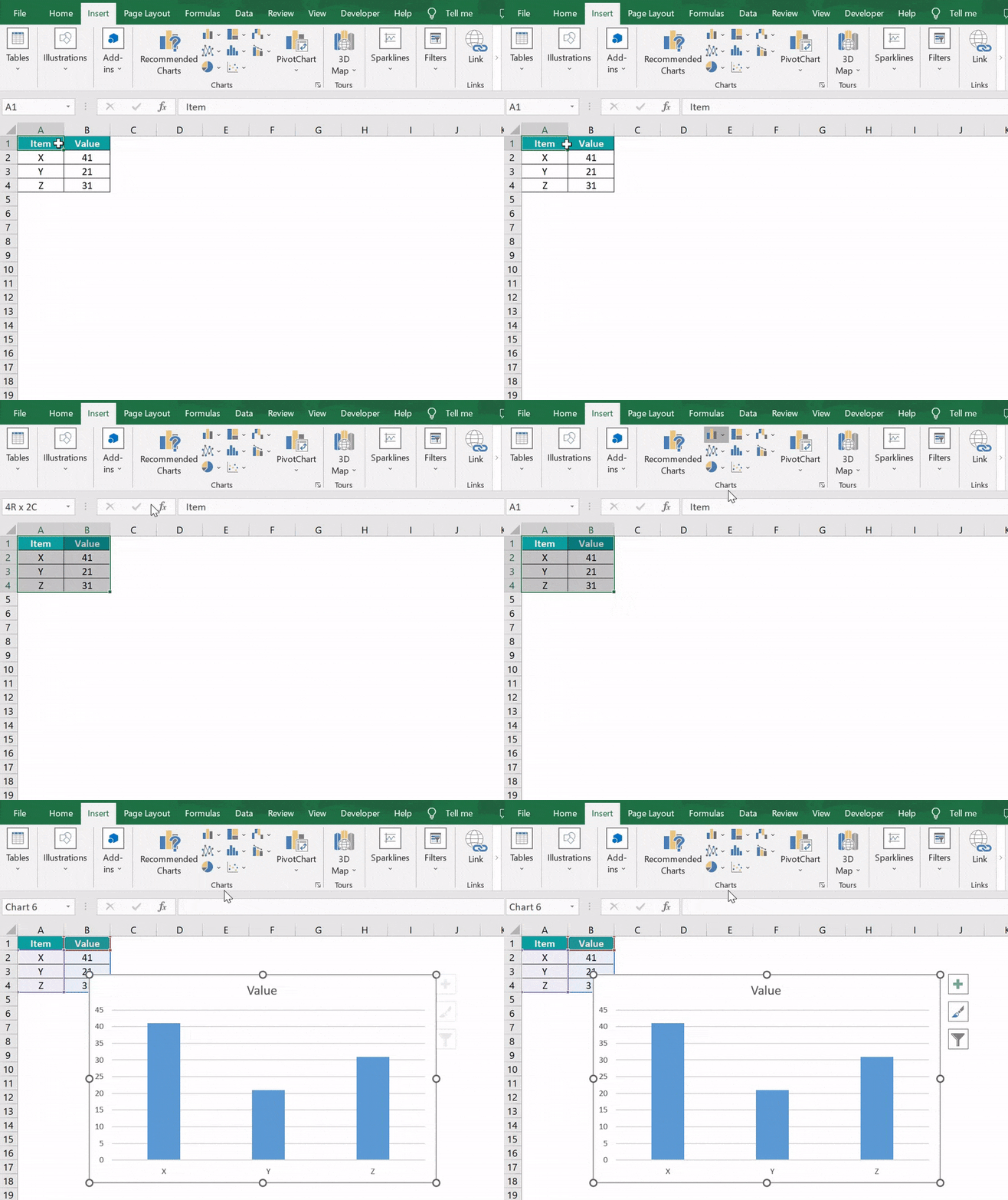
For example, the values of the three items are shown in columns A and B. We will create a Column Chart in Excel using the given data.

Select the cell range, and insert the required column chart from the “Charts” group. The following Column Chart is formed for the given data.
📥Download the ready-to-use Excel template to practice this tutorial yourself.
Column Chart In ExcelTable of contents
Key Takeaways
- The Column Chart in Excel compares the data and displays it pictorially using rectangular bars where the length of the bar is proportional to the data value.
- In the chart, when we select the cell range, the data category appears on the horizontal axis, and the data values are along the vertical axis.
- There are different types of Column Charts, such as Clustered and Stacked Columns, in 2D and 3D groups.
- We can also represent the percentage Column Chart using the 2D or 3D 100% chart types.
- If there is a single data series, it is easy to see the comparison.
How To Create Column Chart In Excel?
We can Create Column Chart in Excel as follows:
First, choose the cell range → select the “Insert” tab → go to the “Charts” group → click the “Insert Column or Bar chart” option drop-down → go to the “2-D Column” group → select the first option, i.e., the “Clustered Column” chart type, as shown below.
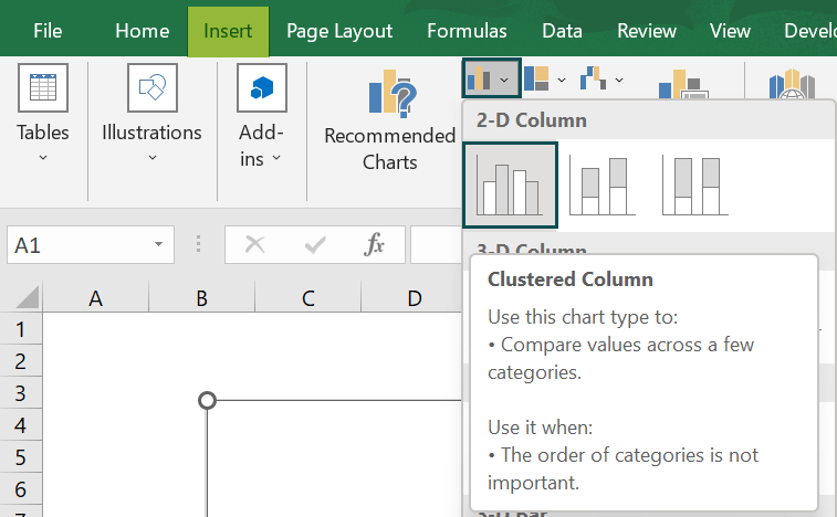
There are various chart types in Column Chart in Excel, namely,
- Clustered Column – It presents more than one data series in clustered vertical columns.
- Stacked Column – It is useful for representing the total (sum) because it visually aggregates all categories in a group.
- 100% Stacked Column – It is helpful to show the percentage of the cumulative data categories and data values of various data series.
Let us take an example to understand this chart.
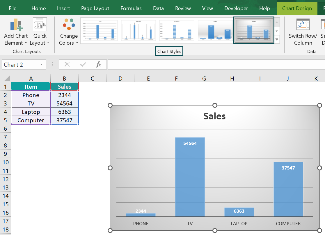
We will insert Column Chart from the given data on Items and Sales.
In the table, the data is,
- Column A shows the Items.
- Column B contains the Sales.

The steps to create the Column Chart in Excel are as follows:
- Choose the cell range A1:B5 → select the “Insert” tab → go to the “Charts” group → click the “Insert Column or Bar chart” option drop-down → go to the “2-D Column” group → select the first option, i.e., the “Clustered Column” chart type, as shown below.

- The Column Chart is created, and the “Chart Design” tab appears. Select the “Chart Design” tab → select the desired format from the “Chart Styles” group. The final Column Chart is shown below.

Examples
We will understand some other Column Chart types with some examples.
Example #1 – Stacked Column
We will create the Stacked Column Chart in Excel from the data of the Company and its turnover.
In the table, the data is,
- Column A shows the Company Names.
- Column B contains the Turn Over.

The steps to the Stacked Column Chart in Excel are as follows:
- Step 1: Choose the cell range A1:B5 → select the “Insert” tab → go to the “Charts” group → click the “Insert Column or Bar chart” option drop-down → go to the “2-D Column” group → select the second option, i.e., the “Stacked Column” chart type, as shown below.
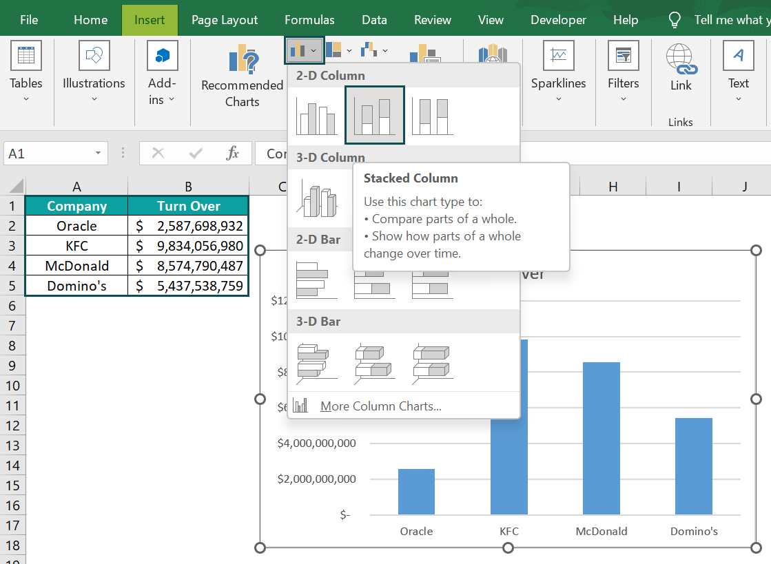
- Step 2: The Column Chart is created, and the “Chart Design” tab appears. Select the “Chart Design” tab → select the desired format from the “Chart Styles” group.

The output of the Stacked Column Chart in Excel is shown above.
Example #2 – 3-D Clustered Column
We will create the 3-D Clustered Column Chart in Excel from the given student’s Marks.
In the table, the data is,
- Column A shows the Subjects.
- Column B contains the Marks of John.
- Column C contains the Marks of Ron.
- Column D contains the Marks of Harry.
- Column E contains the Marks of Jenifer.

The steps to create the 3-D Clustered Column Chart in Excel are as follows:
- Step 1: Choose the cell range A1:E6 → select the “Insert” tab → go to the “Charts” group → click the “Insert Column or Bar chart” option drop-down → go to the “3-D Column” group → select the first option, i.e., the “3-D Clustered Column” chart type, as shown below.
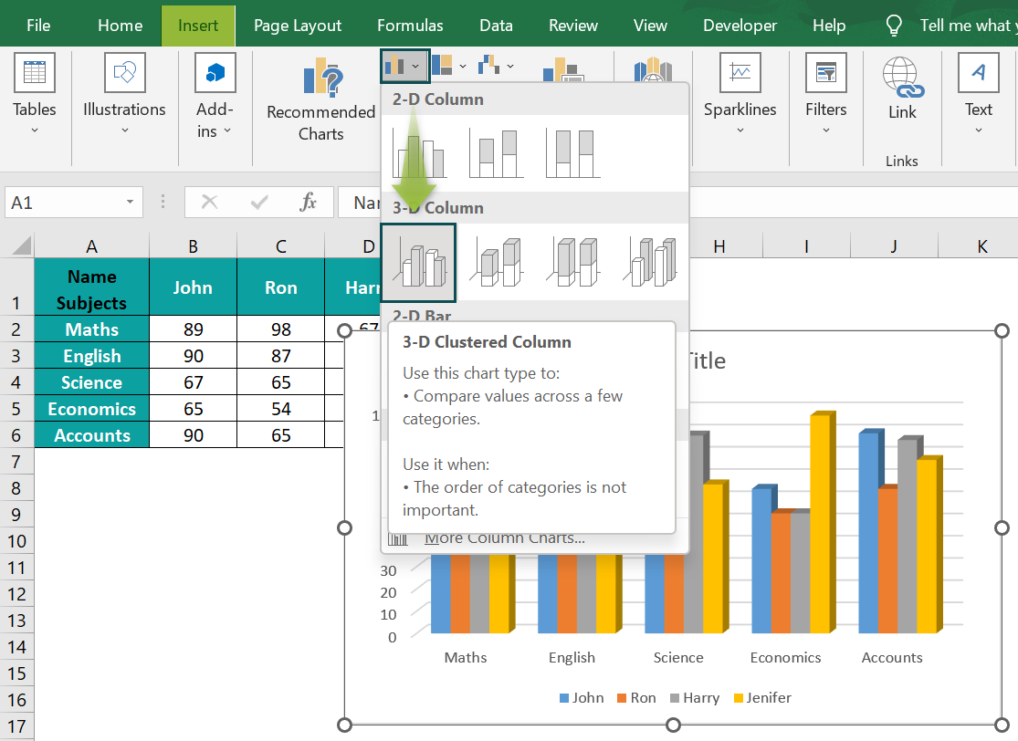
- Step 2: The Column Chart is created, and the “Chart Design” tab appears. Select the “Chart Design” tab → select the desired format from the “Chart Styles” group.
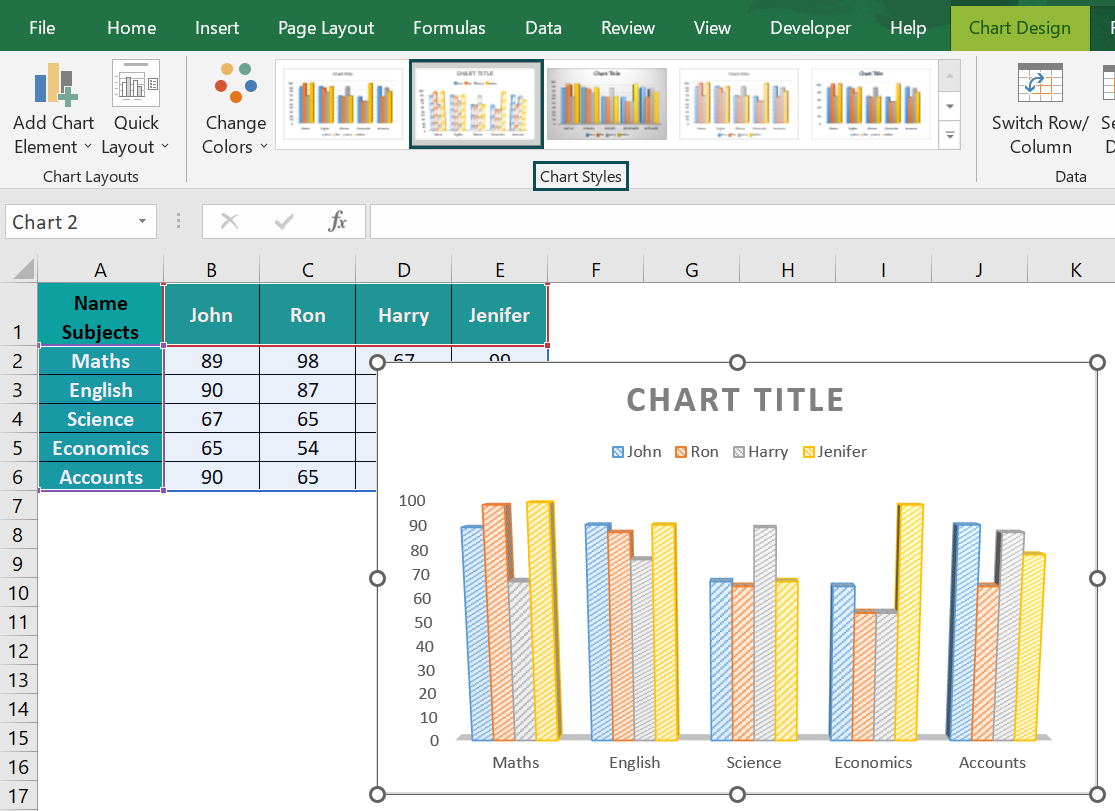
The output of the 3-D Clustered Column Chart in Excel is shown above.
Use Of Column Chart
- The Column charts in Excel are simple to create with just a few clicks.
- MS Excel offers a variety of formatting options and chart types.
- We can insert a secondary axis and trendlines.
- The chart helps us see the improvements toward the set target, the impact and the data distribution w.r.t the target.
Important Things To Note
- The Column Chart displays data using rectangular bars where the length of the bar is proportional to the data value. But excel bar charts are useful when we have long category labels.
- Various colors are used for bars to contrast and highlight data in the chart.
- We can edit the chart titles and axis titles as per our requirements.
- The graph representation always starts with zero and uses it while comparing.

Frequently Asked Questions (FAQs)
• The Column Chart in Excel is easy to create and comprehend the accuracy and reasonableness of calculations.
• Each bar represents only one series and can be used to represent negative values.
• Display relative numbers or proportions of multiple categories in a stacked column chart.
• The Column chart helps summarize a large amount of data visually and is easily interpretable.
First, choose the cell range → select the “Insert” tab → go to the “Charts” group → click the “Insert Column or Bar chart” option drop-down → go to the “2-D Column” group → select the first option, i.e., the “Clustered Column” chart type, as shown below.
We will create the Percentage in a Column Chart from the given fruits data using the 3-D 100% Stacked Column chart type.
In the table, the data is,
• Column A shows the Fruits.
• Column B contains the Price.
• Column C contains the Quantity.
The steps to create the Percentage in Column Chart in Excel are as follows:
• Step 1: Choose the cell range A1:C10 → select the “Insert” tab → go to the “Charts” group → click the “Insert Column or Bar chart” option drop-down → go to the “3-D Column” group → select the first option, i.e., the “3-D 100% Stacked Column” chart type, as shown below.
• Step 2: The Column Chart is created, and the “Chart Design” tab appears. Select the “Chart Design” tab → select the desired format from the “Chart Styles” group.
The output of the 3-D 100% Stacked Column Chart in Excel is shown above.
Download Template
📥Download the ready-to-use Excel template to practice this tutorial yourself.
Column Chart In ExcelRecommended Articles
This has been a guide to Column Chart In Excel. Here we create Column charts & their 2D/3D clustered/stacked, types, Examples & a downloadable excel template. You can learn more from the following articles –


Leave a Reply