What Is Pareto Chart In Excel?
A Pareto chart in Excel is a statistical chart that works according to the 80/20 principle. It comprises a bar plot and line graph. While the bar chart displays the frequencies in descending order, the line graph represents its cumulative total. The Pareto chart helps users identify the critical defects they should prioritize to achieve a notable overall improvement.
For example, the below table shows the customer complaints and their frequencies at a retail store.
📥Download the ready-to-use Excel template to practice this tutorial yourself.
Pareto Chart In Excel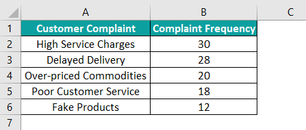
Once we insert a Pareto chart in Excel for the above table, we can review the complaints to understand which ones to focus on to yield improved outcomes.
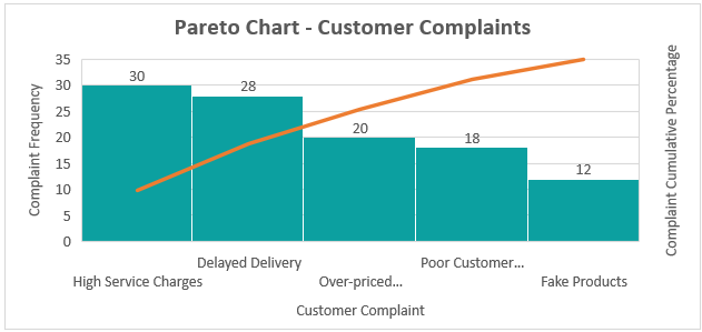
The above Pareto chart in Excel example shows the most-significant customer complaints and their relative importance in the total. They are High Service Charges and Delayed Delivery, which need our attention. On the other hand, the Pareto chart in Excel will help us infer that for most events, nearly 80% of the effects are due to 20% of the causes, proving the 80/20 principle.
Table of contents
Key Takeaways
- A Pareto chart in Excel shows the defect frequencies using a Bar chart and the cumulative total using a Line graph. Together, they help users identify improvement areas to work on to achieve a better outcome.
- We can create a Pareto chart using the Pareto chart type from the Histogram chart category in the Insert tab.
- If our Excel version is older than 2016, create a Pareto chart manually using a Custom Combination chart under Combo chart type, containing 2-D Column and Line graphs.
- We can create a dynamic Pareto chart by inserting a Scroll Bar from the Developer tab.
How To Make/Create Pareto Chart In Excel?
The Pareto chart in Excel template is available as an in-built feature in Excel version 2016 and above. The below illustration shows how to create a Pareto chart in Excel using the template.
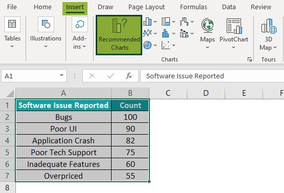
Suppose the following table is our source data.
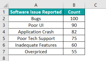
The steps to create and insert a Pareto chart in Excel for the above table are:
Step 1: First, click on a cell in the above table to select the entire table.
And then, choose the options Insert > Insert Statistic Chart > Pareto.
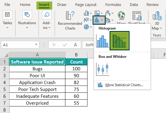
Alternatively, we can select the table and choose the Insert > Recommended Charts option.
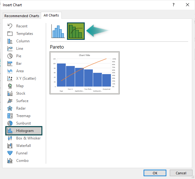
The Insert Chart window opens up. Then, click on Histogram from the menu in All Charts tab and pick Pareto chart type.
Once we pick the highlighted Pareto chart in Excel template, the outcome will appear as shown below.
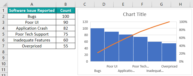
Please Note: Even if the source data’s frequency or count of issues is not in descending order, the Pareto chart in Excel will sort the data. And we will view the bars in descending order representing the sorted data in the graph. And the cumulative percentages (Line graph) in the secondary axis indicate the percentage of issues that can get removed when the most critical issues get resolved.
Step 2: Next, click the chart area to enable the Chart Elements option. And then select the options highlighted in the below image.

Once we update the Chart Title, Axis Titles, and resize the chart, the outcome will appear as shown in the below image.
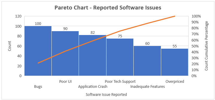
The interpretation of the above Pareto chart in Excel example is as follows:
- Bugs and Poor UI are the two most frequently reported issues.
- The Line graph, representing the Pareto chart in Excel cumulative percentage of issues, is steep. Thus, the different issues have a significant cumulative impact on the outcome. And it is best to identify the cause of these issues and solve them to ensure the software meets customers’ expectations.
But, suppose we need to create a Pareto chart in Excel, but our Excel version is old, before 2016. Then we would need to build the graph manually.
Assume the below table contains the source data.

Step 1: To begin with, we must ensure that the source data lists all the required cause categories and their frequencies or counts.
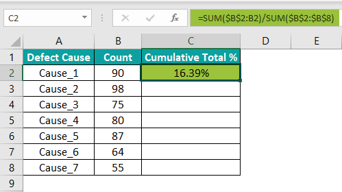
Step 2: In this step, we shall determine the Pareto chart in Excel cumulative percentage.
Next, add another column, Cumulative Total %. Then, choose cell C2 and enter the formula mentioned in the Formula Bar.
Also, ensure the column C values have the Number Format set as Percentage.
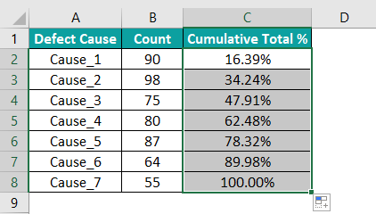
Next, copy the above formula in cell range C3:C8 using the fill handle.
Step 3: As mentioned previously, a Pareto chart shows count data in the form of bars in descending order. Thus, sort column B, Count, in descending order.
Choose any cell in column B of the table and click the descending order Sort option from the Data tab.
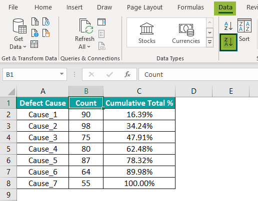
The column C data gets updated automatically.
Step 4: Click on a cell in the table to select the entire table and choose the option Insert > Recommended Charts.

In the Insert Chart window, open the All Charts tab and choose Combo > Custom Combination chart type.
Ensure the Count and Cumulative Total % fields have Clustered Column and Line as the chart types. Also, check the Secondary Axis box for the Cumulative Total % field.
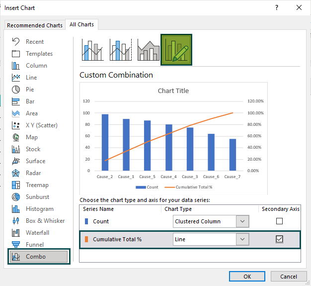
Once we click OK, the resulting Pareto chart will be:
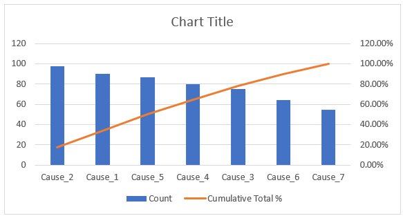
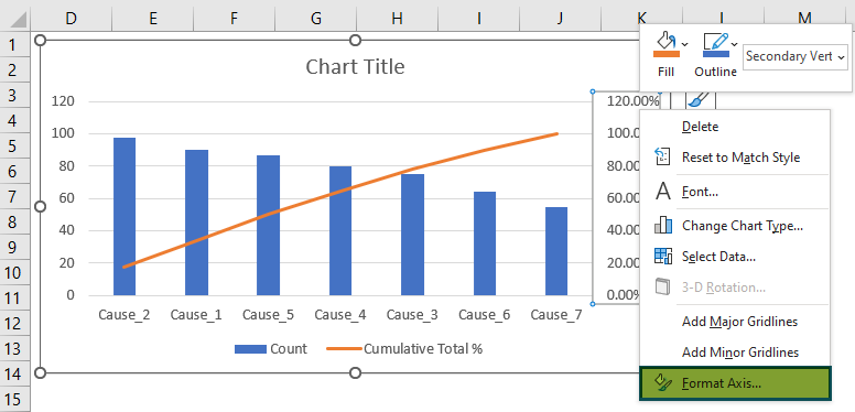
Step 5: Right-click on the secondary Y-axis and choose the Format Axis option from the context menu.
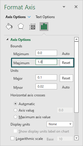
In the Format Axis window, set the option Maximum under Bounds as 1.0 to make the maximum percentage in the secondary Y-axis 100%.

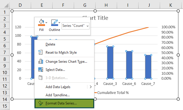
Step 6: Right-click on a bar to select the entire data series and choose the Format Data Series option from the context menu.
In the Format Data Series window, set the Gap Width in the Series Options tab as 5%. It will make the bar graph appear more like a Pareto chart.

Finally, update the Chart Title, Data Labels, and Axis Titles (discussed previously) and remove the Legend using the Chart Elements option.
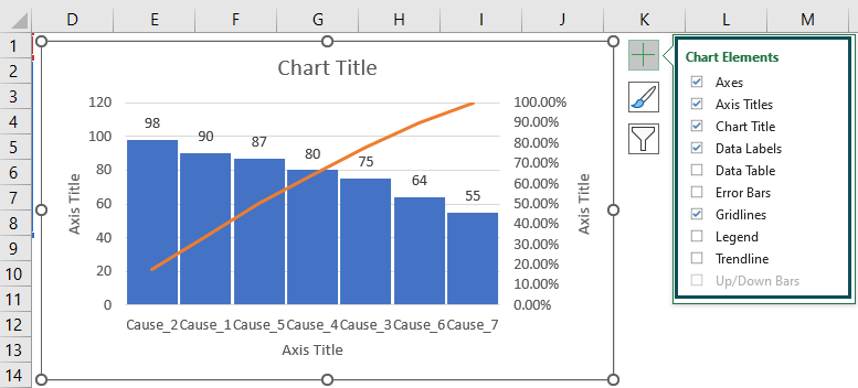
The final Pareto chart in Excel will appear as,

Create Dynamic Pareto Chart In Excel
A dynamic Pareto chart in Excel makes the graph highly interactive. Let us see how to create one with an example.
Suppose the below table is our source data. The Number of Complaints is in descending order, and the Cumulative Total % calculation is as discussed in the previous section.

Step 1: Add new columns and rows as depicted in the image below.

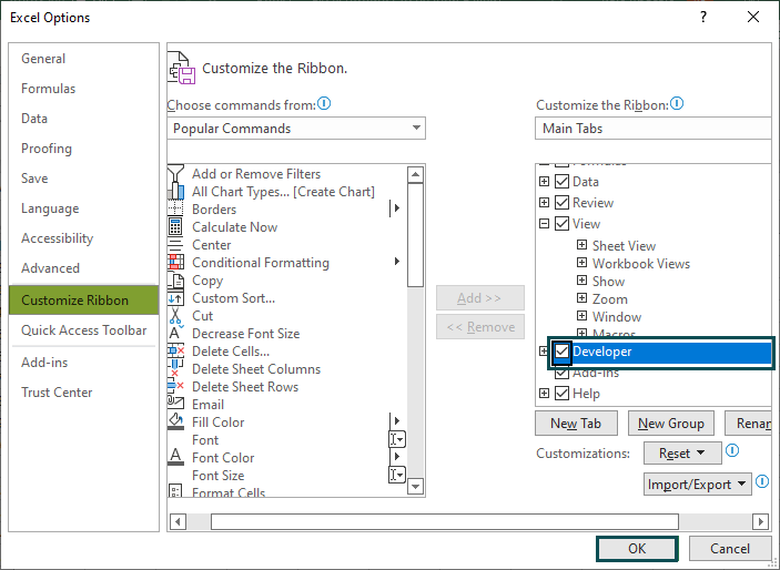
Step 2: Right-click on the Excel ribbon and choose Customize the Ribbon option.

In the Excel Options window, the Customize Ribbon tab will open where we need to check the Developer box in the Main Tabs list to enable Developer tab in Excel.
Step 3: Now select Developer > Insert > Form Controls > Scroll Bar and click on the active spreadsheet.
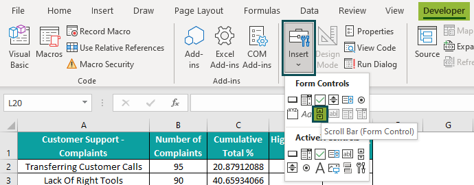
We will now have the Scroll Bar in our active sheet.
Step 4: Adjust the Scroll Bar to create a horizontal one.

Step 5: Right-click on the Scroll Bar and choose Format Control from the context menu.

In the Control tab of the Format Control window, set the below settings and enter the Cell link as $B$11, the Scroll Bar Value.

Once we click OK, the Scroll Bar Value gets updated.

Step 6: In cell B9, enter the formula to determine Target as:
=B11

Step 7: Calculate the Cumulative Value in cell B10 using the formula in the Formula Bar.
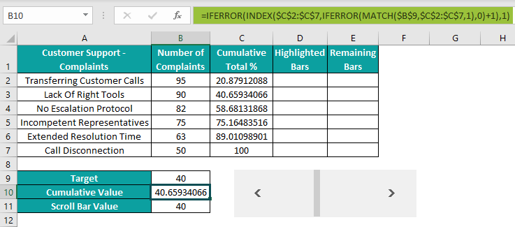
Step 8: Now, choose cell D2 and enter the formula provided in the Formula Bar.

Using the fill handle, copy the formula in the range D3:D7.

Step 9: Choose cell E2 and enter the formula as depicted below:

Using the fill handle, copy the formula in cells E3:E7.
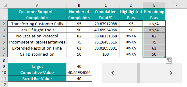
Thus, the current Scroll Bar position highlights the first two complaint counts.
Step 10: Select all the columns in the table, leaving column B, and then choose the option Insert > Recommended Charts.

Go to the All Charts tab in the Insert Chart window and choose the Combo > Custom Combination chart type.
Set the Highlighted Bars and Remaining Bars fields chart type as Clustered Column and for Cumulative Total % field as Line. Also, enable the secondary axis for the Cumulative Total % field.
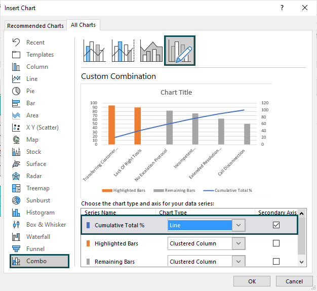
Click OK to get the below dynamic Pareto chart in Excel.
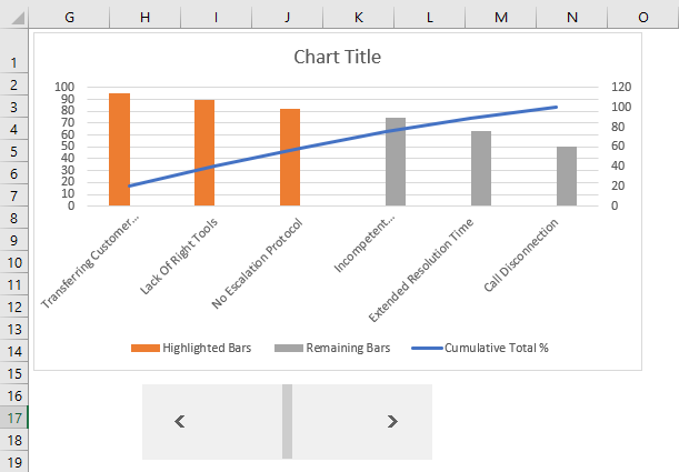
Update the chart elements, and adjust the secondary Y-axis maximum value and the gap width between the bars (as explained previously) to get the required dynamic Pareto chart.

We can now scroll the horizontal scroll bar below the Pareto chart and analyze different scenarios based on the calculated Target, Cumulative Value, and Scroll Bar Value.
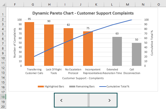
Please Note: As we scroll the scroll bar, the chart changes dynamically. The reason is that the Target, Cumulative Value, and Scroll Bar Value change.
And they change the table data, as the formulas in the table use these values in the calculations.
Uses Of Excel Pareto Chart
The uses of the Pareto chart in Excel feature are:
- Analyze the frequency of issues in a process.
- Determine the critical reasons for issues in a process.
- Identify the critical defects in an item.
- Locate the snags in a process sequence.
- Assess the improvement areas that can lead to higher profit margins.
Important Things To Note
- A Pareto chart in Excel helps users determine the defects that impact the outcome the most; it is also known as the 80/20 rule.
- It is a combination of a line graph and bar chart in Excel.
- The Pareto chart type is available in Excel 2016 version and above.
- If creating a Pareto chart manually, ensure the frequency or count data is in descending order.
- Enable the secondary Y-axis for the Line graph, which displays the cumulative total percentage.
- We can also customize the Pareto charts, i.e., we can change the style, color, etc.,

Frequently Asked Questions (FAQs)
Pareto chart in Excel is available under the Histogram chart type in the Insert tab.
However, this feature is unavailable in Excel with versions older than 2016. So, we will have to create the chart manually using a Custom Combination chart containing a 2-D Column chart and Line graph.
We can interpret the Pareto chart in Excel as shown below:
1. The primary axes plot the bar graph showing the defect frequencies in descending order. Thus, we can determine those defects that impact the outcome the most.
2. The secondary Y-axis comes into the picture when we analyze the cumulative total % using the Line graph. We can determine the percentage of defects that can get eliminated once we resolve the most critical issues.
3. If the line is steep, the various defects have a notable cumulative impact on the outcome and require focus.
We can’t find the Pareto chart in Excel, perhaps because we have an Excel with a version older than 2016.
We can show percentage in Pareto chart in Excel in the secondary Y-axis by choosing the Pareto chart, available under the Histogram chart type in the Insert tab.
Suppose our source table contains the different product complaint types and their frequencies.
We can create a Pareto chart showing the percentage.
If our Excel version is 2016 or above, the steps are:
Step 1: Select the cell range A1:B6 and click Insert > Recommended Charts > All Charts > Histogram > Pareto.

And once we click OK, we will see a Pareto chart in our worksheet with the percentages on the secondary axis.
Step 2: Update the Chart Title, Data Labels, and Axis Titles (discussed in the above article) using the Chart Elements option.
Once we update the above elements, the final Pareto Chart will appear as shown in the image below:
Otherwise, when we manually create a Pareto chart using the 2-D Column chart, we can set the chart type of the cumulative total % as Line and enable its secondary axis. Then, enable the data labels for the Line graph to view the percentage in the Pareto chart. [Refer to section How to Pareto Chart in Excel?]
Download Template
📥Download the ready-to-use Excel template to practice this tutorial yourself.
Pareto Chart In ExcelRecommended Articles
This has been a guide to Pareto Chart In Excel. Here we discuss how to create dynamic pareto chart with examples and downloadable excel template. You can learn more from the following articles –

Leave a Reply