
What Is Clustered Column Chart In Excel?
The Clustered Column chart in Excel is a vertical column chart containing a group of columns, in series, for each category. It enables one to represent subcategories based on different dimensions visually.
Users can use the Clustered Column chart to compare data over multiple interrelated categories, such as sales figures and stats that change over time.
Use this Clustered Column Chart In Excel Template to follow along with the examples in this article.
Download Excel TemplateFor example, the below table shows a firm’s region-wise quarterly sales figures, and we will analyze the data visually using the 2D Clustered Column chart.

Select cell range A1:E6, and enter the 2D Clustered Column chart from the charts group.

Output Observation:
- The above imageshows a cluster of four bars for each quarter representing the sales in the four regions, in the order of Region1 to Region4.
- Region4 in Q4 showed the highest sales of $36 thousand.
- Region3 registered the lowest sales of $5 thousand in Q3.
- The firm performed exceptionally well in Q4 compared to the other quarters.
Key Takeaways
- The Clustered Column chart in Excel shows the given data categories in clusters of bars arranged in a series.
- Users can use this chart to assess data across interrelated categories and stats which change over the specified period.
- The Clustered Column chart is available in the Insert tab. We can use the Recommended Charts option or click the required Column chart type from the Column or Bar Chart option to insert a Clustered Column chart.
- The keyboard shortcut Alt + F1 inserts a Clustered Column chart as a default chart.
How To Create Clustered Column Chart In Excel?
We can create the Clustered Column chart in Excel in 2 ways, namely,
- Access from the Excel ribbon.
- Use the keyboard shortcut.
Method #1 – Access from the Excel ribbon
Choose the cell range of the required data → select the “Insert” tab → go to the “Charts” group → click the Recommended Charts option, as shown below.

The Insert Chart window appears. Click the “All Charts” tab → select the “Column” chart type from the list on the left → select the desired Chart Styles from the options on the right → click “OK”, as shown below.

[Alternatively, we can select the cell range of the data to plot → select the “Insert” tab → go to the “Charts” group → click the “Column or Bar Chart” option drop-down, as shown below.

In the “Column or Bar Chart” option drop-down, select the “Clustered Column” chart type from the “2-D Column” category, as shown below.

And clicking the highlighted Column plot option will insert a Clustered Column chart in Excel worksheet, as shown above.
Method #2 – Use the Keyboard Shortcut
Select the cell range of the required data to plot and press Alt + F1. The keyboard shortcut in excel will insert the Clustered Column plot in the active worksheet as the default chart.

The above methods will help us access the Clustered Column chart. However, we can modify the graph to display the desired data.
We will plot a Clustered Column chart for the below table that shows the monthly customer votes data for two brands.

The steps to create a Clustered Column chart for the given data are,
- Select cell range A2:E4, and follow the path Insert → Recommended Charts.

Click All Charts → Column → 2-D Clustered Column chart. And then click OK to complete the action.
The chart generates as shown below.
[Alternatively, select the cell range A2:E4, and click Insert → Column or Bar Chart → 2-D Clustered Column chart.

And once we click the highlighted Column chart, we will get the above-depicted 2-D Clustered Column chart.]
[Note: On the other hand, selecting the cell range A2:E4 and pressing Alt + F1 will insert the 2-D Clustered Column chart as the default graph.] - To show the cluster of columns for each category distinctly, right-click on the second bar in the chart area, and select the Format Data Series option from the context menu.

- The Format Data Series window opens, set the Series Overlap and Gap Width options under Series Options, as shown below.

The above step will make the clustered columns appear more clearly, as shown below:
- : Click anywhere in the chart area to enable the Chart Elements option (‘+’ icon), and check the Axis Titles box.

- Update the chart and axis titles by double-clicking the respective elements one at a time in the chart area, as shown in the images below.


Thus, the final 2-D Clustered Column chart will be:
Output Observation:
• The above plot shows each brand’s total customer votes each month in the form of a column or bar. While the Blue bars represent the data points of the brand Apple, the Orange bars show the brand Samsung’s data points.
• The brands received the maximum customer votes in April.
• Among the two brands,
৹ Samsung got the maximum votes, 6945.
৹ Samsung got the least votes, 1479.
৹ Apple received more votes than Samsung in Jan-Mar.


Examples
We will consider some advanced scenarios using the Clustered Column chart examples.
Example #1
The below table shows the units ordered data for the listed items in the specified months at a Houston warehouse. Also included is the required target unit data for each item. The requirement is to check visually the items that met the targets during the specified months.

The steps to create the Clustered Column chart for the required analysis are,
- Step 1: Select the cell range A2:D13, and follow the path Insert → Column or Bar Chart → 2-D Clustered Column chart.

Clicking the highlight chart option will give the below graph.

- Step 2: Right-click the second bar in the chart, and select the Format Data Series from the context menu.

- Step 3: The Format Data Series window opens, set the Series Overlap and Gap Width options under Series Options as shown below. This setting will make the clustered columns appear more clearly.

So, the Clustered Column chart will be:

- Step 4: Next, to change the Target data series chart type to a Line chart to ensure we can compare each item, click on any Target data series bar (Orange column), and select Design → Change Chart Type.

- Step 5: The Excel Combo chart type under the “All Charts” tab in the Change Chart Type window appears.

Click the Target series Chart Type drop-down button and select the Line chart in excel, as shown below.

Next, we will see the preview, as shown below.

Finally, click OK and update the chart and axis titles in the chart area (as explained in the previous section). We will get the following graph.

Output Observation:
- The units ordered met the targets for the Smartphone in March, Laptop in February, and Desktop in January.
- The units ordered exceeded the targets for the Smartphone and Desktop in February.
Example #2
The table below shows a firm’s yearly sales figures and profit margins. The requirement is to compare the sales and profit margins.

The steps to create the Clustered Column chart are,
- Step 1: Click on a cell in the above table, and follow the path Insert → Column or Bar Chart → 2-D Clustered Column chart.

Clicking the highlight chart type will result in the following graph.

But the column that must form the X-axis contains numbers (years), making the bars in the plot represent incorrect data. So, we must modify the selected data.
- Step 2: Click the chart area to enable the Design tab and click the Select Data option.

The Select Data Source window opens.

- Step 3: Update the Chart data range to plot the sales and profit margin data. And then click Edit under the Horizontal Axis Labels field.

The Axis Labels window opens.

- Step 4: Enter the axis label range, as shown below, to have the years along the X-axis, and Click OK.

- Step 5: Click OK in the Select Data Source window to close it.

So, the Clustered Column chart will be:

The above chart plots the sales and profit margin figures. But we can see only the sales bars. The reason is that the profit margin values are relatively less than the sales figures.
- Step 6: To show the profit margin data series with the sales figures, we can use an Excel Clustered Column chart with secondary axis. Click the chart area and go to Design → Change Chart Type.

The Change Chart Type window opens.

- Step 7: Go to the Combo chart type, click the Profit Margin (%) series chart type drop-down button, and click the Line chart. And check the Secondary Axis box against it.


Click OK. Finally, once we update the chart and axis titles, as explained earlier, we will obtain the following Excel Clustered Column chart with secondary axis.

Thus, the above plot shows that the firm registered exceptional sales and profit margin in 2021, right after a poor performance in 2020.
Example #3
We will create a 3D Clustered Column chart in Excel for the below table that shows a person’s monthly income and savings data.

The steps to create a 3d Clustered Column chart in Excel are,
- Step 1: Click on a cell in the table, and select Insert à Recommended Charts.

- Step 2: The Insert Chart window opens, go to All Charts → Column chart → 3-D Clustered Column chart. And click the required plot.

Click OK to get the below chart.

And once we update the chart and axis titles, the final 3-D Clustered Column chart will appear as shown below:

Output Observation: In the above plot, the person’s income and savings were the highest in April.
Clustered Column Chart Vs Column Chart
The differences between a Clustered Column chart and a Column chart in excel are as follows:
- When the source data includes multiple variables, we use the Clustered Column chart. On the other hand, if the source data includes only one variable, we use a Column Chart.
- A Clustered Column chart enables one to compare a group of variables with another set of variables across a subcategory. But, in the case of a Column chart, we can check a variable against the same group of other variables.
Pros And Cons
The pros of a Clustered Column chart are as follows:
| Pros | Cons |
|---|---|
| It enables one to compare multiple data series in each given category. | Comparing a single data series across different categories is challenging. |
| We can show the changes in a variable over time. | Adding more categories or data series makes the plot harder to interpret. |
Important Things To Note
- Ensure the source data contains smaller datasets to avoid clutter in the plotted Clustered Column chart in Excel.
- Avoid 3-D effects in a Clustered Column chart, as they might distort and misrepresent the data.
- Set the appropriate Series Overlap and Gap Width settings under Series Options in the Format Data Series window for the last bar in each category. It will ensure the clusters of columns are distinctly visible.
Frequently Asked Questions (FAQs)
The Clustered Column chart in Excelis in the Insert tab. We can use the Recommended Charts option or the Column or Bar Chart option to insert a Clustered Column chart.
We can add percentages in the Excel Clustered Column chart using the following steps. Let us see them with an example.
The table below shows a firm’s region-wise units and market share percentage data. The requirement is to show the above data as a graph with the units and percentage values displayed in the chart.
The steps to create the Clustered Column chart and add percentages are,
• Step 1: First, introduce two helper columns, F and G.
• Step 2: Select cell F3, enter the formula =D3*1.15, and press Enter.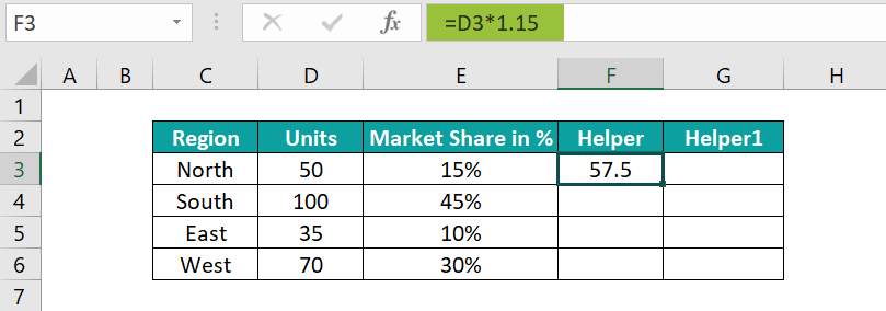
And using the fill handle, drag the formula from cell F3 to F6.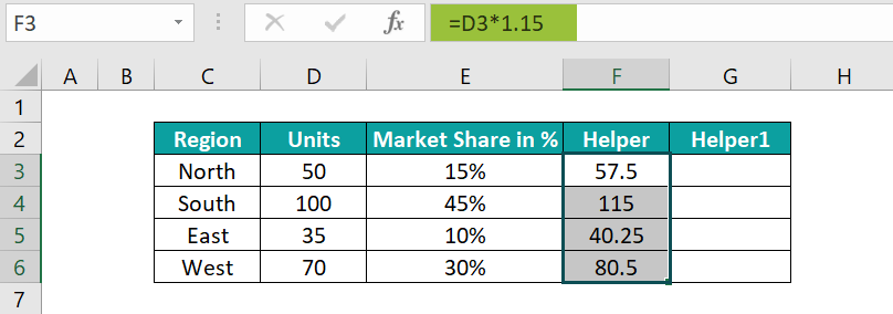
• Step 3: Select cell G3, enter the formula =D3&CHAR(10)&” (“&TEXT(E3,”0%”)&”)”, and press Enter.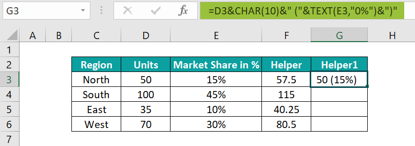
And using the fill handle, drag the formula from cell G3 to G6.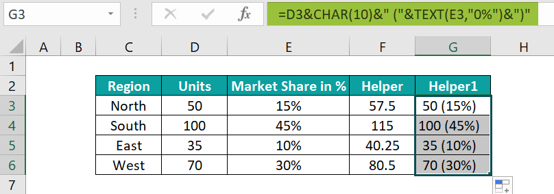
• Step 4: Select the cell range C2:D6, and follow the path Insert → Column or Bar Chart → 2-D Clustered Column chart.
Clicking the highlighted chart type will give the following graph.
• Step 5: Click the chart area and go to Design → Select Data
Next, click Add under the Legend Entries field to add a series.
And update the Helper column cell range in the Series values field.
Click OK, to get the following chart.
• Step 6: Right-click on a newly-introduced column (Orange bar), and click Format Data Series from the context menu.
Select the Secondary Axis option, under the Series Options, in the Format Data Series window.
We will get the below chart:
• Step 7: Click the chart area and go to Design → Select Data.
Select Series2 in the Legend Entries field, and click Edit under the Horizontal Axis Labels field.
The Axis Labels window opens, enter the Helper1 cell range, and click OK.
• Step 8: Click OK in the Select Data Source window to close it.
• Step 9: Right-click on a bar in the chart, and select Add Data Labels in the context menu.
The chart will appear as shown below:
• Step 10: Right-click on a bar, and click Format Data Labels from the context menu.
Check the Category Name box, and ensure to uncheck the Value box under the Label Options in the Format Data Labels widow.
• Step 11: Right-click on a bar in the chart, and click Format Data Series from the context menu.
Next, click the No fill option in the Fill tab, and close the window.
So, the plot will appear as shown below:
• Step 12: Right-click the secondary Y-axis, and click Format Axis from the context menu.
Set the Tick Marks and Labels options as None.
And once we click OK, we will see the below chart.
• Step 13: Click the chart area to enable the Chart Elements option (‘+’ icon). Check the Chart Title and Axis Titles boxes. Ensure to uncheck the Secondary Vertical axis title box.
Finally, once we update the chart title and the axis titles, the Clustered Column chart with percentages will be:
We should use an Excel Clustered Column chart because it represents discrete values for multiple variables that share the same category. Thus, it helps visualize data grouped into categories, such as sales figures.
Use this Clustered Column Chart In Excel Template to follow along with the examples in this article.
Download Excel Template