
What Is Comparison Chart In Excel?
The Comparison Chart in Excel helps users to compare different datasets of numeric or textual values graphically. It can be compared for different geographical regions, different categories, etc. The Chart is also called a Comparison or Comparative Diagram.
We do not have an inbuilt Excel Comparison Chart. However, we can build one using the Bar Chart, Line Chart, Column Chart, etc. For example, we can create a Comparison Chart in Excel for the given data, where Column A has the items and Columns B and C has the Values.
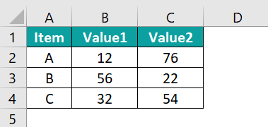
Select the data, A1:C4, and insert the required chart from the Insert tab. We get the Comparison Chart in Excel, as shown below.
Use this Comparison Chart In Excel Template to follow along with the examples in this article.
Download Excel TemplateKey Takeaways
- The Comparison Chart in Excel compares multiple subcategory values under one main category to understand their correlation.
- We can build the chart using the Line, Bar, Column, or Scatter chart types since Excel doesn’t have an inbuilt chart for the same.
- The chart always has a secondary axis to visualize better.
- We can always click the generated chart to activate the “Chart Design” and “Format” tabs, which helps in the desired formatting and highlighting of the bars or columns to create an attractive and presentable chart.
How To Create A Comparison Chart In Excel?
We can Create a Comparison Chart in Excel by selecting the data range and then inserting a Column, Line, or Bar chart from the “Charts” group of the “Insert” tab.
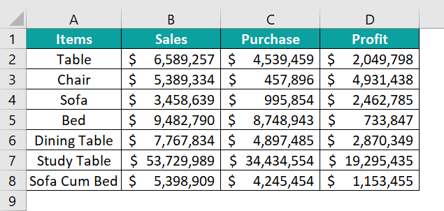
We will create the Comparison Chart for the furniture company’s data.
In the table, the data is,
- Column A shows the Items.
- Column B contains the Sales.
- Column C contains the Purchase.
- Column D contains the Profit.
The steps to create the Comparison Chart in Excel are as follows:
- Select the table data, A1:D8 → select the “Insert” tab → go to the “Charts” group → click the “Insert Column or Bar Chart” option drop-down → select the “3-D Clustered Column” chart type from the “3-D Column” group, as shown below.

- Click on the generated chart, the “Chart Design” and the “Format” tabs appear on the ribbon. Select the “Design” tab → choose the desired style from the “Chart Styles” group, as shown below.

We get the Comparison Chart using the“3-D Clustered Column” chart type, as shown above.


Examples
We will create Comparison Chart with some advanced scenarios.
Example #1
We will create Comparison Chart in Excel with some advanced scenarios.
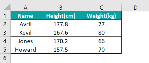
In the table, the data is,
- Column A shows the Names.
- Column B contains the Height.
- Column C contains the Weight.
The steps to create the Comparison Chart are as follows:
- Step 1: Select the table data, A1:C5 → select the “Insert” tab → go to the “Charts” group → click the “Insert Column or Bar Chart” option drop-down → select the “Clustered Bar” chart type from the “2-D Bar” group, as shown below.

- Step 2: Click on the generated chart, the “Chart Design” and the “Format” tabs appear on the ribbon. Select the “Design” tab → choose the desired style from the “Chart Styles” group, as shown below.
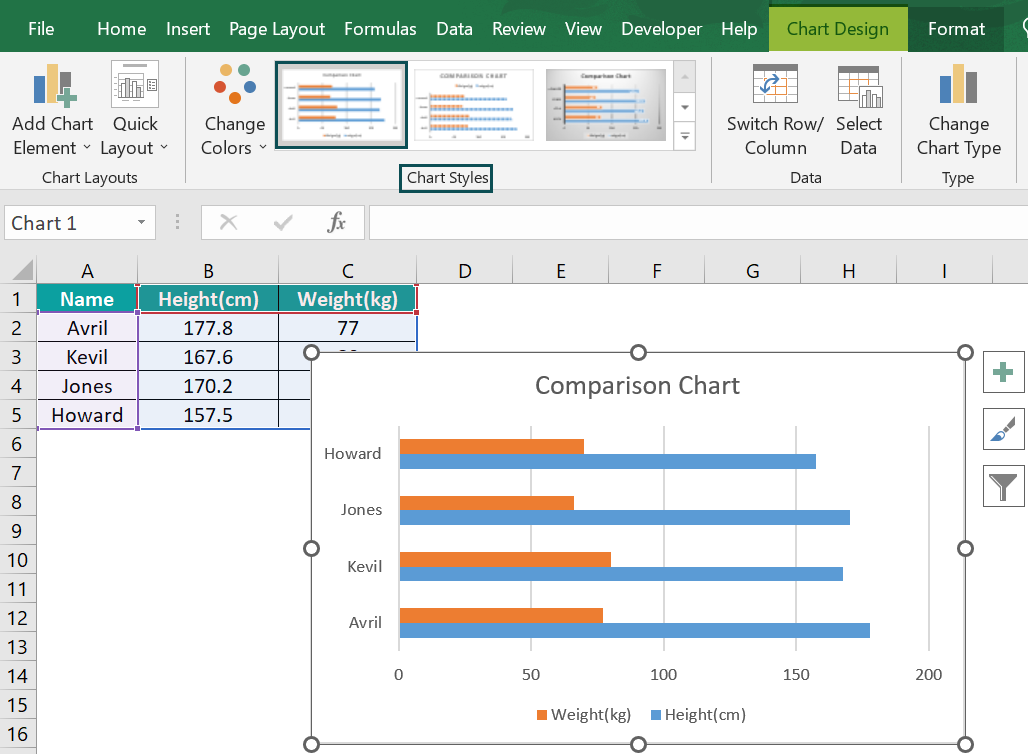
We get the Comparison Chart using the “Clustered Bar” chart type, as shown above.
Example #2
We will create the Comparison Chart in Excel from the given student’s data.
In the table, the data is,
- Column A shows the Names.
- Column B contains the Marks1.
- Column C contains the Marks2.

The steps to create the Comparison Chart in Excel are as follows:
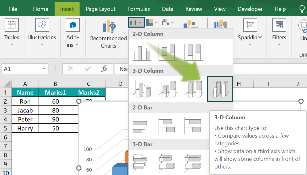
- Step 1: Select the table data, A1:C5 → select the “Insert” tab → go to the “Charts” group → click the “Insert Column or Bar Chart” option drop-down → select the “3-D Column” chart type from the “3-D Column” group, as shown below.
- Step 2: Click on the generated chart, the “Chart Design” and the “Format” tabs appear on the ribbon. Select the “Design” tab → choose the desired style from the “Chart Styles” group, as shown below.
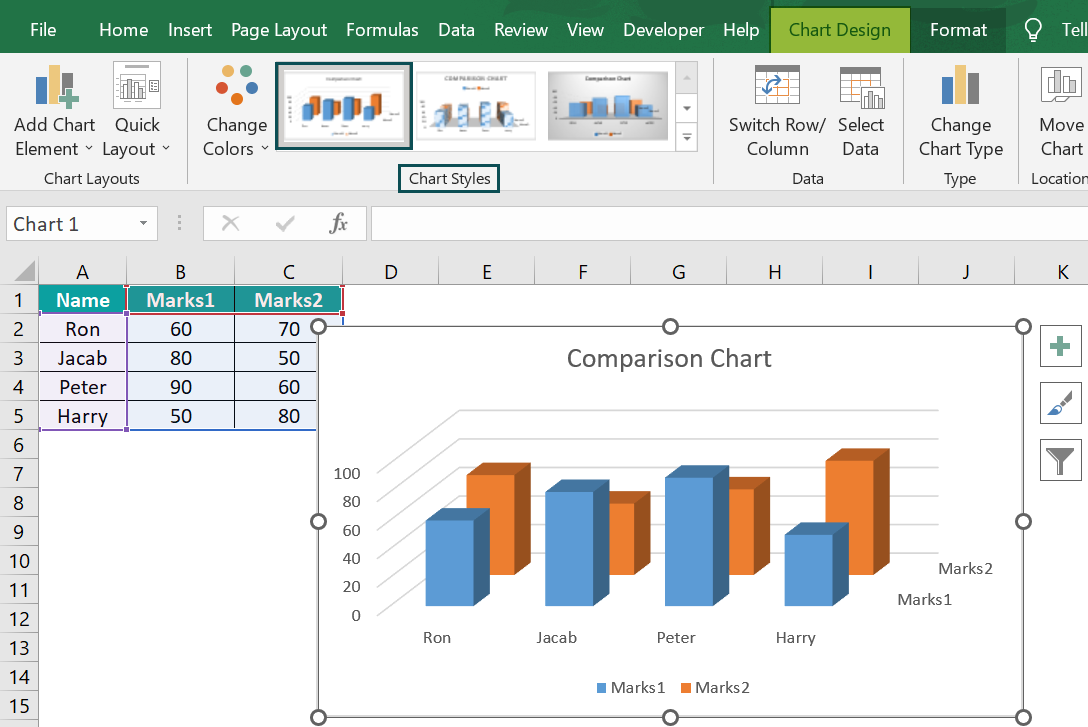
We get the Comparison Chart using the “3-D Column” chart type, as shown above.
Example #3
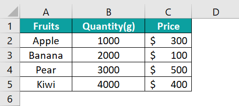
We will create the Comparison Chart from the given fruits data.
In the table, the data is,
- Column A shows the Fruits.
- Column B contains the Quantity.
- Column C contains the Price.
The steps to create the Comparison Chart in Excel are as follows:
- Step 1: Select the table data, A1:C5 → select the “Insert” tab → go to the “Charts” group → click the “Insert Column or Bar Chart” option drop-down → select the “Clustered Bar” chart type from the “2-D Bar” group, as shown below.

- Step 2: Click on the generated chart, the “Chart Design” and the “Format” tabs appear on the ribbon. Select the “Design” tab → choose the desired style from the “Chart Styles” group, as shown below.
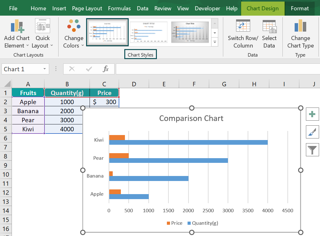
We get the Comparison Chart in Excel using the “Clustered Bar” chart type, as shown above.
Uses Of Comparison Chart In Excel
The Comparison Chart is used –
- To compare multiple values against the same or different categories and to analyze graphically.
- To save time when we have to analyze a large dataset.
Important Things To Note
- The Chart is best suited to compare multiple values against the same or different categories and to visualize the data pictorially.
- The Comparison Chart in Excel is also known as Multiple Column Chart, Multiple Bar Chart Comparison, or Comparative Diagram.
- This Comparison Diagram shows qualitative or quantitative information data.
Frequently Asked Questions (FAQs)
The Comparison Chart in Excel is used to compare different values and understand their similarities or differences.
Generally, using a bar or column chart to compare datasets is recommended because a graphical representation of the lengths of bars or columns is easy to comprehend than reading numeric or textual values from a dataset.
We will create a Comparison Chart using the Line Chart for the following example of the sales and purchase of items shown in columns B and C.
The steps to create the Comparison Chart are as follows:
• Step 1: Select the table data, A1:C4 → select the “Insert” tab → go to the “Charts” group → click the “Insert Line or Area Chart” option drop-down → select the “Line” chart type from the “2-D Line” group, as shown below.
• Step 2: Click on the generated chart, the “Chart Design” and the “Format” tabs appear on the ribbon. Select the “Design” tab → choose the desired style from the “Chart Styles” group, as shown below.
We get the Comparison Chart in Excel using the “Line” chart type, as shown above.
The four methods to create the Comparison Chart in Excel are as follows;
1. Clustered Column Chart.
2. Scattered Charts.
3. Utilizing Combo Chart.
4. Apply the Pivot table and Line Chart.
Use this Comparison Chart In Excel Template to follow along with the examples in this article.
Download Excel Template