What Is The Clustered Bar Chart In Excel?
The Clustered Bar Chart in Excel is a type of Stacked Bar Chart used as a powerful data visualization tool allowing users to group and compare multiple data sets simultaneously. The Excel Clustered Bar Chart is ideal for displaying information in which each category has subcategories, providing a clear and concise comparison between them.
Table of contents
📥Download the ready-to-use Excel template to practice this tutorial yourself.
Clustered Bar Chart In ExcelKey Takeaways
- Clustered Bar Chart in Excel is particularly useful when analyzing various trends and patterns across different categories to provide visual clarity and aid decision-making.
- The bars are clustered or joined, so comparing values within each group makes it easier. It also provides an effective way to present complex information clearly and concisely.
- The charts offer various formatting options, such as color coding, adjusting the width of bars or adding a data series label to make them even more effective.
- We can also represent Clustered Bar Chart in the 3-D format using the 3-D Clustered Bar chart type.
How To Create A Clustered Bar Chart In Excel?
To create a Clustered Bar Chart in Excel,
- First, ensure the desired data is organized into rows or columns with clear labels.
- Next, choose the entire dataset → select the “Insert” tab → go to the “Charts” group → click the “Insert Column or Bar Chart” option drop-down → select the “Clustered Bar” chart type from the “2-D Bar” category, as shown below.

When we click this chart type, it will create a basic chart with default formatting, which can be adjusted using the various formatting options available in Excel’s “Chart Tools” tab. Later, to add data series to the chart, right-click within the chart area and select “Select Data“. We can add or remove series and adjust their colors and labels here. With a few customizations, our Clustered Bar Chart should accurately display our data in an easily understandable format.
Examples
We will consider some examples for the Clustered Bar Chart in Excel.
Example #1
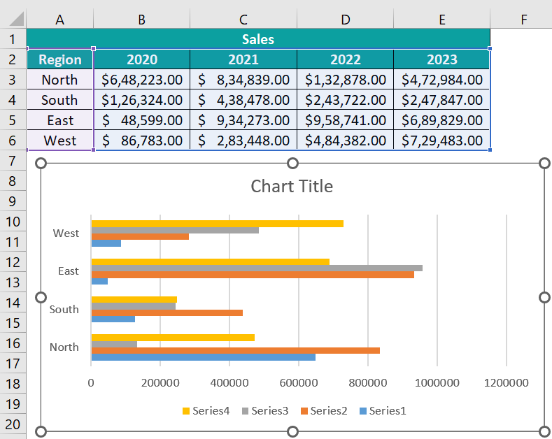
As an illustration, the image below displays the Sales data categorized by region.
The data is presented in the table as follows:
• Column A indicates the Region.
• Columns B, C, D, and E contain the Sales figures.

The steps to create a Clustered Bar Chart in Excel are,
- Step 1: Choose the table data you wish to represent in the Bar Chart, here, cells A2:E6.
- Step 2: Navigate to the “Insert” tab.
- Step 3: From the “Charts” group, select the “Insert Column or Bar Chart” option.
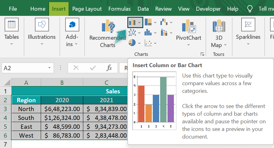
- Step 4: Click on the down arrow button of the “Insert Column or Bar Chart” option.
- Step 5: Choose the desired formatting for your Excel Clustered Bar Chart from the drop-down list.

- Step 6: Excel will promptly generate and embed the chart into our worksheet after selecting a chart type. The resulting cluster bar chart will display horizontal bars representing sales data across various regions, seamlessly integrating into our spreadsheet, as shown below.
Example #2
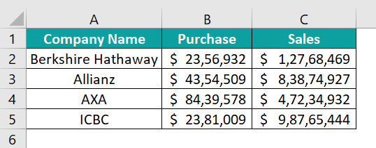
To provide a clear example, the image below showcases various companies’ Sales and Purchase data. We will follow the straightforward steps below to create a Clustered Bar Chart in Excel using this data.
The data is presented in a table format, with Column A indicating the Company Name, Column B containing the Purchase data, and Columns C containing the Sales data.
To demonstrate the creation of a Clustered Bar Chart in Excel, please follow these steps:
- Step 1: Select the table data you wish to represent in the Bar Chart, here, cells A1:C5.
- Step 2: Navigate to the “Insert” tab.
- Step 3: From the “Charts” group, select the “Insert Column or Bar Chart” option.
- Step 4: Click on the down arrow button of the “Insert Column or Bar Chart” option.
- Step 5: Choose the desired formatting for your Excel Clustered Bar Chart from the drop-down list.
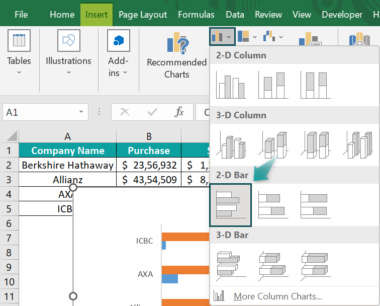
- Step 6: Excel will promptly generate and embed the chart into our worksheet after selecting a chart type. The resulting cluster bar chart will display horizontal bars representing sales and purchases, seamlessly integrating into our spreadsheet, as shown below.

Example #3
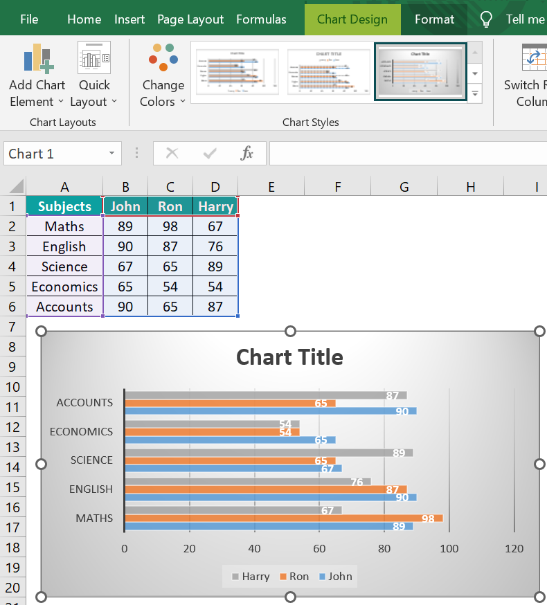
To provide a clear example, the image below showcases students’ marks. We will follow the steps outlined below to create a Clustered Bar Chart in Excel using this data.
The data is presented in a table format, with Column A indicating the Marks and Columns B, C & D containing the Names.

To demonstrate the creation of a Clustered Bar Chart in Excel, please follow these simple steps:
- Step 1: Choose the table data you wish to represent in the Bar Chart.
- Step 2: Navigate to the “Insert” tab.
- Step 3: From the “Charts” group, select the “Insert Column or Bar Chart” option.
- Step 4: Click on the down arrow button of the “Insert Column or Bar Chart” option.
- Step 5: Choose the desired formatting for your Excel Clustered Bar Chart from the drop-down list.

- Step 6: Excel will promptly generate and embed the chart into our worksheet after selecting a chart type. The resulting cluster bar chart will display horizontal bars representing students’ marks, seamlessly integrating into our spreadsheet, as shown below.
Pros
Clustered Bar Charts in Excel have several advantages for data visualization.
- Firstly, they are useful when comparing multiple data sets that can be grouped into categories. It enables the viewer to identify trends and patterns across different categories easily.
- Additionally, the clustered format allows for better analysis of individual data points within each category as they are not crowded together.
- Clustered Bar Charts enable easy customization with various color schemes and formatting options, providing a visually pleasing and informative data display.
- They are simple to create in Excel, making them an accessible tool for professionals seeking to communicate important information with their audience quickly.
Therefore, using a Clustered Bar Chart in Excel can improve the understanding and analysis of complex quantitative data professionally.
Cons
- Clustered Bar Charts in Excel may not always be optimal for representing data, particularly when dealing with complex or large sets of information.
- One major disadvantage is that the visual representation can become cluttered and difficult to read when too much data is included, leading to confusion and misinterpretation.
- Another issue is that using different colors for each category within a cluster can make it easy to mistake one color for another, especially if many categories or subcategories are involved.
- Additionally, Clustered Bar Charts are less effective when trying to compare multiple sets of data side by side as the bars are placed next to each other, which makes it harder to differentiate between them rather than stacking them on top of each other as in a stacked chart where relative sizes between groups remain constant across comparisons.
- Ultimately, selecting the appropriate type of chart in Excel requires careful consideration of several factors, such as the size of the data set and its complexity, while ensuring readability and ease of interpretation for our intended audience.
Important Things To Note
- Using Excel’s built-in tools, users can easily create Clustered Bar Charts with customized colors, axis labels, and data ranges to suit their needs.
- Utilizing this chart type effectively can provide insights into trends or patterns that may not be apparent from raw data alone.

Frequently Asked Questions (FAQs)
A Clustered Bar Chart is a graphical representation that displays multiple sets of data side by side, allowing for easy comparison. It consists of two or more vertical bars grouped, each representing a different category or subcategory of data. Unlike a regular bar chart which only displays one set of data, a Clustered Bar Chart allows for the visualization of multiple variables simultaneously.
When creating Clustered Bar Charts, it is important to avoid certain mistakes and pitfalls that can compromise the accuracy and clarity of the chart.
• One common mistake is not labelling the axes properly – Both X and Y axes need clear and concise labels indicating their data.
• Another pitfall is using too many categories or variables – It can lead to congestion on the chart and make it difficult to read.
• It is important to keep the width of each bar consistent throughout the chart, as inconsistency can lead to confusion in interpreting the data.
• Finally, choose appropriate colors for each category – Contrasting but complementary colors will help differentiate between categories more easily.
We can create accurate, informative, and easy-to-read Clustered Bar Charts in Excel by avoiding these common mistakes and adhering to best practices.
We can add multiple data series to a single Clustered Bar Chart in Excel. Clustered Bar Charts allow us to compare the values of different categories in the same chart, which makes them useful for presenting complex data sets.
To add additional data series to a Clustered Bar Chart,
• Select the chart and choose “Select Data” from the Chart Design tab.
• From there, we can add a new data series or edit an existing one by selecting “Edit” and inputting our data range.
• Label our axes clearly and choose colors that make each data set easily distinguishable.
These tips enable us to create informative Clustered Bar Charts that convey our information effectively.
Download Template
📥Download the ready-to-use Excel template to practice this tutorial yourself.
Clustered Bar Chart In ExcelRecommended Articles
This has been a guide to Clustered Bar Chart In Excel. Here we create Clustered Bar Charts along with step by step examples & downloadable Excel template. You can learn more from the following articles –


Leave a Reply