What Is Stacked Bar Chart In Excel?
The Stacked Bar Chart in Excel is a type of bar chart that compares different data categories over time and graphically represents the same. The comparison is between the portions of individual data points and the total/whole. The bars are stacked vertically, one above the other, to picturize the gradual variation of a single or more variables. Hence the name Stacked Bar Chart.
For example, the values of the three items are shown in columns A and B.
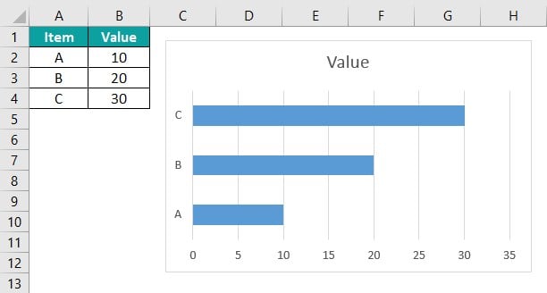
The Stacked Bar Chart is created using the given data, as shown in the above image.
Table of contents
Key Takeaways
- The Stacked Bar Chart represents the data as different parts and cumulated volume. Gradually varying data for a single variable can be effectively visualized by this type of graph.
- We can visually format or enhance the chart by adding the trend line, title, legend, data label, etc.
- The chart does not vary w.r.t the data when we apply different chart types like 2-D or 3-D.
- A variety of Stacked Bar Charts are available, and according to the data we want to represent, the suitable one can be selected. 2D and 3D Stacked Bar Charts, and the 100% Stacked Bar Chart are also available in 2D and 3D styles.
How To Create Stacked Bar Chart In Excel?
We can create Stacked Bar Chart as follows:
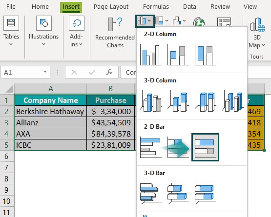
First, choose the cell range – select the “Insert” tab – go to the “Charts” group – click the “Insert Column or Bar chart” option drop-down – go to the “2-D Bar” group – select the “Stacked Bar” chart type, as shown below.

The Stacked Bar Chart automatically appears, as shown in the above image.
There are 4 different Stacked Bar Charts, namely,
- 2-D Bar – Stacked Bar.
- 2-D Bar – 100% Stacked Bar.
- 3-D Bar – 3-D Stacked Bar.
- 3-D Bar – 3-D 100% Stacked Bar
Let us look at a basic example. Here, we will insert Stacked Bar Chart using the 2-D Stacked Bar Chart type.
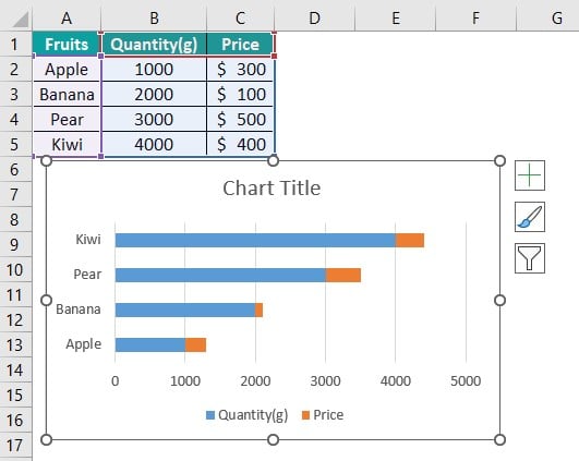
The below image shows the Quantity and Price of fruits, and the data is,
- Column A shows the Fruits.
- Here, column B contains the Quantity.
- Column C contains the Price.

The procedure to create the 2-D Stacked Bar graph in Excel is,
Step 1: Select the cell range A1:C5 – go to the “Insert” tab – go to the “Charts” group – click the “Insert Column or Bar Chart” option drop-down – in the “2-D Bar” group, select the “Stacked Bar” chart type, as shown below.

Step 2: The 2-D Stacked Bar Chart in Excel is created for the selected data, as shown below.
Examples
We will create different Stacked Bar Chart in Excel with different types
Example #1 – 2-D 100% Stacked Bar Chart
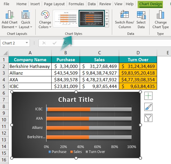
The below image shows the Company’s Purchases, Sales, and calculated Turn over. We will create a 2-D 100% Stacked Bar Chart in Excel.
In the table, the data is,
- Column A shows the Company Name.
- Here, column B contains the Purchase.
- Column C contains the Sales.
- Column D contains the Turn Over.

The steps to create the 2-D 100% Stacked Bar Chart in Excel are as follows:
Step 1: Select the cell range A1:D5 – go to the “Insert” tab – go to the “Charts” group – click the “Insert Column or Bar Chart” option drop-down – in the “2-D Bar” group, select the “100% Stacked Bar” chart type, as shown below.
We get the following generated chart.
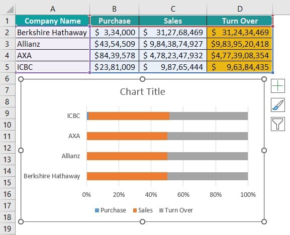
Step 2: The “Chart Design” tab appears on the ribbon. Go to the “Chart Design” tab – select the desired style from the “Chart Styles” group. The 2-D 100% Stacked Bar Chart in Excel is created for the selected data, as shown below.
Example #2 – 3-D Stacked Bar Chart
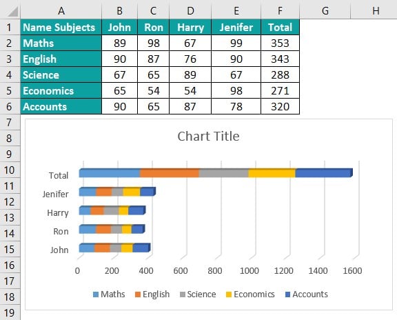
The below image shows the four Student’s Marks in five subjects. We will create a 3-D Stacked Bar Chart.
In the table, the data is,
- Column A shows the Subjects.
- Column B contains the Marks of John.
- Here, column C contains the Marks of Ron.
- Column D contains the Marks of Harry.
- Column E contains the Marks of Jenifer.
- Here, column D contains the Total Marks.

The steps to create the 3-D Stacked Bar Chart in Excel are as follows:
Step 1: Select the cell range A1:F6 – go to the “Insert” tab – go to the “Charts” group – click the “Insert Column or Bar Chart” option drop-down – in the “3-D Bar” group, select the “3-D Stacked Bar” chart type, as shown below.
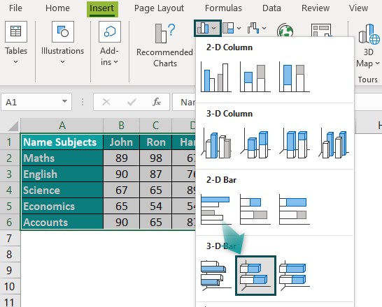
Step 2: Once the chart is formed and the “Chart Design” tab appears on the ribbon, go to the “Chart Design” tab – select the desired style from the “Chart Styles” group. The 3-D Stacked Bar Chart is created for the selected data, as shown below.
Example #3 – 3-D 100% Stacked Bar Chart
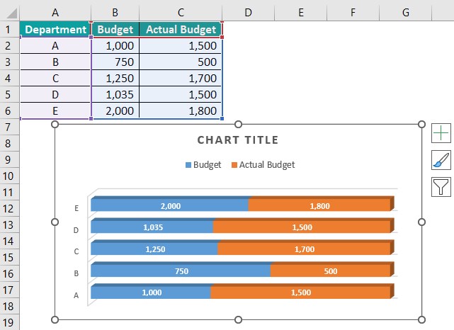
The below image shows the Department, the allotted budget, and the actual budget. We will create a 3-D 100% Stacked Bar Graph in Excel.
In the table, the data is,
- Column A shows the Department.
- Here, column B contains the Budget.
- Column C contains the Actual Budget.

The steps to create the 3-D 100% Stacked Bar Chart in Excel are as follows:
Step 1: Select the cell range A1:C6 – go to the “Insert” tab – go to the “Charts” group – click the “Insert Column or Bar Chart” option drop-down – in the “3-D Bar” group, select the “3-D 100% Stacked Bar” chart type, as shown below.

Step 2: Once the chart is formed and the “Chart Design” tab appears on the ribbon, go to the “Chart Design” tab – select the desired style from the “Chart Styles” group. The 3-D 100% Stacked Bar Chart in Excel is created for the selected data, as shown below.
Uses Of Stacked Bar Graphs In Excel
- The Stacked Bar graph In Excel can be used in the following ways:
- It allows easy comparisons of data w.r.t profits, sales, turnovers, productions, etc.
- The Chart shows the rankings across periods using different colors for different lengths of the bars.
- It helps analyze the results of a survey by highlighting the key aspects and differentiating the data values.
- The chart differentiates every part of the data from the whole part to show the focus area of the chart.
- We cannot use the Stacked Bar Chart In Excel in the following ways:
- It is not preferable for a large amount of data because the chart becomes complicated and challenging to analyze.
- The Stacked Bar Chart is unsuitable for long-term decision-making because conducting an in-depth data analysis is difficult with a Stacked Bar Chart.
Important Things To Note
- The Stacked Bar Chart in Excel helps study the impact of the changes in each segment on the total value across categories.
- Every Bar Chart consists of different segments, which are components that make the bar.
- The Horizontal Stacked Bar Chart has adjacent data segments.
- In the Vertically Stacked Bar Chart, the data segments are stacked over one another.
- The Stacked Bar Charts cannot be used for large data sets that require in-depth data analysis.

Frequently Asked Questions (FAQs)
The Stacked Bar Chart pictorially represents the selected data. It can be implemented in 2D or 3D format.
We will create the Percentage in Bar Chart in Excel using the 3-D Stacked Bar.
In the table, the data is,
• Column A shows the Employees Name.
• Here, column B contains the Annual Salary.
• Column C contains the Deduction Rate.
The steps to create the Percentage in Bar Chart in Excel are as follows:
Step 1: Select the cell range A1:C6 – go to the “Insert” tab – go to the “Charts” group – click the “Insert Column or Bar Chart” option drop-down – in the “3-D Bar” group, select the “3-D Stacked Bar” chart type, as shown below.
Step 2: Once the chart is formed and the “Chart Design” tab appears on the ribbon, go to the “Chart Design” tab à select the desired style from the “Chart Styles” group. The 3-D Stacked Bar Chart is created for the selected data, as shown below.
We will make the Stacked Bar Chart and change the bar Width for the data of the fruit data chart.
In the table, the data is,
• Column A shows the Fruits.
• Here, column B contains the Amount of Stock.
• Column C contains the Deduction Rate.
The steps to change the width in the Stacked Bar Chart in Excel are as follows:
1: Select the cell range A1:B9 – go to the “Insert” tab – go to the “Charts” group – click the “Insert Column or Bar Chart” option drop-down – in the “3-D Bar” group, select the “3-D Stacked Bar” chart type, as shown below.
2: Once the “Chart Design” tab appears on the ribbon, go to the “Chart Design” tab – select the desired style from the “Chart Styles” group. Next, click the “+” sign on the chart – check/tick the checkbox and click the right arrow of the “Axes” option – click the “More Options…” option. The “Format Axis” window appears on the right, as shown below.
3: Select the “Series Amount in Stock” from the drop-down as shown below.
4: The Format pane changes to “Format Data Series”, then select the “Effects” option under the “Series options”. Now, click the “3-D Format” option, and change the width to “30”.
We get the final chart as shown above. This is how we change the width of the Stacked Bar Chart in Excel.
Download Template
This article must help understand the Stacked Bar Chart in Excel with examples. You can download the template here to use it instantly.
Recommended Articles
This has been a guide to Stacked Bar Chart In Excel. Here we create stacked bar graphs and their types, formatting, examples & a downloadable excel template. You can learn more from the following articles –

Leave a Reply