
What Is Pivot Chart In Excel?
Pivot chart in Excel is an in-built Excel feature that visually summarizes complex data and trends. It offers interactive filtering options that make analyzing the selected data quick and straightforward. Thus, the pivot chart is the best option users can use when summarizing, reviewing, or presenting massive data in sales and executive reports.
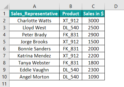
For example, consider the below table showing the sales data of sales representatives.
Once we create a pivot table and insert pivot chart in Excel, the graph will appear as depicted below:
Use this Pivot Chart In Excel Template to follow along with the examples in this article.
Download Excel TemplateIn the pivot chart in Excel example, the graph gets plotted according to the pivot table in the cell range E1:I12, in the same sheet as the source data. Later, we will see how to add a pivot chart to a new worksheet.
The chart offers two filters, one for filtering products and the other for sales representatives. Thus, the pivot chart enables us to compare the sales generated by specific sales representatives or the chosen products, making it highly dynamic.

Key Takeaways
- The pivot chart in Excel feature enables users to visually represent and analyze pivot table data.
- We can create a pivot chart using the below options:
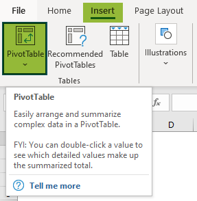
- Create a pivot table from the source data and choose the PivotChart option in the Insert tab.
- Click on the source data table and select Insert à PivotChart à PivotChart & PivotTable.
- Use the PivotTable and PivotChart Wizard.
- We can utilize the Analyze, Design, and Format tabs to edit and format a pivot chart.
How To Create Pivot Chart In Excel?
The steps to create a pivot chart in Excel are:
- Ensure the source data is complete and accurate.
- Click on the table and select the PivotTable option in the Insert Then, click on the pivot table and choose the PivotChart option in the Insert tab. Alternatively, we can click on the source data table and choose PivotChart à Pivot Chart & PivotTable to create the pivot table and chart together.
- Once formatted, we can make the best use of pivot chart in Excel by dynamically filtering and comparing the selected data series trends according to our requirements.
Let us understand the procedure using an example.
Suppose we need to create a pivot chart in Excel for the below table.

Step 1: First, click on the table and select Insert > PivotTable to create a pivot table.
The Create PivotTable window opens where we need to ensure the selected Table/Range is correct.

And if we want the pivot table in a new sheet, choose New Worksheet. Otherwise, select the Existing Worksheet option and enter the target Location.
Here we shall choose the New Worksheet option. Once we click OK, a new worksheet gets inserted before the worksheet containing the source data.
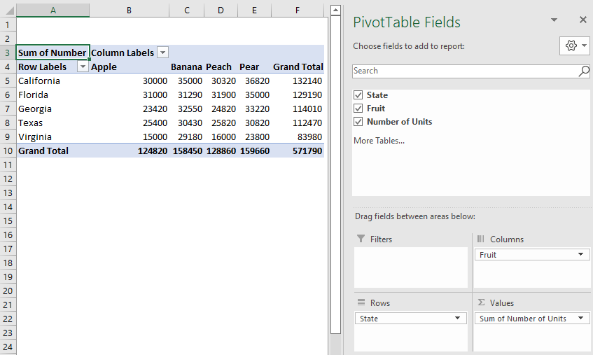
Step 2: Then, drag and drop the required fields in the respective sections in the PivotTable Fields window.
Step 3: Next, click on the pivot table, then select Insert > PivotChart.

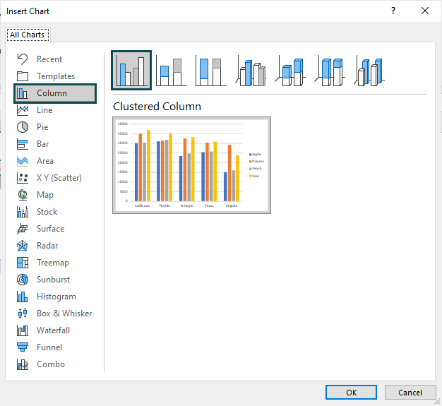
The Insert Chart window will open, where we have to choose the required chart type.
Once we click OK, the pivot chart will be as depicted below:

Alternatively, we can click anywhere on the pivot table and apply the excel keyboard shortcut for pivot chart in Excel, Alt + F1. It will automatically insert the above chart. But if we want to pick another chart type, click on the chart to enable the Design tab and choose the Change Chart Type option.

The other method to insert pivot chart in Excel is using Insert > PivotChart > PivotChart & PivotTable. Click on the source table and navigate the path mentioned above.

The Create PivotTable window opens, and the rest of the process remains the same as we saw previously. But here, we will see the pivot chart building as we create the pivot table.
Thus, now we can filter the chart data state-wise and fruit-wise to perform the required analysis.
Please Note: Excel offers a PivotTable and PivotChart Wizard. Press the keyboard shortcut, Alt + D + P, to open the wizard window.

It is a three-step process.
Step 1: First, ensure the settings are as in the image above to create a pivot chart. Click Next.
Step 2: Next, enter the required data range in the Range field and click Next.

We might get the below message. Click Yes to continue.

Step 3: Select the target worksheet where we want to view the pivot chart.

And once we click Finish, we will see the settings to build the pivot table and pivot chart, as discussed earlier in this section.
Examples
Here are a few more examples to understand the concept of pivot charts in Excel.
Example 1
Assume we have to create a pivot chart for the below table.

Step 1: To begin with, click on the above table and then the Insert tab to choose the PivotTable option.
Ensure the data range in the Table/Range field is correct and choose the target location. Click OK.

Step 2: Fill the sections in the PivotTable Fields window, as depicted below.

Step 3: Next, click on the pivot table and apply the keyboard shortcut for pivot chart in Excel, Alt + F1.

Thus, now we have the required pivot chart in Excel.
Here is how we can use the chart for analysis.
- Suppose we want to compare the total number of shirts and t-shirts purchased. We can click on the Item filter in the bottom-left corner and choose the required options from the Item

Once we click OK, the pivot chart will be:

- Assume we want to determine the items for which we spent less than $4,000. Then set the below filter setting for Total Amount in $
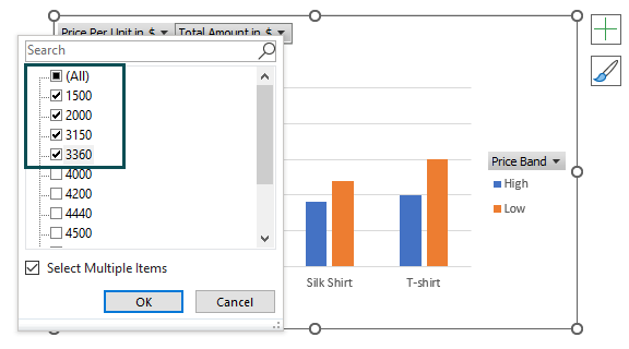
Once we click OK, the pivot chart will be:

Please Note: In both scenarios, the filter applied on the pivot chart is also reflected in the pivot table.
Likewise, we can analyze other aspects by applying different combinations of filters in the above chart.
Example 2
The following pivot chart in Excel example shows how we can use the Slicer feature and make the chart more interactive.
Consider that we have to create a pivot chart with the Slicer for the below table.

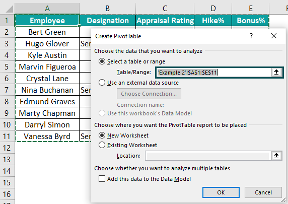
Step 1: First, click on the above table and select Insert > PivotChart > PivotChart & PivotTable.

The Create PivotTable window opens. Ensure the Table/Range data range is correct, and choose the target location where we want to show the pivot chart. Click OK.
Step 2: Then, the pivot chart gets created as we build the pivot table.

Step 3: Next, click on the chart to enable the Analyze tab in the Excel ribbon and choose the Insert Slicer option.

In the Insert Slicers window, choose the fields we want to use as visual filters or Slicers.

Here we choose Designation for the example table. And once we click OK, the Slicer will appear as below:

We can filter the required Designation, say Senior Engineer, to analyze the appraisal data.

Once we apply the filter, the result is reflected in the pivot chart and table.
Edit A Pivot Chart
Sometimes, we might have to edit our pivot chart in Excel.
For example, the below images show the source data and the pivot chart representing it graphically.


Here are some ways we can edit this dynamic chart.
Change Source Data
Suppose there is a change in the source data. We can update the source data, right-click on the pivot table and choose Refresh from the context menu. We will get the updated pivot chart in Excel.
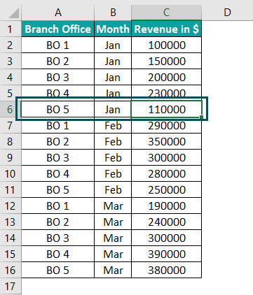
For example, let us change the Jan month revenue for BO 5 from $210000 to $110000.

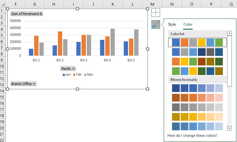
Alternatively, we can click on the chart area to enable the Analyze tab and then choose the Refresh option.

Once we click Refresh, the updated pivot chart will be:

Alternatively, once we create the pivot chart, right-click on the chart area and choose PivotChart Options from the context menu.

The PivotTable Options window will open. Then, in the Data tab, check the Refresh data when opening the file box, and click OK.

So, once we open the pivot chart file, it will show the updates we made in the source data.
Likewise, if we have to delete data points and require an edited pivot chart for the new data range, delete the specific data points from the source data and refresh the pivot table.
Please Note: When the source data has new entries added, we need to change the data range of the pivot table to get the updated pivot chart.
We can click on the chart area to enable the Analyze tab and choose the Change Data Source option to update the new source data range.

Change PivotTable Field Settings
Suppose we need to make changes in our pivot chart fields. Then, edit the specific fields in the required sections in the PivotChart Fields window.
If the PivotChart Fields window does not appear when you click the chart, choose Analyze > Field List option to get the pane.

For example, if we need to enter a filter to check the branch offices that earned revenue of less than $200,000. Then, drag the Revenue in $ field and drop it in the Filters section in the PivotChart Fields window.

We can now click on the Revenue in $ filter in the pivot chart, check the Select Multiple Items box, and filter the required values.


Use Context Menu Options
Right-click the specific data series we want to edit in the pivot chart to open the context menu.

We can now use the options in the menu to edit the pivot chart data.
Change Chart Style
Click on the chart area to enable the Chart Styles option. We can then use the options available in the Style and Color tabs to change the chart style and color.


Once we make the required edits, click on the chart area to enable the Chart Elements option and use it to add the Chart Title and Axis Titles.

Double-click on the Chart Title and Axis Title in the chart area to update the details. And the final pivot chart will appear as depicted below:

Advantages Of Pivot Chart In Excel
This section will help us understand the use of pivot chart in Excel.
Using a pivot chart in Excel:
- We can analyze massive data sets quickly and differently using various field settings and filter options.
- We can visually represent summarized data, which is useful while preparing executive reports.
- We can graphically show multiple trends in a single chart.
- We can create a dynamic graph, which is easily editable.
Important Things To Note
- The pivot chart in Excel helps summarize and review data using different graph types and layouts.
- We require a pivot table to create a pivot chart.
- We will have to change the selected data range every time our source data has additional entries to get an updated pivot chart.
- Ensure the PivotChart Fields settings are correct to get the desired pivot chart.
- The pivot chart in Excel is a critical tool that users can use while preparing performance and sales reports.
Frequently Asked Questions (FAQs)
The pivot chart in Excel is available in the Insert tab of the Excel ribbon.
We can filter a pivot chart in Excel using the chart’s filter options and the Filters section in the PivotChart Fields window.
For example, consider the below pivot chart.
We can click the Subject and Student filters to apply the required filter. On the other hand, we can drag and drop the fields we need to use as filters in the Filters section of the PivotChart Fields window.
Using the steps below, we can add an average line in a pivot chart in Excel.
1. Include a column Average in our source data to show the average value.
2. Click on our pivot chart to enable the Analyze tab and choose the Refresh option.
3. Drag and drop the Average field in the Values section of the PivotChart Fields window.
4. Now click on any data point of the Average series in the pivot chart to select the specific data series.
5. Right-click the chosen data series and select the Change Series Chart Type option.
6. In the Change Chart Type window, choose the Combo option. And then, select the Average field chart type as Line and check its Secondary Axis box.
7. Once we click OK, the average line will appear in our pivot chart.
We can delete a pivot chart in Excel by clicking on the chart and pressing the Delete key.
Use this Pivot Chart In Excel Template to follow along with the examples in this article.
Download Excel Template