
What Is Dynamic Chart In Excel?
The Charts in Excel are the graphical representation of a dataset or cell range that update automatically when the selected data is modified. However, the Dynamic Chart in Excel is an advanced type of chart as it accepts the modification of the dataset with new rows/columns added next to the existing data table. Therefore, to create a dynamic chart, we need to follow a different methodology than the one we follow for the regular chart.
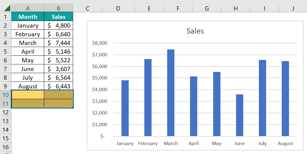
For instance, we have the following chart created in an Excel spreadsheet.
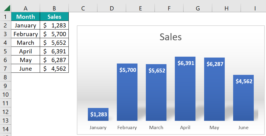
The above image shows the data from A1:B7, and a chart is created based on this range. Now, let us add a few more rows of data.
Use this Dynamic Chart In Excel Template to follow along with the examples in this article.
Download Excel Template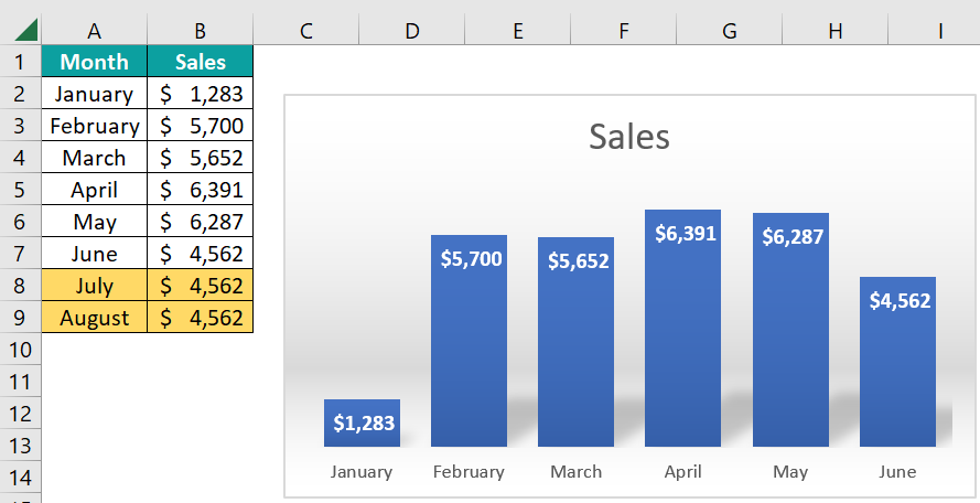
We have added July and August data, but the chart still shows the data till June. It is because while creating the chart, we have provided the static range of cells from A1:B7. Any data modification after this specified range doesn’t alter the chart. In such scenarios, the Dynamic Chart in Excel is an expected choice.
Key Takeaways
- A Dynamic Chart in Excel accepts selected data modification to the existing dataset and updates the generated chart automatically.
- There are two ways to create a dynamic chart, i.e., using Excel Table and Named Ranges.
- An OFFSET formula works differently if there are any blank cells in the middle of the data range. Ideally, there shouldn’t be any blank cells or rows before the last record.
- The F3 key lists all the named ranges in the workbook.
- Excel Tables uses structured references, so any new data added to the list will be expanded automatically.
How To Create Dynamic Chart Using Excel Table?
Excel Tables are the best for dynamic data because they use structured references. Thus, any additional data gets updated and automatically added to the Excel Table range.
If we have the data table with a normal range, we can press the shortcut key “Ctrl + T” to convert it into Excel Table format.
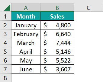
For instance, we have the following monthly sales data in Excel.
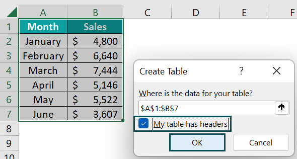
To convert this into Excel Table format, select any cells in the table range from A1:B7 and press the Excel Table shortcut key “Ctrl + T” to bring up the following “Create Table” window.
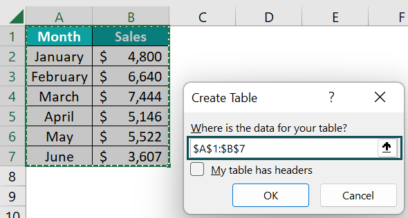
Since our data already has headers, check/tick the “My table had headers” checkbox, and click “OK”.
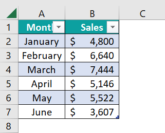
The Excel Table is created, as shown below.
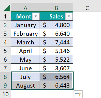
Now, if we add anything to the next immediate column or row table format expands.
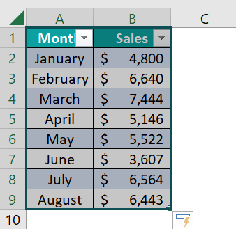
We have added July and August month data, and the Excel Table automatically expands, i.e., two new rows are added. Now, we can create a Dynamic Chart.
The steps to create a Dynamic Chart in Excel are as follows:
- Step 1: Select the entire Excel Table range, A1:B9.
- Step 2: Select the “Insert” tab → go to the “Charts” group → click the “Insert Column or Bar Chart” option drop-down → select the “Clustered Column” chart type from the “2-D Column” category, as shown below.
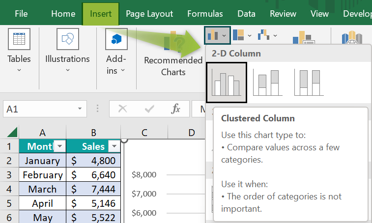
- Step 3: The column chart is generated, as shown below.
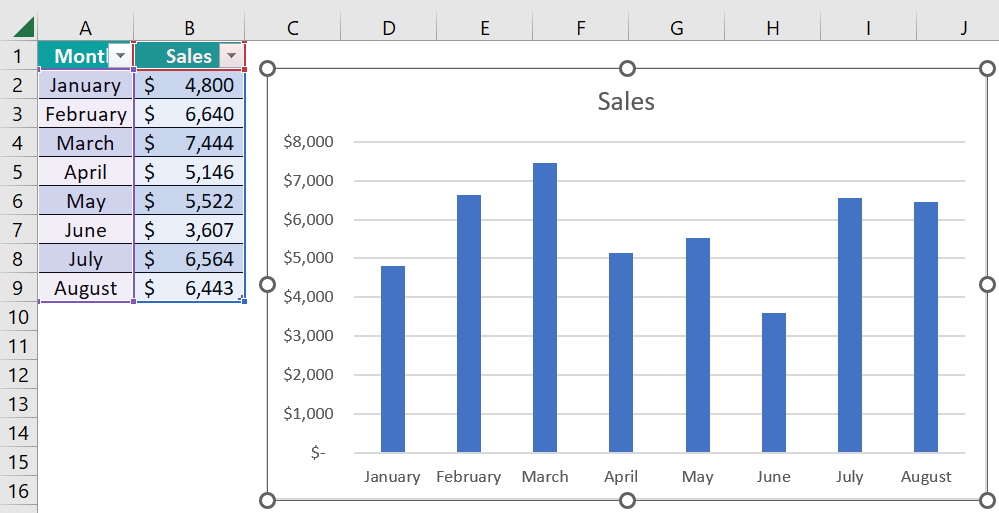
- Step 4: To check the flexibility and dynamic nature of the Excel Table, add additional months’ data to the existing table, such as September and October.
Once we modified the data, the chart automatically added 2 new column bars for September & October.

However, there is a drawback in using Excel Table as a data source while creating a dynamic chart. For instance, let us delete the last 2 months’ data that we have added in the above steps.
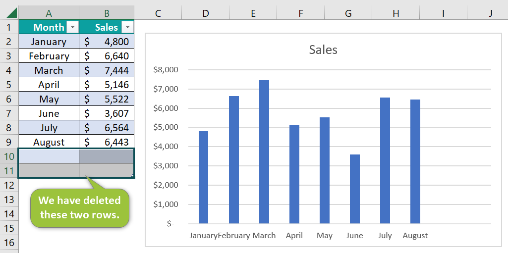
When the last two lines are deleted, we see an empty space in the chart.

The reason is that when we delete the data in the Excel Table, it deletes only the data, and the Excel Table range remains the same. Therefore, the chart shows the empty spaces.
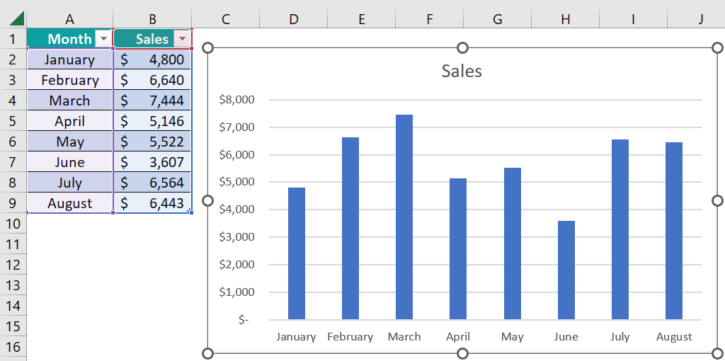
To fix this issue drag the table range using the Excel fill handle.

Now the chart will show the updated data without any empty spaces.
This way, we can use the Excel Table structured format to create Dynamic Charts In Excel.
How To Create Dynamic Chart Using Named Range And Offset?
Named Ranges are rarely used to make the reports or visualizations dynamic. However, by creating named ranges, we can create dynamic charts.
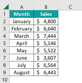
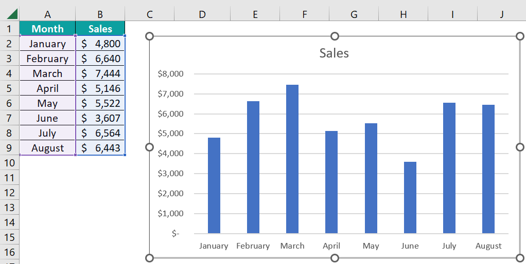
Let us consider the same data from the above example. We have the monthly sales data, shown below.
The above one is not an Excel Table reference, but rather, it is just a normal cell reference in Excel. Instead of creating the chart by using this static range, first, we need to create a named range for the fields that we are going to use.
Let us create two named ranges using the OFFSET function, one is the Sales Column, and another one is the Month Column.
The steps to create the named ranges, Month, using the OFFSET function are:
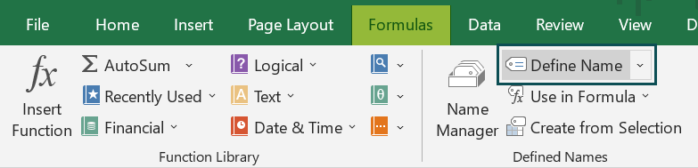
- Step 1: Select the “Formulas” tab → go to the “Defined Names” group → click the “Define Name” option drop-down, as shown below.

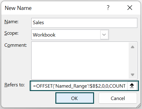
- Step 2: The “New Name” window opens. In the “Name:” box, type “Month”.
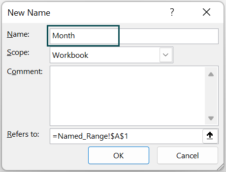
- Step 3: In the “Refers to:” box, enter the formula
=OFFSET(‘Named_Range’!$A$2,0,0,COUNTA(‘Named_Range’!$A$2:$A$13)), and click “OK”.

- Step 4: The named range “Month” for the Month Column is ready.
[Note: Formula Explained:
=OFFSET(‘Named_Range’!$A$2 → OFFSET will start its offsetting from cell A2.
=OFFSET(‘Named_Range’!$A$2,0, → It offsets zero rows.
=OFFSET(‘Named_Range’!$A$2,0,0, → It offsets zero columns.
=OFFSET(‘Named_Range’!$A$2,0,0, COUNTA(‘Named_Range’!$A$2:$A$13)) → Then the COUNTA Excel function will provide the numbers cells that have the data in the range A2:A13. Based on the number of cells provided by the COUNTA function, the OFFSET function offsets those many numbers of rows.]
To test this, enter an equal sign in an empty cell, and type the name we created, i.e., Month.

We can see that the IntelliSense list shows the named range that we have created. Select the same, i.e., Month, and press the “Enter” key to get the result.
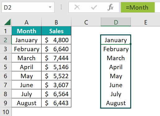
The formula displays the values from the month column starting from cell A2 to A13. Now, enter a few names in rows 10 and 11.
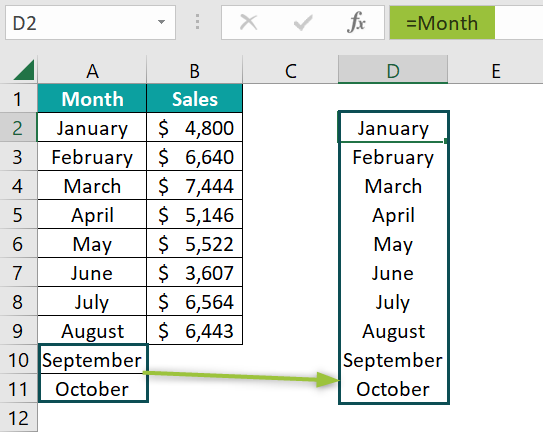
The named range dynamically picks up the month names that we have entered.
The steps to create the named ranges, Sales, using the OFFSET function are:
- Step 1: Select the “Formulas” tab → go to the “Defined Names” group → click the “Define Name” option drop-down, as shown below.
- Step 2: The “New Name” window opens. In the “Name:” box, type “Sales”.

- Step 3: In the “Refers to:” box, enter the formula
=OFFSET(‘Named_Range’!$B$2,0,0,COUNTA(‘Named_Range’!$B$2:$B$13)), and click “OK”.
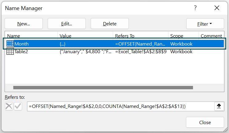
- Step 4: Now, we have two named ranges ready, i.e., “Month” and “Sales”.

This formula also works similarly to the previous one. OFFSET will start from cell B2 and offset the number of rows of the data returned by the COUNTA function between cells A2 to A13.
The steps to create a blank chart and then customize it to use the created named ranges are as follows:
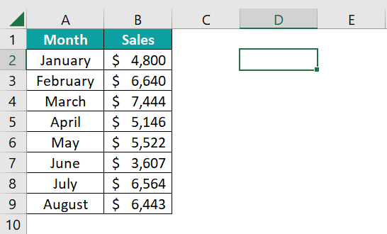
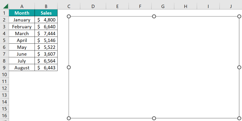
- Step 1: Select an empty cell in the worksheet, here, cell D2.
- Step 2: Select the “Insert” tab → go to the “Charts” group → click the “Insert Column or Bar Chart In Excel” option drop-down → select the Clustered Column chart type from the “2-D Column” category, as shown below.

- Step 3: A blank chart outline is generated, as shown below.
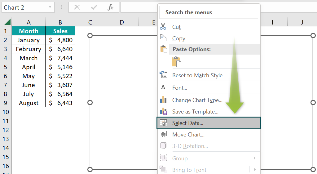
- Step 4: Right-click on the blank chart, and click the “Select Data” option.
- Step 5: The “Select Data Source” window opens. In this window, click the “Add” button in the “Legend Entries (Series)” category.

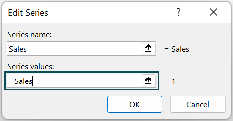
- Step 6: The “Edit Series” window opens. Here, enter “Sales” in the “Series name:” field.

- Step 7: In the series values, we need to enter the “Sales” named range we have created. Hence, select the box “Series Values” and press the shortcut key F3 to bring the list of named ranges in the workbook. The “Paste name” box pops up.

- Step 8: Choose “Sales” named range, and click “OK”.

- Step 9: Now, we should see the named range in the “Series Values” box.
However, this isn’t the right way to give the named range reference. The named range should include the worksheet name as well.
Enter the worksheet name in single quotes followed by an exclamation sign (!) as ‘Named_Range!’
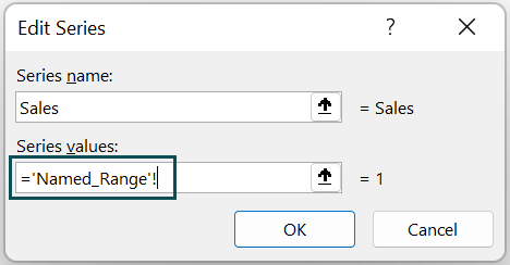
Now give the named range as “Sales”.

- Step 10: Click “OK”, and we are back to the “Select Data Source” window. In this window, click on the “Edit” option under “Horizontal (Category) Axis Labels”.

- Step 11: This will open the “Axis Labels” window like the following one.
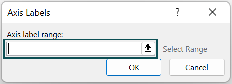
- Step 12: For the named range, i.e., Month, enter the worksheet name too, in a single quote followed by an exclamation sign (!).
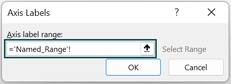
- Step 13: Now press the F3 Excel shortcut key to bring the list of named ranges that we created. Choose the named range “Month” and click on “OK”.

- Step 14: This will insert the named range after the worksheet name.

- Step 15: Click on “OK” in the next two windows. The dynamic chart looks as shown below.
To test the dynamic nature of this report, let us add a couple of months’ data to the table.
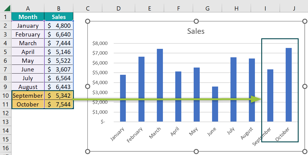
As soon as we have added two months “September” and “October” in rows 10 and 11, the above chart shows the newly added month’s data.
Now let us delete those newly added records and see the changes in the chart.
We have deleted the newly added rows, and the chart doesn’t show any empty spaces, as shown in Excel Table format.
This way, we can create dynamic charts in Excel by using Excel Table and Named Ranges.
Important Things To Note
- Ctrl + T is the shortcut key to create an Excel Table format.
- While using the named range in Excel, we should first provide the worksheet in single quotes then followed by an exclamation mark (!).
- F3 is the shortcut key to bring the list of named ranges created in the workbook.
- The names we create should be unique, and there shouldn’t be any duplicates.
- When the named range is created, there should not be any blank cells in the middle of the data.
- Excel Table would take the new data into consideration only if we added it to the immediate row or column. If we add rows after leaving one blank row, it won’t take it into consideration.
Frequently Asked Questions (FAQs)
To create a dynamic chart, we need to write a VBA code in Excel, and execute it using the VBA Editor, found as follows:
Select the “Developer” tab → go to the “Code” group → click the “Visual Basic” option, as shown.
The advantages of creating a Dynamic Chart In Excel are:
• We can save a lot of time by creating a dynamic chart. We need not have to worry about the new added to the list.
• Any modification of data will automatically reflect in the chart.
• Quick visualizations and end users are up-to-date with the data in the visualization.
We have the following data in Excel.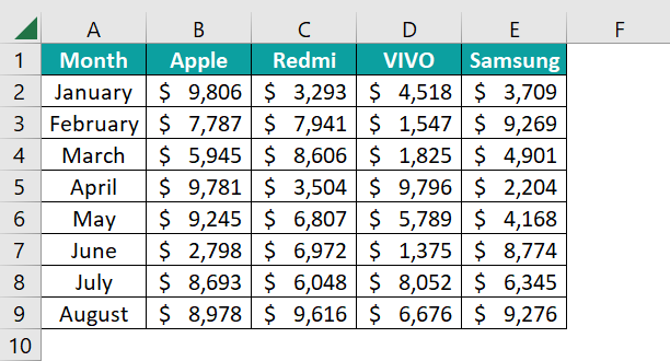
• Create a drop-down list of products.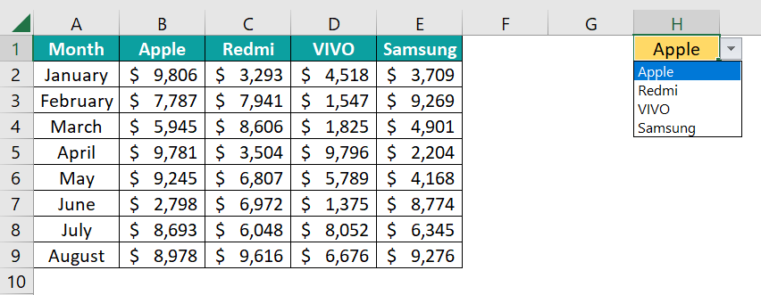
• Next, copy the month names before the drop-down list column.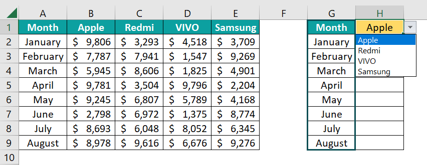
• Select cell H2, apply the following formula, and drag it to all the other cells as well.
=INDEX($B$2:$E$9,MATCH(G2,$A$2:$A$9,0),MATCH($H$1,$B$1:$E$1,0))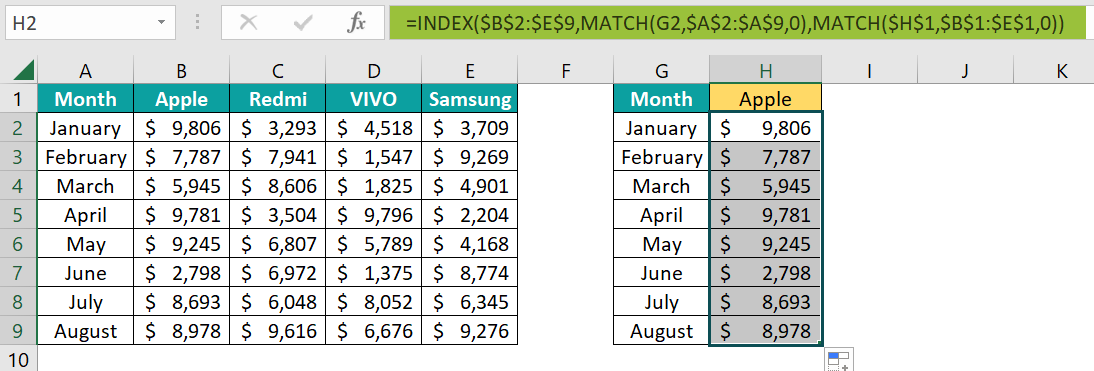
• Now using the range G1:H9 create a chart.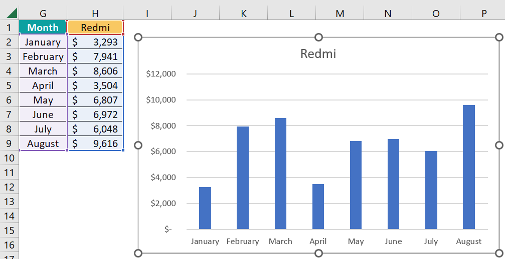
• Now change the drop-down list in cell H1 and see the changes happening in the chart.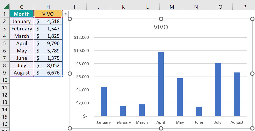
We have changed the value to VIVO, and the chart dynamically shows the VIVO sales numbers.
Use this Dynamic Chart In Excel Template to follow along with the examples in this article.
Download Excel Template