
What is Radar Chart in Excel?
A Radar chart in Excel (Spider Chart), is used to showcase and compare values with respect to a central value. Here, the axes begin at a midpoint and radiate outwards. The data points are plotted on the axes resulting in a spiderweb-type chart that helps visualize performance. In addition, it helps compare the same type of data over different periods.
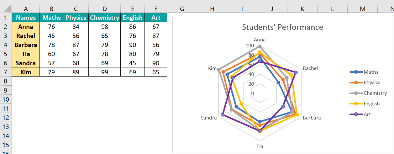
For instance, below, we have the performance of five students in various subjects. For a spider chart for performance review, go to the Insert tab and select the Charts group. Next, click on the drop-down arrow in the “Insert Waterfall, Funnel, Stock, Surface, or Radar Chart.” Choose Radar with Markers chart. You can evaluate the student’s performance at a glance in all subjects.
Use this Radar Chart In Excel Template to follow along with the examples in this article.
Download Excel TemplateKey Takeaways
- A radar chart in Excel, also known as Spider Chart, is used to compare values with respect to a central value. The data points are represented on the axis starting from the same central point with the same scales on the axes.
- The data in the tables are plotted on each axis, and when these points are joined together, a spider-web-like structure is formed.
- Fewer variables and fewer axes help study the chart better, thereby helping in the accurate interpretation of the performance.
Types of Radar Chart in Excel (Spider Chart)
There are three types of Radar charts in Excel.
#1 – Radar
It displays values relative to a center point and is helpful for non-comparable categories.

#2 – Radar with Markers

It is like the radar chart above, but the data points are marked.
#3 – Filled Radar
It is similar to the basic radar chart, but its entire area is filled with color.
How to Create/Make Radar Chart in Excel?
Here’s how you create a radar chart.
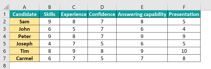
The table contains details of different interviewees who attended a job interview. The below data shows the interviewees graded based on the parameters shown. Let us present this in a radar chart.
- • Select the table from A1 to F7.
• In the “Insert” tab. Proceed to the Charts group.
• Click on the button “Insert Waterfall, Funnel, Stock, Surface, or Radar Chart.”
• Now, click “Radar with Markers” chart.
- You get the chart as shown below.

- Right-click on the chart and click “Select Data.” In the pop-up window, you can change the data series, add or remove legends, change the horizontal axis labels, and so on.


How to Interpret the Chart
We get the following information based on the plotting radar chart.
- Sam has the best skills required for the job, while his presentation is the poorest.
- Tim has the most experience and is the most confident.
- Overall, Tim is an ideal fit for the job with high performance in all parameters, followed by Peter.
- Joseph seems the least qualified for the job.
Examples
Let us look at the examples below to understand the radar chart in Excel.
Example #1
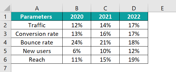
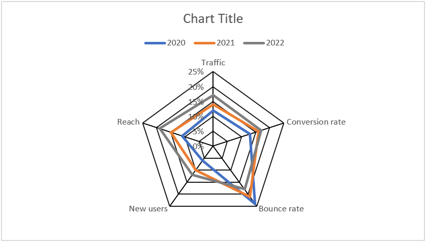
We use a Radar Chart to showcase and compare values with respect to a central value. Let us take an example of a website owner who wants to evaluate his site’s performance. The parameters, such as readability, bounce rate, new user, conversion rate, etc. are compared. We can plot this data over three years. Let us choose the simple radar chart to make things clearer.
Given below is the data of the website for three years. But first, let us check if the site’s performance has increased with time. Our data includes traffic, conversion, bounce rate, new users, and reach.
So, let’s plot a radar chart using this data.
- Step 1: First, select the data in the table. Now, go to the “Insert” tab → Charts group → “Insert Waterfall, Funnel, Stock, Surface, or Radar Chart” → “Radar.”
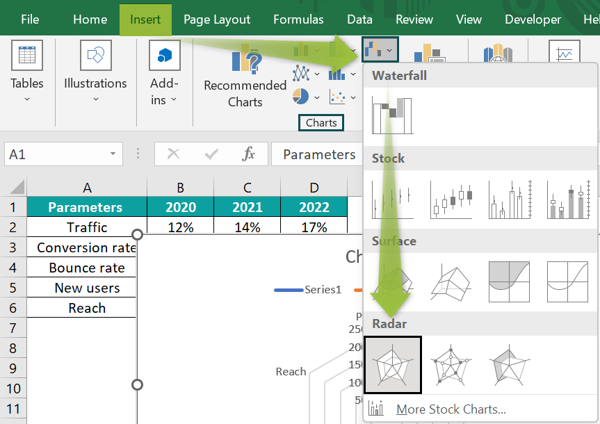
- Step 2: You get a simple radar chart.
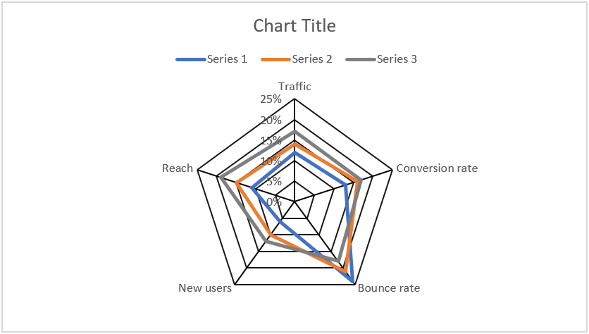
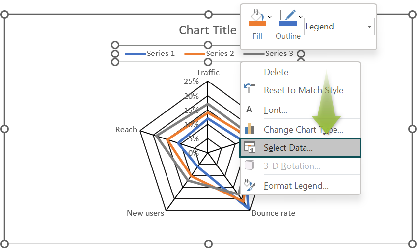
- Step 3: You can observe that instead of years, the data series has been named Series 1, Series 2, and Series 3. To change this, place the cursor on them, right-click and choose the option “Select Data.”
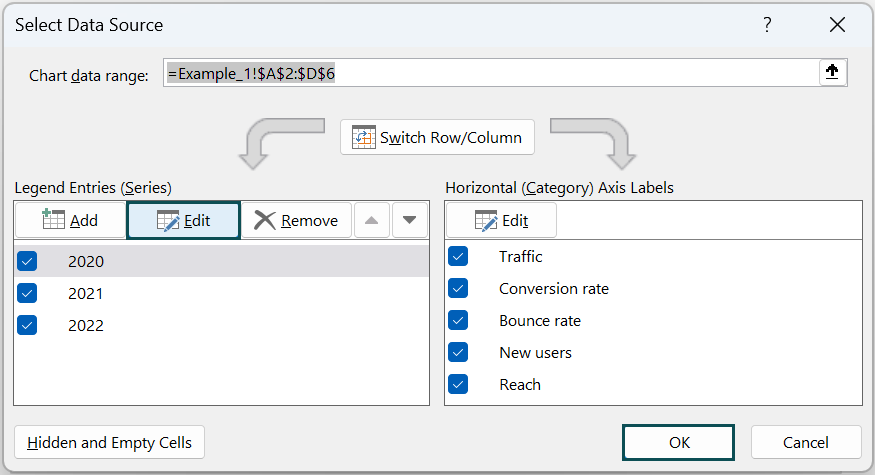
- Step 4: In the pop-up window, select the series, click on “Edit,” and change the Series data to 2020, 2021 and 2022, as shown below.
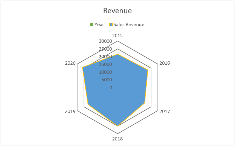
Thus, you get a modified chart that shows the website’s performance over three years.
- Step 5: You can also change radar chart and modify its look, like the legend’s color. Click on the series color you want to change. Right-click and choose the option “Format Data Series.”
In the pane that appears, change to a color of your choice.
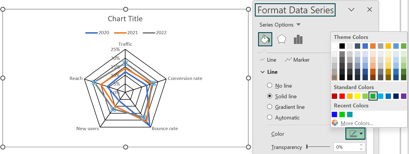
- Step 6: Thus, the color of the year 2022 in the graph is changed.

You can see that the website’s performance has increased well, considering that most parameters have significantly improved according to the graph. The bounce rate has also decreased from 2020 to 2022.
Example #2
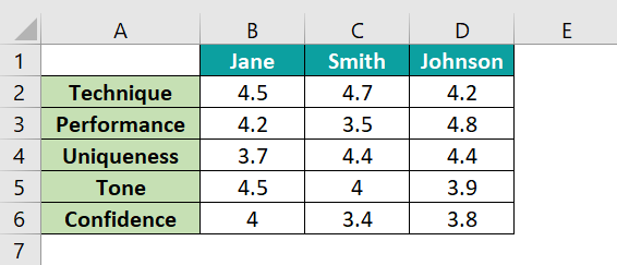
Let us look at another example where three singers are rated in a competition based on specific parameters. They are evaluated on a scale of 5. Let us assess their performance using the radar chart in Excel.
- Step 1: To plot the radar chart, select the data and follow this chain of steps. Go to “Insert” tab → Charts group → “Insert Waterfall, Funnel, Stock, Surface, or Radar Chart” → “Radar with markers.”

- Step 2: You get a filled radar chart, as shown below. We can make many changes to the chart. Double-click on the chart title and add a title of your choice.

- Step 3: You can also change the way how legends are displayed in the Chart Design tab. Click on Add Chart Element, and under the “Legends” option, choose “Right.”
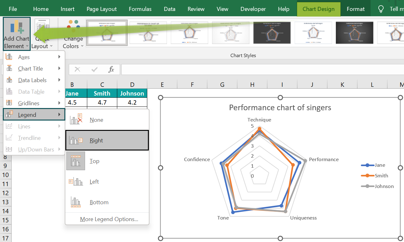
Thus, the radar chart helps analyze the singers’ performance. Using the above methods, you can also add elements and change the chart format.
Example #3
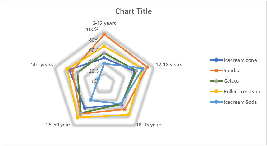
Radar charts help show the differences between data in sub-groups. They are wrapped around a central point; hence, the y-axis starts from the central point and extends outwards. Let us look at an example of survey data. We studied the preference of different age groups over a newly launched ice cream brand to understand the performance of their various products. We can easily notice some options from the table, while we can check the others on a chart.

- Step 1: Select the data and choose the“Insert” tab → Charts group → “Insert Waterfall, Funnel, Stock, Surface, or Radar Chart” → “Radar with Markers”.
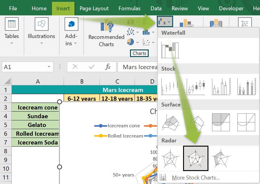
- Step 2: We get a graphical radar chart that looks like a line radar chart in Excel displaying the customers’ preferences. You can quickly check the most and least preferred products for each age group.
However, the chart needs to be improved in appearance. For this, you can make changes by clicking on any particular element. Its related pane appears on the right side.

- Step 3: We can move the legends to the side rather than be displayed on the top. For this, go to the tab Chart Design → Add Chart Element → Legend → Right. The chart legends are now moved to the right.
- You can also change the axis scale by clicking on it, which opens the Format Axis pane on the right.
- To change the color of any data series, click on it. You get the Format Data Series option on the right side, where you can change the color.
Advantages and Disadvantages
Pros
- The presentation in a radar chart is compact.
- It can handle more than one data series.
- The chart is eye-catching with a radial axis, making it look like a circular radar chart in Excel resembling a spider’s web.
- Radar chart helps interpret parameters like performance at a glance which are otherwise difficult to study from a complex table with more data.
- It is useful where the actual values are not too important, but the overall picture is.
Cons
- The radar chart looks unusual and can be confusing if one needs help understanding the radial axis.
- It isn’t easy to read in terms of values.
- Once you change the order of the categories, their shape changes immediately.
- The complex presentation is challenging for those who cannot interpret such visualization techniques.
Important Things to Remember
- Radar charts have one axis per category using a common scale.
- Its axes radiate out from the center, and the data points are plotted on them using the same scale.
- The radar chart in Excel is helpful when presenting a two-dimensional dataset.
- The Filled Radar Chart works if there are only a few data series; otherwise, it isn’t easy to read. To read this chart correctly, set the transparency at a high level, or the polygons overlap.
- A radar chart in Excel helps you get an overall picture where the exact values are less important.
- If the axes or the variables are more, the structure becomes complex to read.
Frequently Asked Questions (FAQs)
Radar charts show commonality in data and can be used to display performance metrics, such as new users, employee performance, etc. It also helps compare different data points on a radial axis.
• Create a radar chart and click on it.
• You can see the Chart Design tab.
• Click on Add Chart Elements and then click on Axes, followed by More Axes Options.
• Under the “Axis Options” button, choose the option, Solid line.
In a radar chart, the data points are flooded with a concentric flow of information, which is confusing. However, a bar chart is excellent when you have a dependent and a categorical independent variable. Also, we can use a lollipop chart with thinner bars topped with a bubble, which helps interpret the data simply and accurately.
The radar chart in Excel is more suitable where the user does not require exact values but an overall picture of the performance. We can quickly compare each category along with its axis. Spider charts are more effective when comparing the target and the achieved performance.
Use this Radar Chart In Excel Template to follow along with the examples in this article.
Download Excel Template