
What is Power BI Ribbon Chart?
A Power BI Ribbon chart helps you quickly determine the data category with the highest rank or the largest value. Using a ribbon chart, you can explain the changes in the value of a data category over a period of time under consideration. It compares the values for different categories over time and displays the ribbons’ increase or decrease in category values at different intervals of time. The larger value of the ribbon would mean a higher category value at the reference time point compared to other time periods.
A Power BI Ribbon chart merges multiple categories into a singular view that provides insight into how a category ranks compared to other categories throughout the tenure of the chart’s horizontal axis. It precisely displays any changes to the category ranks over time. With a ribbon chart, you can easily illustrate the ribbon for the highest rank over the other ribbons at every time reference point. Ribbon charts are extremely suitable for:
- Illustrating changes in values or ranking over a time horizon.
- Discovering any patterns or projecting trends in your data categories.
- Identifying any drifts or moves within the change.
Key Takeaways
- Power BI Ribbon charts are an effective data visualization tool when you want to display any changes to the rank in a data category.
- It allows you to visualize data with the highest rank over the others for each time reference point.
- You can plot a ribbon chart in a 2-dimensional view having both an X-axis and Y-axis, which provides insight on hidden trends and patterns in your data categories.
- You can create a ribbon chart by navigating to the Visualizations pane and choosing the Ribbon chart visual icon.
- Apply customization and different formatting options to enhance user experience and data visualization.
How to Create Power BI Ribbon Chart?
To create a Power BI Ribbon Chart, follow the instructions highlighted below:
Step 1: Open the Power BI Desktop in your system and load the datasets into Power BI using the Get data option.
Step 2: Navigate to the Visualizations pane and choose the Ribbon chart visual icon.

Step 3: Drag and drop the data fields from the Fields pane to the different sections applicable to the Power BI scatter chart. These include the X-axis, Power BI Ribbon chart Y-axis, Legend, Power BI Ribbon chart Small multiples, and Tooltips.

Note: Using Power BI Ribbon chart small multiples, you can create a visual matrix based on the mapped field by dragging and dropping the field to Power BI Ribbon chart small multiples.
Step 4: Configure customization and formatting options for your ribbon chart. These include look and feel, titles, formatting axes, colors of the bubble, markers, etc.
Step 5: Save the changes and then publish the report to Power BI Service for collaboration and sharing it with other users.
In the next section, we will see how you can format a Power BI ribbon chart.
How to Format Power BI Ribbon Chart?
To format a Power BI ribbon chart, follow the instructions below:
Step 1: Navigate to the Format your visual tab under the Visualizations pane in Power BI Desktop.

Step 2: Format Axis Titles, Layouts, and Values for both the X-axis and Y-axis. You can also adjust any labels for both axes.
Step 3: Toggle the Legend slider on and expand this section to configure the formatting options such as position, title, and look and feel configurations for your chart.

Step 4: You can also configure the gridlines (such as show or hide), use the Zoom slider option to add a slider to the vertical axis, and add Data labels to customize the appearance of your chart.

Step 5: You can also customize the colors and add background images to your chart.
Step 6: Expand the Ribbons section to customize the color, border, and layout of your ribbons in the chart.

Step 7: Navigate to the General tab of Format your visual pane for customizing other formatting options such as Title, effects, adding any tooltips, and other chart properties.

Step 8: Once the changes are completed, save the changes to reflect in your visual.
In terms of Power BI Ribbon chart totals, there is no direct option supported in the ribbon chart. However, you can use DAX (Data Analysis Expression) to create columns or measures to add totals to your chart for your reporting requirements.
In the next section, we will go through a few examples of creating and formatting the Power BI Ribbon charts using different datasets.
Examples
In this section, we will demonstrate the Power BI Ribbon chart using 3 different scenarios.
Example #1 – Customizing the Ribbon Chart in Power BI
In this example, we will demo an animated scatter plot in Power BI using Sales Performance Report DQLab Store data. Sales Performance Report DQLab Store contains a retail transaction dataset over four years i.e. 2009 to 2012.
To plot a Power BI Ribbon chart with customized formatting, follow the instructions below:
Step 1: Import the Sales Performance Report DQLab Store in Power BI Desktop using the Get data option and load it into Power BI.

Step 2: Navigate to the Visualizations pane and select the Ribbon chart visual icon.

Step 3: Drag and drop the fields from the Fields pane to the different sections applicable to the ribbon chart. In this case, we have mapped the X-axis with Order_date, the Power BI Ribbon chart Y-axis to total sales, Legend with product_category, and added Tooltips with order_quantity as per the screenshot shown below.

It will create a ribbon chart in the report canvas.
Step 4: Select the ribbon chart and navigate to the Format your visual tab in the Visualizations pane. Customize the chart by choosing the options under the Visual tab.
Step 5: Specify the Legend position, turn on the Zoom slider, and configure the slider options.

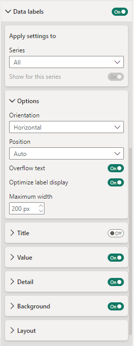
Step 6: Add the Data labels to the chart and customize the display options.

Step 7: Similarly, you can also apply the look and feel and other formatting options by navigating to the General tab.

Step 8: Save the changes. It will create a Power BI Ribbon Chart with customized formatting options.

Example #2
In this example, we will plot the Power BI Ribbon chart using the vending_machine_sales dataset. vending_machine_sales contains 2022 vending machine sales data from different locations in Central New Jersey.
To plot this chart, follow the instructions highlighted below:
Step 1: Import the vending_machine_sales dataset into Power BI using the Get data option. Click on Load to load data into Power BI.

Step 2: Choose the Ribbon chart icon from the Visualizations pane. Drag and drop the data fields into the Visualizations pane.

Step 3: Navigate to Format your visual tab under the Visualizations pane. Toggle on the Zoom slider option and configure the options.

Step 4: Expand the Legend section and configure the position of the legend values on the chart

Step 5: Expand the Data labels option and add customization options such as Title, Value, Detail, Background, and other options

Step 6: Navigate to the General tab to configure chart visual options to make it visually appealing.

Once you save the changes, you will see the ribbon chart in the report canvas.

Example #3
In this example, we will demo the plotting of the Power BI Ribbon chart using the US Superstore Sales dataset. The US Superstore Sales dataset contains the Retail dataset of a global US superstore giant for 4 years.
To create this ribbon chart, follow the steps outlined below.
Step 1: Import the US Superstore Sales dataset into Power BI Desktop and load it into the Power BI.

Step 2: Choose the Ribbon chart icon from the Visualizations pane. Drag and drop the data fields into the Visualizations pane.

Step 3: Navigate to Format your visual tab under the Visualizations pane. Configure the axes ie. X-axis and Power BI Ribbon chart Y-axis in your chart.

Step 4: Toggle on the Zoom slider option, expand the section, and configure the slider options.

Step 5: Expand the Legend section and specify the position of the legend values on the chart.

Step 6: Expand the Data labels option and add customization options such as Title, Value, Detail, Background, and other options
Step 7: Configure the Ribbons option to define the colors and other settings

Step 8: Navigate to the General tab to configure chart visual options to make it visually appealing.

Once you save the changes, you will see the ribbon chart in the report canvas.

Important Things to Note
- Power BI Ribbon charts require categorical data and a time horizon to visualize the data category changes
- Consider the level of granularity you want to display using the ribbon chart for effective data visualization
- Ensure that the dataset you are using is accurate and validated to avoid any biases or outliers
- It is recommended that you use a limited number of categories in a ribbon chart for effective visualization
- Good choice of colors and data labels are necessary to make clear and easy interpretations
Frequently Asked Questions (FAQs)
Yes, you can additional data labels to the Ribbon Chart in Power BI. You can do it in either of the two ways highlighted below:
1. Using Data labels
2. Using the Tooltips
No, as such, the ribbon chart in Power BI does not support the drill-down functionality. Drill down is a Power BI functionality, and for it to function, you need to have a hierarchy in your dataset. However, you can consider other visualization options to display data granularity.
Yes, you can export a Ribbon Chart to other formats. These include Excel, CSV, PDF, PowerPoint, and PNG image formats. You can export the ribbon chart by clicking on the ellipsis (…), i.e., More options, and choosing the Export data option.
While Ribbon charts are effective data visualization tools, they come with certain limitations. Understand these limitations before you consider these charts for your visualization requirements. These limitations include:
• Data requirements: Ribbon charts work effectively with categorical data and time horizons and, hence, are not suitable for all data types
• Customization options: Ribbon charts provide limited customization options compared to other charts or visual options
• Drill-down capabilities: Ribbon charts don’t come up with in-built drill-down capabilities
• Data Categories: With high data category options, your chart may look visually complex and difficult to interpret.
• Loading performance: The chart rendering or loading time may significantly be impacted by large datasets