What is a Power BI Treemap?
A treemap is a data visualization technique in Power BI that represents hierarchies through nested rectangles. Each branch of the hierarchy is given a colored rectangle, and the size of each rectangle corresponds to a certain measure (e.g., sales, revenue). Treemaps are helpful for displaying hierarchical data and making it easy to identify patterns and trends within the data.
Treemaps display a hierarchical structure where each level of the hierarchy is labeled with a colored rectangle, i.e., a branch node. Each branch is further divided into smaller rectangles known as leaf nodes. Power BI arranges the rectangles as per their size, where the rectangle with the largest colored rectangles/branch node is placed at the top left, and the one with the smallest branch node is placed at the bottom right. The same logic applies to the leaf nodes within each branch node.
An example of a treemap in Power BI is seen below.
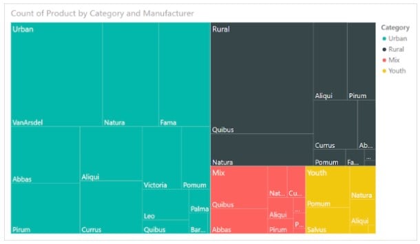
Table of contents
Key Takeaways
- Treemaps are powerful data visualization tools that allow you to gain quick insights into big, complex data sets. They help understand the hierarchical relationships between data points.
- Treemaps are effective when representing hierarchical data, so choose your hierarchy wisely.
- Each branch in the hierarchy is shown as a colored rectangle with its size corresponding to a specific measure.
- You should customize colors, labels, and formatting to make the treemap visually appealing and informative.
- Update the treemap as needed, especially if there are changes in the underlying data or if new insights are required.
📊 Unlock Advanced DAX Skills in Power BI!
Take your Power BI skills to the next level with our Advanced DAX in Power BI Training Course. Dive deep into advanced DAX functions, complex calculations, and optimization techniques to enhance your data analysis and reporting capabilities.
How to Create a Power BI Treemap?
To create a basic treemap in Power BI, follow the steps highlighted below:
Step 1: Open Power BI Desktop on your machine and load the data you want to use for the Treemap visual. Ensure that your data has a hierarchical structure.
Step 2: Navigate to the Fields pane and select the table or dataset that contains the hierarchical data.
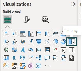
Step 3: Navigate to the Visualizations pane and choose the Treemap visual. In the next section, we will see how you can customize treemap in Power BI.
How to Customize Treemap in Power BI?
You can adjust Treemap in Power BI by customizing various options such as appearance, colors, labels, etc. To customize the treemap in Power BI, follow the instructions outlined below:
Step 1: Select the Treemap visualization you want to apply formatting or customization.
Step 2: Navigate to Format your visual tab in the Visualizations pane. Adjust settings such as title, data labels, and background color.

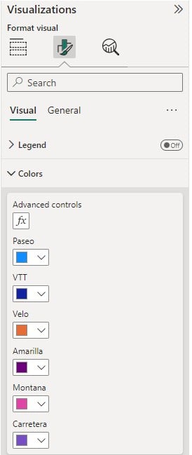
Step 3: You can adjust the Treemap in Power BI by customizing the color scheme of the treemap in the Colors section
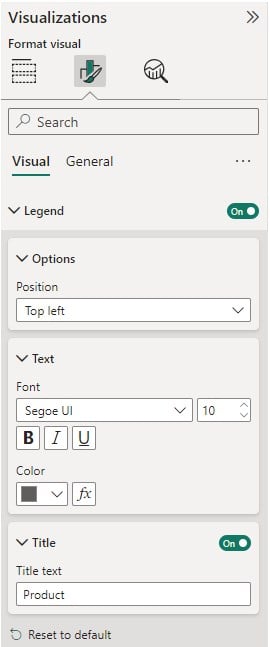
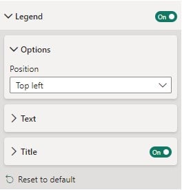
Step 4: Adjust the position of the legends, text formatting, and titles through the Options, Text, and Title settings in the Legend section under the Visual tab in the Format visual pane.
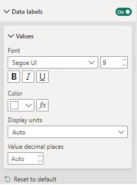
Step 5: Configure data labels by toggling the Data label option in the Format visual pane. Here, you can change the color, display units, and value decimal places by navigating to the Values section.
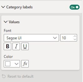
Step 6: Customize the category labels in the rectangle by navigating to the Category labels section in the Format visual pane and adjusting the font color and size of the labels.
Step 7: You can also navigate to the General tab under the Format visual in the Visualizations pane to apply additional formatting options. These include Title to the visuals, applying effects, tooltips, and other formatting options related to text, size visuals, etc.
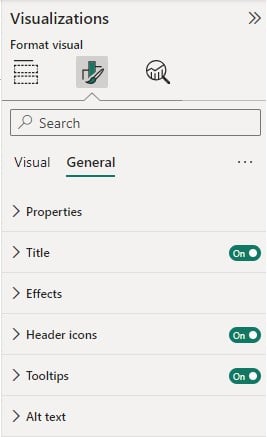
You can adjust Treemap in Power BI by following the steps highlighted above. You can also sort Treemap in Power BI by choosing a Treemap visual in the report canvas and selecting the Sort ascending or Sort descending option.
Note that if you are looking for an alternative for TreeMap in Power BI, consider other visualizations that may better suit your data and analysis needs. These include:
- Sunburst chart: Provides hierarchical view similar to Treemap. A ring represents the hierarchy.
- Hierarchy chart: This allows you to visualize hierarchical data using rectangles to represent levels
- Stacked Bar Chart: Each bar is divided into segments, representing different components and useful for data comparison across categories
- Matrix table: Displays data in rows and columns format
- Scatter chart: helpful in visualizing relationships between two variables
In the next section, we will go through some examples to demonstrate how to create and use treemaps in Power BI.
Examples
Let us look at some examples presenting the treemap in Power BI.
Example #1 – Using Conditional Formatting to Highlight Key Insights in Treemap
In this example, we will create a Treemap and apply conditional formatting to highlight any key insights based on the dataset. For this demo, we have used Garment_Sales data to create the visual. It contains the details of sales, categories, and geography of apparel and accessories.
To create a Treemap with conditional formatting, follow the instructions below:
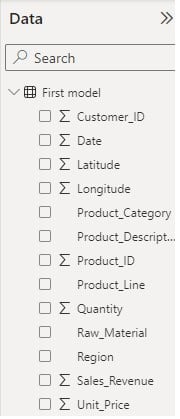
Step 1: Open Power BI on your machine and import the Garment_Sales dataset using the Get data option.
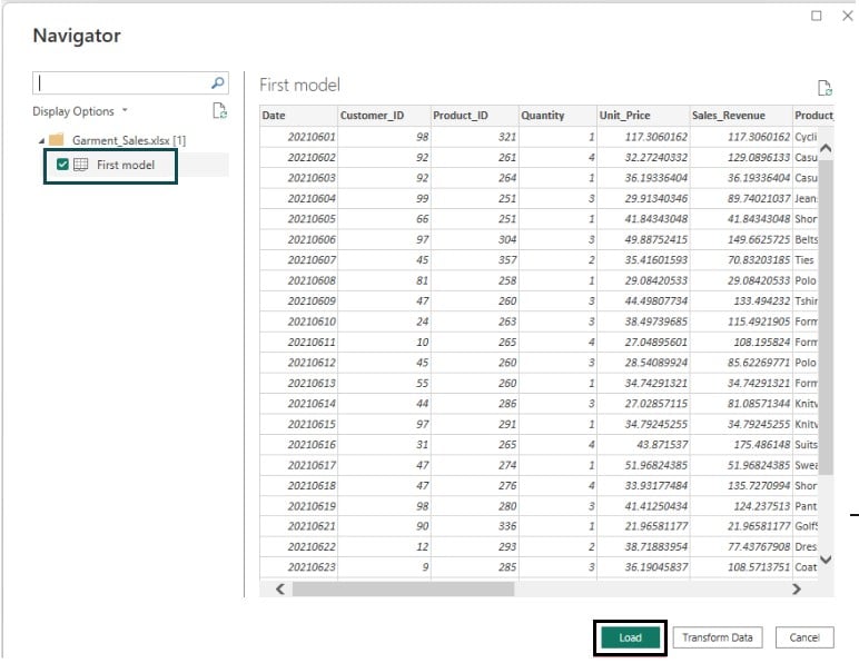
Click on the Load button to load the data into Power BI. Once the data is loaded, you will be able to view it by navigating to the Fields pane.
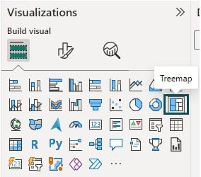
Step 2: Navigate to the Visualizations pane and choose the Treemap visual.
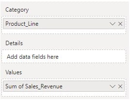
Step 3: Drag the fields from the Fields pane and drop them into the Category, Details, and Values section in the Visualizations pane.
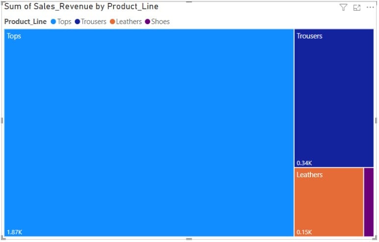
It will create a Treemap in the report canvas, as shown below.
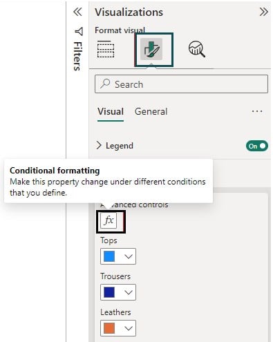
Step 4: Select the Treemap visual and navigate to the Format visual tab under the Visualizations pane. Expand the Colors section and click on the Advanced controls icon.
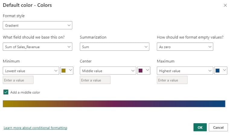
Step 5: Specify the conditional formatting settings on the Default color – Colors window. You can define the color gradient as per the measure. For example, we have defined the color gradient based on Sales revenue. Click on the OK button.
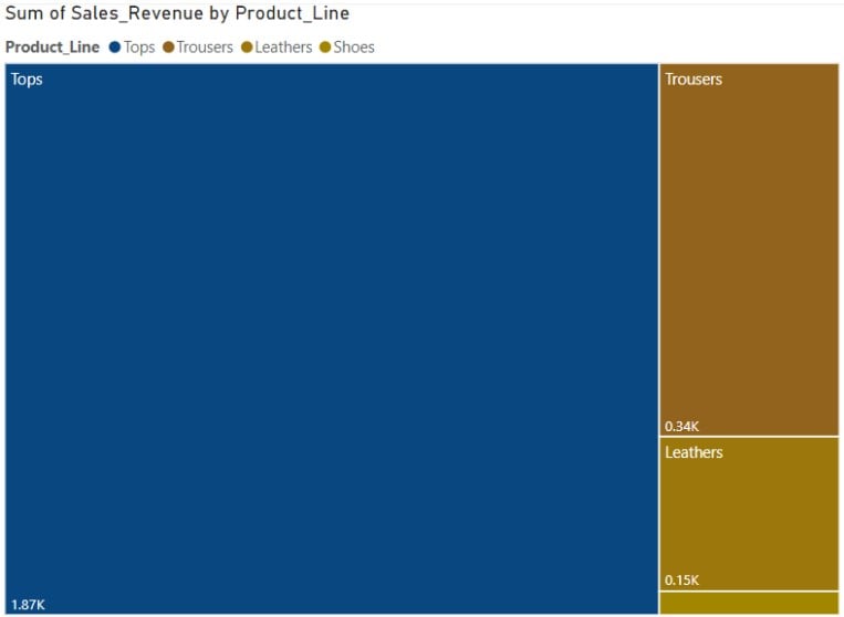
Step 6: Once you have defined the conditional formatting, the Treemap visual will be refreshed with the color combination provided.
Example #2 – Using Filters and Slicers to Enhance Treemap Analysis
In this example, we will create a Treemap in Power BI and apply slicers to the visual. For this demo, we have used Walmart_Superstore_Sales data to create the visual. The Walmart_Superstore_Sales dataset contains the details of sales, categories, and unit economics of the products.
To create a Treemap with slicers, follow the instructions below:
Step 1: Import the Walmart_Superstore_Sales dataset using the Get data option and click on the Load button.
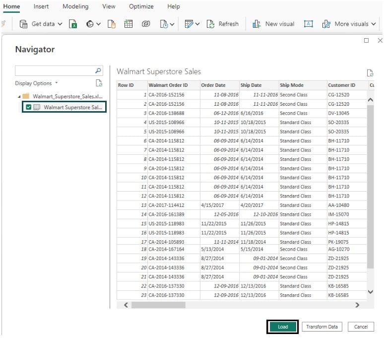
Once the data is loaded, you will be able to view it by navigating to the Fields pane.
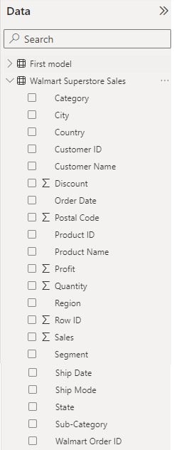
Step 2: Navigate to the Visualizations pane and choose the Treemap visual. Drag the fields from the Fields pane and drop them into the Category, Details, Values, and Tooltips section in the Visualizations pane.
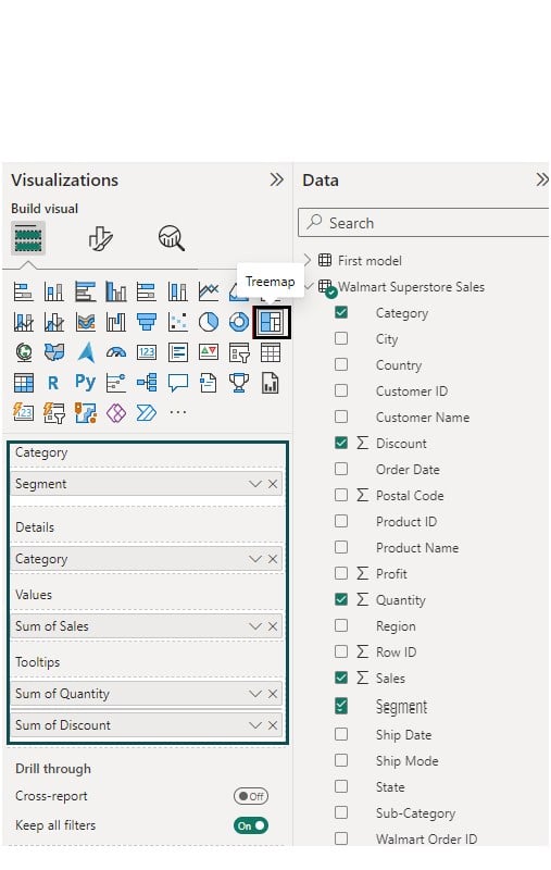
It will create a Treemap visual in the report canvas, as shown below.

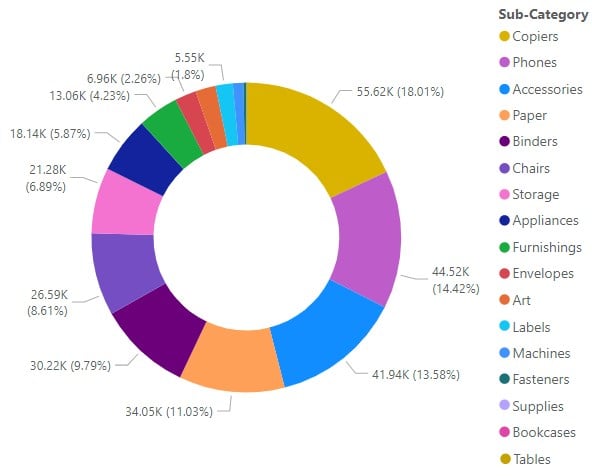
Step 3: Navigate to the Visualizations pane and choose the Donut chart visual. Drag the fields from the Fields pane and drop them into the Legend and Values section in the Visualizations pane.
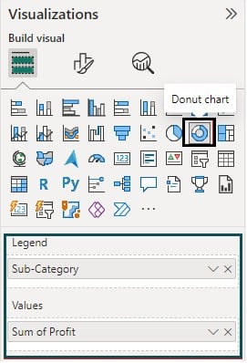
It will create a Donut chart in the report canvas.
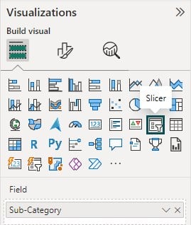
Step 4: Navigate to the Visualizations pane and choose the Slicer visual. Drag the fields from the Fields pane and drop them into the Field section.
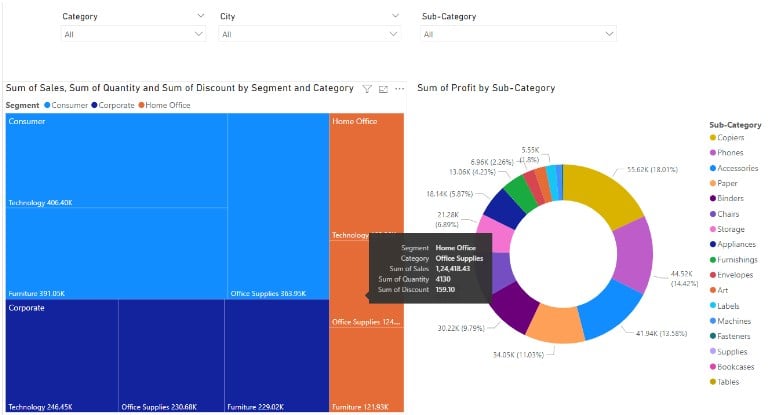
Here we have three slicers to the visual as shown below.

Once you have applied the required formatting to the visuals, your final report will look like the one below.
Example #3 – Formatting a Tree Map in Power BI
In this example, we will extend example 2 to demonstrate the formatting options of the Treemap in Power BI.
To apply formatting to a Treemap in Power BI, follow the instructions below:
Step 1: Open the Treemap visual in Power BI in your system as shown in the previous examples.
Step 2: Select the Treemap visual, and navigate to the Format visual tab in the Visualizations tab.
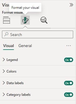
Step 3: Navigate to the Visual tab and turn on the Legend, Data labels, and Category labels sliders.
Specify the position of the legend by choosing appropriate options.
Expand the Colors section and adjust the colors of the rectangles as per the visual requirements.

Expand the Data labels section to configure the display units of the labels

Similarly, expand the Category labels to specify any color combination for the category labels.

Step 4: Navigate to the General tab to configure details such as Properties, Adding Title, Effects, and any Tooltips to the visuals. You can further customize each of these options by expanding the tiles and specifying the custom configurations to suit your visual requirements.

Important Things to Note
- Carefully select the hierarchy field to ensure a meaningful representation of data.
- Choose an appropriate measure for the size or color of the rectangles.
- Ensure data quality and consistency for accurate treemap visualization.
- Leverage Power BI’s interactive features to allow users to explore the treemap dynamically.

Frequently Asked Questions (FAQs)
The key limitations of treemap in Power BI include:
• Treemaps may not be suitable for visualizing data with too many hierarchy levels. A complex hierarchy can make the visualization cluttered and difficult to interpret.
• Treemaps are designed for hierarchical data, and they may not be the best choice for non-hierarchical or flat data.
• In a treemap, smaller tiles may become hard to click or select, especially if there is a large number of them. This can make it challenging to interact with the data at a detailed level.
• Compared to other visualizations, treemaps offer limited customization options. Users might find it challenging to fine-tune the appearance according to their specific needs.
• You cannot use the color saturation and details features concurrently.
Treemaps are effective for comparing the sizes of different categories or subcategories based on a measure.
• The hierarchical structure of treemaps allows users to easily navigate through levels and understand the relationships between parent and child elements.
• Power BI allows users to color-code the treemap based on a specific measure, helping to provide additional insights and highlight key information.
• Treemaps in Power BI support interactive features such as drill-down and drill-up, allowing users to explore data at different levels of detail.
• Treemaps are useful in presenting a large number of values that are difficult to be presented using a bar chart and you can easily show the distinction between each part and the whole portion.
• You can also identify patterns, extreme values, key contributors, and any exceptions using the treemaps.
Yes, you can use a treemap for categorical data in Power BI. Treemaps are designed to display hierarchical data, and they can be effective for visualizing categories and subcategories based on a numerical measure.
Yes, it is possible to create a dynamic treemap with slicers in Power BI. You can use slicers to filter and slice the data displayed in the treemap dynamically. By connecting the slicers to the treemap, users can interactively control and customize the view based on specific criteria or categories.
To create a dynamic treemap with slicers:
• Add a treemap visualization to your Power BI report.
• Add slicers to your report and connect them to the relevant fields or measures.
• Configure the treemap to respond to slicer selections by using the slicer values as filters for the treemap.
Recommended Articles
This has been a guide to Treemap in Power BI. We learn to create new and customized treemap in power bi, with examples and points to remember. You can learn more from the following articles –

Leave a Reply