What is the Gantt Chart?
A Power BI Gantt chart visually represents project schedules or timelines. It provides a graphical view of tasks, their durations, dependencies, and the overall project timeline in a single chart. The Power BI Gantt chart consists of horizontal bars representing individual tasks or activities plotted against a timescale.
The Gantt chart in excel helps product managers, program managers, and development and business teams understand project progress, track task dependencies, identify bottlenecks, and manage resources effectively. One of the best parts of these charts is that they help teams track the progress by what’s been finished, current progress, and the pending tasks in an efficient means.
Table of contents
Key Takeaways
- The Power BI Gantt charts are effective tools for visualizing project schedules, and timelines and can be used to create dynamic and interactive project timelines.
- Creating a Gantt chart involves importing data, configuring the visual settings, and customizing the appearance.
- You can add the milestones, the Power BI Gantt chart with dependencies, and also the customized Gantt chart template as per the visual requirements.
- Pay attention to data formatting, task dependencies, and additional fields to enhance the Gantt chart’s usefulness.
- Keep in mind any limitations or specific behaviors of the Gantt chart visual in Power BI to ensure an accurate representation of your project data.
📊 Unlock Advanced DAX Skills in Power BI!
Take your Power BI skills to the next level with our Advanced DAX in Power BI Training Course. Dive deep into advanced DAX functions, complex calculations, and optimization techniques to enhance your data analysis and reporting capabilities.
How to Create Gantt Chart in Power BI?
To create a Power BI Gantt chart, follow the steps below:
Step #1 – Prepare data
To create a Gantt chart, your data source must contain the necessary columns, such as task names, start dates, end dates, and optionally, additional columns for task categories or milestones. Ensure this information is available before importing the Power BI tool dataset.
Step #2 – Import data
Import your data into Power BI by selecting the appropriate data source, such as Excel, CSV, or a database connection. Connect to your data and load it into Power BI.
Step #3 – Import Gantt chart visual into Power BI
By default, Power BI doesn’t provide Gantt Chart visual in the Visualization pane, and hence there is a need to import this visual into Power BI. To import the visual, follow the steps highlighted below:
Navigate to the Visualization pane, and click on (…).
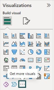
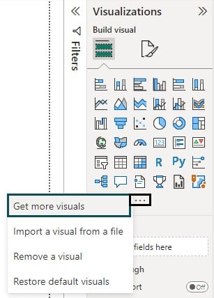
Choose the Get more visuals option from the menu bar.
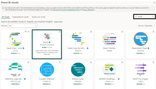
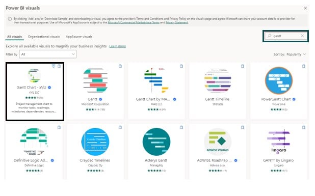
It will open the AppSource pop-up window. Search for the Gantt keyword in the search bar.
Click on Add to import the Gantt chart from AppSource.
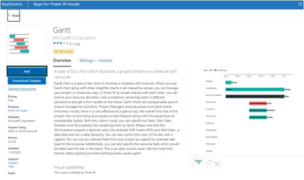
Once the import is successful, the Gantt chart visual icon will be visible in the Visualization pane.
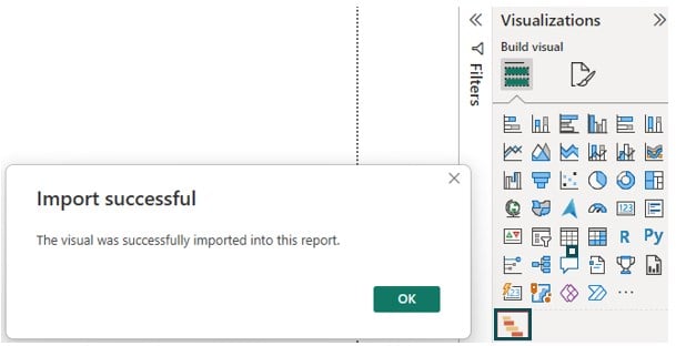
Step #4 – Add a Gantt chart visual
From the Visualizations pane on the right, click on the Gantt chart visual icon to add the Gantt chart visual to your report canvas.
Step #5 – Configure the Gantt chart visual:
In the Gantt chart visual settings pane, drag and drop the relevant data fields into the appropriate sections, such as Legend, Task, Start Date, End Date, and Duration.
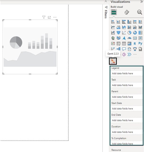
The details of these properties are provided below:
- Legend – refers to the project category
- Task – The project work description to be done in a specified period
- Parent – this takes a summary of the child tasks
- Start Date – Start date of the project tasks
- End Date – The end date of the project tasks
- Duration – timeframe for working on a particular project i.e., 3 months, 6 months, etc.
- % Completion – The percentage of the task completed
- Resource – This is what you use in the project. For example various project teams such as Project Manager, Developer, Test Manager, Analyst, etc.
- Tooltips – Text boxes that are displayed when a timeline or data grids are hovered over
- Milestones – This refers to the important or specific milestones in your project that describe the improvements in a project
Step #6 – Customize the Gantt chart:
Format the Gantt chart to adjust the appearance, colors, and labels using the formatting options in the Visualizations pane.
Step #7 – Save and publish the report:
Once you have customized the Gantt chart, save your report, and publish it to the Power BI service or share it with other users.
Using the Power BI Gantt chart, you can define the Gantt chart milestones to effectively visualize key events or significant milestones in your project timeline. Similarly, by including multiple date columns in your dataset and mapping them to the chart properties, you can create the Gantt chart with multiple dates.
The key thing to note is that Power BI doesn’t have any built-in support for creating the Gantt chart with dependencies. However, you can import additional third-party visuals such as Gantt Chart -viz from the AppSource to define and display dependencies between the different tasks or activities in the Gantt chart.
Similarly, the Gantt chart templates are not built-in by default in the Power BI Desktop. However, you can find the pre-built Power BI Gantt chart templates created by the Power BI community or third-party vendors in AppSource or the Power BI marketplace.
Examples
Now, we will go through some of the examples to see how you can create the Gantt chart for your report.
Example #1
In this example, we will create a simple Gantt chart to display the project progress across various tasks. To create a simple Gantt chart, follow these steps:
Step 1: Import the Power BI Gantt chart Task Dataset into the Power BI using the data connection.

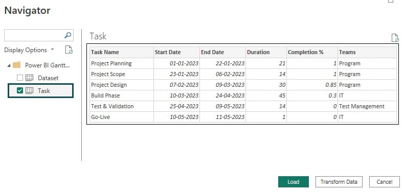
Step 2: Navigate to the Visualization pane and select the Gantt chart visual.
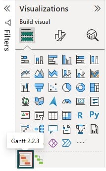
It will create a blank chart in the report canvas.
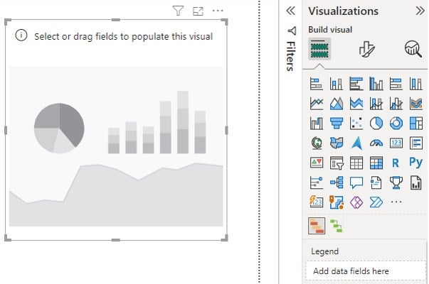
Step 3: Map the properties of the Gantt chart with the fields in the Fields pane.
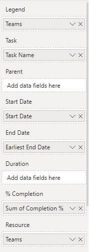
It will create a Power BI Gantt chart with task progress along with the timelines.

You can view the progress of each task along with the timelines and task completion % across various phases of the program using this chart.
Example #2
In this example, we will create a Gantt chart and define its milestone for tracking the specific program milestones using the Power BI Gantt chart Dataset. To create the Power BI Gantt chart, follow the steps highlighted below:
Step 1: Import the Gantt chart dataset into Power BI using the data connection and load the dataset into the Power BI Desktop.
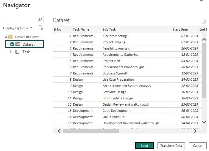
Step 2: Navigate to the Visualization pane and select the Gantt chart visual. It will create a blank chart in the report canvas.
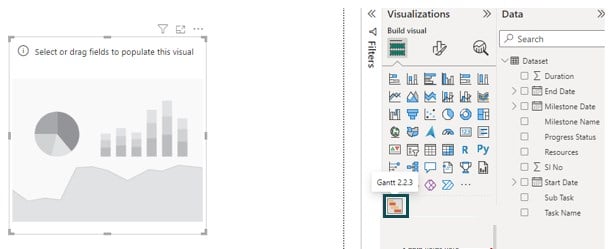
Step 3: Configure the chart visual by linking the properties of the Power BI Gantt chart to the appropriate fields in the Fields pane.

Step 4: Select Milestone Name under the Milestones header to add the Power BI Gantt chart milestones.

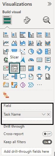
Step 5: Now navigate to the Visualization pane and select Slicer Visual onto the report canvas. Drag the Task Name field to the Field section.
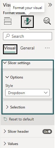
Format the slicer properties by choosing the appropriate Slicer settings under the Visual section in Format your visual tab.
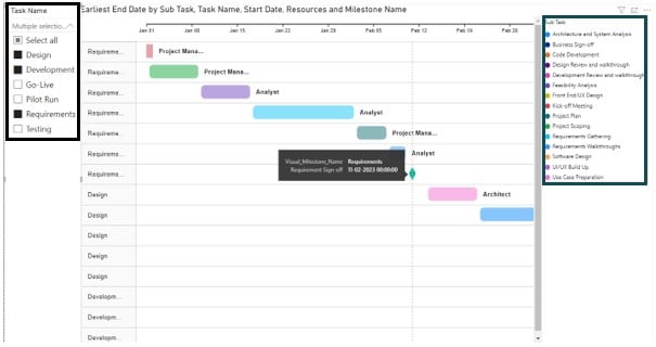
Step 6: Choose the relevant task name from the Task Name dropdown filter.
You will see the chart with the Power BI Gantt chart milestones for each associated task along with the subtask legends for effective tracking.
Important Things to Note
- Ensure that your data is correctly formatted with the appropriate date and time values for the start and end dates.
- Validate that the data is accurate and consistent such as task durations, % completion, milestone details, and alignment of dates to create a meaningful Power BI Gantt chart
- Make sure to properly define dependencies and task relationships if required.
- Consider adding additional fields like task categories or milestones to enrich the Gantt chart’s visual representation.
- Be aware of any limitations or specific behaviors of the Gantt chart visual in Power BI, as these may impact your desired output.

Frequently Asked Questions (FAQs)
There could be several reasons why the duration is not working in a Power BI Gantt chart. Here are a few things you can check:
• Make sure the duration field in your data source is correctly formatted as a numerical value (e.g., number of days or hours).
• Check if the duration field is mapped to the correct data type in Power BI
• Verify that the duration column is correctly mapped to the Duration field in the Gantt chart visual settings.
There could be various reasons why the Power BI Gantt chart legend is not working. Here are a few things to consider:
• Ensure that your dataset has a column to represent the task categories or statuses.
• Validate that the column to be mapped to the legend is correctly mapped to the Legend section in the Gantt chart visual settings.
• Check if the legend option is enabled in the Gantt chart visual settings in the “Format” pane under the “Legend” section.
• Verify that the legend is positioned correctly on the report canvas and has enough space to display the task categories or statuses.
If you have checked these aspects and the legend is still not working, it could be due to a bug or limitation in the Power BI Gantt chart visual. Consider reaching out to the Power BI community or Microsoft support for further assistance.
To add Gantt chart milestones, you can follow these steps:
• Ensure that your data source includes a milestone column that represents the milestones to display.
• In Power BI Desktop, add a Gantt chart visual to your report canvas.
• Drag and drop the milestone column to the Milestones field in the Gantt chart visual settings.
• Format the milestones by adjusting the color, shape, or appearance by navigating to the visual settings pane.
Once you have completed these steps, the Gantt chart visual will display the milestones based on the data in your milestone column.
You can sort the Power BI Gantt charts using the steps below:
• Select the Gantt chart visual in Power BI Desktop.
• In the “Fields” pane, locate the column that you want to sort the Gantt chart by (e.g., start date or end date).
• Right-click on the column and choose the desired sorting option (“Sort ascending” or “Sort descending”).
The Power BI Gantt chart visual will rearrange the tasks according to the selected sorting option. Following the same steps, you can also sort the Gantt chart by other columns, such as task duration or task name.
Power BI does not provide a built-in option to download a Gantt chart as an image or file. However, you can use other methods to capture or export the Gantt chart.
Recommended Articles
This has been a guide to Power BI Gantt Chart. Here we will guide to create a Gantt chart in Power BI with examples. You can learn more from the following articles –

Leave a Reply