
What Is Stacked Column Chart In Google Sheets?
Stacked column chart is one of the chart types available in Google sheets. Using this chart type, we can create stacked column with 2D and 3D types. For example, consider the below table showing the sample products along with the sales in 4 quarters – Q1, Q2, Q3, and Q4, respectively.

Now, let us learn how to create stacked column chart.
To begin with, insert the data in the Google sheets spreadsheet. In this example, the data is inserted in the cell range A1:E3. Next, click on Insert and select the Chart option. We will be able to see the Chart editor window at the right end of the screen. Under the Setup tab, choose Stacked Column in the Chart Type option. We will be able to see the data presented in stacked column chart, as shown in the below image.

Likewise, we can create stacked column chart.
In this article, let us learn how to create stacked column charts in Google sheets with detailed examples.
Use this Stacked Column Chart In Google Sheets Template to follow along with the examples in this article.
Download Excel TemplateKey Takeaways
- Stacked column chart in Google sheets is a type of chart readily available by default.
- Users can use this chart type when they want to show each value distinctly.
- There are two types of stacked column charts in Google sheets. They are
- Stacked column chart
- 100% stacked column chart
- We can convert both the charts into 3D format by selecting the chart and clicking on Customize -Chart Style – 3D.
- These stacked column charts in Google sheets are useful while showing progress as sales in different years, marks in various exams, etc.,
5 Main Parts Of Stacked Column Chart In Google Sheets
There are 5 main parts in stacked column charts.
They are:
- Title shows the heading about the stacked column.
- The X-axis (horizontal) represents the values presented in the data.
- Bars are the columns showing the total value
- The Y-axis (vertical) denotes the period between the lowest and highest values.
- Legend shows the type of the dataset present for the column bars.
Types
In Google sheets, there are 4 main types of charts. They are:
- Stacked Column
- 3-D Stacked Column Chart
- 100% Stacked Column
- 3-D 100% Stacked Column
How To Create A Stacked Column Chart In Google Sheets?
The steps to create a stacked column chart in Google sheets are:
Step 1: To begin with, insert the data in the Google sheets spreadsheet.
Step 2: Next, click on Insert. Select the Chart option.
Step 3: We will be able to see the Chart editor window. It is at the right end of the screen.
Step 4: Under the Setup tab, choose Stacked Column in the Chart Type option.
We will be able to see the data in a stacked column chart.
Likewise, we can create stacked column chart.
Examples
Let us have a look at the following examples.
Example #1 – Steps To Create A Basic Google Sheets Stacked Column Chart
For example, consider the below table showing the data along with the sales in 4 years – Year 1, Year 2, Year 3, and Year 4, respectively.

Now, let us learn how to create stacked column chart.
The steps are:
Step 1: To begin with, insert the data in the Google sheets spreadsheet. In this example, the data is inserted in the cell range A1:E5. Next, select the data.

Step 2: Now, click on Insert. S0elect the Chart option.

Step 3: We will be able to see the Chart editor window. It is at the right end of the screen.

Step 4: Under the Setup tab, choose Stacked Column in the Chart Type option.

We will be able to see the data presented in stacked column chart in Google sheets, as shown in the below image.

Likewise, we can create stacked column chart.
Example #2 – Steps To Create 3D Stacked Column Chart
Let us use the same example. Consider the below table showing the data along with the sales in 4 years – Year 1, Year 2, Year 3, and Year 4, respectively.

Now, let us learn how to create 3D stacked column chart.
The steps are:
Step 1: To begin with, insert the data in the Google sheets spreadsheet. In this example, the data is inserted in the cell range A1:E5. Next, select the data.
Step 2: Now, click on Insert. Select the Chart option.
Step 3: We will be able to see the Chart editor window. It is at the right end of the screen.
Step 4: Under the Setup tab, choose Stacked Column in the Chart Type option.
We will be able to see the data presented in stacked column chart, as shown in the below image.

Step 5: Now, let us make the chart in 3D. To change it into 3D stacked column chart in Google sheets, simply click on Customize – Chart Style – select 3D.

We can immediately see the 3D stacked column chart, as shown in the below image.

Likewise, we can create 3D stacked column chart.
Example #3 – Steps To Create 100% Stacked Column Chart
For example, consider the below table showing the sales region-wise along with the sales in 4 quarters – Quarter 1, Quarter 2, Quarter 3, and Quarter 4, respectively.

Now, let us learn how to create stacked column chart.
The steps are:
Step 1: To begin with, insert the data in the Google sheets spreadsheet. In this example, the data is inserted in the cell range A1:E5. Next, select the data.

Step 2: Now, click on Insert. Select the Chart option.

Step 3: We will be able to see the Chart editor window. It is at the right end of the screen.

Step 4: Under the Setup tab, choose 100% Stacked Column in the Chart Type option.

We will be able to see the data presented in 100 % stacked column chart, as shown in the below image.

Likewise, we can create 100% stacked column chart.
Example #4 – Steps To Create 3D 100% Stacked Column Chart
For example, consider the below table showing the sales region-wise along with the sales in 4 quarters – Quarter 1, Quarter 2, Quarter 3, and Quarter 4, respectively.

Now, let us learn how to create stacked column chart in Google sheets.
The steps are:
Step 1: To begin with, insert the data in the Google sheets spreadsheet. In this example, the data is inserted in the cell range A1:E5. Next, select the data.
Step 2: Now, click on Insert. Select the Chart option.
Step 3: We will be able to see the Chart editor window. It is at the right end of the screen.
Step 4: Under the Setup tab, choose 100% Stacked Column in the Chart Type option.
We will be able to see the data presented in 100 % stacked column chart in Google sheets, as shown in the below image.

Similarly, we can create stacked column chart.
Step 5: Now, let us make the chart in 3D. To change it into 3D stacked column chart in Google sheets, simply click on Customize > Chart Style > select 3D.

We can immediately see the 3D 100% stacked column chart, as shown in the below image.
Likewise, we can create 100% stacked column chart.
Pros And Cons
The main advantage is that users can represent every value in a particular column stacked on top of each other.
The disadvantage is that we cannot use this for spreadsheet with huge dataset.
Important Things To Note
- Stacked column chart is a default chart type in Excel and Google sheets
- We need to select the data and click on Insert – Chart to insert chart for the selected data.
- Next, click on Stacked Column Chart under Chart type in the Chart Editor tab.
Frequently Asked Questions (FAQs)
For example, consider the below table showing the sample products along with the sales in 4 quarters – Y1, Y2, Y3, and Y4, respectively.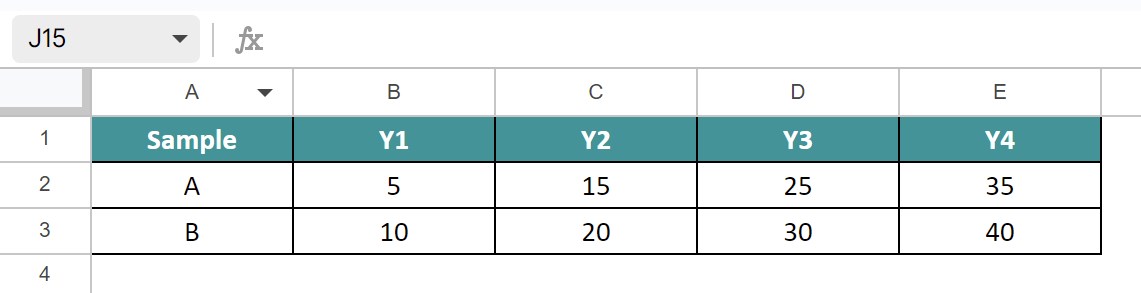
Now, let us learn how to create stacked column chart in Google sheets.
The steps are:
1: To begin with, insert the data in the Google sheets spreadsheet. In this example, the data is inserted in the cell range A1:E3.
2: Next, click on Insert and select the Chart option.
3: We will be able to see the Chart editor window at the right end of the screen.
4: Under the Setup tab, choose Stacked Column in the Chart Type option.
We will be able to see the data presented in stacked column chart in Google sheets, as shown in the below image.
Likewise, we can create stacked column chart in Google sheets.
Yes. We can change the chart type after creating the stacked column chart. Simply click double click on the chart. We will be able to see the Chart editor. Here, click on 100% stacked column chart under the Chart type.
We can right away edit the title in the stacked column chart by selecting the title. We will be able to see Title text under Chart & Axis titles option in the Chart editor tab.
Here, we can edit the title or completely remove it, as per the user’s requirements.
Use this Stacked Column Chart In Google Sheets Template to follow along with the examples in this article.
Download Excel TemplateRecommended Articles
Continue with these related resources when you want the next practical step in this topic.
- Graphs And Charts In Google Sheets
- Types of Charts in Google Sheets
- Google Sheets Pie Chart
- Bar Chart In Google Sheets
- Column Chart In Google Sheets
Explore the full Google Sheets Charts Dashboards and Pivot Tables guide or browse Google Sheets Resources.