
What are Charts in Tableau?
Tableau charts are a group of visualization tools that can help you present your raw data in a way that end users can easily understand. Using the charts in Tableau, you can represent your data in the form of a tabular format, graph, map, geospatial, or diagram. The most commonly used Tableau chart types include Bar charts, Line graphs, Pie charts, and Scatter plots. These chart types are beneficial for allowing users to draw insights from the datasets in the form of visualizations. Each of these chart types has dimensions (For example, category, sub-category, etc.) and measures (profit, revenue, etc.) that are plotted in 2-dimensional coordinates. Using these charts, you can perform data comparisons, visualize relationships, and data distribution for your dataset.
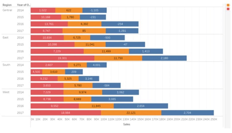
The below diagram is an example of a horizontal stacked bar chart in Tableau.
Key Takeaways
- Tableau charts allow you to represent your data in the form of a tabular format, graph, map, geospatial, or diagram.
- Tableau supports multiple chart types such as common charts and advanced chart types, such as Pareto charts, Z-scores, Population Pyramids, and many more.
- The most commonly used Tableau chart types include Bar charts, Line graphs, Pie charts, and Scatter plots.
- Before you recommend any chart type, always perform an analysis to identify the right chart type for your data analysis.
- To create an effective and visually appealing chart for your users, always follow the best practices applicable to the chart type.
Chart Types in Tableau
Multiple chart types are supported in Tableau. The most common types of charts are provided below:
#1 – Pie Chart
- Description:
- These charts are handy when you want to display proportions as compared to the whole value.
- Pie charts have two key components, i.e., color and angle. Color is represented using the dimensions, whereas the angle is linked to the measure values.
You can create a Pie chart following the steps outlined below
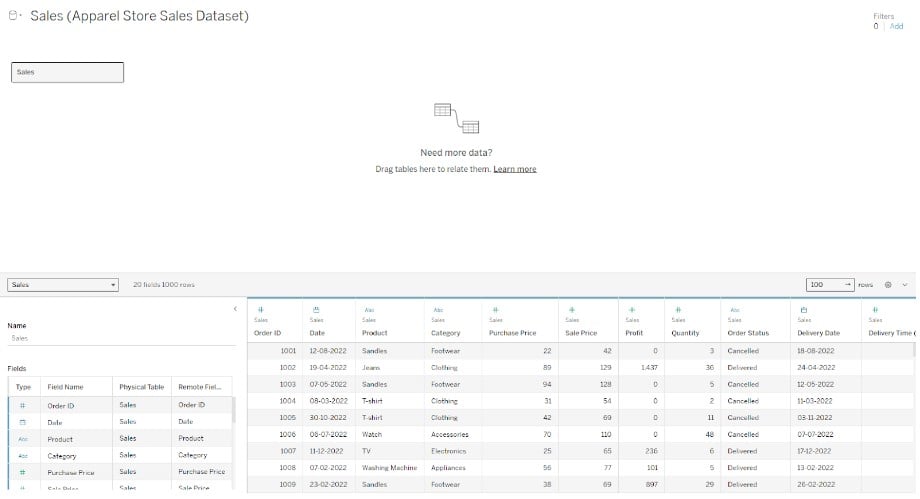
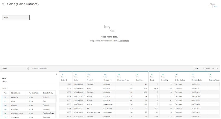
- Step 1: Connect to your dataset from the Tableau interface.

- Step 2: Drag and drop the Segment dimension to the Columns shelf and the Revenue measure to the Rows shelf. Tableau will automatically create a bar chart in the view.

- Step 3: Click Show Me on the toolbar and choose pie chart type from the available options.

- Step 4: Tableau will create a pie chart in the view. Change the view from Standard to Entire View.
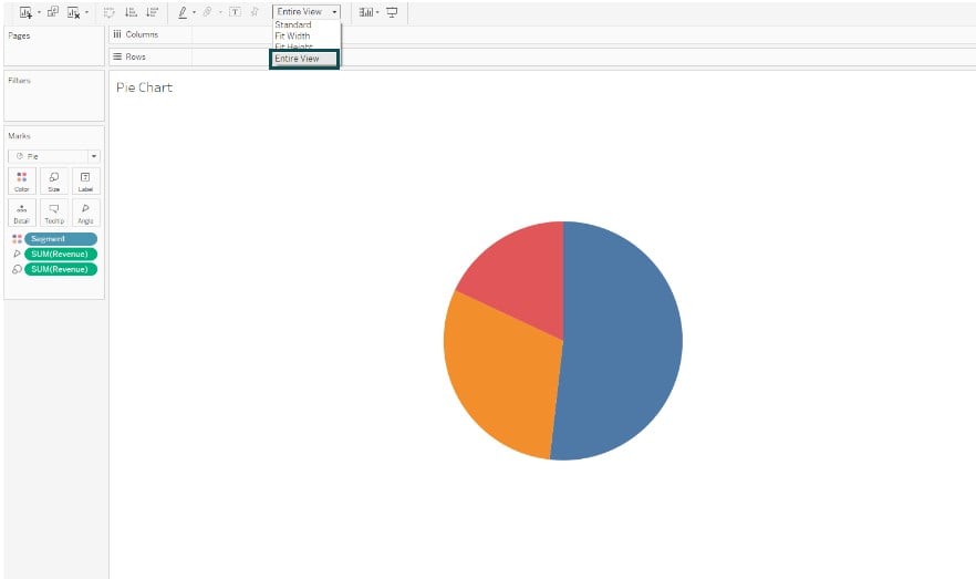
- Step 5: Drag the Segment and Revenue to the Label on the Marks card. Your Tableau Pie chart is now ready for visualization.

#2 – Bar Chart
- Description:
- These charts are excellent tools to compare data across various categories.
- It represents data in the form of horizontal or vertical bars, which can then be used to perform data comparisons across the categories or segments.
To create a bar chart in Tableau, follow the instructions outlined below:
- Step 1: Connect to your dataset using the Tableau interface to import the data into the Tableau desktop.

- Step 2: In a new worksheet, drag Product and Region to the Columns shelf and Units Sold to the Rows section. Drag the Product to the Color on the Marks card.
Tableau will add color to the visual as shown below. Your bar chart is now ready for visualization in the Tableau view.

#3 – Line Chart
- Description:
- These charts help you connect with individual data points in your data, creating a view of sequential lines in Tableau.
- They enable you to create a trend over time or forecast future projections based on the underlying values.
You can create a Line chart following the steps outlined below
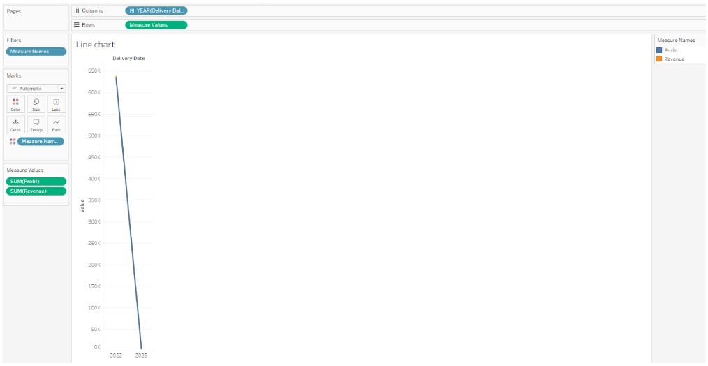
- Step 1: Navigate to File – Open in Tableau desktop and import the dataset into Tableau desktop.
- Step 2: Drag the Delivery Date to the Columns shelf and Revenue and Profit Measures to the Rows shelf. Tableau will create 2 line charts in the view. Drag the Profit from the Rows shelf to the Revenue axis to create a blended axis. You will notice two green parallel bars when you drag the measure to the axis.

- Step 3: Once you release the Profit measure to the Revenue axis, we get a blended axis, as shown below.
- Step 4: Right-click on the YEAR field in the Columns shelf and choose Month from the context menu.
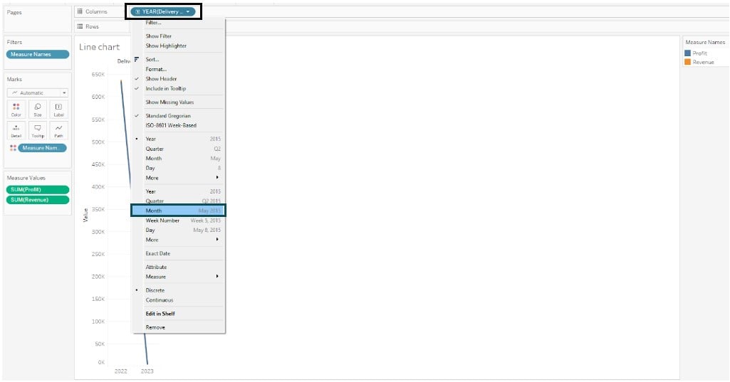
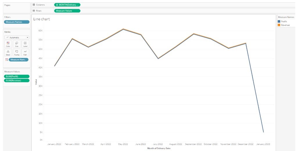
- It will create a detailed line chart to the Tableau view, as shown below.
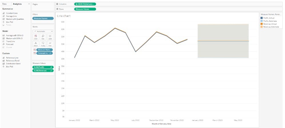
- Step 5: Drag the Forecast model from the Analytics pane to the Tableau view and drop it on the Forecast.

- Tableau will display seasonal trends in the forecast, as shown below.
#4 – Scatter Plot
- Description:
- Scatter Plots are the preferred choice when it comes to visualizing relationships between the numerical variables in Tableau.
- These charts are created by plotting 2 measures in the view
To create a scatter plot in Tableau, follow the instructions highlighted below
- Step 1: Open the dataset using the Tableau public desktop on your machine.
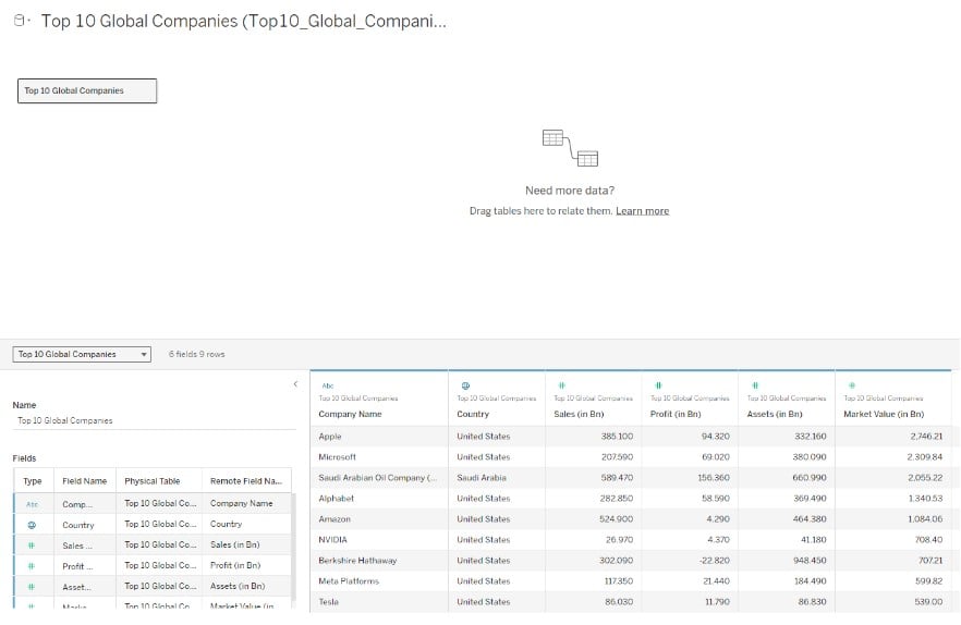
- Step 2: Drag Market Value (in Bn) measure to the Columns shelf and Assets (in Bn) measure to the Rows shelf. Tableau will aggregate the measures and create a vertical axis to display a one-mark scatter plot in the view.
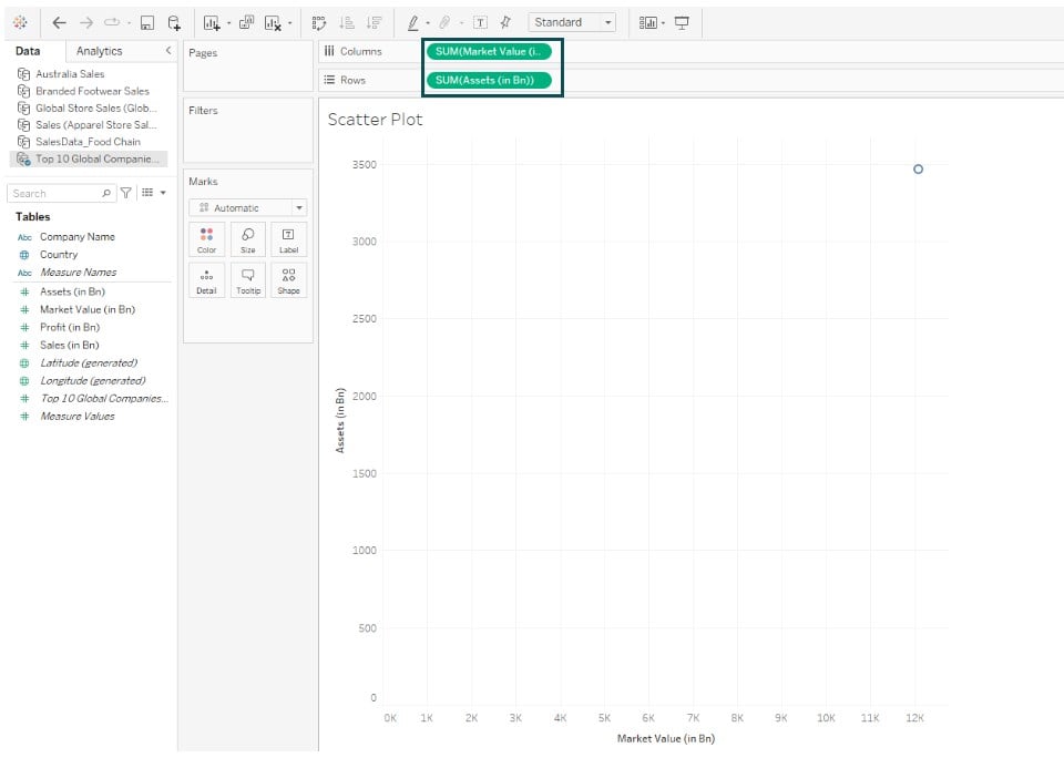
- Step 3: Drag the Company Name to the Color on the Marks card. As you can see, Tableau has added more marks in the view that are color-coded according to the company names.

- Step 4: Drag Country to the Detail on the Marks card.

- Step 5: Navigate to the Analytics tab, drag the Trend Line model to the Tableau view, and drop it to the Linear trend line Now, you will see multiple trend lines according to the company names in the view.

#5 – Bubble chart
- Description:
- Tableau bubble charts allow you to visualize how the members within a data field compare. They are typically displayed in the form of bubbles that vary in size as per the values of the categories or members within a field.
- Bubble charts can be displayed with different color coding to provide insights and can also have different stylized approaches, where bubbles can be superimposed over other bubbles.
To create a Tableau bubble chart, follow the step-by-step instructions below:
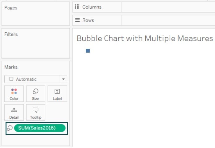
- Step 1: Connect the SalesData_Food Chain to the Tableau interface.

- Step 2: Click on a new worksheet tab. Drag the Sales 2016 to the Size on the Marks card. It will create a square in the view.
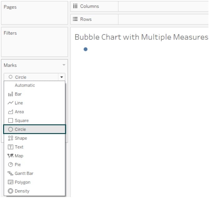
- Step 3: Change the Marks Type from Square to Circle on the Marks card.
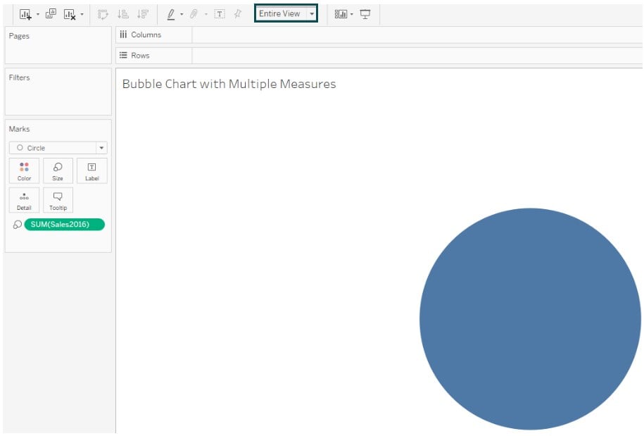
- Step 4: Change the visual to Entire View, as shown below.
- Step 5: Drag the Tier dimension to Detail on the Marks card.

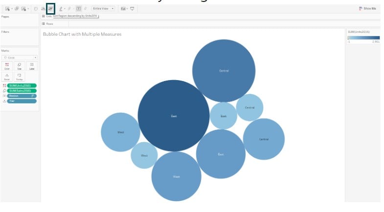
- Step 6: Drag and drop another measure, Units2016, to the Color on the Marks card.

- Step 7: Drag and drop the Region dimension to the Label on the Marks card.

Tableau will automatically change the view as shown below.
#6 – Histogram
- Description:
- Tableau histograms are a data visualization tool in which the distribution of data is displayed as a series of connected data bars.
- To display the distribution, histograms group the single continuous measures into bins. Each of these bins contains a data range for the measure.
- Tableau divides these bins into equal sizes and create a visualization of stacked bars in the view.
- A basic Tableau histogram has Marks Type as Automatic, Rows shelf representing a continuous measure, and Column shelf as a bin.
To create a Tableau histogram, follow the steps provided below
- Step 1: Connect to the input data source into Tableau using the File Navigator.
- Step 2: Drag the Measure to the Columns shelf. In this case, we are using (Selling Price Per Unit) as a measure.

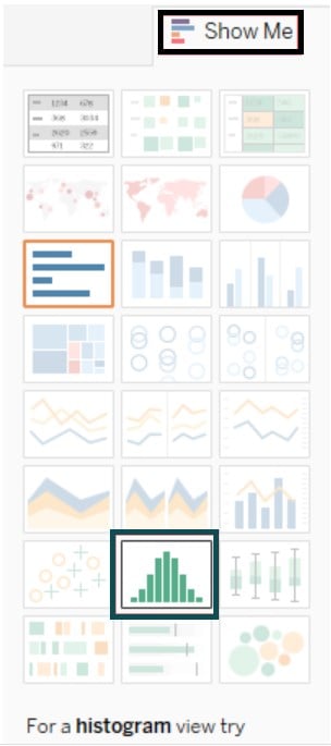
- Step 3: Click Show Me on the toolbar and then select the histogram chart type.
- You will notice that Tableau has created a histogram chart in the view. The vertical bar displays the bin counts created because of data aggregation, as shown below

- Step 4: Drag the Invoice Id field from the Data pane to the Rows shelf

- Step 5: Apply color coding by dragging the Region to the Color. You will see the different colors in the view as per the Region values.

- Step 6: Hold down the Ctrl key and drag the CNT(Invoice ID) field to the Label on the Marks card. Tableau will add labels to the view and your Tableau Histogram is ready for visualization.

#7 – Bullet Graph
- Description:
- Tableau bullet charts allow you to quickly compare the performance of a primary measure against another or multiple measures.
- It displays bars with additional enciphering displaying the progress of your measure toward a goal.
To create a Tableau bullet chart, we have provided the steps below
- Step 1: Connect to your dataset from the Tableau interface.
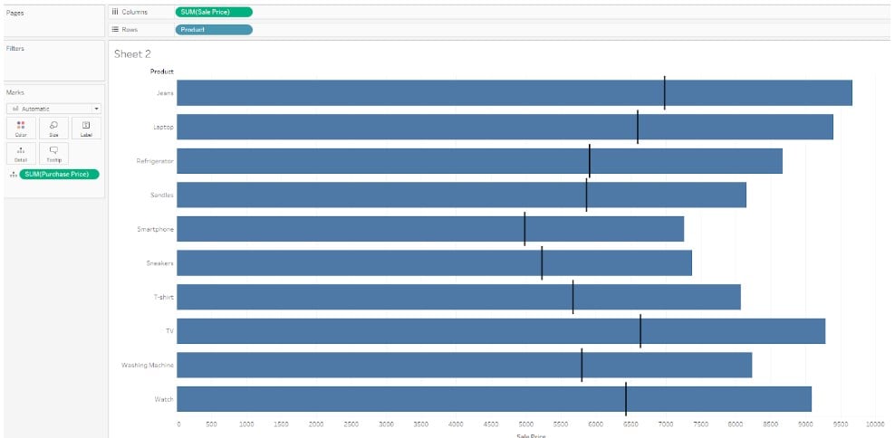
- Step 2: Drag the Sales Price to the Columns shelf and the Product to the Rows shelf. Change the view to Entire View. Drag the Purchase Price to the Details on the Marks card.

- Step 3: Navigate to the Analytics pane and drag the Reference Line to the Tableau view to add a reference line.

- Step 4: In the Edit Reference Line, Band, or Box screen, provide the choice of options as shown below. Click on OK.

- Now, your Tableau Bullet chart is ready for visualization.
For more details on different Tableau chart types and uses, refer to the latest Tableau documentation.
Importance
Tableau charts are handy for the following reasons.
- Data Insights – Tableau charts provide data insights, patterns, or trends in your data, thereby helping the users make informed decisions
- Data Communication – By transforming the raw data into storytelling or visualization, you can perform data analysis and communicate your analysis in a manner that is user-friendly and easy to visualize
- User Interaction – Tableau charts support user interactions through highlights, filters, drill-downs, and other options.
- Improved business decisions – Tableau charts facilitate improved business decisions by allowing users to visualize the key trends or changes of measures over time, perform data comparisons, etc.
Frequently Asked Questions (FAQs)
To choose the right chart type in Tableau, you need to understand what is the problem you are trying to solve, the data properties, and the mode of presentation and communication to the end users. For example, you may want to visualize the change of a measure (say, Profits) distributed over time, the relationship between 2 or more variables, or the magnitude of changes as compared to other variables. Similarly, you may be interested in visualizing the data distribution, ranking of your data, spatial visualization, or flow charts to display your data. Hence, depending on your requirements, you can choose the chart type that best suits your problem.
Indeed, you can customize the appearance of charts in Tableau. You can customize the areas, such as
Color, size, user interactivity, tooltips, and labeling to your chart.
Adjust axis scale, titles, and range values in your chart
Add analytical information, such as adding a reference line to your chart
Format your chart view using the available options in the Formatting pane
To compare the categories in Tableau, you may use Bar charts, bullet charts, stacked bar charts, or a combination of all these charts in your visualization. Depending on the data points you want to compare, you may also use other options such as pie charts, donut charts, etc.
Yes, you can combine multiple chart types in a single visualization in Tableau. For example, you can combine a line chart and a bar or stacked bar chart into a single visualization. You can also consider Dual axis charts or different mark types for your visualization.