
What is Tableau Conditional Formatting?
Tableau conditional formatting refers to the capability in Tableau to dynamically change the data visualization, such as color, size, shapes, etc., based on a specific condition. Most of you may already be familiar with the conditional formatting feature in the Excel tool, and Tableau conditional formatting is no different from it.
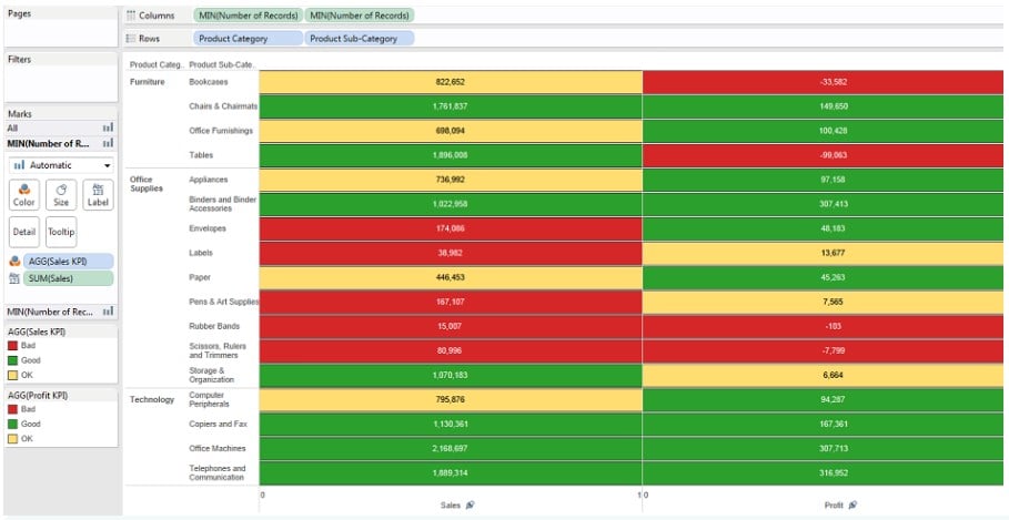
Using conditional formatting, you can classify data to identify a trend or pattern and present the data in a visually appealing manner using specific rules or criteria. A sample Tableau conditional formatting visual is provided below.
Use this Tableau Conditional Formatting Template to follow along with the examples in this article.
Download Excel TemplateKey Takeaways
- Tableau conditional formatting allows you to dynamically change the data visualization such as color, size, shapes, etc. based on a specific condition.
- Using conditional formatting, you can classify data to identify a trend or pattern and present the data in a visually appealing manner using specific rules or criteria.
- With Tableau conditional formatting, you can format the size and color of measures, rows and columns, data tables, and measures based on parameters.
- You can use the Tableau conditional formatting for a range of numerical values, text-based conditions, data comparison, Boolean values, Blank/Non-blank, or Top/Bottom N values.
How to do conditional formatting in Tableau?
Let us do conditional formatting in Tableau as seen below.
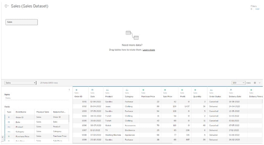
Step 1: Open Tableau public on your machine and connect to your dataset from the Tableau interface.
Step 2: Navigate to a new worksheet. Drag the Category dimension to the Columns shelf. Drag the Product to the Rows shelf. Additionally, drag the Revenue measure to the Text on the Marks card.

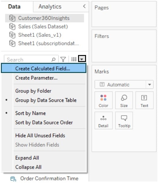
Step 3: Click on the down arrow next to the Search box in the Data pane. Choose Create Calculated Field.

Step 4: In the Calculation Editor, specify a name for the field and add the logic for the calculated field.
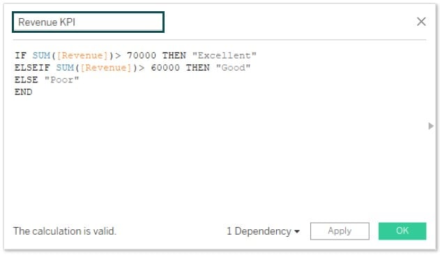
You can view the created field in the Data pane.
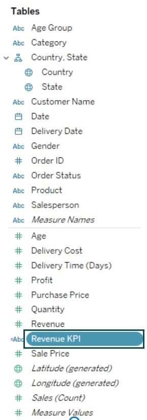
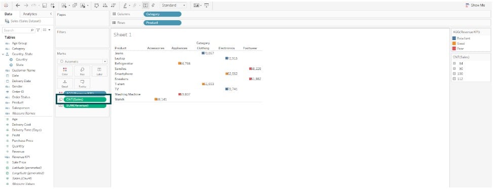
Step 5: Drag the Revenue KPI to the Color on the Marks card. As you can see, Tableau has added color to the Revenue based on the KPI you have created.

Step 6: Drag Sales (Count) to the Size on the Marks card. Tableau will add colored blocks to the view.
Step 7: Change the Marks Type from Automatic to Bar.
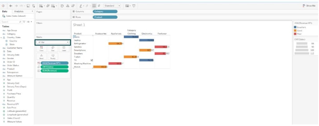
Step 8: Adjust the size as needed for your visual.

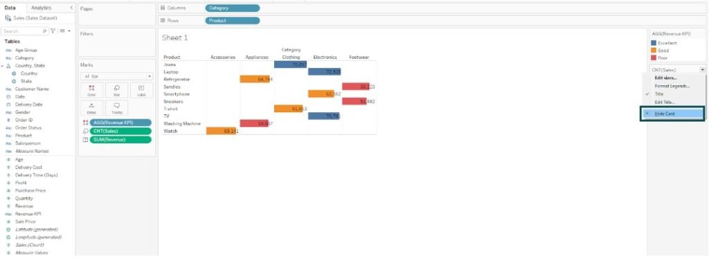
Step 9: Hide the CNT(Sales) card by choosing the Hide card option.
Note: You can also apply Tableau conditional formatting text color based on value, which works similarly to the above example. You can also extend this to Tableau conditional formatting text color.
Tableau conditional formatting cell color is not supported in Tableau, unlike Excel. To apply Tableau conditional formatting cell color, you may follow a specific workaround, such as creating a calculated field in Tableau.
Examples
In this section, we will demonstrate different use cases that you can refer to when applying conditional formatting in Tableau.
Example #1 – Conditional format the size and color of measures
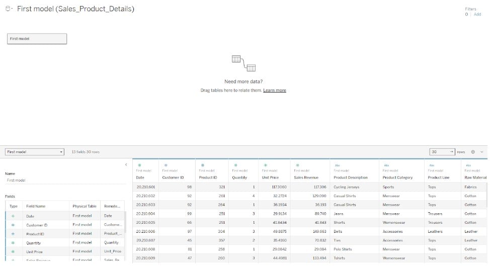
In this example, we have demonstrated how to apply the conditional format to the size and color of measures in Tableau using the Sales_Product_Details dataset which contains the sales, categories, and geography of apparel and accessories.
To apply conditional format, the size and color of measures in Tableau, follow the instructions outlined below:
Step 1: Import your dataset into the Tableau interface using the File Navigator.
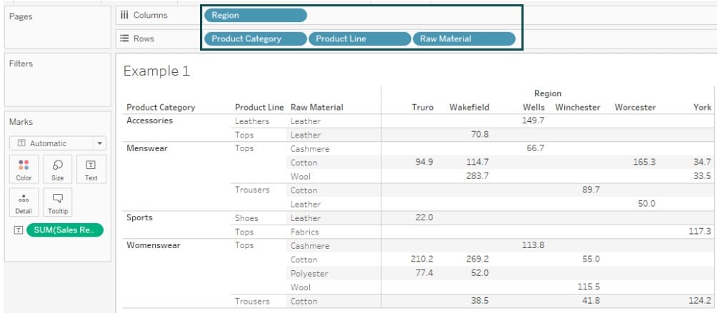
Step 2: Drag the Region to the Rows shelf. Similarly, drag the Product Category, Product Line, and Raw Material to the Columns shelf. Drag the Sales Revenue to the Text on the Marks card.
Tableau will create a visualization in the view, as shown below.
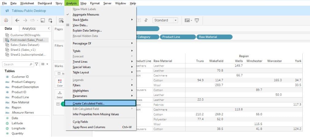
Step 3: Navigate to Analysis – Create Calculated Field.
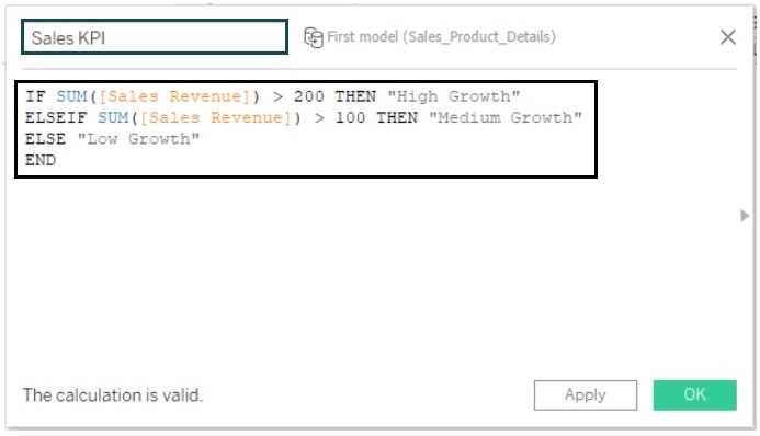
Step 4: In the Calculation Editor screen, specify the logic to create a Sales KPI.
Here, we have created three values based on Sales Revenue.
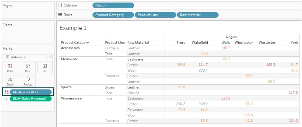
Step 5: Drag the Sales KPI field to Color on the Marks card.
Step 6: Click on Color – Edit Colors. In the Edit Colors window, select the Color Palette and assign them to the Data Item. Click OK to save changes.
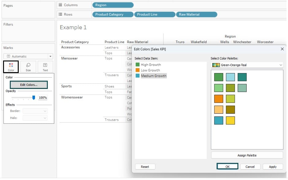
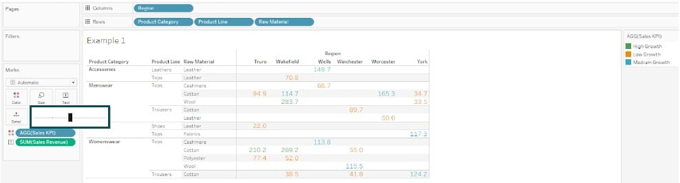
Step 7: Adjust the size as needed. It will update Tableau conditional formatting measure values, as shown below. You can see the color and size applied to the Sales Revenue in the view.
Example #2 – Conditional format Rows & Columns
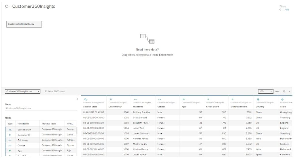
In this example, we will apply conditional format rows and columns using the Customer360Insights data which contains a synthetic collection meticulously designed to mirror the multifaceted nature of customer interactions within an e-commerce platform.
To apply conditional format rows and columns in Tableau public, follow the instructions outlined below:
Step 1: Import the Customer360Insights dataset into the Tableau public desktop using the File navigator.
Step 2: In a new worksheet, click on the down arrow next to the search bar to create a calculated field.
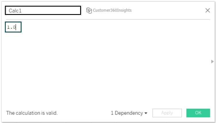
Step 3: In the calculation editor, specify the value as 1.0. Name the field to Calc1.
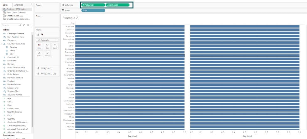
Step 4: Drag the City field to the Rows shelf. It will create a visualization in the view.

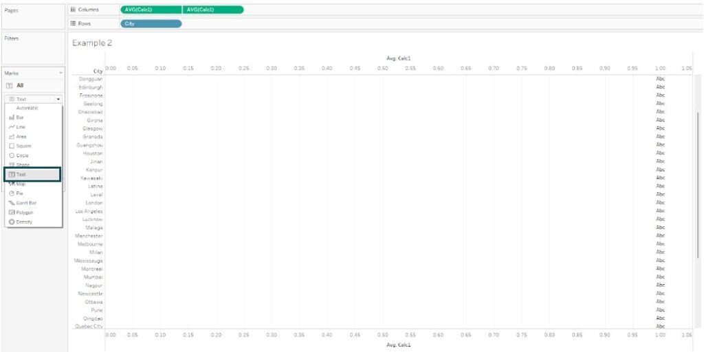
Step 5: Drag the Calc1 to the Columns shelf. Control-click the Calc1 again to add another field in the Columns shelf.
Step 6: Right-click on the 2nd AVG(Calc1) and choose Dual Axis.
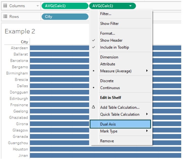
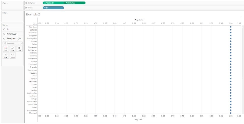
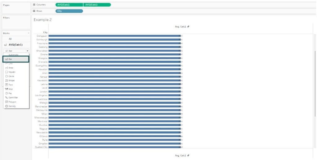
Tableau will update the view, as shown below.
Step 7: In the All section, change the Marks Type to Text.
Step 8: Right-click on the Top axis and select Edit Axis.
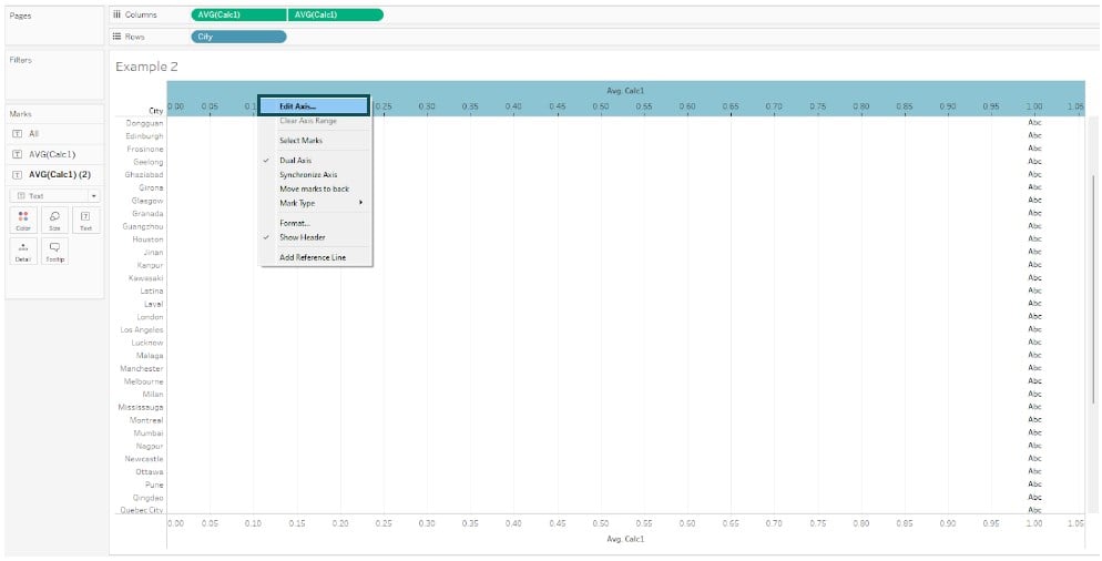
Step 9: In the Edit Axis window, specify the changes under the General tab, as shown below.

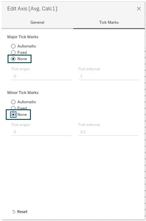
Step 10: Similarly, set both the Major Tick Marks and Minor Tick Marks to None under the Tick Marks tab.
Step 11: Right-click on the bottom axis and select Edit Axis.
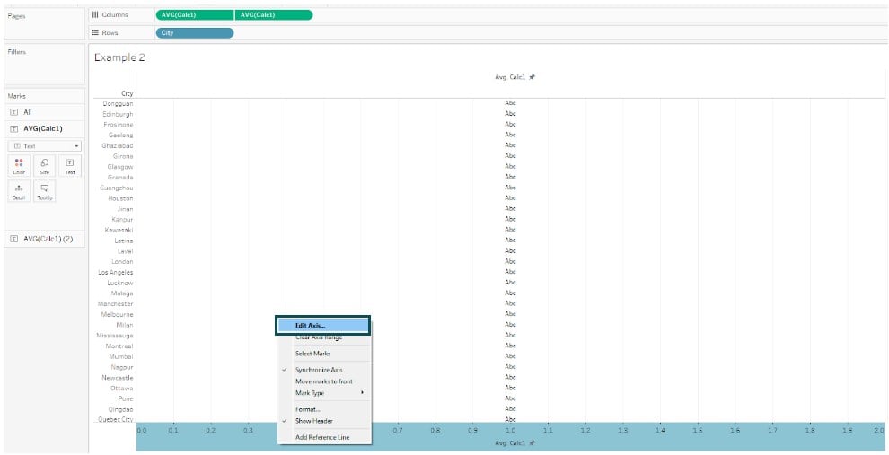
Step 12: In the Edit Axis window, specify the similar changes as included in the previous steps.

Step 13: In the AVG(Calc1) section, change the Marks Type to Bar.
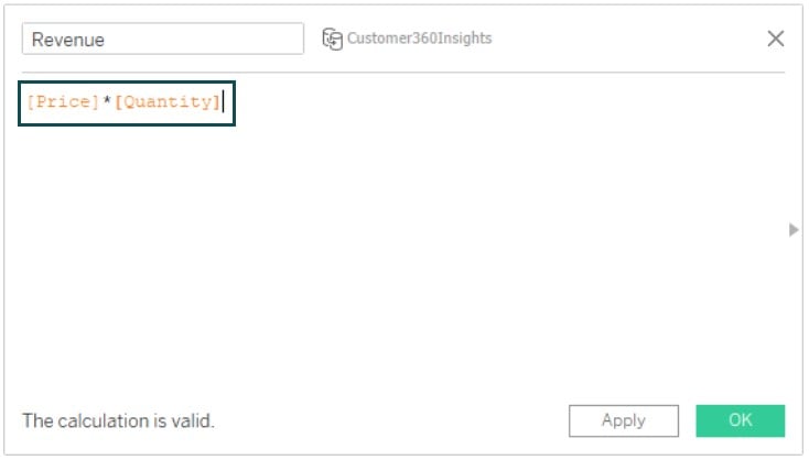
Step 14: Create a calculated field by choosing Analysis – Create Calculation Field. In the Calculation Editor screen, specify the logic as provided below.
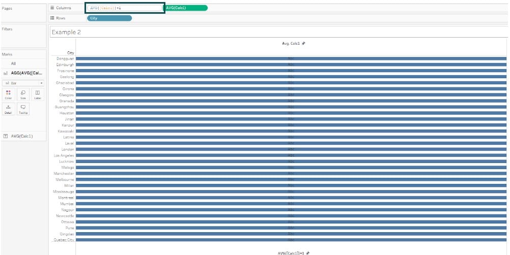
Step 15: Create full-sized bars in the view by adding 1 to the first AVG(Calc1) measure, as shown below.
Step 16: In the AGG(AVG(Calc1+1) section on the Marks card, add Revenue to the Color.
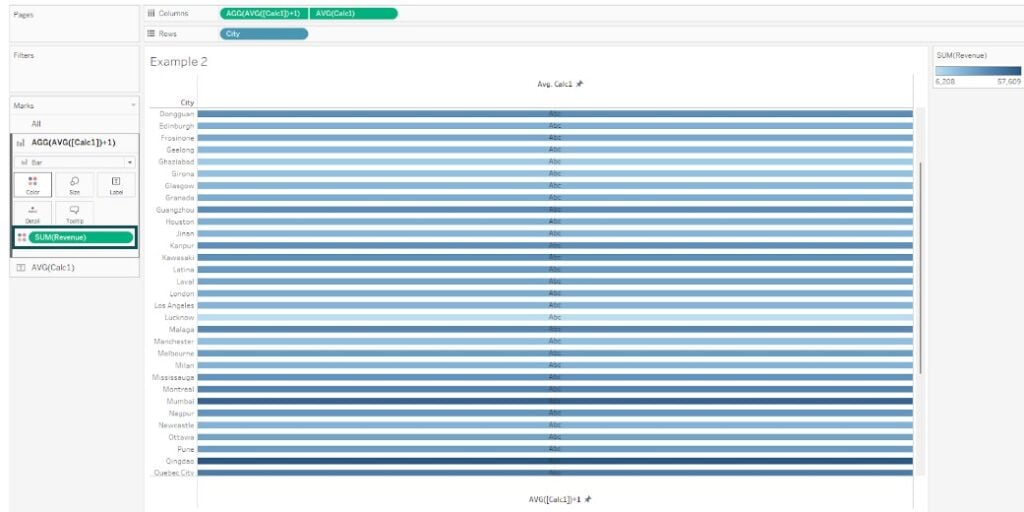
Step 17: Click on Color – Edit Colors. In the Edit Colors screen, select the Orange-Blue Diverging option from the drop-down.
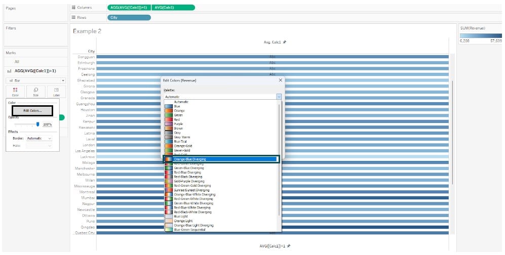
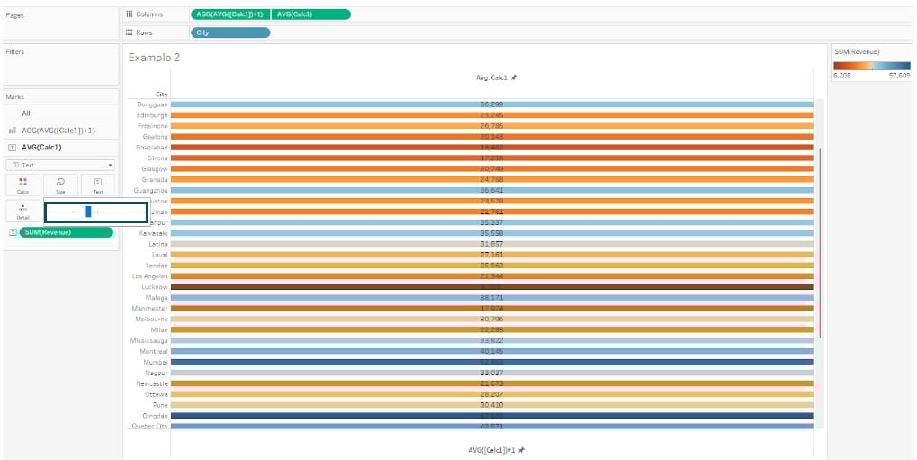
Tableau will update the view with the color selection we had in the previous step.
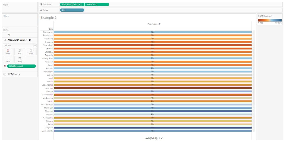
Step 18: Adjust the color as needed to your view. Now you can see Tableau conditional formatting measure values in the view with color-coding as per your selection.
Example #3 – Conditional format Data
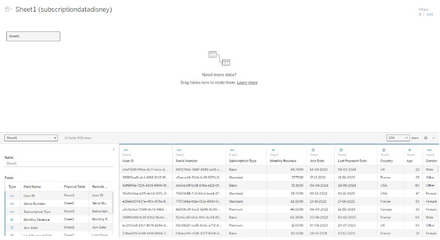
In this example, we will demonstrate conditional format data in Tableau using the Subscription Data Disney+ dataset. The Subscription Data Disney+ contains information about subscriptions for Disney’s service including various user-specific data such as unique identifiers, subscription types, monthly revenue, join dates, etc.
To apply conditional format data in Tableau, follow the instructions outlined below:
Step 1: Import your dataset into the Tableau interface. You can view the data under Data Source tab.
Step 2: Drag the fields from the Data pane to the view as shown below.
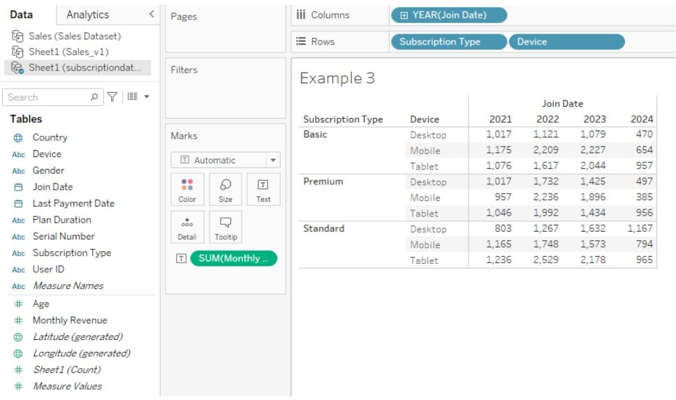
Step 3: Drag the measure to the Color and Text on the Marks card. It will create a visualization in Tableau view and display the color range.
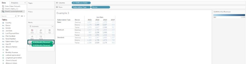
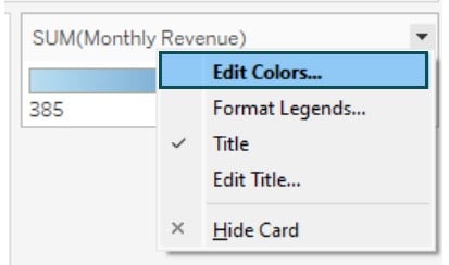
Step 4: Right-click on the SUM(Monthly Revenue) card and choose Edit Colors.
Step 5: In the Edit Colors window, select a color palette from the drop-down menu.
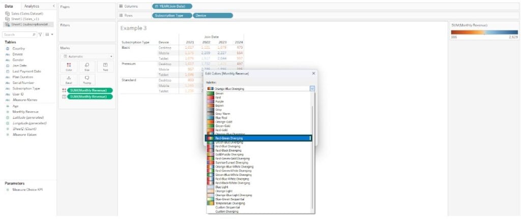
Tableau will update the view based on the color palette selection.
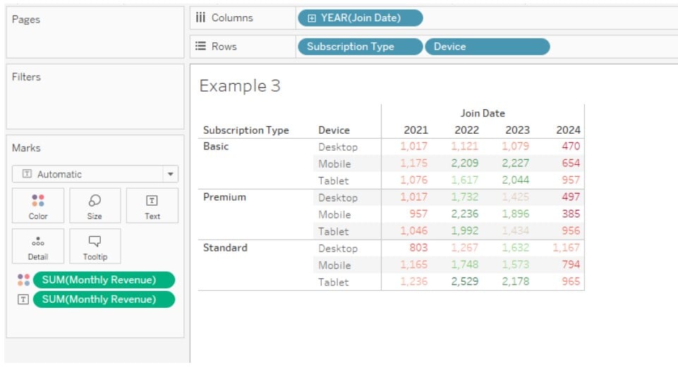
Step 6: Adjust the size of the Marks card. Tableau will change the Monthly Revenue values into colored symbols.
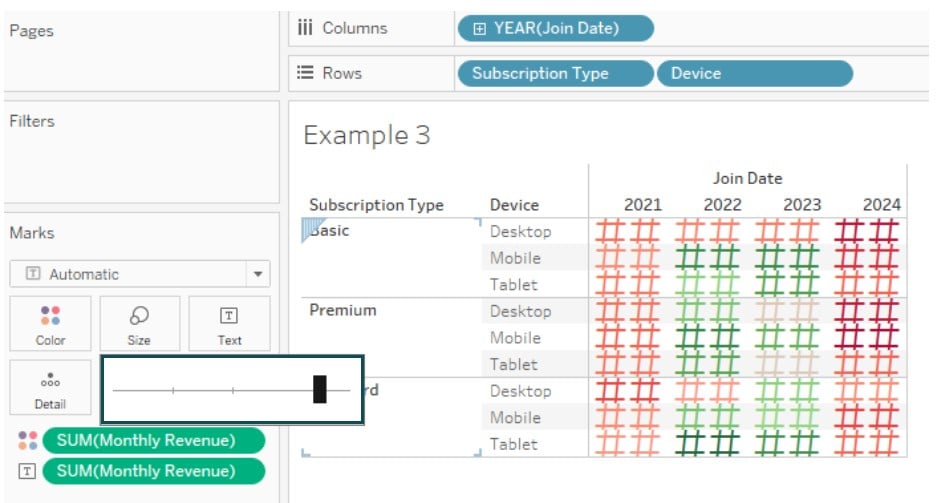
Step 7: Change the Marks Type to Square.

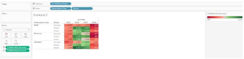
Tableau will add colors to the data table, as shown below.
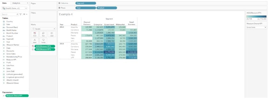
Example #4 – Conditional format measures based on a parameter selection
In this example, we will apply conditional format measures based on a parameter selection using the Sales Corporate Customers data in Tableau. It contains a detailed view of sales and profit data for corporate customers across various regions and provinces.
To apply conditional format measures based on a parameter selection in Tableau public, you may follow the below step-by-step guide:
Step 1: Connect with the Sales Corporate Customers dataset in Tableau public.
Step 2: In a new worksheet, right-click on the Data pane and select Create Parameter from the context menu.

Step 3: In the Create Parameter window, specify the choice selection as provided below. Click on OK to save the changes.
Here, we have created a parameter Measure Choice KPI.
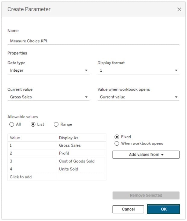
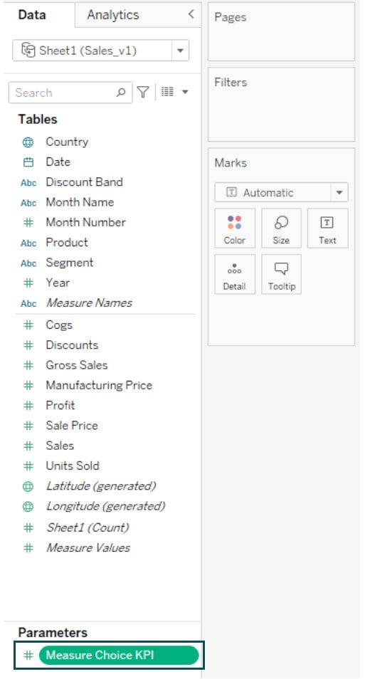
Tableau will automatically create a parameter which you see under the Parameters section in the Data pane.
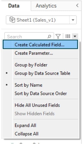
Step 4: Click on the down arrow next to the search bar and choose Create Calculated Field.
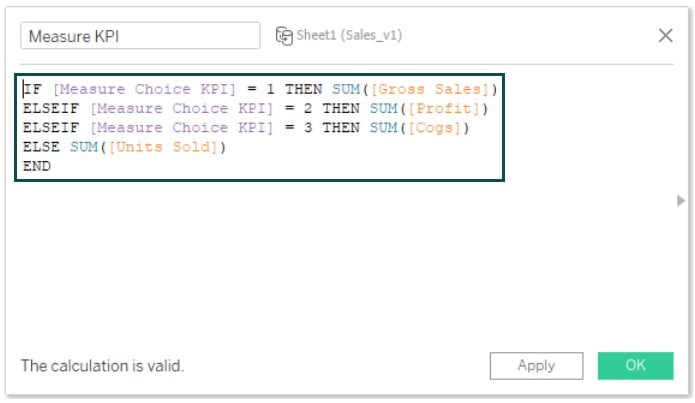
Step 5: In the Calculation Editor, specify the logic for the calculated field using the parameter we have created.
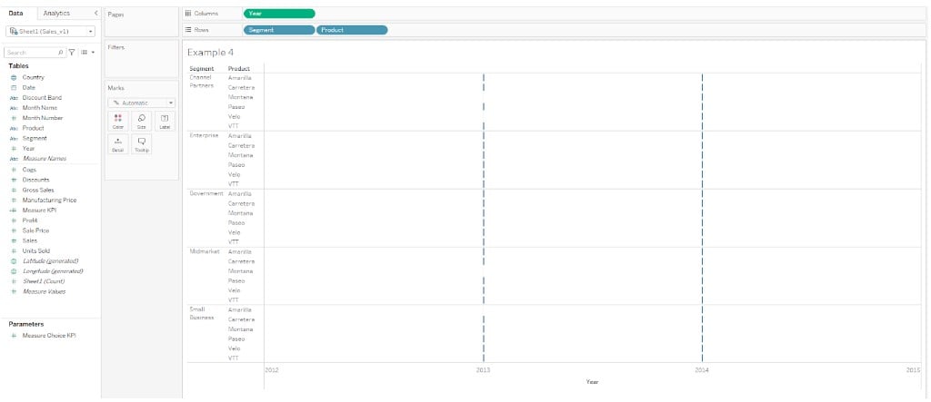
Step 6: Drag the fields to the Tableau view.
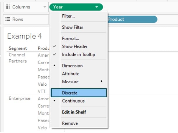
Step 7: Right-click on the Year field in the Columns shelf and choose Discrete.
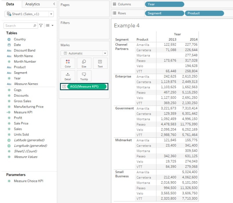
Step 8: Drag the Measure Choice KPI parameter to the Text on the Marks card.
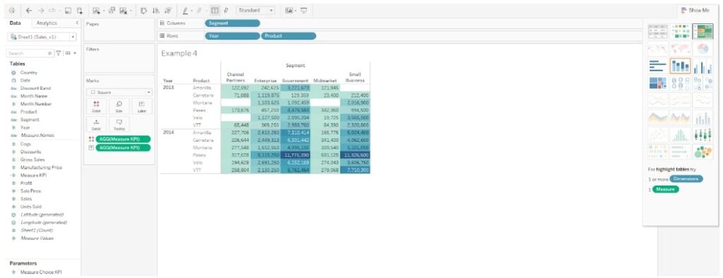
Step 9: Under the Show Me toolbar, choose highlight tables visualization. Now, you can see Tableau conditional formatting measure values in the view.
Step 10: Right-click on the Measure Choice KPI on the Marks card and select Show Parameter.
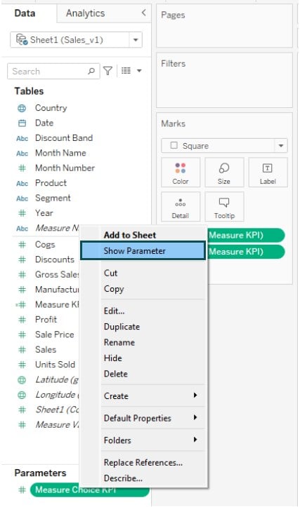
Tableau will display the Measure Choice KPI to the right of the view.
Step 11: Click on the Color – Edit Colors. In the Edit Colors screen, select the Orange-Blue Diverging palette option.
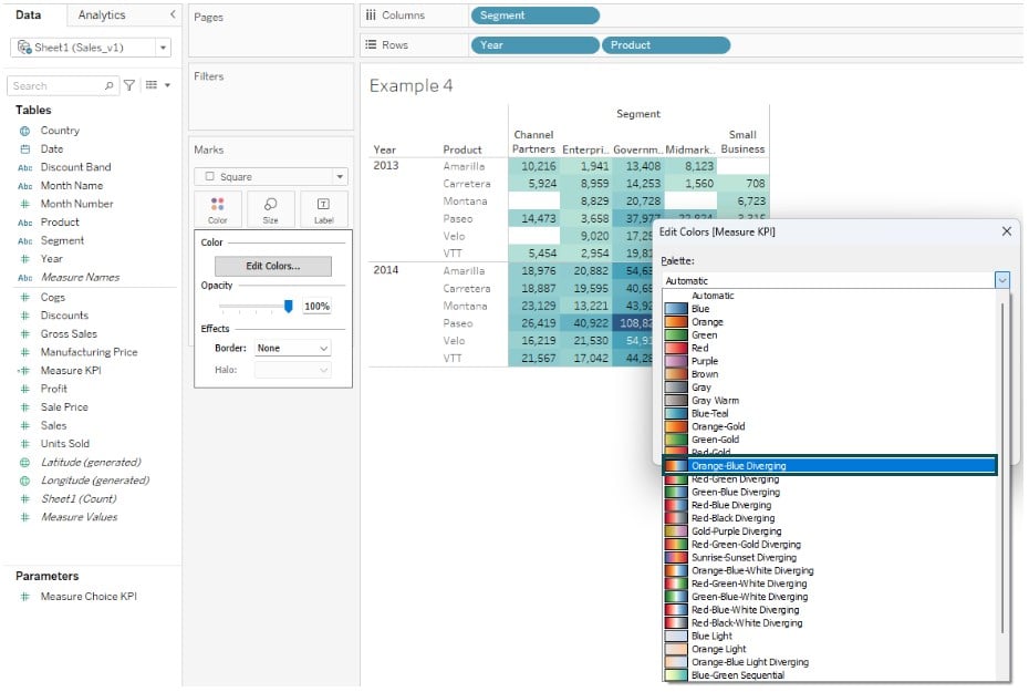
Now, your Tableau conditional formatting measure values is applied to the data table. As you change the values of the parameter, you will see different conditional formatting options in the view.

Importance Things to Note
- Tableau conditional formatting is dynamic and changes with user interactivity.
- For large and complex datasets, you may experience performance issues for Tableau visuals with multiple conditional formatting.
Frequently Asked Questions (FAQs)
You can apply conditional formatting to a few specific sets of visualization types in Tableau. For example, you can apply conditional formatting to Tableau charts such as bar charts, line charts, pie charts, maps, tables, scatter plots, etc.
You can use conditional formatting for
• a range of values – specify conditions based on certain ranges
• text-based conditions – If the text contains certain values, then apply formatting
• data comparison – comparative-based formatting such as If Revenue > Cost, then apply to the format
• True/False conditions – formatting based on Boolean values
• Blank/non-blank values – Apply formatting for Null/Not Null values
• Top N values – Formatting for Top 10 or bottom 10
Certainly. You can use multiple conditions for conditional formatting in Tableau. Tableau supports.
• Tableau conditional formatting text color
• Tableau conditional formatting measure values
• Tableau conditional formatting cell color
• Tableau conditional formatting text color based on the value
combinations of dimensions and measures
Tableau will evaluate the specified conditions to determine the dataset on which conditional formatting shall be applied.
Yes, conditional formatting is dynamic in Tableau. Because it is based on specified conditions, any changes to the dataset, such as data filter or transformation will mean a re-evaluation of specified conditions to apply the conditional formatting to the dataset.
Use this Tableau Conditional Formatting Template to follow along with the examples in this article.
Download Excel Template