
What Is The Clustered Bar Chart In Google Sheets?
Clustered bar chart in Google sheets is a chart type used to show the different values in a single chart with varied differences. It is commonly used in Excel and Google sheets but is easier and quicker to create clustered bar chart in Google sheets in Google sheets comparatively.
Clustered bar chart is not a default chart, similar to Bar chart, line chart or column chart. We can include clustered charts with the help of bar chart or column chart. For example, consider the below table showing marks obtained by students in three subjects – Physics, Chemistry and Maths in columns A, B, C, and D respectively.

Now, let us learn how to create clustered bar chart.
To begin with, insert the data in the spreadsheet. In this example, it is available in the spreadsheet A1:D4. Next, select the range of cells, A1:D4 for which we want to create the clustered bar chart. Select Insert and click on Chart. We will be able to see the Chart editor tab at the right end of the screen. Next, choose Bar chart. We will be able to see clustered bar chart in the spreadsheet, as shown in the below image.
Use this Clustered Bar Chart In Google Sheets Template to follow along with the examples in this article.
Download Excel Template
Likewise, we can create clustered bar chart.
In this article, let us learn how to create clustered bar chart with detailed examples.
Key Takeaways
- Clustered bar chart in Google sheets is a great method to show the data in a graphical format.
- Using the clustered bar chart type, users can easily analyse the data and read the changes effectively.
- To create clustered bar chart type in Google sheets, we need to simply select the data and click on Insert and chart.
- In the Chart editor tab that appears on the right end of the screen, we can choose bar chart along with the desired customizable options.
How To Create A Clustered Bar Chart In Google Sheets?
Let us learn how to create clustered bar chart with the following steps:
Step 1: To begin with, insert the data in the spreadsheet. Next, select the range of cells for which we want to create the clustered bar chart.
Step 2: Select Insert and click on Chart. We will be able to see the Chart editor tab at the right end of the screen.
Step 3: Next, choose Bar chart. We will be able to see clustered bar chart in the spreadsheet.
Likewise, we can create clustered bar chart.
Examples
Let us learn how to create clustered bar chart with the following examples.
Example #1
For example, consider the below table showing marks obtained by students in three subjects – Physics, Chemistry and Maths in columns A, B, C, and D respectively.

Now, let us learn how to create clustered bar chart.
The steps are:
Step 1: To begin with, insert the data in the spreadsheet. In this example, it is available in the spreadsheet A1:D4. Next, select the range of cells, A1:D4 for which we want to create the clustered bar chart.
Step 2: Select Insert and click on Chart.

We will be able to see the Chart editor tab at the right end of the screen.
Step 3: Next, choose Bar chart. We will be able to see clustered bar chart in the spreadsheet, as shown in the below image.

Likewise, we can create clustered bar chart.
Example #2
Now, let us use the same example we used in Example 1.

Let us learn how to customize the clustered bar chart.
Now, this is the chart we have created in Google sheets.

Now, let us learn how to customize clustered bar chart.
The steps are:
Step 1: Double click on the chart. We will be able to see the Chart editor tab at the right end of the screen.

Step 2: Now, to change the rows and columns in the chart. To do this, simply select the Switch rows / columns under the Setup tab.

Step 3: We will be able to see clustered bar chart in the spreadsheet with switched rows and columns, as shown in the below image.

Likewise, we can create and customize clustered bar charts.
Example #3
For example, consider the below table showing sample with list of participants, present and absent population in columns A, B, C, and D respectively.

Now, let us learn how to create clustered bar chart.
The steps are:
Step 1: To begin with, insert the data in the spreadsheet. In this example, it is available in the spreadsheet A1:D5. Next, select the range of cells, A1:D5 for which we want to create the clustered bar chart.
Step 2: Select Insert and click on Chart.

We will be able to see the Chart editor tab at the right end of the screen.
Step 3: Next, choose Bar chart. We will be able to see clustered bar chart in the spreadsheet, as shown in the below image.

Likewise, we can create clustered bar chart.
Pros And Cons
The pros or advantages of using clustered bar chart are:
- Clustered bar charts in Google sheets are simple and easy to create.
- We can include the category labels which helps users read the data effectively.
- We can add the labels by double clicking on the chart and selecting the labels manually.
- It is helpful as we can see the changes from time to time.
The cons or disadvantages of using clustered bar charts are:
- As the name suggests, clustered bar chart can sometimes make the chart too difficult to read.
- While dealing with huge dataset, the clustered bar charts can be hard to understand.
Important Things To Note
- Clustered bar chart in Google sheets is not a default chart type but we can create one using bar chart.
- In Google sheets, clustered chart type can be created to read and analyse data effectively.
- Because of huge dataset, sometimes readers can find the chart confusing. In such cases, we can customize the chart type accordingly.
Frequently Asked Questions (FAQs)
For example, consider the below table showing marks obtained by students in three subjects – Physics, Chemistry and Maths in columns A, B, C, and D respectively.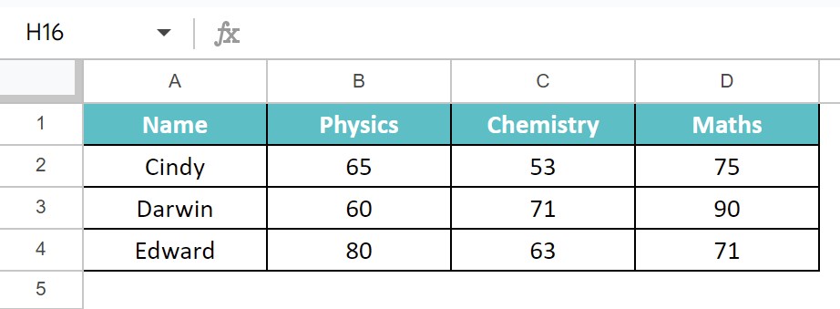
Now, let us learn how to create clustered bar chart.
The steps are:
Step 1: To begin with, insert the data in the spreadsheet. In this example, it is available in the spreadsheet A1:D4. Next, select the range of cells, A1:D4 for which we want to create the clustered bar chart.
Step 2: Select Insert and click on Chart. We will be able to see the Chart editor tab at the right end of the screen.
Step 3: Next, choose Bar chart. We will be able to see clustered bar chart in the spreadsheet, as shown in the below image.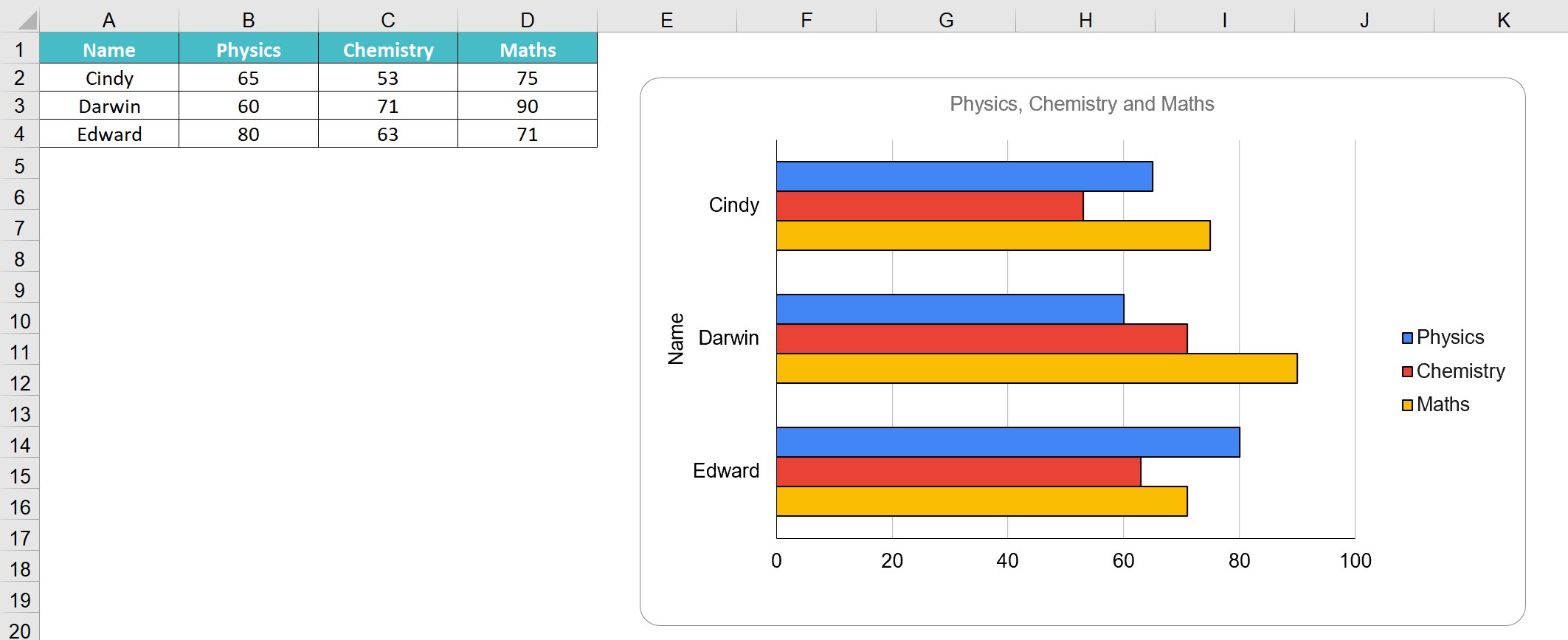
Likewise, we can create clustered bar chart in Google sheets.
To add the data labels in clustered bar chart in Google sheets,
• We should first double-click on the chart and select Setup in the Chart editor tab, that appears at the right end of the screen.
• Next, we need to scroll down and select the option, under X-axis. Here, we can add the desired label.
Immediately, we will be able to see the labels in the chart.
Likewise, we can add data labels in Google sheets clustered bar chart.
Yes. We can change the title right away by simply double clicking on the chart title option and typing the required title. Alternatively, we can also double click the chart, and select Chart & axis titles under Setup option.
Under Chart Title, we can type the desired chart name.
It will appear in the chart right away.
Use this Clustered Bar Chart In Google Sheets Template to follow along with the examples in this article.
Download Excel Template