What Is Heat Map In Excel?
Heat map in Excel is a visualization or graphical representation of the data where a range of values are represented by different colors. When we say different colors, the scale is from dark to light such as red, yellow, and green. In simple terms, a heat map analyzes the traffic in a particular time frame.
It is a typical visualization technique vastly used by market analysts, scientists, and analysts to showcase graphical representation and draw inferences from it. Some of the typical heat map representations are:
📥Download the ready-to-use Excel template to practice this tutorial yourself.
Heat Map in Excel- The day-wise temperature of a particular city.
- Seasonal rainfall of a particular region.
- Monthly Sales data of a particular region.
For example, the following image is a prime example of a heat map in Excel.

As we can see, we have different color shades that help us to compare the value of cells quickly; the highest value cells are in green color with a range of dark to light, and the lowest value cells are filled with red color, and the cells with middle value are in yellow color.
There are several ways to create heat map in Excel. We will discuss various methods used to create heat map in Excel.
Table of contents
Key Takeaways
- A heat map in Excel is created using conditional formatting.
- A heat map takes the color scale into consideration, it highlights the highest values in green, middle values in yellow, and lowest values in red.
- A heat map is helpful in highlighting the maximum and minimum values of a data set.
- Conditional formatting allows the user to apply formulas and create a customized heat map.
- Choose the color scale based on the data set. For example, if we are creating a map for customer visits to the branch, then you need to highlight the maximum numbers in green and the lowest numbers in red.
When To Use Heat Map?
- Cricket Analysis
Assume that a cricket analyst’s responsibility is to showcase the team about the opposition team’s strengths and weaknesses through data analysis.
When analyzing the opposition’s impact and the bowler’s strength, he needs to understand what length and line that particular bowler is pitching the ball to cause problems for the batsmen.
For instance, the following heat map image shows the bowler’s consistent line and length.
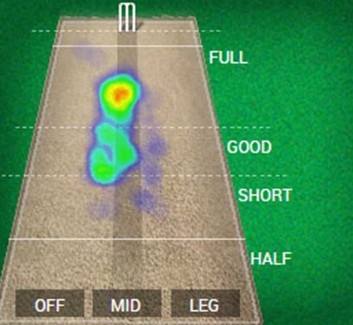
When we look at the above heat map image, a bowler consistently bowled in the fuller length ball (indicated in red) and rarely in the short length.
- Population Analysis
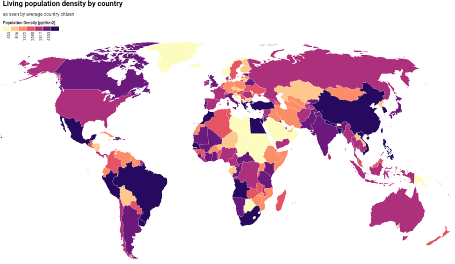
When we analyze the country-wise population, a heat map will convey the message to the end-users with simple colors.
The following image is an example of a country-wide population.
Why Use Heat Map?
- To understand the patterns of consumer interest in a specific region or area.
- By understanding the peak hours of the sales companies, we can plan their marketing activity and roll out offers to the consumers during non-peak hours.
- Communication of key areas of sales volume and making the territory managers understand the trend in their respective regions.
- Capitalizing on seasonal sales trends to make most of the opportunities available in the market.
How To Create A Heat Map In Excel?
In Excel, we do not have a built-in Heat map chart. However, by using formatting techniques, we can create heat map in Excel.
The best way to create heat map in Excel is by using conditional formatting.
The following is the city-wise monthly sales data we have in an Excel spreadsheet.

We will create a heat map in Excel by using conditional formatting. The steps are listed as follows.
- Select the cells or range of cells where we need to create a heat map. In this example, select the cells from the range B2:G5.

- Go to the Home tab, and click on the Conditional Formatting option under the Styles group.

- After we click on the drop-down list, hover on Color Scales and choose the first combination of color scales i.e., Green – Yellow – Red.

- Once we click on the above color scale, all the cells are colored with combination colors (Green, Yellow, and Red) based on the cell values as shown in the following image.

As we can see, all the highest values are in green color (dark to light green) (from 77 to 50), the middle values are in yellow color (from 49 to 40), and all the bottom values are in red color (anything below 40).
Examples
Example #1 – Create Heat Map With Custom Color Scale
Consider the following table showing the temperature data for a city in the previous year.

Let us create heat map in excel for the above temperature data.
- Step 1: Select the cells from the range B2:M4.

- Step 2: Go to the Home tab and choose Color Scale under conditional formatting.
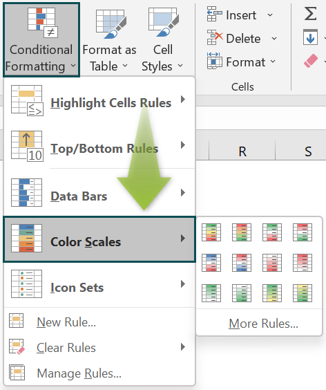
- Step 3: In this example, we need to choose the color scale of “Red – Yellow – Green”. Because the higher the temperature, the more dangerous it is. So, we need to go in the combination of the highest in red, middle values in yellow, and lowest values in green.
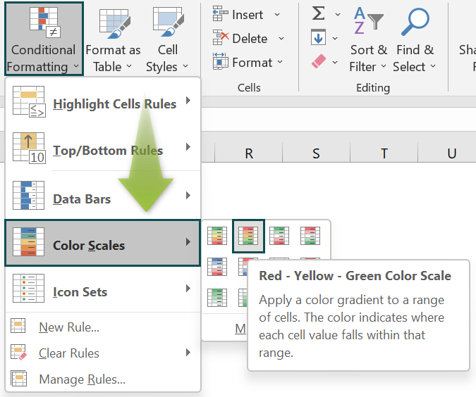
This will create a default heat map like the following one.

However, this isn’t the best heat map yet. Because anything greater than 27 should be in dark red rather than shading red, and anything below 20 should be in dark green rather than shading green.
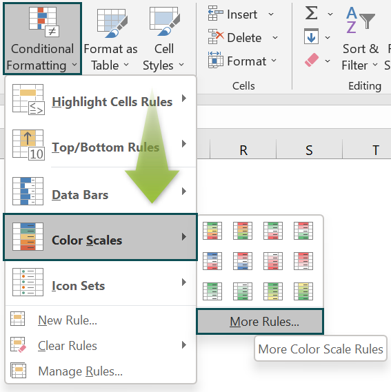
- Step 4: When we are electing the color scale, we need to choose the More Rules option.
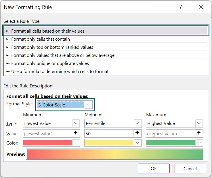
- Step 5: This will bring the New Formatting Rule window. Select the option Format all cells based on their values and choose 3-Color Scale as Format Style.
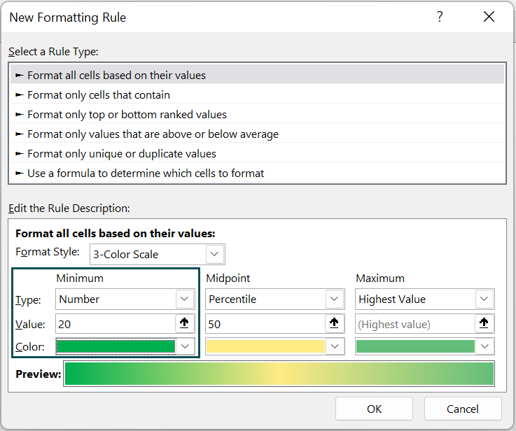
- Step 6: Under the Type option, choose Number for minimum, enter the value as 20, and choose the green color.
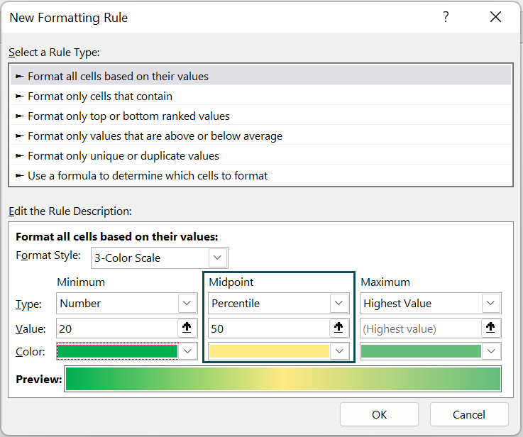
- Step 7: For the Mid-Point option, we can keep the default values as 50 percentile and yellow color scale.
- Step 8: For the Maximum values, set the type as a number, enter the value as 27, and choose the color as Red.
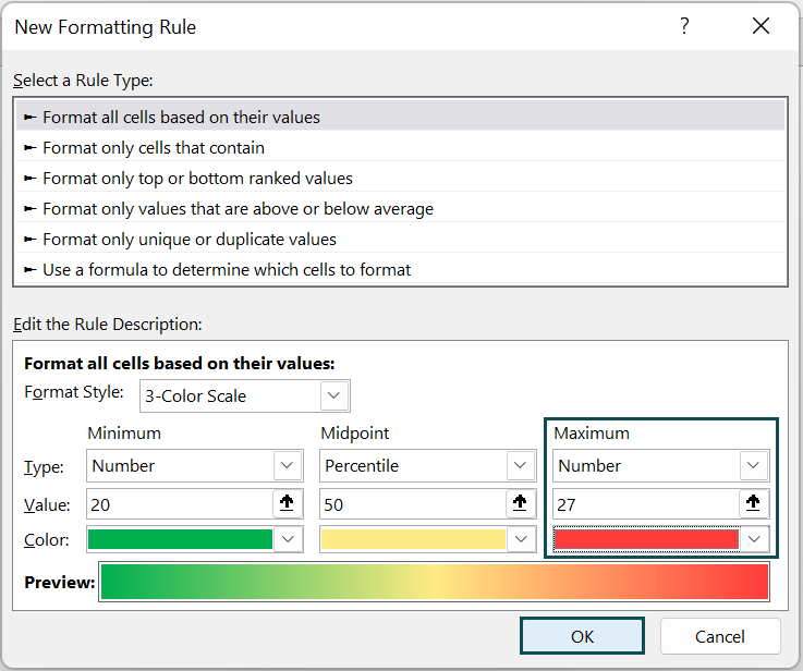
Click on OK, and we will have a heat map like the following.

The difference between a default heat map and a customized heat map is that the temperature of anything above 27 is filled with dark red color, while the default one was raining the red from dark to light red.
Similarly, dark green denotes a temperature of less than 20.
Example #2 – Dynamic Heat Map With Check Box
The above examples showed us how to create heat map in Excel but giving an option to the user to switch between the summary table, and heat map makes things dynamic.
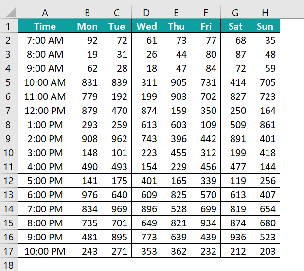
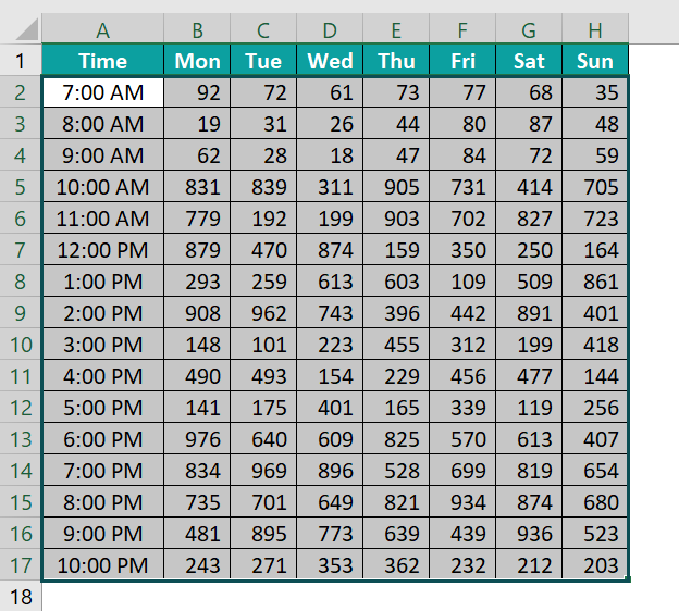
The following data shows the customer visits the retail shop on an hourly basis throughout the week.
- Step 1: Go to the Developer tab and add Check Box from the Insert option.

- Step 2: Draw the check box on the worksheet.
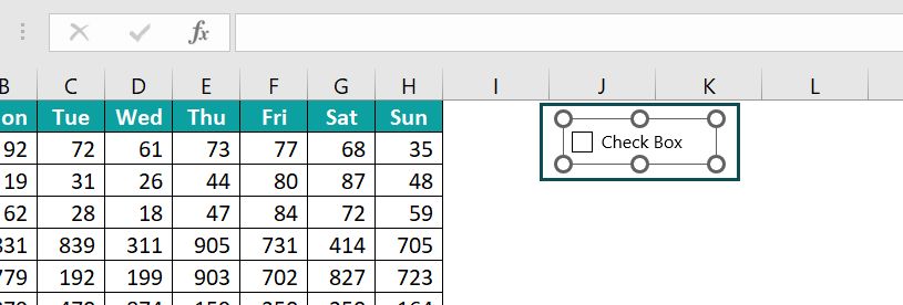
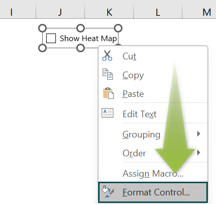
- Step 3: Right-click on the check box and “Edit Text” as “Show Heat Map”.
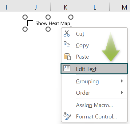
- Step 4: Again, right-click on the check box and choose Format Control.
- Step 5: This will bring the Format Control window like the following. Click on Checked and give an Excel cell reference as cell L2.
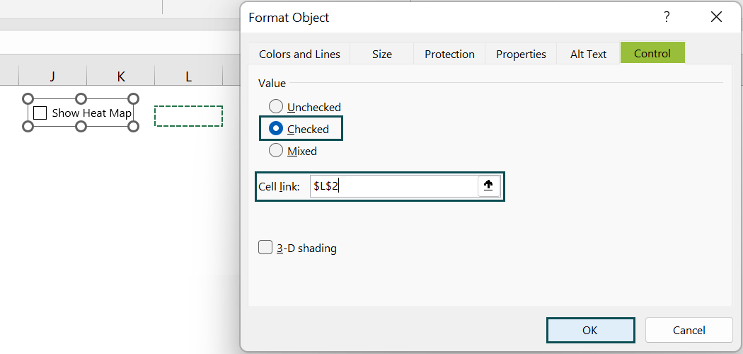
Click on OK and check the box set up is done.
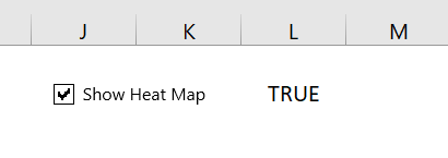
Whenever the check box is checked, it will show a TRUE value in linked cell L2 otherwise, it will show a FALSE value.
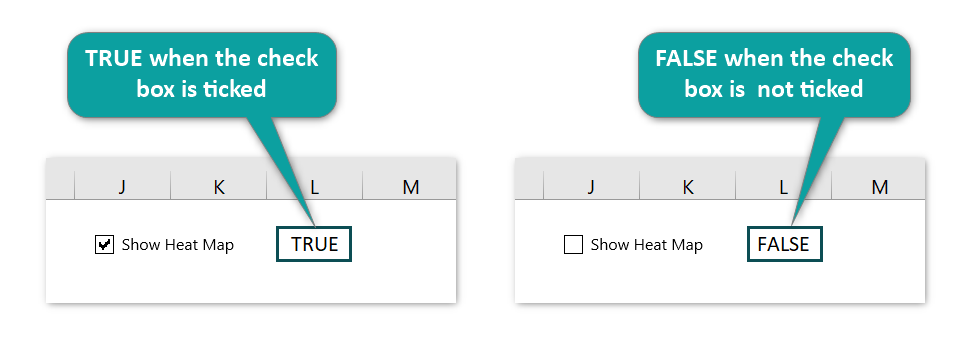
By using this TRUE or FALSE value, we will make the dynamic heat map.
- Step 6: Select the cells from B2:H17
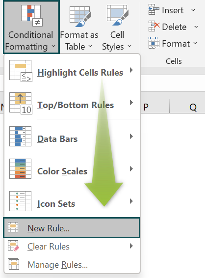
- Step 7: Go to the Conditional Formatting under the Home tab and choose New Rule.
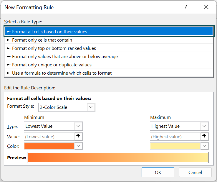
- Step 8: This will bring the New Formatting Rule window. Choose the Format all cells based on their values option.
- Step 9: Choose the 3-Color Scale option from Format Style.
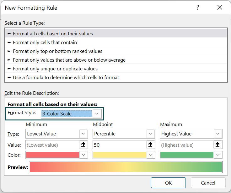
- Step 10: Under Type, choose Formula for Minimum, Mid-Point, and Maximum.
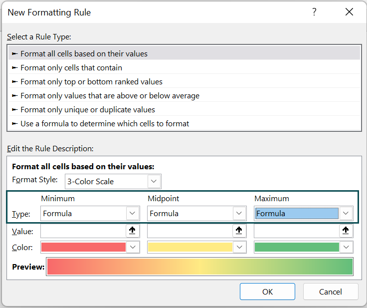
- Step 11: For the minimum, enter the following formula.
=IF($L$2=TRUE,MIN($B$2:$H$17),FALSE)
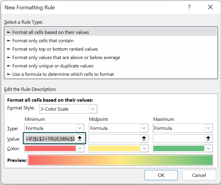
Formula Explanation: If the check box is ticked, we will get a value as TRUE in cell L2, so when the cell L2 value is TRUE, we are getting the minimum value from the data range B2:H17.
- Step 12: For the mid-point, enter the following formula.
=IF($L$2=TRUE,AVERAGE($B$2:$H$17),FALSE)
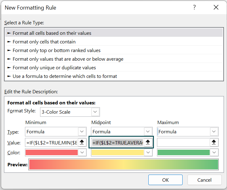
Formula Explanation: If the check box is ticked, we will get a value as TRUE in cell L2, so when the cell L2 value is TRUE, we are getting the average value from the data range B2:H17.
- Step 13: For the maximum, enter the following formula.
=IF($L$2=TRUE,MAX($B$2:$H$17),FALSE)
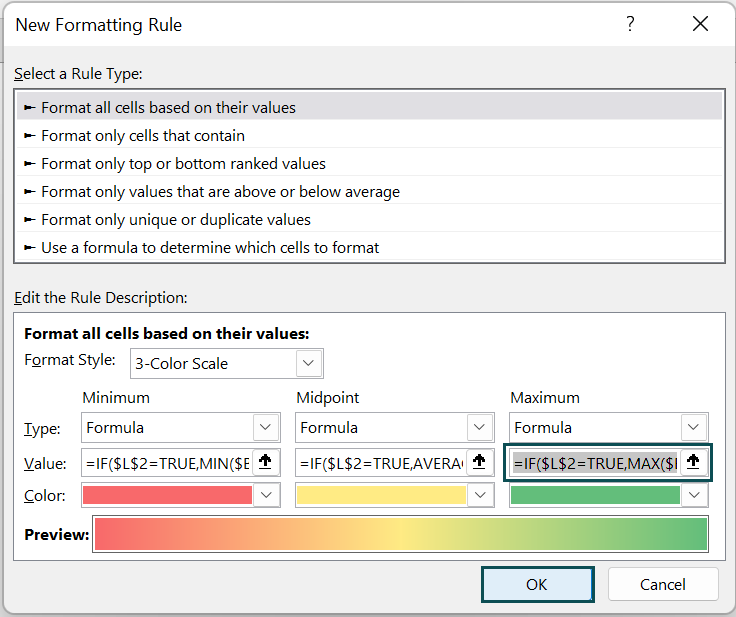
- Step 14: Click on OK. We will have a heat map that look like the following image.
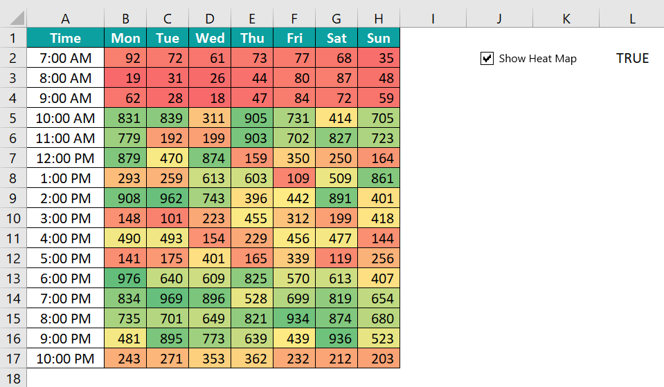
From the above heat map, we can clearly identify the high-traffic hours. Usually, on all the days of the week, the morning, 7 AM to 9 PM, has the low visits and the evening, 6 PM to 8 PM, records peak visits.
Another interesting inference from the above heart map is that Saturdays between 7 PM to 9 PM record the greatest number of visits. Similarly, at 10 PM, visitors slow down as the store nears the end of the operation for the day.
Whenever we uncheck the check box, the heat map will disappear.
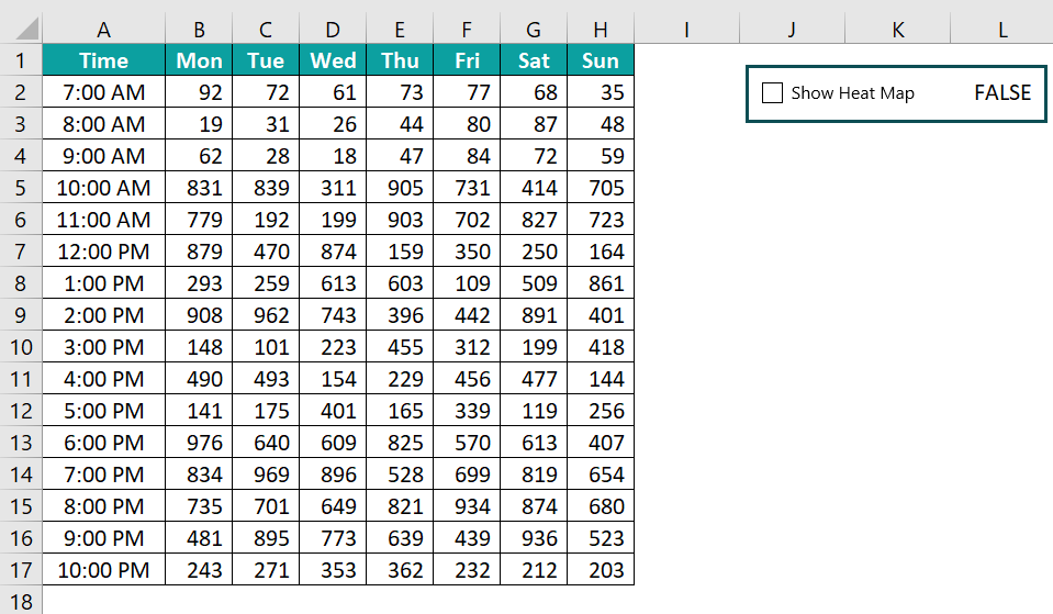
In this way, we can create a heat map in Excel even though we do not have a built-in heat map chart in Excel.
Important Things To Note
- A heat map is not a built-in chart in Excel.
- Conditional formatting will be removed if we copy and paste the non-conditional formatting cells onto the already formatted cells.
- Remember, conditional formatting will not be applicable for any additional rows or columns to the data table.
- Conditional formatting is volatile in nature. Hence, whenever there is a change in the worksheet, conditional formatting requires recalculation to happen, which will impact the workbook’s performance. Always use a heat map when you work with a small amount of data.
- It accepts only logical formulas which return only TRUE or FALSE.

Frequently Asked Questions (FAQs)
For instance, we have the following sales data of a provision store in a week in an Excel spreadsheet.
Select the cells from B2:H6.
We can add heat map in excel using the below steps.
When we select the color scales Green – Yellow – Red, we will have the following heat map ready in Excel.
We need to insert Geographic Heat Map from the marketplace.
In Excel, go to the Insert tab and click on Get Add-ins.
Download the following Geographic Heat Map.
We can create heat map in excel showing geographic locations for the city, state, or province.
Using heat map in Excel, we can identify the high traffic time and high sales areas, and compare the values between two places or two time periods. A heat map shows us the visual representation of the data so that users quickly identify the key areas.
Download Template
📥Download the ready-to-use Excel template to practice this tutorial yourself.
Heat Map in ExcelRecommended Articles
This has been a guide to Heat Map in Excel. Here we learn how to create heat maps with step-by-step examples and downloadable excel template. You can learn more from the following articles –


Leave a Reply