
What Is Non-linear Regression In Excel?
Non-linear regression in Excel is a statistical method used to find the nonlinear relationship between one dependent variable and independent continuous variables. Users can use the non-linear regression in a worksheet to fit the data to a model and represent it as a mathematical equation.
For example, the table below shows the ad counts and the sales they generated.
Use this Non-linear Regression in Excel Template to follow along with the examples in this article.
Download Excel Template
Suppose the requirement is to calculate nonlinear regression in Excel for the above data. Then, we can use the Scatter plot from the Insert tab to achieve the required outcome.

The ad count is the independent variable, and sales are the dependent variable in the above example.
And plotting a Scatter chart for the two variables and inserting a linear trendline, as shown in the first plot, shows a nonlinear relationship between the two parameters. In other words, the sales do not vary linearly with the ad count.
Thus, we must choose the appropriate trendline to achieve the required nonlinear regression curve in Excel. In this case, we pick the Exponential trendline, as shown in the second plot. And hence, we obtain the exponent-based nonlinear regression equation relating the two specified variables.
Key Takeaways
- The non-linear regression in Excel is a regression technique. It exhibits the nonlinear relationship between the response (dependent variable) and predictors (independent variables).
- Users can use the nonlinear regression method to evaluate if the regression line fits the data. It helps review the relationship between the dependent variable and one or more independent variables and reckon how well the model fits the data.
- We can use the Trendline Options from the Trendline Format window to determine the trendline curve that best fits the model to the data. And we can use the above mentioned option, LINEST(), or Regression from the Data Analysis ToolPak to obtain the nonlinear regression equation.
Explanations & Uses
Nonlinear regression in Excel statistically generates a curve depicting the nonlinear relationship between the specified variables or parameters. And Excel uses the nonlinear least square regression method to calculate nonlinear regression equations.
The technique is more accurate and offers flexibility, allowing one to estimate diverse curves with complex equations that best fit the given data.
Furthermore, this regression method helps evaluate if the predicted model fits the given data well and satisfies the analysis assumptions.
The uses of non-linear regression in Excel are as follows:
- Financial modeling and price fluctuations over time.
- Logistic price variation model for estimating untouched market prices.
- Predicting and forecasting in agriculture, finance, AI, and machine learning domains.
- Dose-response research in biological sciences.
How To Do Non-linear Regression In Excel?
We can use non-linear regression in Excel by following the below steps:
- Plot a Scatter plot for the given data from the Insert tab.
- Insert a linear trendline to confirm the nonlinear relationship between the given variables.
- Once confirmed, pick the best-fitting trendline to obtain the required Excel nonlinear regression formula or equation.
- Thus, now we can perform the required nonlinear regression analysis.
Click on a cell in the table of dependent and independent variables’ data or select the entire table range. And then, select the Insert tab – Pick the Scatter (X, Y) or Bubble Chart option – Choose the Scatter chart.

[Alternatively, we can click on a cell in the table of dependent and independent variables’ data or select the entire table range. And then, select the Insert tab – Pick Recommended Charts option.

The Insert Chart window opens.
Go to All Charts tab – Pick X Y (Scatter) chart – Choose Scatter chart – Pick the appropriate Scatter chart from the provided options.

And clicking OK will give us the Scatter chart to calculate nonlinear regression in Excel and perform the required analysis.]
And then, click the Chart Elements option – Enable the Trendline option to confirm the nonlinear relation between the two variables.

Next, click the Chart Elements option – Click Trendline right arrow – Pick More Options.

The Format Trendline pane will open, where we can set the appropriate settings to achieve the nonlinear regression curve in Excel with the formula required for analysis.


Let us see the above steps in detail with an example.
#Basic Example
The table below shows the observations of two parameters, X and Y.

Suppose the requirement is to confirm the non-linear relationship between the two variables. Then, the steps are as follows:
Step 1: To start with, click on a cell in the given table, and then, follow the path Insert – Scatter (X, Y) or Bubble Chart – Scatter chart to visualize the given data in a chart format.
Step 2: Next, click the chart area to enable the Chart Elements option, and then, check the Trendline box.
We see the trendline is linear. But the data points do not align with the linear trendline. It implies that the relationship between X and Y is nonlinear.
Next, we shall find the trendline that best fits our model.
Step 3: Then, click the Chart Elements option and uncheck the Trendline box. And click the Trendline right arrow to choose More Options from the list.
Step 4: The Format Trendline window opens, where we must try every option to determine the appropriate trendline. In this case, the Logarithmic curve best fits our model to the data.
Next, scroll down the Format Trendline pane and check the option to display the Excel nonlinear regression formula or equation in the chart area.
Step 5: Now, click the Chart Elements option and check the Axis Titles option.

Step 6: Next, double-click the chart title and axis titles’ elements in the chart area, one at a time. And update them, as shown below.

Thus, the final Scatter plot gives the non-linear regression in Excel for the given data will be depicted below.

Examples
Check out the following non-linear regression in Excel examples to use it effectively.
Example #1
The table below contains the trial results of an experiment involving one independent and one dependent parameter.

Suppose the requirement is to determine the non-linear regression in Excel for the above data. Then, the steps are as follows:
Step 1: First, select the cell range B1:C11 and then, follow the path Insert – Scatter (X, Y) or Bubble Chart – Scatter chart.

Step 2: Next, click Chart Elements – Trendline right arrow – More Options to open the Format Trendline window.

Step 3: Then, pick the Power curve under the Trendline Options, as it helps to fit the model to the given data in the best way possible.

Step 4: Now, check the options to display the nonlinear regression equation and the R-squared value in the chart area.

Step 5: Next, click Chart Elements – Axis Titles.

Finally, double-click the chart and axis titles elements, one at a time, to update them in the chart area.

The R-squared value of 0.999 indicates that the model best fits the given data. And we can use the power equation for nonlinear regression analysis, with x in the expression representing the independent parameter and y, the dependent parameter.
Example #2
The table below contains a list of X and Y values.

Suppose we must evaluate the non-linear regression in Excel for the above data. Then, the steps are as follows:
Step 1: First, click on a cell in the given table, and then, follow the path Insert – Scatter (X, Y) or Bubble Chart – Scatter chart to visualize the given data in a chart format.

And clicking Chart Elements – Trendline shows a linear line, which indicates that the relationship between the two parameters is nonlinear.

Step 2: Next, uncheck the Trendline option and then, click the Trendline right arrow to pick More Options.

The Format Trendline window will open, where we must check every trendline option to identify the best curve fitting the given data into a model.
In this example, we find the best fit with the Polynomial curve with the Order set as 6. We can click the drop-down buttons to increase and decrease the order, as per our requirement.

And check the option to display the nonlinear regression equation.

Step 3: Next, update the chart and axis titles as explained in the previous section to obtain the below Scatter plot for non-linear regression in Excel for the given X and Y values.

We shall now see how to use the excel function LINEST for nonlinear regression in Excel. The function will help us determine the variable coefficients in the nonlinear regression equation.
Sometimes, displaying the nonlinear regression equation from the Format Trendline window shows the coefficients up to one or two significant digits. It limits the analysis accuracy to the same number of significant digits.
Also, we may require to show the equation in the worksheet. And in such a case, when we update the source data, the equation does not get updated.
But when using the function LINEST for nonlinear regression in Excel, the coefficient accuracy will be for more significant digits. And when we update the source data, the coefficients also get updated automatically, as the function works with the given datasets.
Step 4: Now, we shall introduce a table to determine the nonlinear regression equation coefficients using the LINEST().

Step 5: Next, select the cell range K3:Q3.

And enter the LINEST().
=LINEST((B2:B11),(A2:A11)^{1,2,3,4,5,6},TRUE,FALSE)

Next, press Ctrl + Shift + Enter to apply the expression as an array formula in excel.

The LINEST() determines a line’s statistics using the least squares technique to obtain a line that fits the given data in the best way possible. And it returns an array of values describing the line.
The function accepts the known Y value range and the known X value range to the power of array {1,2,3,4,5,6} as we require six coefficients. And it takes two logical values to calculate the constant c normally and return the coefficients and constant c, respectively.
Further, we select seven cells to display the resulting array containing six coefficients and a constant.
So, thus we obtain the required coefficients for our nonlinear regression equation, matching those obtained using the option in the Format Trendline window.
Example #3
The non-linear regression in Excel works when the number of dependent variables is one. However, the source data can have more than one independent variable.
For example, in the table below, Z is the dependent variable. And 1/X and Y are the independent variables.

Using the column A values, we must determine 1/X values in column D. And determine the non-linear regression in Excel for the given variables Z, 1/X, and Y.
Then, the steps are as follows:
Step 1: To begin with, select cell D2, enter the formula, and then, press Enter.
=1/A2

And using the fill handle in excel, enter the formula in cell range D3:D8.

Next, we will use the Regression analysis tool from the Data Analysis ToolPak feature in the Data tab to obtain the nonlinear regression equation required for the analysis.
Suppose the Data tab does not show the Data Analysis option, as depicted below:

Then, here are the steps to enable the option in the Data tab.
Step 2: Next, click File – Options to open the Excel Options tab.

Then, choose Add-ins in the menu and then, click Go in the Excel Options window.

Now, the Add-ins window will open, where we must check the Analysis ToolPak box and click OK.

We can now see the Data Analysis option from the Data tab.

Step 3: Next, click on a cell in the table range C1:E8 and then, follow the path Data – Data Analysis to open the Data Analysis window.

Next, pick Regression from the Analysis Tools list in the Data Analysis window, and click OK.

Step 4: The Regression window opens. Update the Z variable dataset as the input Y range and the 1/X and Y variables’ data ranges as the input X range.
Include the column headings in the input ranges and check the Labels box to view the variable names in the output. Also, we shall assume the constant is 0 and let the confidence level be 95%, implying the significance threshold is 0.05.

And let us pick the first option under Output options and set the range as cell G2 to view the summary in cell G2 of the current worksheet.
Finally, click OK to obtain the below summary output.

The R Square value is 0.996938507. It indicates that the model fits the data well.
Also, the P-value of the two independent variables, 1/X and Y, is below 0.05, the significance threshold, indicating the model is significant.

Thus, we can use the coefficients of the two independent variables, 1/X and Y, to form the required nonlinear regression equation in cell H1.

Important Things To Note
- The trendline will not be linear when calculating the non-linear regression in Excel. Thus, ensure to pick the trendline curve from the Format Trendline window that best fits the model to the data.
- The R-squared value does not count in nonlinear regression. But we can use it to pick the suitable trendline curve from the options in the Format Trendline window, with a higher value indicating the model fits the data better.
- When using the Regression Analysis ToolPak to calculate nonlinear regression, ensure the independent variables’ P-value is below the significance threshold. It indicates the model is significant, and we can use the independent variables’ coefficients to create the nonlinear regression equation.
Frequently Asked Questions (FAQs)
Excel can do non-linear regression. It calculates the nonlinear least square regression to determine the nonlinear relationship between response and predictors.
Linear vs. non-linear in Excel is one of the two ways of performing regression analysis.
Linear regression creates a straight line that graphically represents the linear relation between the dependent and independent parameters.
On the other hand, non-linear regression creates a curve, graphically representing the nonlinear relationship between the dependent and independent variables.
We can find the non linear line of best fit in Excel using the Trendline Options in the Format Trendline window. Let us see the steps with an example.
The following table contains the average annual rainfall data from 2011-20.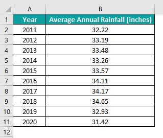
Here is how to find the non-linear line of best fit in Excel for the above data.
Step 1: First, click on a cell in the table and then, follow the path Insert – Scatter (X, Y) or Bubble Chart – Scatter chart.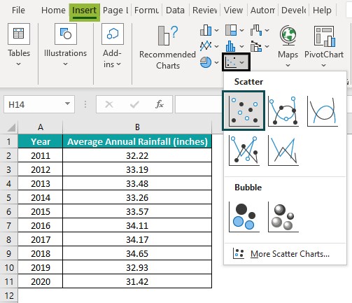
Step 2: Next, click Chart Elements – Trendline right arrow – More Options to open the Format Trendline window.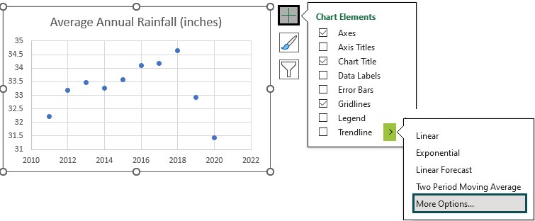
The linear trendline will appear by default as the best-fit line.
Next, scroll down the Format Trendline window to select the options to display the line equation and R-squared value.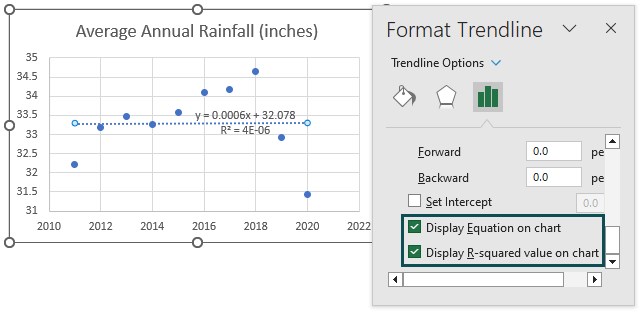
We now must check the trendline curve that best fits the model to the data. And for that, we can select one Trendline curve at a time and check the R-squared value. The one with the highest R-squared value will be the best-fitting curve.
Step 3: Next, pick each curve one by one under Trendline Options and then, check the respective R-squared value.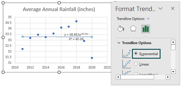
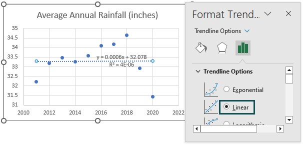
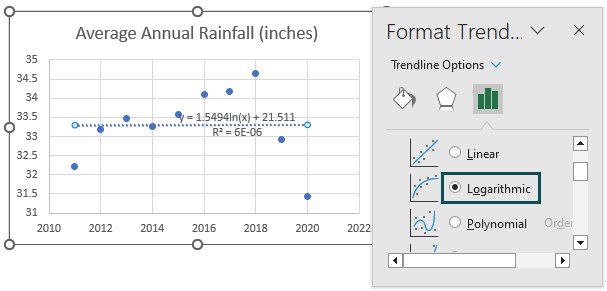
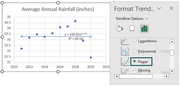
For all the above-chosen options, the R-squared values are low.
Hence, we shall now check the Polynomial curve and change the Order one step at a time using the drop-down buttons to look for the curve with the highest R-squared value.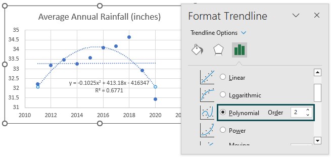
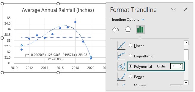
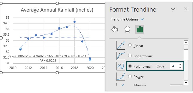
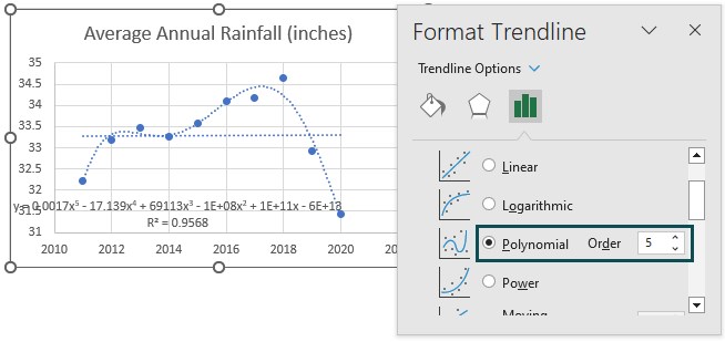
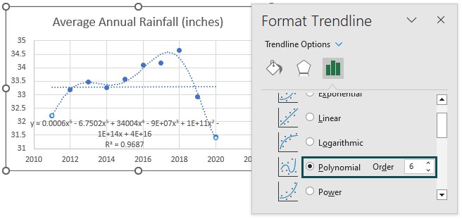
The Order of 6 is the maximum value that Excel offers. And in this example, the Polynomial curve with Order 6 shows the highest R-squared value, 0.9687 or 96.87%.
Thus, the non-linear line of best fit for the given data is the Polynomial curve of order 6.
Step 4: Then, click Chart Elements – Axis Titles.
Next, double-click the chart and axis titles elements one at a time to update them as depicted below: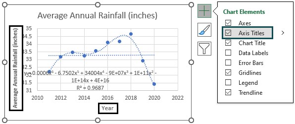
Step 5: Finally, resizing the chart to view the nonlinear regression equation properly will result in the plot below showing the nonlinear line of best fit.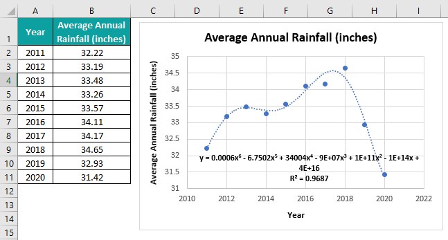
Use this Non-linear Regression in Excel Template to follow along with the examples in this article.
Download Excel TemplateRecommended Articles
Continue with these related resources when you want the next practical step in this topic.
- What-If Analysis in Excel
- Goal Seek In Excel
- Scenario Manager in Excel
- Solver in Excel
- Break-Even Analysis In Excel
Explore the full Excel What-If Analysis guide or browse Excel Resources.