What Is Linear Regression In Excel?
Linear Regression in Excel is a statistical function that helps us understand the correlation between two or more datasets, whether dependent or independent variables. We can graphically demonstrate the impact on the dependent variables or predict their variations when the independent variables are modified, using the Linear Regression Graph.
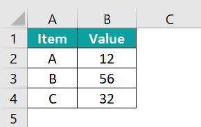
For example, the below image shows some values in columns A and B.

We get the following graph using Linear Regression in Excel.

📥Download the ready-to-use Excel template to practice this tutorial yourself.
Linear Regression In ExcelTable of contents
- What Is Linear Regression In Excel?
- How To Do Linear Regression In Excel With Analysis ToolPak?
- Examples
- How To Make A Linear Regression Graph In Excel?
- How To Do Regression In Excel Using Formulas?
- Draw A Linear Regression Graph
- Regression Analysis In Excel With Formula
- Frequently Asked Questions (FAQs)
- Download Template
- Recommended Articles
Key Takeaways
- Linear Regression in Excel is used to see if there is a statistically significant relationship between two sets of variables.
- We can predict the value of the dependent variable based on the values of one or more independent variables.
- When an independent variable is modified, we can see its impact on the dependent variables.
- We will get incorrect results if we choose to predict any value outside the given range.
- To work on the Linear Regression, we must first enable the regression option from the Excel Add-ins.
How To Do Linear Regression In Excel With Analysis ToolPak?
To do Linear Regression in Excel with Analysis ToolPak we must first enable the Analysis ToolPak Add-in.
The steps to enable the Analysis ToolPak Add-in are as follows:
Select the “File” tab → click the “More…” option → select the “Options” option from the drop-right list, as shown below.

The “Excel Options” window opens. Now, select the “Add-ins” option on the left → on the right below, in the “Manage:” field select the “Excel Add-ins” option from the drop-down → click “Go…”, as shown below.

The “Add-ins” window opens. Here, check/tick the “Analysis ToolPak” checkbox → click “OK”, as shown below.

[Note: The “Data Analysis” option appears under the “Analysis” group in the “Data” tab of the Excel sheet, as shown below. Once enabled, the option will always be available.]

Let us take an example to learn about this function.
We will generate a graph using Linear Regression.
The below image shows the two values, x and y.

The steps to generate a Linear Regression in Excel using Data Analysis are as follows:
- Select the table data, A1:B5 → select the “Data” tab → go to the “Analysis” group → click the “Data Analysis” option, as shown below.

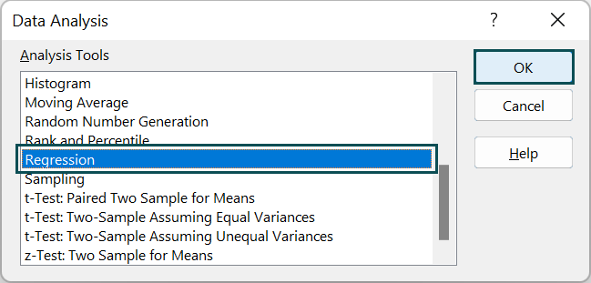
- In the “Data Analysis” window that appears, select the “Regression” option → click “OK”, as shown.

- In the “Regression” window that appears,
• Go to the “Input” group – enter the cell values in the “Input Y Range:” and “Input X Range:” fields, as B2:B5 and A2:A5, respectively → and check/tick the “Labels” checkbox.
• Next, go to the “Output options” group → select the “New Worksheet Ply:” checkbox option.
• Go to the “Residuals” group → and check/tick the “Residuals” checkbox.
• Click “OK”, as shown below.
The Regression summary output is generated, as shown below.
We can form the Linear Regression in Excel graph, as shown in the following image.
Examples
We will understand some advanced scenarios with Linear Regression examples.
Example #1
The below image shows the two values of the items.

The steps to demonstrate Linear Regression in Excel using Data Analysis are as follows:
- Step 1: Select the table data, A1:B5 → select the “Data” tab → go to the “Analysis” group → click the “Data Analysis” option, as shown below.

- Step 2: In the “Data Analysis” window that appears, select the “Regression” option → click “OK”, as shown.

- 3: In the “Regression” window that appears,
- Go to the “Input” group à enter the cell values in the “Input Y Range:” and “Input X Range:” fields, as B2:B5 and A2:A5, respectively → and check/tick the “Labels” checkbox.
- Next, go to the “Output options” group → select the “New Worksheet Ply:” checkbox option.
- Go to the “Residuals” group → and check/tick the “Residuals” checkbox.
- Click “OK”, as shown below.
The Regression summary output is generated, and the Linear Regression in Excel graph is formed in the following image.


Example #2
The below image shows the two values of the items.

The steps to demonstrate Linear Regression in Excel using Data Analysis are as follows:
- Step 1: Select the table data, A1:B5 → select the “Data” tab → go to the “Analysis” group → click the “Data Analysis” option, as shown below.

- Step 2: In the “Data Analysis” window that appears, select the “Regression” option → click “OK”, as shown.

- Step 3: In the “Regression” window that appears,
- Go to the “Input” group → enter the cell values in the “Input Y Range:” and “Input X Range:” fields, as B2:B5 and A2:A5, respectively → and check/tick the “Labels” checkbox.
- Next, go to the “Output options” group → select the “New Worksheet Ply:” checkbox option.
- Go to the “Residuals” group → and check/tick the “Residuals” checkbox.
- Click “OK”, as shown below.
The Regression summary output is generated, and the Linear Regression graph is formed in the following image.


How To Make A Linear Regression Graph In Excel?
Let us generate a Linear Regression graph in Excel with the help of an example.
In the table, the data is,
- Column A shows the Item.
- Here, column B contains the Value1.
- Column C contains the Value2.

The steps to generate a Linear Regression graph are as follows:
- Step 1: Choose the data table, A1:C4 → select the “Insert” tab → go to the “Charts” group → click the “Insert Scatter or Bubble Chart” option drop-down → select the “Scatter” chart type from the “Scatter” group, as shown below.

- Step 2: Click the generated Linear Regression in Excel graph, the “Design” and the “Format” tabs appears on the ribbon.
Select the “Chart Design” tab → go to the “Chart Styles” group → select the desired styles, as shown below.

We will get the Linear Regression in Excel graph, as shown above.
How To Do Regression In Excel Using Formulas?
We can calculate the Linear Regression using the following formula.
y = bx + a
where,
- x – independent variable
- y – dependent variable
- a – y-intercept
- b – a slope of the regression line
We will generate the Linear Regression in Excel graph using the formula.
The below example has some parameters in column A and their values in column B.

The steps to generate a Linear Regression graph are as follows:
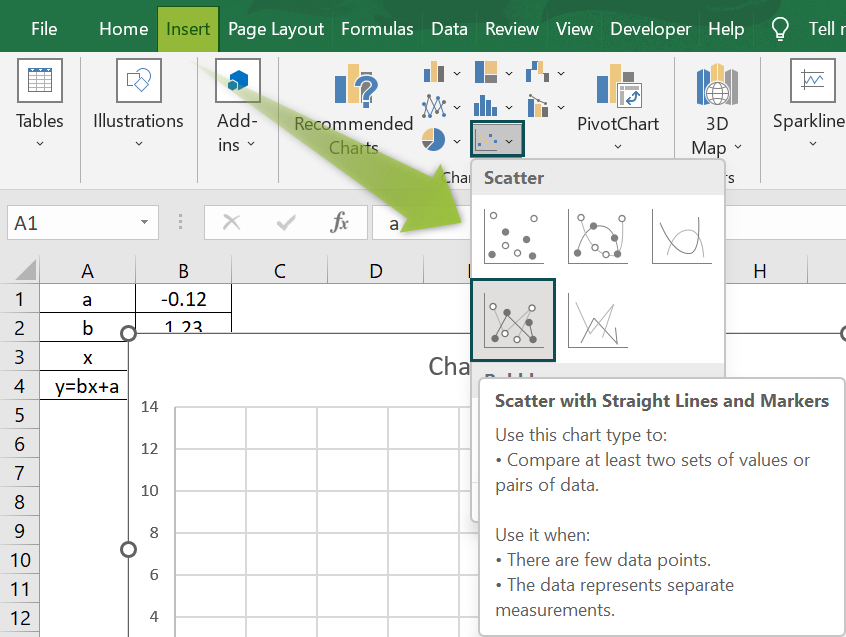
- Step 1: Choose the data table, A1:B4 → select the “Insert” tab → go to the “Charts” group → click the “Insert Scatter or Bubble Chart” option drop-down → select the “Scatter with Straight Lines and Markers” chart type from the “Scatter” group, as shown below.

- Step 2: Click the generated Linear Regression in Excel graph, the “Design” and the “Format” tabs appears on the ribbon.
Select the “Chart Design” tab → go to the “Chart Styles” group → select the desired styles, as shown below.

We will get the Linear Regression graph, as shown above.
Draw A Linear Regression Graph
We will draw a Linear Regression Graph in Excel.
The below example has x and y values in columns A and B.

The steps to generate a Linear Regression in Excel graph are as follows:
- Step 1: Choose the data table, A1:B4 → select the “Insert” tab → go to the “Charts” group → click the “Insert Scatter or Bubble Chart” option drop-down → select the “Scatter with Smooth Lines and Markers” chart type from the “Scatter” group, as shown below.

- Step 2: Click the generated Linear Regression graph, the “Design” and the “Format” tabs appears on the ribbon.
Select the “Chart Design” tab → go to the “Chart Styles” group → select the desired styles, as shown below.

We will get the Linear Regression graph, as shown above.
Regression Analysis In Excel With Formula
The Regression analysis of quantity and price is shown in the following graph.
In the below image, the example shows the quantity and price of items. We will generate the graph for the formula used, using Linear Regression in Excel.

- Step 1: Choose the data table, A1:B5 → select the “Insert” tab → go to the “Charts” group → click the “Insert Scatter or Bubble Chart” option drop-down → select the “Scatter with Straight Lines and Markers” chart type from the “Scatter” group, as shown below.

- Step 2: Click the generated Linear Regression in Excel graph, the “Design” and the “Format” tabs appears on the ribbon.
Select the “Chart Design” tab → go to the “Chart Styles” group → select the desired styles, as shown below.

We will get the Linear Regression in Excel graph, as shown above.

Frequently Asked Questions (FAQs)
Linear Regression is a relationship between dependent and independent variables using a linear equation on the selected cell range. Linear i.e., a line represents the data in the generated graph. One independent variable is a simple linear regression, and several independent variables are multiple linear regression.
We will generate a Linear Regression graph for the following example with the students’ marks.
The steps to generate a Linear Regression in Excel graph are as follows:
• Step 1: Choose the data table, A1:C5 → select the “Insert” tab → go to the “Charts” group → click the “Insert Scatter or Bubble Chart” option drop-down → select the “Scatter with Smooth Lines and Markers” chart type from the “Scatter” group, as shown below.
• Step 2: Click the generated Linear Regression in Excel graph, the “Design” and the “Format” tabs appears on the ribbon.
Select the “Chart Design” tab → go to the “Chart Styles” group → select the desired styles, as shown below.
We will get the Linear Regression graph, as shown above.
Linear Regression is important due to the following reasons:
• It allows an understanding of the strength of the relationship between variables.
• Also, predicts that the models are statistically significant.
• It estimates the regression coefficient.
Download Template
📥Download the ready-to-use Excel template to practice this tutorial yourself.
Linear Regression In ExcelRecommended Articles
This has been a guide to Linear Regression In Excel. Here we explain how to do Linear regression with Analysis ToolPak and excel formulas along with examples and & downloadable template. You can learn more from the following articles –


Leave a Reply