
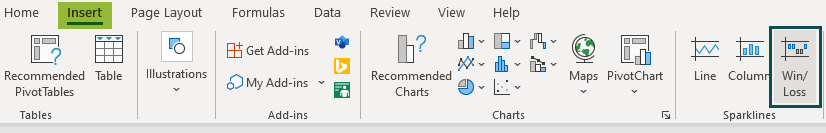
What Are Sparklines In Excel?
A sparkline in Excel is a tiny embedded chart that fits next to the data of interest within a cell in the worksheet. It offers a graphical representation of various trends in the data series. Sparklines help users visualize the data trends based on rows or columns, thus making data analysis easier. It was introduced in Excel 2010.
For example, the table below shows temperatures (in °F) recorded for two consecutive weeks. The data also has deviation information, where value 1 and -1 indicates an increase and decrease in temperature, respectively.
Use this Sparklines In Excel Template to follow along with the examples in this article.
Download Excel Template
First, select Sparklines from the Insert tab. Now, we can include a visual representation of the data in cell range B3:F5 using sparklines, as shown below.

In this table, we can see three mini-charts (sparklines) in column G.
- The first graph (in G3) is the Line sparklines in Excel type that denotes the data trends in the range B3:F3.
- The second plot (in G4) is the Column sparkline that graphically represents the data in the range B4:F4.
- The third plot (in G5) is a Win/Loss sparkline that indicates the temperature deviations over the two weeks based on the data in the range B5:F5.
Key Takeaways
- The sparklines in Excel are mini-charts that indicate trends in the data range. It can be inserted next to the source data, making data analysis more straightforward, with row- and column-wise mini-graphs.
- There are three sparkline types.
- Line: This consists of line segments connecting the data points of interest and is useful to represent stock figures and web traffic.
- Column: This shows data points as vertical columns. It is commonly used to visualize revenues.
- Win/Loss: This represents the data points with same-sized bars. It does not show varying trends in data point values but uses 1 and -1 signs to depict win or loss.
- Using the options in the Design tab, one can change, resize, group, ungroup, and delete sparklines.
How To Insert Sparklines In Excel?
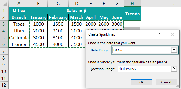
Let us understand the steps involved in inserting sparklines in Excel with an example. The table below shows the sales data of a company from its branches in four U.S. states, from January to June.

The steps to insert sparklines in Excel for the above table are as follows:
- First, choose cell H3 to insert the sparkline for Texas office sales data.
- Go to the Insert tab. Choose your required sparklines type in Excel. For our table, let us select Line sparkline.

- The Create Sparklines window pops up. In Data Range, we will enter the cell range B3:G3 to represent the data using line sparkline.
The Location Range is the absolute cell reference of the cell where we wish to insert the sparkline. So, we will select cell H3 to display the in-line chart.
- Click OK to view the sparkline.

- We can use the Fill Handle option in H3 to automatically display the other branches’ sales. With the cursor on cell H3, drag the Fill Handle downwards to get sparklines in cells H4, H5, and H6.

Please Note: You can choose the target cells individually and select a different sparkline type in each row to visualize the data graphically in the specific row.
Also, all the steps mentioned above will remain the same if you need to add sparklines per column. So, you should select the data points (cell range) to create the sparklines per column in Excel.


How To Add Sparklines To Multiple Cells?
Suppose you have to display the in-line charts in multiple cells; you can add sparklines in Excel across all the required cells in one click.
Let us consider the example used in the previous section.
Step 1: Select the cell range, H3:H6, to add the sparklines in excel.

Step 2: Go to the Insert tab, and select column sparklines in Excel.

Step 3: The dialog window pops up. Enter the cell range B3:G6 in the Data Range. Next, check the Location Range to ensure the cell reference you chose to display the sparklines in Excel is accurate.
Step 4: Click OK to view the mini-charts.

You can also select multiple cell ranges and enter them in the Data Range, each separated by a comma. Similarly, you should provide the respective target cells (where you want the sparklines) in the Location Range, separated by a comma.
Types Of Excel Sparklines
The three kinds of sparklines in Excel are:
- Line
- Column
- Win/Loss
1. Line Sparklines
It consists of line segments connecting the data points of interest. The line sparkline is useful for visualizing data, such as stock figures and web traffic.
Here is an example to show how you can use Line sparklines.
The following table shows the yearly sales report of five retail companies.

You can insert a line sparkline in each column to create a graphical representation of the sales figures for all the companies.
Step 1: Choose cell range B15:F15 to display the line sparklines in each column.

Please Note: Select the entire cell range since you want to create Line sparklines for every company’s yearly sales reports.
Step 2: Go to Insert > Line.

Step 3: Enter the Data Range as B3:F14 to generate the line sparkline for each company.

Ensure the Location Range is the absolute cell reference to the required cell range, B15:F15.
Step 4: Click OK to view each company’s sales reports in line sparkline.

Please Note: The difference between certain data points is not visible in some sparklines. However, you can use Markers from the Design tab to highlight every data point in the line sparkline in such scenarios.

Please Note: If a cell in the data set range is blank, the respective line sparkline will have a corresponding break in the graph. Also, if any data points are non-numeric, line sparkline considers them as 0, and the scale gets adjusted according to the other data points.
2. Column Sparklines
The column sparklines in Excel show data points as vertical columns. The data points can be positive or negative. The vertical column points upwards or downwards, depending on the value.
You can use this sparkline type to compare data sets and visualize detailed data, such as revenues made in different departments in an office or store.
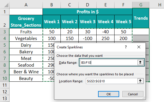
For example, the below table summarizes the profits and losses incurred in different grocery store sections in a month.

While the positive values denote profits, the negative figures represent losses. Cell C10 is blank; there was no business in the particular section in Week 2.
Below are the steps to create column sparklines for each department.
Step 1: Choose the cell range G3:G10 to insert the column sparklines for each store section.

When you want the same sparkline type for all the cells, you can choose the cell range to add sparklines in Excel in the required cells all at once.
Step 2: Select Insert > Column.
Step 3: Enter the cell range B3:F10 in the Data Range dialog box to generate column sparklines for all the sections in the grocery store. The Location Range will be the absolute cell reference G3:G10.
Step 4: Click OK to view the column sparklines.
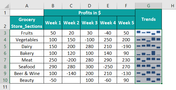
Please Note: The vertical column represents each data point, but the results might be confusing as all the columns are blue. We can denote the positive and negative values with different colored bars in this case. The steps to change colors are as follows:
Step 1: Choose any cell in the cell range G3:G10. The entire cell range gets selected.
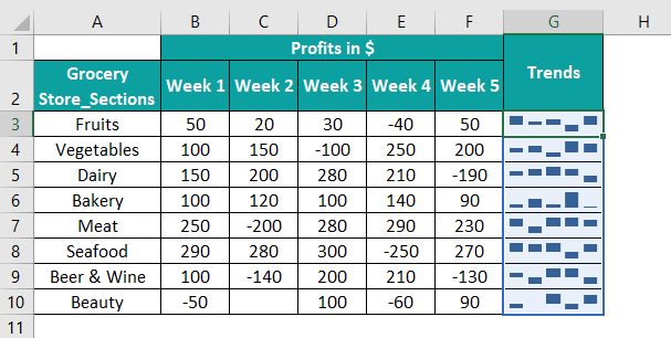
Step 2: Go to Sparkline > Marker Color. Click on Negative Points to choose a color representing the negative data points.

Step 3: We can select a color contrasting the positive values. In our example, the blue bars represent positive values. So, let us choose red to denote the negative data points.

We can now compare and determine the profit-making sections and those incurring more losses. Likewise, we can highlight the maximum and minimum profits in each mini-chart, thus adding value to our analysis.
Please Note: Cell C10 is empty. So, the column sparkline in cell G10 denotes it with a space. We can find a blank space in sparklines even if the value of a cell is 0 or non-numeric. . The graph’s scale gets adjusted according to the value of other data points in the specific data set.
3. Win/Loss Sparklines
A Win/Loss sparkline represents the data points with same-sized bars. , The column points can be upward or downwards based on the data point value (positive or negative).
The Win/Loss sparklines in Excel consider only the sign of the data points, thus visually representing a win or loss. They do not show a varying column length to denote the trends in data point values in the specific data set.
For example, the following table indicates the list of top racehorses and their performances in 10 games.

The values 1 and -1 denote whether the horse has won or lost the race. We can use win/loss sparklines to graphically represent each horse’s performance across all the games.
Step 1: Choose the cell range B12:H12 to display each horse’s win/loss sparkline.

Step 2: Select the Win/Loss option from the Insert tab.
Step 3: Enter B2:H11 as the Data Range and ensure the Location Range is the actual cell reference B12:H12.

Step 4: Click OK to view each racehorse’s win/loss sparkline.

Please Note: The Negative Points option in the Design tab gets selected and denoted with a different color (Red in the above illustration). It helps us distinguish between the wins and losses of each racehorse clearly. Thus, you can review each horse’s overall performance across the ten games using the mini-charts in cells B12:H12.
Also, any value other than 1 and -1 will get denoted with a blank space in a Win/Loss sparkline.
How To Change Sparklines In Excel?
When we select a cell containing a sparkline, we will see a tab in the ribbon called Design. It allows us to modify the sparklines in our worksheet according to our requirements.
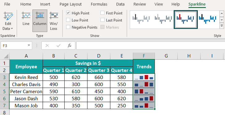
Consider the below table showing five employees’ savings in four quarters.

We can insert Line sparklines in Excel, as shown below:

There are different options available in the Design tab that we can use to customize the sparklines in Excel. But first, ensure to select the required sparklines to make the necessary changes.
- Sparkline
The Edit Data tab under this type shows three options:

The Edit Group Location & Data allows us to change the Location Range for the sparklines when we want to display them in a different cell range.

The Edit Single Sparkline’s Data enables us to change the Data Range for a selected sparkline, one at a time. For example, if we choose cell F4, we can replace the existing sparkline data range B4:E4 with the new data range in the dialog box.

With the Hidden & Empty Cells option, we can decide whether to show empty cells as gaps, 0, or connect the data points with a line. We can also choose to show hidden rows’ and columns’ data.

Please Note: The option, Connect data points with line, is available only for the Line sparkline.
- Type
We can change the sparkline type in our worksheet using the Type group.
Suppose we want to change the sparkline type from Line to Column in the above table. We can choose any cell from F3:F7 and select Column in the Design tab.

In our example, we generated the sparklines by selecting the entire data rage. So, the changes got reflected in all the cells F3:F7. However, we can change the chart type for individual cells, provided the sparklines are created separately, one at a time.
- Show
In excel, there are six options under this category.
- High Point and Low Point options highlight the data points with the maximum and minimum magnitudes on a sparkline.
- On the other hand, the First Point and Last Point options indicate the first and last data points on a sparkline.
- The Negative Points highlight the negative data points of a data set on a sparkline.
- The Markers option shows all the data points on a line sparkline. However, it is not available for the other sparkline types.
For example, when we choose the High Point option for the above table, the result will be:

The red bars indicate the data points with the maximum value in each data set.
- Style
It allows us to change the sparkline style using colors.
We can choose the style from the available visual styles.
Using the Sparkline Color option, we can change the line’s or vertical columns’ color in a sparkline.

Please Note: The Weight option gets enabled for the line sparklines, and you can use it to change the line width.
You also have the option Marker Color. It allows you to change the color of any point you wish to highlight in the sparkline. Click on the arrow next to the specific option and select the required color.

For example, if you have to show the first data point in each chart in green, select the sparklines and click Design > Marker Color > First Point. Then, choose the Green color to get the below output.

- Group
Before learning about Group, Ungroup, and Clear options, let us know about Axis for better understanding.
The above table shows that the sparklines appear closer to zero, where the data points have the minimum value in the data range. The other data points have vertical column lengths relative to the minimum value data point. In such cases, we may interpret the data incorrectly.
The solution is to change the axis settings using the Axis option.
For example, you can change the vertical axis settings to make the column sparklines more understandable. After selecting the sparklines, choose Design > Axis. Then, simultaneously click the Custom Value option under Vertical Axis Minimum Value Options and Vertical Axis Maximum Value Options.

Then enter a suitable minimum and maximum vertical axis value in the dialog boxes, say, 25 and 660, respectively.


Please Note: Ensure to choose the values correctly, considering the data points. Otherwise, the sparkline may not show the negative values, or it might make data comparison more complex.
Click OK to modify the vertical columns in the column sparklines.

Please Note: You can choose different options from the Design tab for each mini-chart if you have created each sparkline individually. Then, you can select the required sparklines type in one click and apply the changes.
Resize Sparklines
- Typically, the sparklines in Excel autofit the cells you choose to display the mini-charts. However, if you want to resize the sparklines, here is how you can do it. First, adjust the cell column width and row height to modify the sparkline’s width and height.
Let us reuse the same table. Once we make these changes, the resized sparklines in Excel will be:

Please Note: When the width of column F is changed, the width of all the sparklines in the column gets modified. Since we selected row 3 and changed its height, the height of the sparkline in cell F3 got adjusted.
- The alternative way is to merge cells to resize the sparklines. We need to merge cells row-wise to increase the mini-chart width and column-wise to increase the height.
For example, in the above table, when we merge cells F3 and G3, F5 and G5 row-wise and cells F7 and F8 column-wise, the resized sparklines will be as shown below:

Group And Ungroup Sparklines
In the Design tab, you can see two options, Group and Ungroup. The first one helps to group sparklines in Excel, allowing you to make the necessary changes to all the mini-charts in one go. You can use the Ungroup option to modify specific sparklines and select the required mini-charts to make the changes.
For example, in the employee-savings table, we inserted multiple sparklines in Excel by selecting a cell range for Location Range. So, the mini-charts in F3:F7 got grouped automatically, and hence the Group option remains disabled in the Design tab.

You can choose the required mini-charts and group sparklines from Design > Group.
Select the cell range and choose Design > Ungroup to ungroup the mini-charts.
Please Note: All mini-charts will have the same type when you group sparklines. On the other hand, you can choose specific sparklines and select Ungroup to ungroup.
Delete Sparklines
We cannot remove sparklines in Excel using the Delete key. Instead, we have to use the Clear option from the Design tab.
- To delete specific sparklines, say those in cells F3 and F6 of the employee-savings table, choose cells F3 and F6 and select Design > Clear.

Alternatively, we can choose the required cells and select Design > Clear > Clear Selected Sparklines.

The output will be:

- If we need to delete all the sparklines in Excel, ensure the entire group is chosen, and select Design > Clear > Clear Selected Sparkline Groups.

As soon as we select Clear Selected Sparkline Groups, the output will be as follows:

Important Things To Note
- Sparklines consider numeric data points and ignore non-numeric data. They show blank spaces for empty cells in the data set.
- The sparklines in Excel are dynamic in-line charts. When you change any data points, the respective chart gets updated.
- The sparkline size varies with the cell size. Therefore, if you change the cell dimension, the mini-chart adjusts accordingly to fit within the cell.
- You have the option to show hidden and empty cells using sparklines.
- While you can modify the sparklines in a cell range in one go, editing a sparkline in a single cell is also possible.
Frequently Asked Questions (FAQs)
1. Choose the cells where you want to insert the sparklines.
2. Select the Insert tab and choose the sparkline type, Line, Column, or Win/Loss.
3. Enter the Data Range (the source data set) in the dialog box. Ensure the Location Range matches the chosen target cells.
4. Click OK to view the sparklines.
You can change the color of sparklines in Excel by following the below steps:
1. First, choose the sparklines to enable the Design tab.
2. Then, click on Sparkline Color to change the sparkline color to your required shade.
Suppose you inserted sparklines in your worksheet containing a table showing a company’s profits at various office locations in California.
Step 1: Click on a cell with a sparkline, say, H3. It will enable the Design tab in the ribbon.
Step 2: Next, choose Design > Sparkline Color. You can now select the color for the sparklines.
Please Note: As you created multiple sparklines, they are in a group. So, if you change the color of one sparkline in the group, the color of all the sparklines gets modified. On the other hand, if you created each sparkline separately, you can change the color of each sparkline individually.
Also, you can choose an option from the Style group in the Design tab to change the sparkline color.
You can add markers to sparklines in Excel using the below steps:
1. First, select the cells with the required sparklines.
2. Then, go to Design >Markers.
Please Note: The Markers option is available only for line sparklines. Also, markers are customizable; you can go to Design >Marker Color >Markers and change their color in the sparklines.
Considering the previous example, if you have line sparklines instead of column sparklines, your table will be:
Step 1: Click on a cell with a sparkline, say, H3. It will enable the Design tab in the ribbon.
Step 2: In the Design tab, select the Markers box.
Step 3: Finally, choose Design > Marker Color > Markers. You can select your required color for the Markers.
Please Note: The sparklines are in a group. So, if you insert the Markers in one sparkline, all the sparklines will also have the Markers. But if you have individual sparklines, you can insert Markers in each of them separately.
It could be because your Excel version is 2007 or older. Otherwise, the values you chose for adjusting your axes settings could be incorrect, leading to sparklines not showing in your worksheet.
Use this Sparklines In Excel Template to follow along with the examples in this article.
Download Excel Template