


Introduction to AI Excel Power Map
Finance teams treat location‑based data as simple rows with city or postal‑code text, even though the same numbers often tell a rich spatial story about concentration, risk, or growth potential. The challenge is that moving from tables to maps traditionally requires GIS tools, custom scripts, or a one‑off visualization, which most analysts do not have time to build. AI Excel Power Map geographic data stories bridge that gap by letting analysts start in Excel, then use Excel’s builtin Power Map (3D Maps) plus AI‑assisted writing to turn raw tables into narrated, map‑based stories.
This workflow fits under geographic data stories with Excel Power Map AI, where the spreadsheet remains the source of truth while the map layer illustrates how revenue, headcount, or risk clusters across regions. Once data is loaded into Power Map, Bing‑backed geocoding translates place names or coordinates into 3D‑globe‑based visuals, and the user can build a guided “tour” that zooms from country‑level to city‑level slides, highlighting changes over time. Microsoft’s guidance on Power Map notes that the feature lets users plot data points on a 3D globe, animate time‑stamped records, and create cinematic tours that can be exported as videos, which is exactly the backbone for AI powered Excel Power Map maps.
How Excel Power Map Works Today
Power Map (also known as 3D Maps) is an Excel add‑in that lets users visualize geographic and time‑stamped data on a 3D globe or 2D map powered by Bing Maps.
The basic pattern:
- A data table is prepared with at least one location‑related column (for example, Country, State, City, or Latitude‑Longitude pairs).
- The user enables Power Map from the Insert tab, then selects the table or range.
- Power Map detects or prompts the user to assign geographic fields, then plots data points as bubbles whose size or color reflects the selected metric.
This behavior is documented in Excel‑focused Power Map guides, which explain how to import ranges, choose location fields, and set up time‑based animations so that the map evolves as the user advances through a tour. For geographic data stories with Excel Power Map AI, the spreadsheet is the control layer, and the map is the narrative layer: the exact numbers stay in Excel, while the visualization shows how they are distributed across geography.
How to Build a Narrated Map Tour
A powerful use case for AI Excel Power Map geographic data stories is a narrated, scrollable map tour that business leaders can watch like a mini‑documentary.
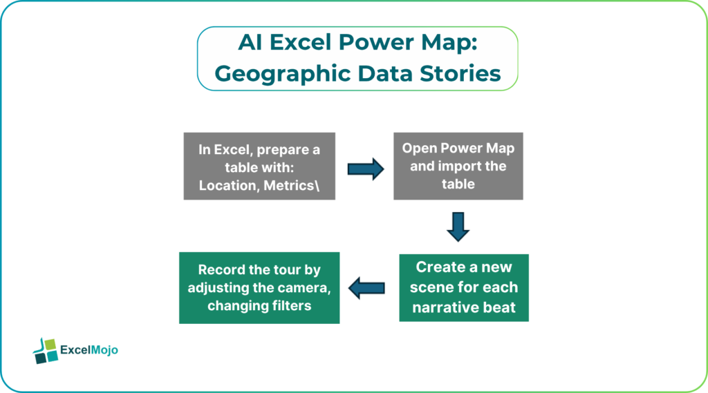
A typical workflow:
- In Excel, prepare a table with:
- Location (City, Region, Postal Code).
- Metrics (Revenue, Headcount, Risk Score).
- Optional Date or Quarter fields for animation.
- Open Power Map and import the table, then map the location column to the appropriate geography type (country, state, or city).
- Create a new scene for each narrative beat:
- One scene for the macro‑view (for example, national revenue by region).
- Another for a “hot spot” (top‑5 cities by growth).
- A time‑based scene if the table includes dates.
- Record the tour by adjusting the camera, changing filters, and then playing back the tour as a continuous map flight.
Microsoft’s Power Map documentation notes that tours can be exported as video files or shared as interactive tours, which makes them suitable for executives who prefer watching a 2‑minute story rather than scrolling through a dense dashboard. For AI powered Excel Power Map maps, AI can then help draft the script for each scene, turning statistics into spoken‑style narratives.
How AI Can Assist the Narrative Layer
AI Excel Power Map geographic data stories become more compelling when an AI assistant helps write the spoken or on‑screen narration for each scene instead of leaving the analyst to summarize metrics by hand.
A practical pattern:
- The analyst exports key metrics for each scene (for example, “Top 5 cities by revenue”) into a small summary table.
- They paste that table into an AI assistant and ask for a short, 1–2 sentence narration per scene, such as:
- “Our 2025 revenue was heavily concentrated in three metropolitan areas, each contributing over 15% of the total.”
- Or: “Between 2023 and 2025, growth in the southern region outpaced the national average by 8 percentage points.”
- The AI generates a first‑draft script, which the analyst then tweaks for tone, compliance, and accuracy.
This workflow is consistent with geospatial‑storytelling tutorials that emphasize using Power Map to “tell stories with data,” where the visual sequence is as important as the exact numbers. For geographic data stories with Excel Power Map AI, the AI does not change the map itself; it simply helps turn the underlying metrics into a narrative that resonates with non‑technical audiences.
Pitfalls and Best‑Practice Tips
AI Excel Power Map geographic data stories can make location‑based analysis more compelling, but it also introduces a few practical pitfalls.
One common issue is over‑simplification: the map layer may smooth out edge cases, such as low‑volume but high‑risk outliers, because it emphasizes aggregates and cluster centers. Best practice is to keep the underlying Excel table fully visible, with the map treated as a visual aid rather than a replacement for the source data.
Another risk is geocoding quality: if the location column is vague or inconsistent, Power Map may misplace bubbles or blend distinct cities into a single centroid. Analysts should validate a sample of locations against a known map, clean abbreviations, and prefer explicit Latitude‑Longitude pairs when available.
A third pitfall is performance and export formats: tours with many scenes or very large datasets can become sluggish or hard to export to video in certain Windows or Excel configurations. Teams should test with a small‑to‑medium set of rows, optimize the underlying table, and avoid animation where the time‑dimension does not add meaningful insight.
Frequently Asked Questions (FAQs)
Can AI Excel Power Map geographic data stories work with Excel‑only skills?
Yes. Power Map runs inside Excel, and the core workflow—preparing a table, assigning location fields, and building a tour—requires no external GIS or coding. AI‑assisted narration simply sits on top of that existing Excel‑based flow, making it accessible to standard finance and business‑analyst skill sets.
Do AI powered Excel Power Map maps require an internet connection?
Power Map relies on Bing Maps tiles and, in some cases, online geocoding, so a stable internet connection is recommended for the first pass, especially when the table uses place names instead of coordinates. Once the map is built, scenes and tours can usually be viewed offline, but the exact behavior depends on the version and data‑source configuration.
How accurate is the storytelling when AI writes the narration?
AI‑generated narratives are only as accurate as the input data and the prompts that describe the business context. Analysts should always validate the key metrics, avoid over‑claims, and explicitly call out data limitations or assumptions in the narration.
Can geographic data stories with Excel Power Map AI include multiple metrics on the same map (for example, revenue and risk)?
Yes. Power Map supports multiple series, where each numeric field can drive the size, color, or height of bubbles or columns. Analysts can layer metrics so that the map shows, for example, high‑revenue cities shaded in one way and high‑risk areas in another, then let AI draft a blended narration for each scene.