
What Is Area Chart In Excel?
The Area Chart in Excel helps visually analyze the rate of change of one or several entities over a specified period. And it depicts the trends with line segments and the areas between them and the X-axis highlighted using colors.
Users can utilize the Area Chart when they must graphically display the relationship of a dataset to the whole data.
Use this Area Chart in Excel Template to follow along with the examples in this article.
Download Excel TemplateFor example, the table below contains three firms’ sales data from 2018-22. To compare the sales data among the firms visually, we will graphically represent the above stats using the 2-D Stacked Area Chart.

Select the cell range, and choose the 2-D Stacked chart in excel. The following chart is generated.

Output Observation: The image above of the 2-D Stacked Area Chart represents each firm’s sales figures as cumulative values for each year. In other words, the graph shows the values as the sum of the data points and highlights the total values across the trend associated with each firm.
For example, consider the 2018 data. Firm A’s sales in 2018 were $24.50 million. And the plot starts the first line segment from this point.
Next, Firm B’s sales value gets added to Firm A’s sales value, which becomes $54.70 million ($24.50 million + $30.20 million). So, the plot shows this value with a line segment starting from the $54.70 million value.
Likewise, Firm C’s sales figure adds to $54.70 million, making the final sales value $80.19 million. And the plot shows this value using the topmost line segment starting from the $80.19 million mark.
Similarly, the Area Chart plots the other remaining years’ data. And the areas between the line segments get highlighted in different shades, representing the sales trends of the respective firms.
Key Takeaways
- The Area Chart in Excel helps to visually analyze the rate at which variables change over a given period. And the trend for each variable is a line segment formed using the corresponding data points, with the area from the line segment to the X-axis shaded in color.
- Users can use the Area Charts when required to analyze trends, review collective data, and compare the relationship of a data series to the whole data.
- The Area Charts are available in the Insert tab. We can use the Recommended Charts option or click the required Area Chart type from the Line or Area Chart option to insert an Area Chart.
- We can use the keyboard shortcut Alt + F1 to insert a default chart and then use the Change Chart Type option in the Design tab to pick the required Area Chart.
Uses Of Area Chart In Excel
The uses of an Area Chart are as follows:
- Trend Review – It shows a trend based on the magnitude, not data points. So, the graph is useful to analyze an entity’s performance, whether it is trending individually or as a group.
- Collaborative Data Review – It groups data points that helps analyze a section of the required line segment instead of reviewing different line segments of the specified data points.
- Quick Data Comparison and Summary – If the source data is time-series oriented, it is useful to visually analyze the relationship of each dataset to the whole data.
How To Create Area Chart In Excel?
We can create the Area Chart in 2 ways, namely,
- Access from the Excel ribbon.
- Use the keyboard shortcut in excel.
Method #1 – Access from the Excel ribbon
Select the cell range containing the required data to plot – select the “Insert” tab – go to the “Charts” group – click the “Recommended Charts” option, as shown below.

The “Insert Chart” window opens. Here, click the “All Charts” tab – select the “Area” option on the left – select the “2D Area” Chart type – click “OK”, as shown below.

[Alternatively, select the cell range containing the data to plot – select the “Insert” tab – go to the “Charts” group – click the “Line or Area Chart” option drop-down – select the “Area” chart type from the “2-D Area” category, as shown below.

Once we click the required Area chart type, the graph will get inserted into our active worksheet.
Method #2 – Use the Keyboard Shortcut
Select the cell range containing the required data to plot, and press Alt + F1 to insert a default chart. But, as we require an Area Chart, click the “Design” tab – select the Change Chart Type option, from the “Type” group, as shown below.

The “Change Chart Type” window opens. Here, click the “All Charts” tab – select the “Area” option on the left – select the “2D Area” Chart type – click “OK”, as shown below.

#Basic Example
Let us see an example to understand how to use the Area Chart. The below table contains the monthly Mathematics test scores of five students. The requirement is to analyze each student’s performance in the monthly tests visually.

The steps to create an Area Chart are shown below,
1: Choose cell range, A2:D7 – select the “Insert” tab – go to the “Charts” group – click the “Recommended Charts” option to open the “Insert Chart” window, as shown below.

2: In the “Insert Chart” window, click All Charts – Area – 2-D Area Chart – OK, as shown.


And once we click the highlighted Area Chart, we will get the above depicted 2-D Area Chart.
3: Click the chart area to enable the Chart Elements option (‘+’ icon), and check the Axis Titles box.

4: Update the chart and axis titles, by double-clicking the respective elements one at a time in the chart area.


Thus, the final 2-D Area Chart will be:

Output Observation: The plot shows a line segment for each monthly test. And the shaded areas from each trend line overlap with the area from the lowest trend line to the X-axis, shown in front.
For example, let us check the Feb monthly test trend, the second line segment formed by data points 95, 91, 94, 93, and 90. And the area from this trendline to the X-axis is in Orange.
Likewise, we get the first and third trendlines for January and March monthly tests, with the respective areas below them shaded in Blue and Grey.
So, now using the above plot, we can review how each student has performed in the monthly tests.
Furthermore, for a better perspective, let us change the Y-axis scale to start from a score of zero. And for that, right-click on the Y-axis and select Format Axis from the context menu.

Apply the below Axis Options settings in the Format Axis window.

Next, close the Format Axis window, and the resulting Area Chart will be:

Examples
We will consider some scenarios using the Area Chart examples.
Example #1
The below table contains a person’s yearly savings and income details.

The steps to create a 3-D Area Chart to analyze the above data in Excel are,
1: Click on a cell in the above table, and select Insert – Line or Area Chart – 3-D Area Chart.

2: Go to Design – Select Data to achieve the correct plot for the required data.

3: The Select Data Source window opens, where we must correct the existing Chart data range to ensure that only the total savings and income data get plotted.

After correcting the Chart data range, as shown below, click the Edit option under the Horizontal Axis Labels field.

The Axis Labels dialog box opens, where we must update the Axis label range to show the years on the X-axis.

Click OK to close the “Axis Labels” window.
4: Click OK to close the Select Data Source window.

We will obtain the below 3-D Area Chart.

Finally, updating the chart and axis titles, as explained earlier, will result in the below Area Chart.

Output Observation: Ideally, the 2-D and 3-D Area Charts are useful in scenarios where we have two datasets, with one set being the subset of the other.
For example, in the above case, while we can analyze the total income and savings trends, we can also visually review the yearly savings as a proportion of the yearly income.
Example #2
The below table shows a monthly inventory data of a firm.

The steps to create a Stacked Area Chart are as follows:
1: Select cell range, A2:D7, and select Insert – Line or Area Chart – 2-D Stacked Area Chart, as shown below.

We get the following graph.

2: Update the chart and axis titles, as explained earlier, to achieve the below 2-D Stacked Area Chart.

On the other hand, we can select the 3-D Stacked Area Chart to present the monthly inventory data graphically. Therefore, select cell range A2:D7, and follow the path Insert – Line or Area Chart – 3-D Stacked Area Chart.

And finally, updating the chart and axis titles will give the following 3-D Stacked Area Chart.

Output Observation: The first trend line in excel with the area below it shaded in Blue represents the Smartphone units ordered data. Next, the Laptop units ordered get added to the first trendline data points every month to form the second trendline, with the area below it being in Orange.
Finally, the Desktop units get added to the second trendline data points every month to form the third trendline, with the area below it being Grey. And the shaded areas from each trend line overlap with the area from the lowest trend line to the X-axis, shown in front.
Thus, we can review the total units of all items ordered each month and the overall and item-wise trends. And we can analyze the proportion of the units of each item order in the overall inventory order.
Example #3
The below table shows the quarterly sales figures in different regions of a company.

The steps to create the 2-D 100% Stacked Area Chart to analyze the above data visually are,
1: Select cell range, A2:E6, and follow the path Insert – Recommended Charts.

2: Pick the Area Chart in the All Charts tab – 2-D 100% Stacked Area. Excel will show two options. Either we can create an Area Chart based on the quarters or region-wise. We shall choose the first option.

Click “OK”, and we will get the following chart.

3: Update the chart and axis titles to achieve the below plot.

Output Observation: Every sales value appears as the percentage of each region’s overall sales figure in the respective quarter.
Thus, the above plot shows the overall trend in proportion to the quarterly sales in each region. Also, we can review each region’s contribution to the firm’s overall sales in each quarter.
Pros and Cons
The pros of Area Chart are:
- It helps create a simple graphical representation of the given data with a few categories.
- This chart is a good option to display trends over the specified period and compare the data series as trends instead of values.
- It enables one to represent positive and negative data points visually.
The cons of the Area Chart are:
- Understanding an Area Chart can take time and effort with a lot of steps involved.
- In some scenarios, analyzing an Area Chart can be challenging.
Important Things To Note
- Ensure our source data includes only a few categories to avoid clutter in the plotted Area Chart.
- Keep the highly variable data at the top of the Area plot to make it easy to understand.
- Use the 2-D or 3-D Area Chart (the first chart type under the two categories) when the number of data series to compare is two. Otherwise, use the Stacked Area Charts.
- First, confirm if the Area Chart variant has the data trends overlapping or stacked on top of each other. And then, accordingly, perform the analysis.
Frequently Asked Questions (FAQs)
The Area Chart types in Excel are as follows:
• 2-D Area Charts –
• Area
• Stacked Area
• 100% Stacked Area
• 3-D Area Charts –
• Area
• Stacked Area
• 100% Stacked Area
The ways to plot the Area Charts are as follows:
• We can plot the data series overlapping each other.
• We can plot the data series stacked one on top of each other.
The Stacked Area Chart plots negative data values in Excel in the following ways.
Let us see the steps with an example. The following table contains the profit figures at various firm branch offices from 2015-18.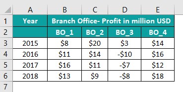
The steps to create a Stacked Area Chart to graphically show the positive and negative data points are,
1: Select cell range, A2:E6, and follow the path Insert – Recommended Charts.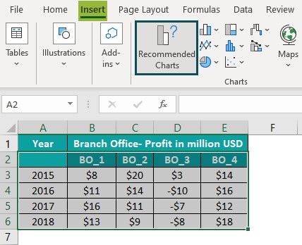
Next, click the “All Charts” tab – “Area Chart” category – “2-D Stacked Area Chart”. And pick the appropriate Area Chart, as shown below.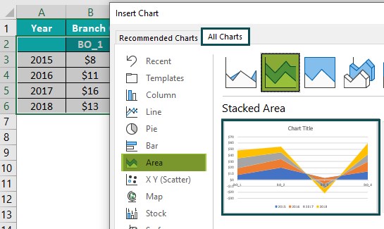
Click OK to insert the below graph in the active worksheet.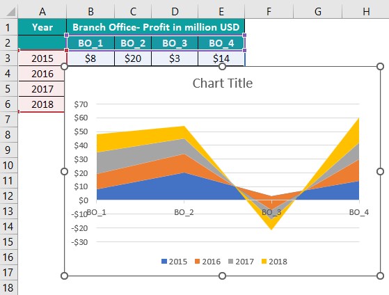
2: Click the chart area to enable the Chart Elements option (‘+’ icon) and check the Axis Titles box.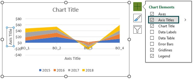
3: Double-click on the chart title, and each axis title element in the chart area one at a time to update them.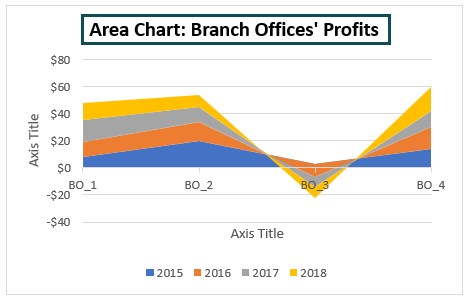
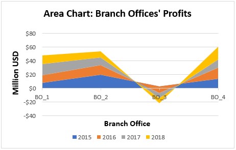
Thus, the required Area Chart will be as follows: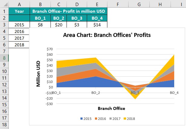
Output Observation: While the branch offices BO_1, BO_2, and BO_4 show profits in all the specified years, the branch office BO_3 shows losses from 2016-18.
And thus, we get trends for the branch offices BO_1, BO_2, and BO_4, as explained in the above article for Stacked Area Charts.
But in the case of the branch office BO_3, the plot gradually shifts towards the negative Y-axis. The reason is that the negative data points in the BO_3 data series get added with each year’s trendline.
And hence, in this way, the Stacked Area Chart plots the negative values relative to the remaining data points in the corresponding data series.
Use this Area Chart in Excel Template to follow along with the examples in this article.
Download Excel Template