
What are Chart Templates In Excel?
Chart templates in Excel are an efficient way to streamline the process of creating visual displays of data. Excel offers pre-designed templates for charts, such as bar graphs, line charts, and scatter plots. These templates reduce the time spent formatting and customizing charts by providing a default structure that can be quickly edited to suit specific needs.
Key Takeaways
- Chart Templates help us to streamline our data visualization process. Assigning unique names to each template to ensure ease of use and clarity is important.
- Once created, these Excel Graph templates will be saved within our system, allowing seamless integration and accessibility.
- It is worth noting that the Excel chart template will retain all formatting previously applied. Therefore, any desired changes to the chart format must be made manually.
- By implementing these best practices, we can optimize our data analysis and presentation, ultimately leading to more informed decision-making.
Use this Chart Templates In Excel Template to follow along with the examples in this article.
Download Excel TemplateHow To Create Chart Templates In Excel?
Creating chart templates in Excel is an excellent way to optimize our workflow, and enhance the visual appeal of your data.
To create a chart template,
- Select the one you want to save as a template.
- Then, go to the “Chart Design” tab and click the “Save As Template” button.
- Give the template a name that will be easy to remember and access later.
- Once saved, we can apply this template to subsequent charts by going to the “Change Chart Type” dialog box and selecting your newly created template from the “Custom Types” section.
- You can also modify your existing templates or remove them altogether by accessing the “Manage Templates” section from the same dialog box.
- Our custom chart template is now ready.
Examples
Example #1 – Create A Chart Template Using Pie Chart
The following image depicts the salaries of our company’s employees. Now, we will utilize a Pie Chart in Excel to create a visually appealing and informative Chart Template.
In the table,
- Columns A and B show the name and the salary
The steps used to create Excel Template using Pie Chart are:
- Step 1: Choose the data we wish to include in our chart.
- Step 2: Navigate to the Insert tab.
- Step 3: From the Charts group, select the Insert Pie or Doughnut Chart option.
- Step 4: Click the down arrow button next to the 3-D Pie option.
- Step 5: Choose the desired format for our Excel 3-D Pie Chart from the drop-down list.

- Step 6: The 3-D Pie Chart appears as shown below:

- Step 7: To add data labels to our chart, click on the + button located on the chart. Select the Data Labels option from the drop-down list to easily identify the data points on our chart.

- Step 8: To properly adjust the chart, right-click on the chart and proceed to select the Save as Template… option from the list. This will save the chart in the appropriate format for future use.

- Step 9: A window will appear to save the template in the required location. Refer to the image below for guidance on selecting the appropriate location. It is imperative to save the template in the correct location to ensure easy access and organization.

- Step 10: The template that has been saved will be displayed in the Template section of the Change Chart Type box. This feature allows access to previously saved templates easily.

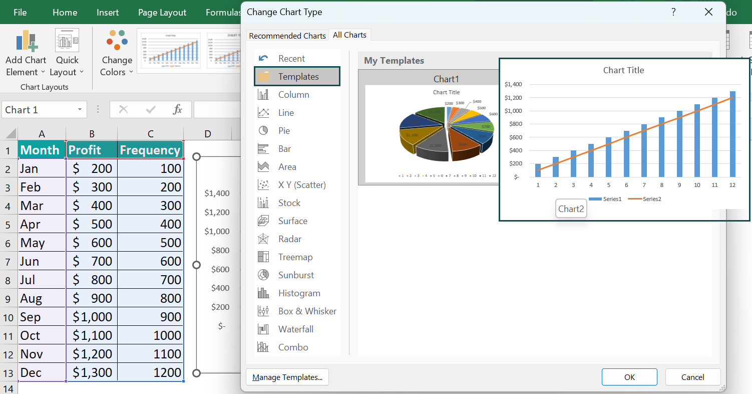
Example #2 – Create A Chart Template Using Pareto Chart
The below example helps us understand the process to create chart template using Pareto Chart in Excel.
In the table,
• Columns A, B and C shows the month, profit and frequency.
The steps used to create chart Template using Pareto Chart are :
- Step 1: Choose the data we wish to include in our chart.
- Step 2: Navigate to the Insert tab.
- Step 3: From the Charts group, select the Recommended Chart option.

- Step 4: The Insert Chart window opens. Select the Combo option from the menu. Set the Custom Combination settings and click OK.

- Step 5: The Combination Chart is formed in the following image.

- Step 6: To ensure the chart is accurately adjusted, first, stretch the designated sections as demonstrated below. Next, right-click on the chart and select the Save as Template… option from the list. This will ensure that the chart is saved in the appropriate format for future use.

- Step 7: Click on the Save Chart Template option, and a window will appear to save the template in a specific location. Please refer to the image below for guidance on selecting the appropriate location. It is crucial to save the template in the correct location to ensure easy access and proper organization.

- Step 8: Once saved, the template will appear in the Template section of the Change Chart Type box.
Important Things To Note
- The templates are also simple, with functions like color changes and font adjustments readily available in the software.
- The availability of these chart templates saves time and produces professional-looking, visually compelling visualizations of data that help simplify complex tasks related to analysis and reporting.
- Chart templates in Excel are great tools for any professional seeking to present data clearly with minimal effort required.
- Chart templates in Excel are powerful tools that allow professionals to quickly create visually appealing charts and graphs for their projects or presentations.
Frequently Asked Questions (FAQs)
• One of the biggest issues is that templates sometimes limit the user’s ability to customize and manipulate the chart. For example, pre-set color schemes may not match branding or data needs, while default labeling may be too small for easy reading.
• Additionally, templates don’t always have the flexibility to accommodate multiple data sources or layouts.
Excel provides a variety of chart templates that can be used for data visualization. These templates can be applied to multiple chart types, including bar charts, column charts, line charts, and pie charts. The template options include pre-defined color schemes, font styles and sizes, and formatting choices.
Using chart templates, we can save users considerable time, particularly when dealing with large volumes of data.
We can generate visually appealing charts and graphs with minimal effort, eliminating the need for manual formatting and design work.
It helps ensure document consistency by adhering to predefined formatting rules.
Users can create compelling visual aids that simplify complex data sets while saving valuable time and energy.
Use this Chart Templates In Excel Template to follow along with the examples in this article.
Download Excel TemplateRecommended Articles
Continue with these related resources when you want the next practical step in this topic.
- Charts In Excel
- Graphs And Charts In Excel
- Chart Wizard In Excel
- Line Chart in Excel
- Column Chart In Excel
Explore the full Excel Charts guide or browse Excel Resources.