
What Are Charts In Excel?
Charts in Excel is an inbuilt feature that enables one to represent the given set of data graphically. It is available as a group in the Insert tab on the Excel ribbon, with different charts grouped into eight categories.
Users can use the appropriate chart types to display massive datasets, which makes the data more meaningful. And the charts make it easier to interpret the relationship between them.
Use this Charts In Excel Template to follow along with the examples in this article.
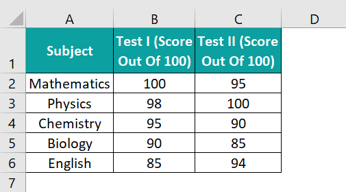
Download Excel TemplateFor example, the table below contains a student’s scores secured in two tests.
We can plot the above data using a 3-D Clustered Column chart from the Insert tab.
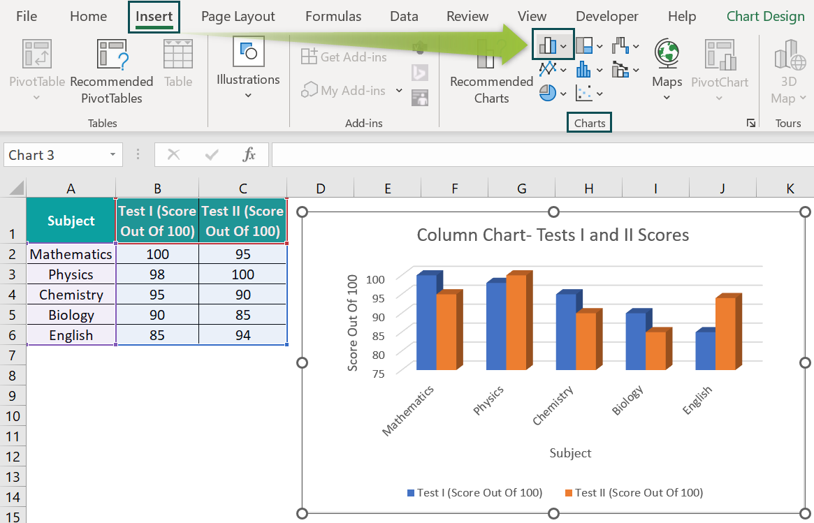
The above Column chart shows the subject-score plot, with the subjects on the horizontal axis and the scores on the vertical axis. And each column represents the score secured in the corresponding subject in each test.
The graph visually helps compare the student’s performance in the two tests subject-wise, making the analysis more straightforward.
List Of Top 10 Types of Excel Charts
Here are the top ten types of charts in Excel we can use in our daily tasks.
#1 – Column Chart
Description
The Column charts in Excel help show data variations over a period and compare the datasets.
The plot shows the categories on the X-axis or the horizontal axis and the values along the Y-axis or the vertical axis. And we will see the data represented as columns raised from the X-axis till the corresponding values specified in the source data along the Y-axis.
And Excel offers 2-D and 3-D Clustered, Stacked, 100% Stacked, and 3-D Column charts.
Example
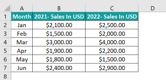
The following table shows the monthly sales at a firm in 2021-22.
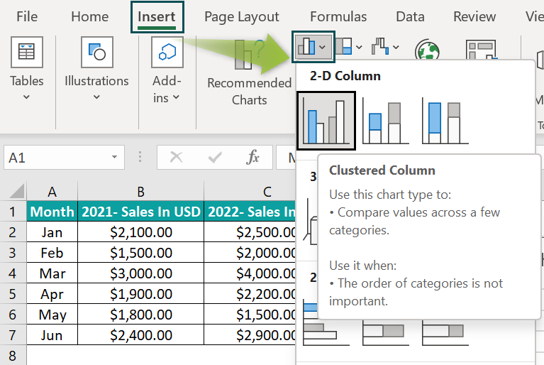
Here is how to display the above data graphically using a Column chart for visual comparison.
- Step 1: Click on any cell in the source table and follow the path Insert → Column or Bar Chart → 2-D Clustered Column chart.
- Step 2: Click the chart area to enable the Chart Elements options.

- Step 3: Click the ‘+’ icon (Chart Elements) and check the Axis Titles box. And then click the ‘+’ icon again to close the feature. By doing so, we will see the fields to update the vertical and horizontal axes titles in the chart area.
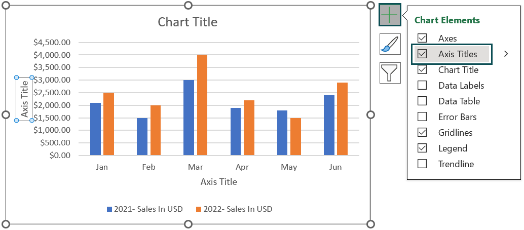
- Step 4: Update the chart and axes titles by double-clicking the respective elements in the chart area to obtain the below Column chart.
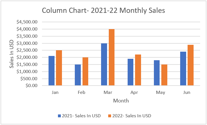
The above Column plot depicts the monthly sales figures of the firm in 2021 and 2022 in the blue and orange columns, respectively. And it makes it easier to review the firm’s sales performance from January to June in the two specified years.
#2 – Line Chart
Description
The Line charts in Excel help display the data trends and behavior at regular intervals. And it is an ideal graph to analyze the given data when there is more than one data series.
The plot shows the category data uniformly distributed along the X-axis and the numeric data spread evenly on the Y-axis, with each data series represented as a line.
Further, Excel provides 2-D Stacked, 100% Stacked, and 2-D and 3-D Line charts. And then there are 2-D Line with Markers and Stacked and 100% Stacked variations of Line with Markers.
Example
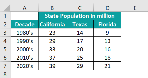
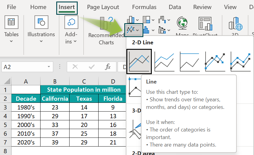
The below table shows the decade-wise population in three US states.
We can use the Line chart to represent the above population statistics graphically. And the steps are as follows:
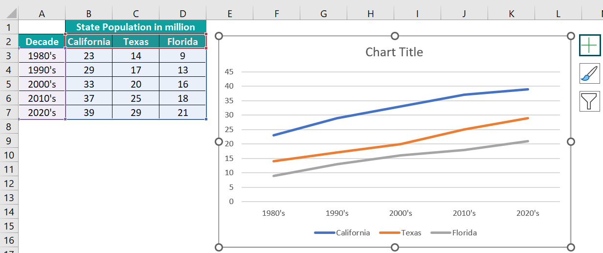
- Step 1: Select the cell range A2:D7 and click Insert → Line or Area Chart → 2-D Line chart.
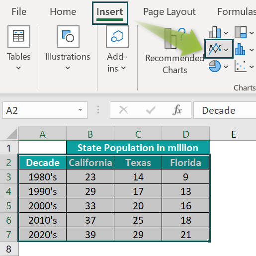
The reason for selecting the entire table is the merged cell on top of the table. The plot will be inaccurate if we click only a cell in the table and select the Line chart.
- Step 2: Click the chart area to enable the Chart Elements options.
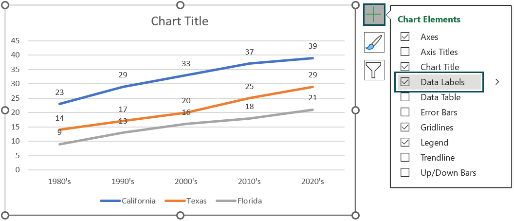
- Step 3: Click the ‘+’ icon (Chart Elements) and check the Data Labels box. And then, click the ‘+’ icon again to close the feature.
- Step 4: Repeat steps 3 and 4 explained in the Column Chart section to update the chart and axes titles and achieve the below Line chart.
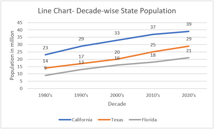
The above Line chart shows three data series, each for a US state’s population in the five decades. So, it makes the population comparison of the three states more straightforward than reviewing the statistics using the source table data.
#3 – Pie Chart
Description
Pie charts in Excel represent the size of each item in a dataset, equivalent to the sum of the item. And we can view the data points in the chart as percentage shares of the entire pie.
Furthermore, Pie charts in Excel are the ideal choice when the source data contains only one data series and no data points are negative or zero. And ensure the source data contains less than seven categories for best results.
Excel offers 2-D and 3-D Pie, 2-D Pie of Pie, and Bar of Pie charts.
Example
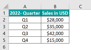
The below table contains the quarterly sales figures of a firm for 2022.
Here is how to use a Pie chart to display the above data graphically.
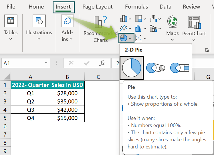
- Step 1: Click on a cell in the source table and go to Insert → Pie or Doughnut Chart → 2-D Pie chart.
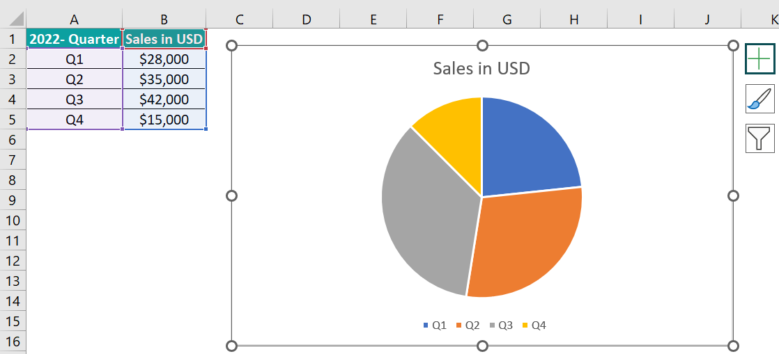
- Step 2: Click the chart area to enable the Chart Elements options.
- Step 3: Click the ‘+’ icon (Chart Elements) and check the Data Labels box. And then, click the ‘+’ icon again to close the feature.
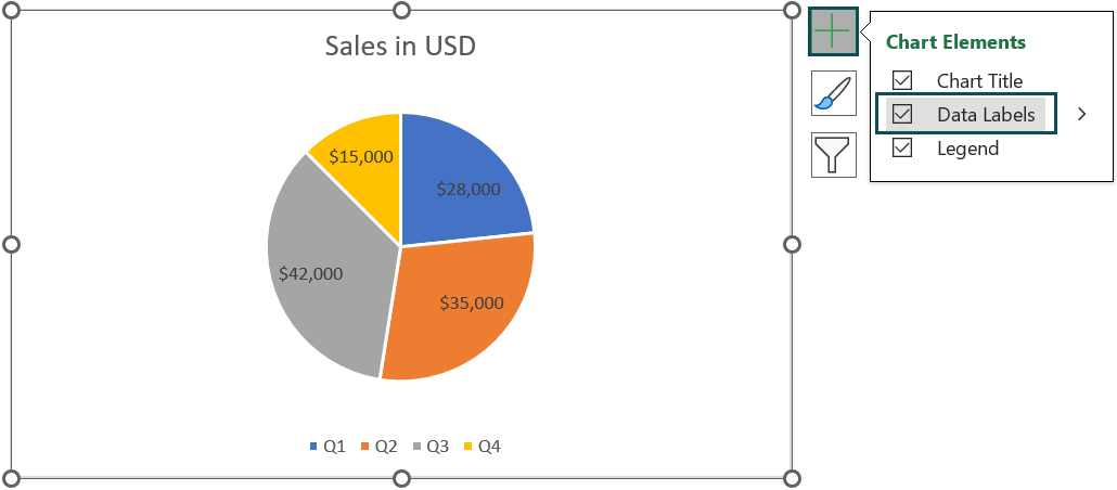
- Step 4: Double-click the chart title element in the chart area to update it and obtain the below chart.
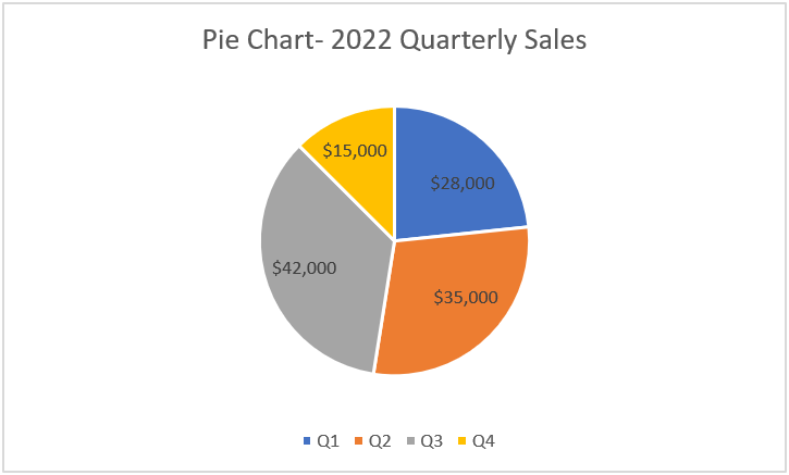
The data points in the source table get represented as sectors, with the sector size varying with the data point value. And all the sectors put together forms a pie, with the whole pie denoting the sum of all data points.
The plot helps visually review the firm’s performance in each quarter of 2022.
#4 – Bar Chart
Description
Bar charts in Excel help perform comparisons between categories specified in the source data.
The plot shows the categories on the Y-axis or the vertical axis and the values along the X-axis or the horizontal axis. And we will see the data represented as bars starting from the Y-axis till the corresponding values specified in the source data along the X-axis.
Further, 2-D and 3-D Clustered, Stacked, and 100% Stacked are the available Bar charts in Excel.
Example
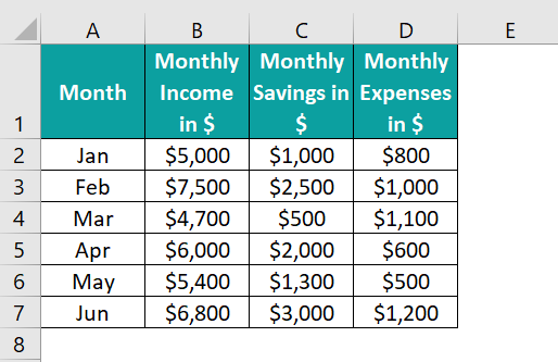
The following table shows an employee’s monthly income, savings, and expenses.
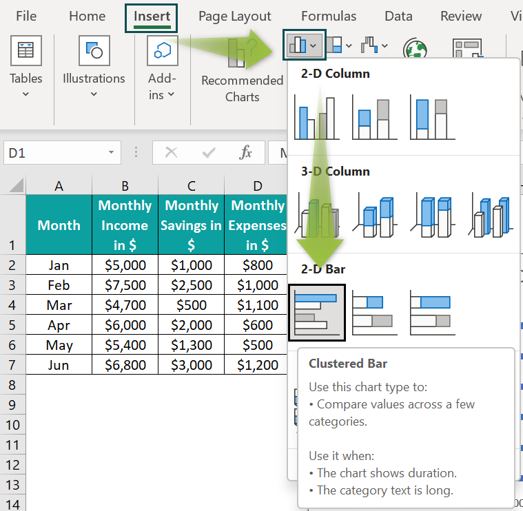
The above data can be better understood using a bar chart, and the steps to create one are as follows:
- Step 1: Click on a cell in the source table and follow the path Insert → Column or Bar Chart → 2-D Clustered Bar chart.
The above plot will be more meaningful if the monthly income bar comes first, followed by the monthly savings and expenses bars. So, the steps to change the bar orders without modifying the source data are as follows:
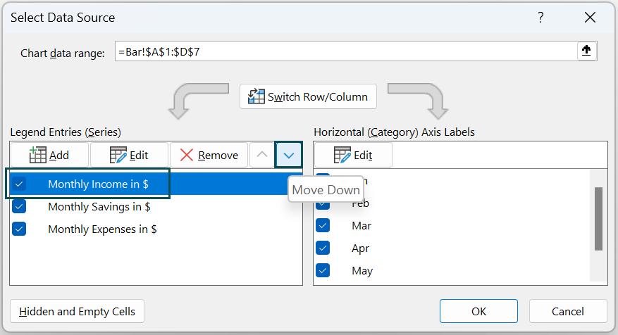
- Step 2: Click the chart area to enable the Design tab and select the Select Data option.
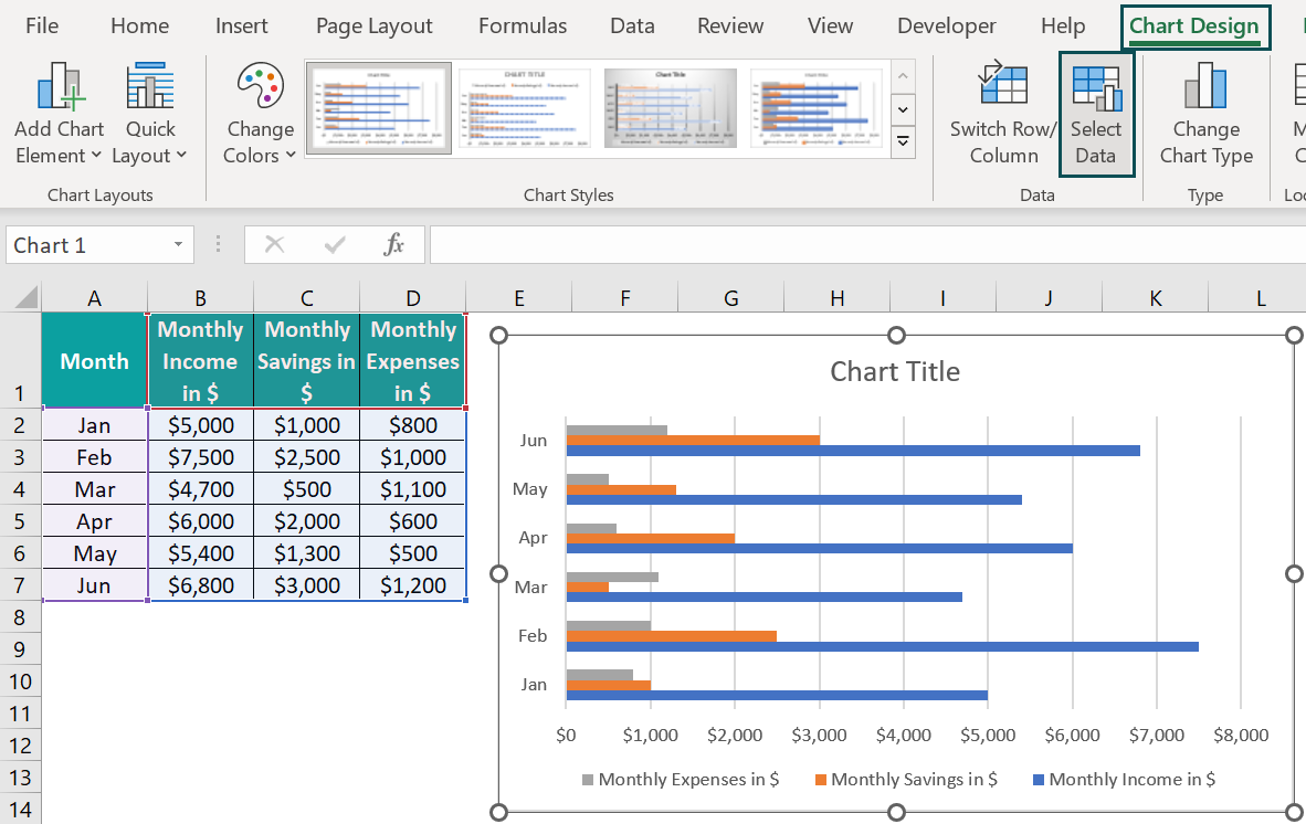
The Select Data Source window opens. Click on the first series in the Legend Entries field and click the down arrow twice to move it and display it as the last series.
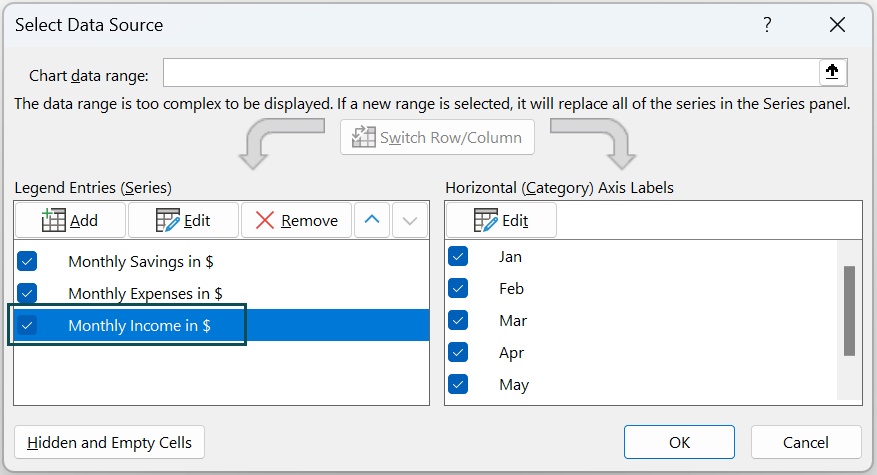
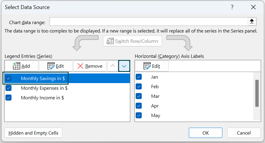
Next, move the Monthly Savings in $ series one step down using the same method.
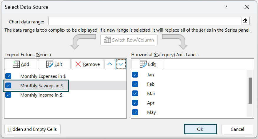
So, the bar plot with the updated data series order and chart title (by double-clicking the chart title element in the chart area) is:
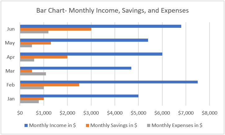
The bar chart makes it easier to assess the monthly savings and expenses.
#5 – Area Chart
Description
The Area charts in Excel help visualize a variation over time and focus on the total value along the trend. It shows the plotted data points’ sum. And thus, the chart helps understand the relationship between the individual data series to the whole data.
It is similar to the Line graph, except the Area chart shows the region between the trend line and the X-axis in color.
The available Area charts in Excel are 2-D and 3-D Area, Stacked, and 100% Stacked Area charts.
Example
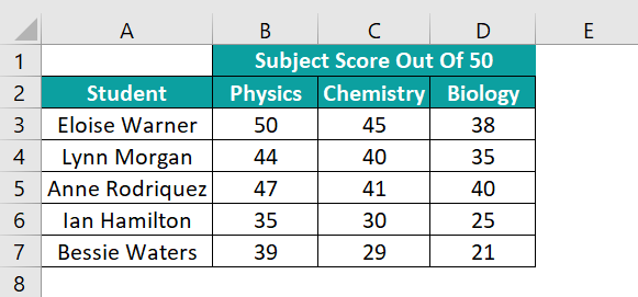
The below table shows the scores secured in science subjects by five students.
The steps to create an area chart for the above data are as follows:
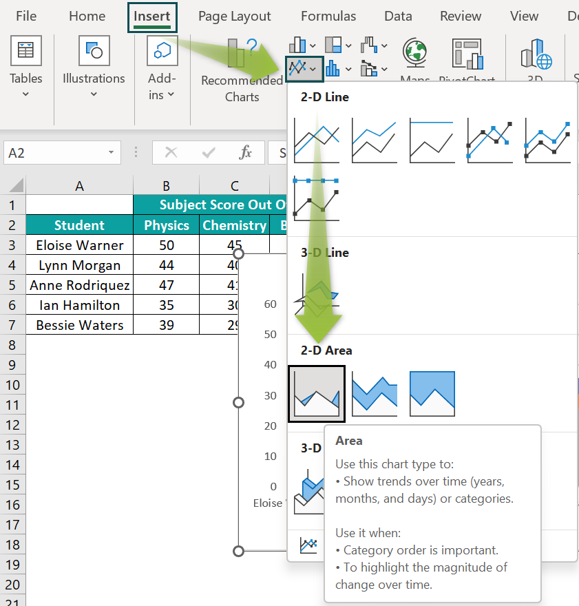
- Step 1: Select the cell range A2:D7 and go to Insert → Line or Area Chart → 2-D Area chart.

And follow steps 2 to 4, explained in the Column Chart section, to update the chart and axes titles in the above chart.
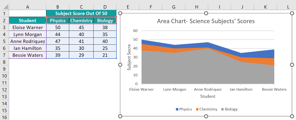
The colored areas from each trend line overlap, with the area from the last trend line to the X-axis, displayed in front.
#6 – Scatter Chart
Description
Scatter charts in Excel help in displaying and comparing scientific and statistical data.
The plot requires the x-values in one row or column and the associated y-values in the next rows or columns. It then combines the x- and y-values and shows them as data points in intermittent intervals.
It is best to use the Scatter chart when we must modify the X-axis scale, get a logarithmic scale axis, or not have evenly spaced values along the X-axis.
Furthermore, the plot is useful when the data points along the X-axis are more or we must focus on patterns in massive datasets.
Excel offers Scatter, Scatter with Smooth Lines, and Straight Lines charts. And the last two plots also have variations, which are with Markers.
Example
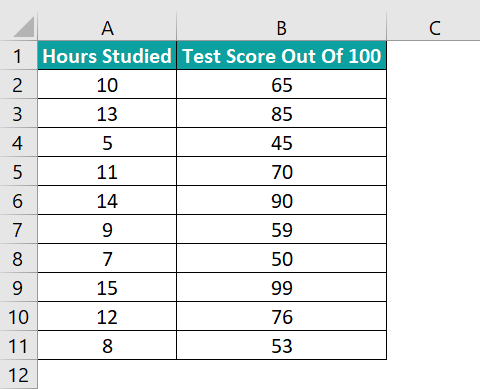
The following table shows the hours spent studying and the corresponding scores secured in a test.
A Scatter plot can help us analyze the above data effectively.
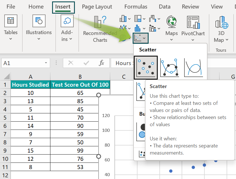
- Step 1: Click on a cell in the source table and select Insert → Scatter or Bubble Chart → Scatter chart.
And update the chart and axes titles using steps 2 to 4, explained in the Column Chart section.
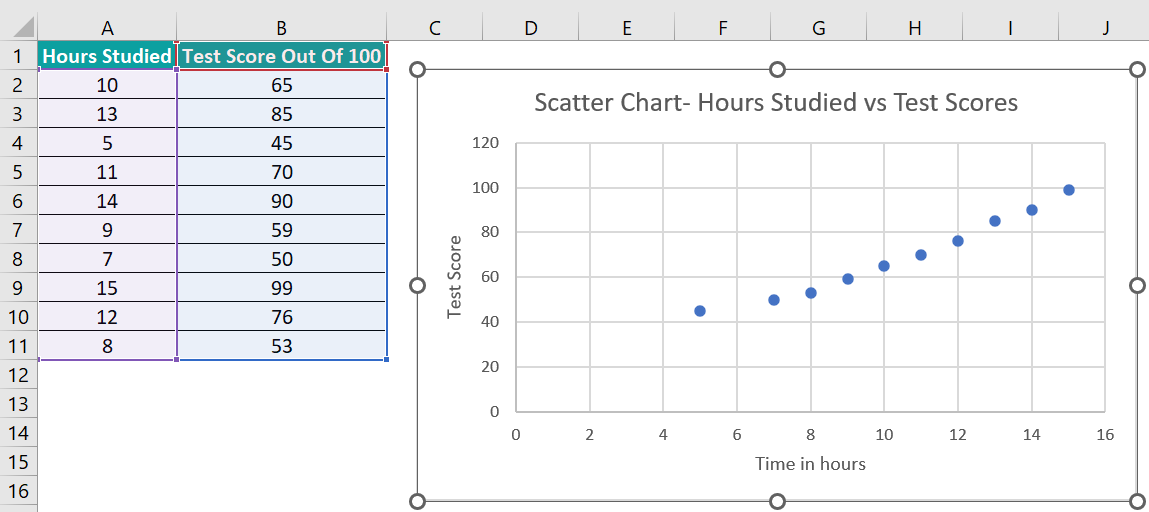
The above Scatter plot shows a highly positive and linear relationship between the hours studied and secured test scores.
#7 – Stock Chart
Description
The Stock charts in Excel visually depict fluctuations in entities, such as stock prices and annual temperatures. However, we must ensure that the source data is in the correct order to achieve the correct plot.
And Excel provides High-Low-Close and Open-High-Low-Close Stock charts. And these come in a variation, which is volume based.
Example
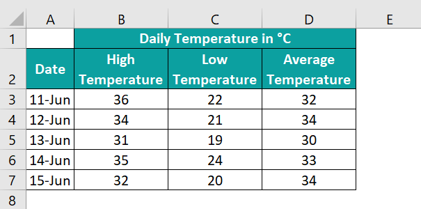
The below table shows a five-day daily high, low, and average temperature data.
We can use the Stock chart to display the above data for visual analysis.
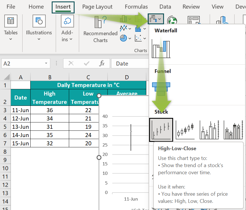
- Step 1: Select the cell range A2:D7 and navigate the path Insert → Stock chart.
And update the chart and axes titles using steps 2 to 4, explained in the Column Chart section.
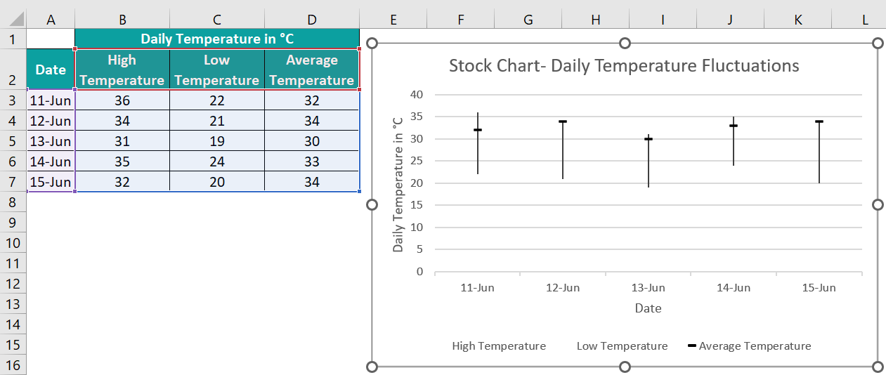
The above Stock chart shows the daily high, low, and average temperatures as a High-Low-Close plot.
The top-most and bottom-most points of each line indicate the high and low temperatures on each date, respectively. And the small horizontal line on each vertical line denotes the average temperature on the specific date.
Also, a long line in a High-Low-Close Stock chart denotes higher instability, and a shorter line indicates higher stability.
#8 – Radar Chart
Description
The Radar charts in Excel help compare the aggregates of multiple data series against several criteria, such as checking temperature variations at different locations in a year. And the chart appears as a spider web or star.
Furthermore, Excel offers Radar, Radar with Markers, and Filled Radar plots.
Example
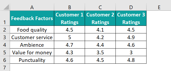
The following table contains customers’ ratings based on five factors.
Here is how to use the Radar chart and depict the above data.
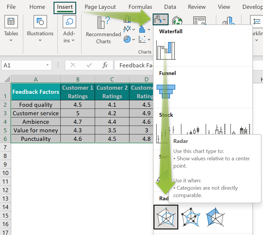
- Step 1: Click on a cell in the source table and select Insert → Radar chart.
And update the chart title as explained in the previous sections to obtain the below Radar chart.
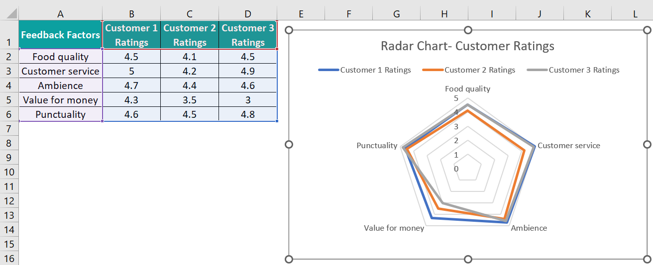
As there are five feedback factors, the plot has a pentagon shape. And we see three lines in the pentagon shape joining the data points in each series, representing each customer’s feedback.
#9 – Histogram Chart
Description
The Histogram Excel chart is similar to a Column chart. But it displays the frequency of a variable occurrence in the given range. And each column in the chart is called a bin, which one can modify for further data review.
Furthermore, there are two types of Histogram Excel charts, Histogram and Pareto.
Example
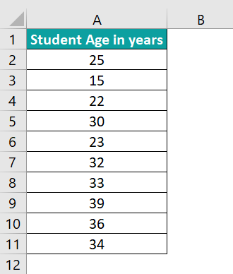
The following table contains the ages of ten students.
We can use the Histogram chart to determine the students’ age groups.
- Step 1: Click on a cell in the source table and select Insert → Statistic Chart → Histogram chart.
And update the chart and axes titles using steps 2 to 4, explained in the Column Chart section.
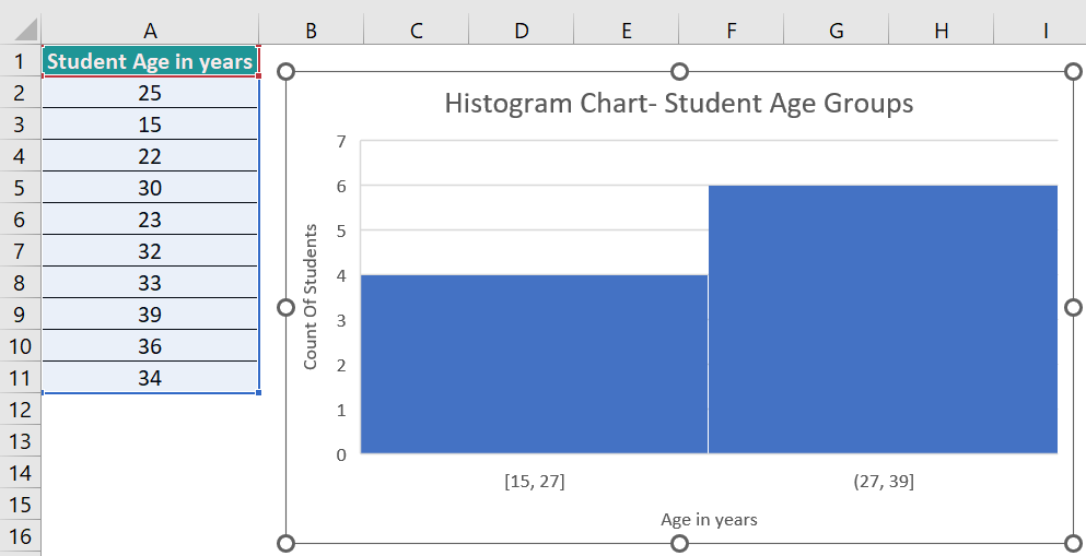
The above Histogram plot shows four students aged 15 to 27 years and six in the age group of 27 to 39.
Also, we can change the number of bins to show the source data using the Format Axis settings for the X-axis based on the extent of our analysis.
#10 – Waterfall Chart
Description
The Waterfall charts in Excel display the accruing result of data points as a running total, with values getting added or subtracted. And the plot will be in the form of color-coded columns, indicating the positive and negative values.
Further, we will find only one category for the Waterfall charts in Excel.
Example
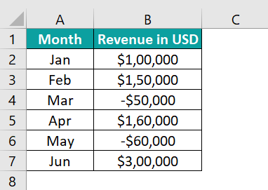
The table below shows a firm’s monthly revenue fluctuations, with the revenues in January and June being the initial and final figures.
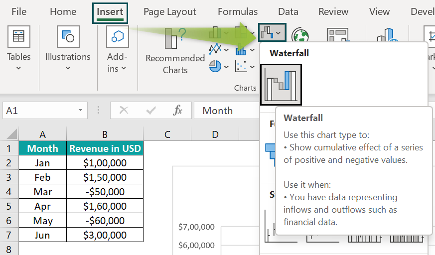
The Waterfall chart can help us view such revenue variations graphically. And here is how to use the inbuilt chart.
- Step 1: Click on a cell in the source table and select Insert → Waterfall chart.
And update the chart and axes titles using steps 2 to 4, explained in the Column Chart section.
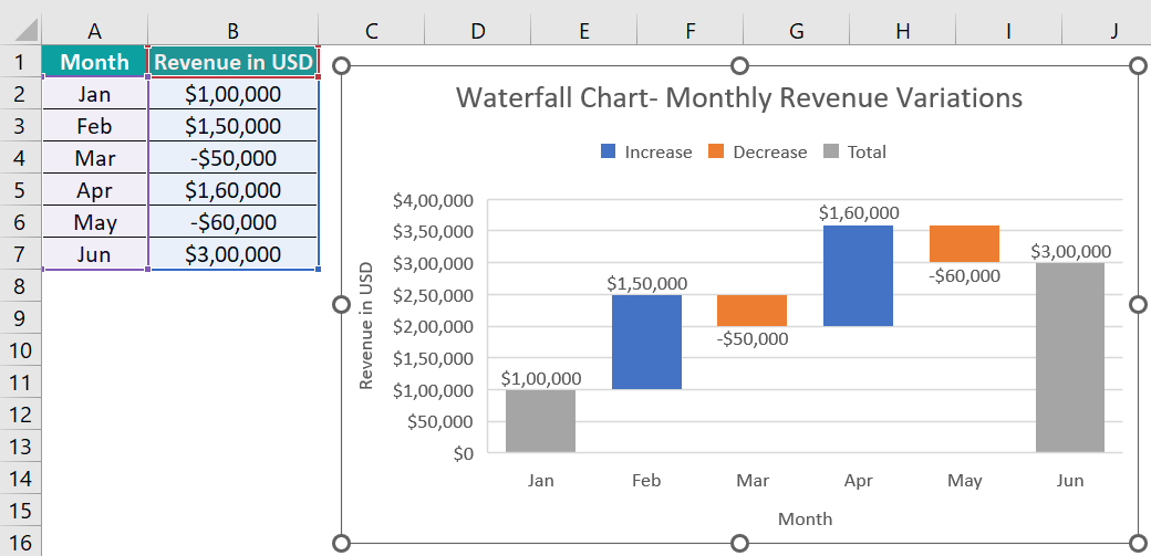
The above Waterfall chart shows the initial and final total revenues in grey. And the Blue and Orange columns indicate the increase and decrease in the monthly revenues.
Further, each column starts where the previous column ends. And for a positive value, the column raises upwards. On the other hand, for a negative data point, the column goes downwards.
Use this Charts In Excel Template to follow along with the examples in this article.
Download Excel Template