
What Is Histogram?
A histogram formula enables one to determine the inputs from the given dataset required to graphically show the numeric data distribution within the dataset. While we can apply the mathematical histogram formula in Excel, we can use inbuilt functions FREQUENCY and COUNTIFS to create the required histogram formulas.
Users can use the histogram formulas to categorize a massive dataset into regular intervals for displaying the complex and large volume of data in a simpler plot.
Use this Histogram Formula Template to follow along with the examples in this article.
Download Excel TemplateFor example, the following table shows the age categories of people living in a gated community and the headcount in each age category (frequency).

The task is to determine the histogram area and visually represent the above data as a histogram.
Then, we can apply the class width expression and frequency density histogram formula based on the given source data.
Next, use the area of histogram formula in the required target cell. And then, create the required histogram using the class intervals and the frequency density data.

First, we introduce a new column, Class Width, which shows the difference between the maximum and minimum age for each specified age interval in column A. Next, we apply the frequency density histogram formula in column D cells to obtain each age interval’s frequency density based on the corresponding frequency and class width data.
And then, we choose cell D8 and enter the area of histogram formula, which gives the total headcount of the people in the gated community. The formula output will be the same as the sum of the frequencies in column B.
Finally, we can choose the cell ranges A1:A6 and D1:D6 and choose the 2-D Clustered Column chart from the Insert tab to create the required histogram for the given dataset.
Thus, the histogram visually shows the headcount frequency density across the different age intervals in the gated community.
Key Takeaways
- The histogram formula helps calculate the values based on the source dataset, required to create a histogram for visually depicting the numeric distribution within the dataset.
- Users can use the histogram formulato perform large-scale studies, such as demographic segmentation, to analyze customer identification in potential markets.
- We can use the mathematical equivalent expression of the formula for the histogram in Excel. Alternatively, we can use the inbuilt functions FREQUENCY and COUNTIFS to develop histogram formulas.
- We can use the histogram formulas instead of the Histogram option in the Data Analysis ToolPak in the Data tab.
Formula
The area of a histogram is the summation of the area of each bar in the plot. And the mathematical expression of the histogram formula to determine its area is as follows:

Where,
- Class Width: It is the difference between the maximum and minimum points of the specified interval.
- Frequency Density: The ratio of the given frequency and the class width for the specific interval. In other words, it is the height of histogram formula for each bar in the plot.
- i: Counter
- n: The total number of intervals the source data is divided.
How To Use Histogram Formula?
Here is how we can create a histogram formula:
- Ensure the source dataset is complete and accurate to ensure we can determine the inputs required to plot a histogram chart.
- Next, calculate the total number of data points in the source dataset.
- Calculate the sample range.
It is the difference between the maximum and minimum values in the given sample.
- Determine the total class intervals, in which we can divide the values specified in the source dataset.
Typically, the total count of intervals is considered as 10. Otherwise, we can calculate the square root of the number of data points in the source dataset. And then, round off the result to the nearest whole number to obtain the total class intervals.
- Next, calculate the class width for each interval.
It is the ratio of the sample range (determined in Step 3) and the total count of intervals (calculated in Step 4).
- Determine the frequency density for each interval.
The height of histogram formula for each interval gives the ratio of the frequency and the class width of the corresponding interval.
- Next, choose the target cell and apply the histogram formula to obtain the area of the required histogram.
And for that, we must multiply each interval’s frequency density and class width. And then add all the product values.
- Select the column range containing the interval details of the source dataset and the column containing the frequency density of each interval.
And then, choose the Insert tab → Insert Column or Bar Chart category → 2-D Clustered Column chart to create a histogram.
- Right-click the data series in the chart area to access the Format Data Series option from the contextual menu.
The Format Data Series pane opens, where we must set the Gap Width option in the Series Options tab as 0%.
The above step will reduce the gap between the bars in the 2-D column chart, and the plot will appear as a histogram.
Furthermore, the histogram plot can be the following types, depending on how the frequencies specified in the source dataset are distributed.
- Uniform – The number of classes will be less, with each class having the same number of elements. And the histogram might have more than one peak.
- Symmetric – The histogram will be bell-shaped, with both sides of the plot identical in shape and size.
- Bimodal – The distribution will have two peaks.
And once we create a histogram formula and plot the histogram chart, here is how to interpret the histogram data:
- First, we must identify the independent and dependent variables. The parameter in the source data containing values such as the weight of a student is the independent variable. And the frequency or number of students with a specific weight will be the dependent variable.
- Next, categorize the source data into groups based on their corresponding frequency in bins.
- Plot a histogram chart using the class intervals and frequency density data. And then, we can analyze the data distribution across the different intervals to understand the trend similarities and differences.
Examples
Check out the following histogram formula examples to use the option effectively.
Example #1
The following table shows the athlete heights, segregated in different class intervals, along with the number of athletes in each class interval.

The requirement is to develop the histogram formula to determine the area of the histogram and plot it for the given source data.
Then, the steps are as follows:
- Step 1: Introduce columns C and D as the Class Width and Frequency Density columns.

- Step 2: Choose cell C2 and enter the formula to find the difference between the interval’s maximum and minimum values specified in cell A2.

Likewise, update the formulas in cells C3:C6 to determine each class interval’s width in each row.

- Step 3: Choose cell D2, enter the formula to divide the frequency by the width of the specified interval, and press Enter.

Next, update the formula in the remaining cells D3:D6 using the Excel fill handle.

- Step 4: Let us set cell D8 as the target cell to calculate and display the area of the histogram for the given data.

So, choose cell D8, enter the following formula, and press Enter.
=C2*D2+C3*D3+C4*D4+C5*D5+C6*D6

The area of the histogram is the same as the total frequency or number of athletes in column B cells B2:B6, 120.
- Step 5: Choose cell A1. And then, with the mouse’s left button pressed, drag the mouse over the cell range A2:A6. Next, while pressing Ctrl and the mouse’s left key, drag the mouse over the cell range D1:D6 to select the two ranges.
And then, select Insert → Insert Column or Bar Chart category.

Next, click the 2-D Clustered Column chart to select it.


- Step 6: Right-click the data series in the chart area and select Format Data Series in the context menu to access the Format Data Series pane.

And set Gap Width as 0% in the Series Options tab of the Format Data Series window.

Next, we can improve the histogram appearance. And for that, click the Fill & Line tab to set the Border as a Solid line in the required color.

Close the Format Data Series window.
- Step 7: Click the chart area to enable the Chart Elements option (‘+’ icon) and select the Axis Titles option.

And then, double-click the chart title and each axis title element in the chart area individually to update them according to our requirements.


Thus, the required histogram formulaand the plot will appear, as shown below.

So, now we can visually analyze the athletes’ distribution across different height classes and identify the height intervals containing the highest and lowest head counts.
Example #2
We shall now see how to achieve the histogram formula using the Excel FREQUENCY function and Excel COUNTIFS function.
Also, this method gives the same output as the Histogram option, in the Data Analysis ToolPak in Excel, for the specified source dataset and bins.
The following table lists students, and the project points they scored out of 100.

The task is to categorize the project points into bins or contiguous non-overlapping intervals and create a histogram.
Then, we can use the appropriate histogram formula to determine the frequency or number of students with the project points in the same ranges (or bins). And then, use the 2-D Clustered Column chart to create the required histogram based on the intervals and frequencies data.
- Step 1: We shall choose the cell range D1:F8 to list the bins and determine the frequency for the source dataset.
As the lowest and highest project points values are 35 and 100, we shall set the bins from 40 to 100.

- Step 2: Choose the range E2:E8 and enter the FREQUENCY().
=FREQUENCY(B2:B21,D2:D8)

And then, implement the function as we would execute array formulas in Excel, which is using the keys Ctrl + Shift + Enter.

The FREQUENCY() checks the number of values falling in each cited range or bin.
[ Alternatively, we can achieve the same output using the COUNTIFS().
And for that, choose cell F2, enter the COUNTIFS(), and press Enter.
=COUNTIFS($B$2:$B$21,”<=”&$D2)

Next, choose cell F3, enter the COUNTIFS(), and press Enter.
=COUNTIFS($B$2:$B$21,”>”&$D2,$B$2:$B$21,”<=”&$D3)

And then, using the fill handle, update the cell F3 formula in cells F4:F8.

The COUNTIFS() checks the number of values in the cited column B range falling within the specified bins.
Thus, the two formulas in columns E and F give the same output.]
The output shows the number of students in each bin or the project points range.
- Step 3: We shall set the range H1:J8 to display the class intervals based on the bins and the determined frequency data for each bin.

- Step 4: Choose the ranges H1:H8 and J1:J8 (as explained earlier). And then, select Insert → Insert Column or Bar Chart → 2-D Clustered Column chart type to insert the chosen plot type.


Finally, once we set the Gap Width as 0% and update the chart title and axis titles, as explained in the previous example, we obtain the following histogram plot.

Relevance And Uses
Let us see the relevance and uses of the histogram formula:
- The formula enables us to create a histogram to represent complex data in a simplified manner.
- Once we obtain the histogram from the formula, we can calculate aspects such as the histogram mean, median and skewness. These factors help us analyze the source dataset better.
- The histogram we achieve using the formula is useful in large-scale studies, such as census data and demographic analysis.
Important Things To Note
- When using the histogram formula for a massive dataset, ensure the source dataset includes at least 50 consecutive data points. And in the case of smaller samples, the source dataset must have at least 20 data values.
- Ensure the source dataset contains numbers as the data points required for the histogram formula. Otherwise, the formula output will be an incorrect or error value.
- Ensure to execute the FREQUENCY() as an array formula. Otherwise, the function output will be incorrect.
Frequently Asked Questions (FAQs)
You can change the value of a histogram formula in Excel by changing the frequencies in the specified class intervals when using the mathematical equivalent formula for the histogram.
For example, the below image shows two datasets, each containing the weight intervals and frequencies or the number of people in each weight range.
The two datasets differ in the last class interval and their corresponding frequency.
Let us check how the changes in the values affect the area formula for the required histogram.
• Step 1: Choose cell C2 and enter the formula to determine the specific class interval’s width.
Likewise, calculate the widths of the remaining class intervals.
• Step 2: Choose cell D2, and enter the formula to determine the frequency density for the specific class interval, which is the corresponding frequency and class width ratio.
And then, drag the fill handle down to update the formula in the remaining cells.
• Step 3: Select cell D8, enter the formula for the histogram area (shown in the Formula Bar), and press Enter.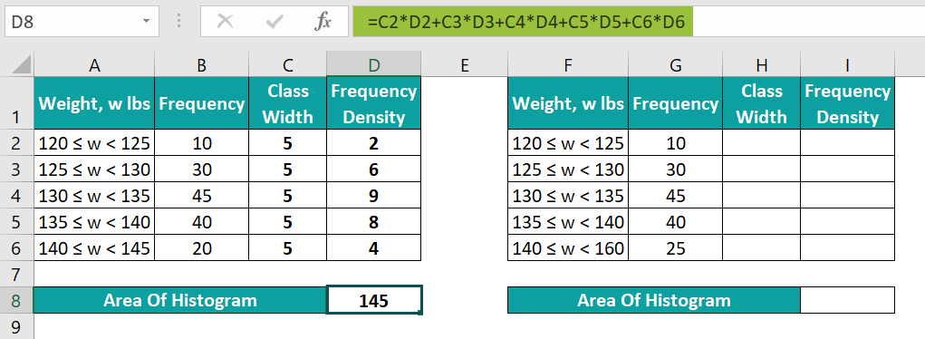
Similarly, iterate steps 1 to 3 for the second dataset to achieve the following output.
The result shows that the histogram area values differ since the frequency for the last class interval in the second dataset differs from the first one.
Also, in the above scenario, the difference in the last class interval in the two datasets does not affect the respective histogram area values. The reason is that the histogram area formula depends on the frequency values.
The amount of data you need for a histogram formula in Excel is as follows:
Massive Dataset
• At least 50 consecutive data points.
• At least 20 class intervals.
Smaller Sample Size
• At least 20 consecutive data points.
• At least 5 class intervals.
You cannot use histogram formula in Excel on nominal data. The reason is that nominal data gets measured across a scale with few probable values. And creating a histogram with minimal data is not advisable.
Use this Histogram Formula Template to follow along with the examples in this article.
Download Excel TemplateRecommended Articles
Continue with these related resources when you want the next practical step in this topic.
- Charts In Excel
- Graphs And Charts In Excel
- Chart Wizard In Excel
- Line Chart in Excel
- Column Chart In Excel
Explore the full Excel Charts guide or browse Excel Resources.