


Introduction
Many Power BI users still treat dashboards as a final, manual step that follows a long sequence of model design, measure writing, and layout polishing. The usual pattern is to build a model first, then open the report view, and finally drag and drop visuals one by one, adjusting fields and filters as they go. Power BI Copilot natural language dashboard creation changes that by letting analysts describe the dashboard they want in plain language and then have Copilot generate a working report layout, visuals, and even draft DAX measures that reflect that intent.
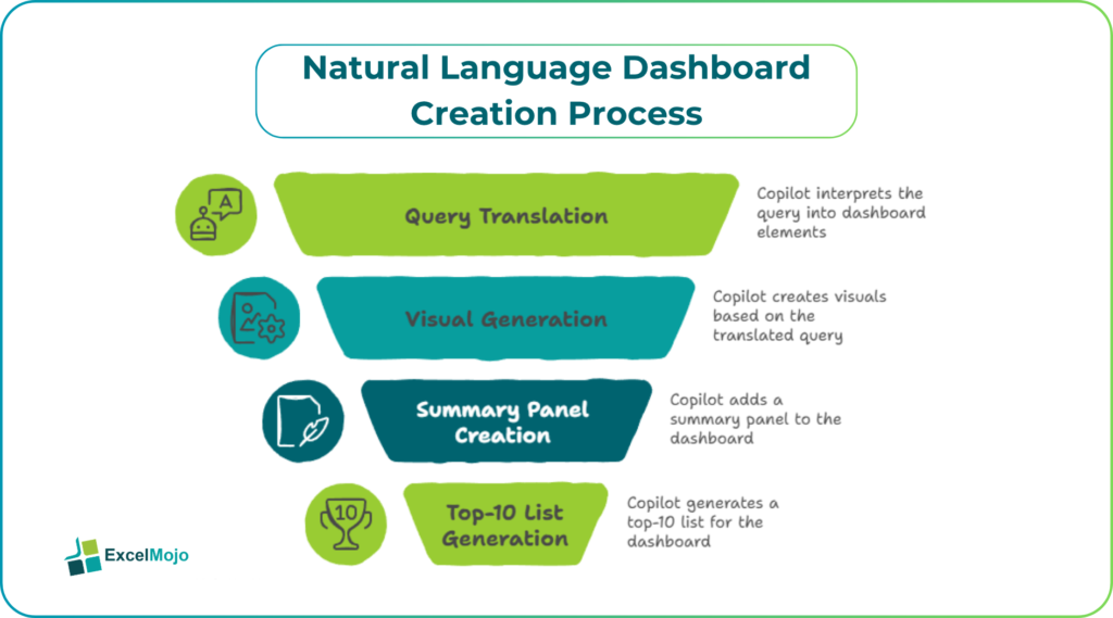
This is natural language dashboard creation Power BI Copilot, where the user starts with a sentence such as “Create a daily sales dashboard by region and product category, with a summary panel and a top‑10 list” and ends up with a live canvas that can be refined rather than built from scratch. Copilot can translate natural‑language queries into visuals, summaries, and DAX snippets, provided the underlying model is well‑structured and accessible to the Copilot engine. For Power BI Copilot create dashboards from text, the AI does not replace the model; it accelerates the translation from requirements to layout.
How Copilot Reads your Power BI Model
Copilot in Power BI works by interrogating the underlying semantic model, including tables, relationships, and existing measures, then mapping those entities to natural‑language prompts.
Typical patterns:
- Copilot can answer questions like “What are the top‑5 customers by revenue in the last quarter?” by generating the equivalent DAX or M logic and rendering it as a table or bar chart.
- It can propose visuals based on the phrasing of the request; for example, “Show revenue trends by month” triggers a line chart, while “Compare by region” favors a bar or map.
- Copilot also respects governance features such as data‑loss‑prevention labels and Purview‑style filters, so sensitive fields are not exposed in autogenerated outputs.
This behavior is documented in Copilot‑for‑Power BI guides and blog posts that describe how AI‑driven assistants translate natural language into queries and visuals over semantic models. For natural language to Power BI dashboard Copilot, the key prerequisite is a clean model with clear column names, relationships, and a small set of reusable measures; the AI can then focus on layout, rather than wrestling with messy or ambiguous data.
How to Create a Dashboard From a Text Prompt
Power BI dashboard creation using Copilot becomes most useful when the user starts with a concrete, business‑oriented description instead of a generic “give me some charts.”
A practical workflow:
- In Power BI Desktop or a Fabric workspace, open the report or semantic model that will serve as the data source.
- Activate the Copilot pane and submit a prompt such as:
- “Create a sales dashboard by region and product category, with a top‑level summary card, a map of revenue by region, and a bar chart of top‑10 products.”
- Or: “Build a monthly financial KPI dashboard including revenue, EBITDA, and headcount, with a table showing variance to budget.”
- Copilot returns:
- A set of suggested visuals already placed on the canvas.
- A tentative set of measures and filters.
- A narrative‑style summary of what each visual shows.
- The user refines the layout, adjusts axis ranges, adds or removes filters, and corrects any misinterpreted metrics.
This approach is consistent with Copilot‑for‑Power BI tutorials that show how AI‑driven assistants can generate visuals, overall layouts, and even performance‑oriented suggestions in a few clicks. For AI dashboard creation Power BI Copilot, the AI is best treated as a first‑draft layout engine; the analyst still owns the final design, the business logic, and the narrative framing of the dashboard.
Practical Example: A Simple Sales‑Performance Dashboard
A common use case for Power BI Copilot create dashboards from text is a sales‑performance dashboard that tracks revenue, volume, and top‑performing regions.
Suppose the user submits a prompt like:
“Create a sales‑performance dashboard that shows total revenue by region, monthly revenue trend, and a table of the top‑5 regions by revenue.”
Copilot might generate:
- A card visual for total revenue, pulling from a [Total Revenue] measure.
- A line chart of revenue by month, using Order Date on the x‑axis and Revenue on the y‑axis.
- A map or filled map of revenue by region.
- A table with Region and Revenue that is pre‑sorted to show the top‑5 regions.
The analyst then:
- Confirms that the underlying model has correct relationships between Sales, Date, and Region tables.
- Adjusts the time grain on the monthly chart from months to quarters if leadership prefers a coarser view.
- Adds conditional formatting or a secondary metric (for example, volume or margin) to the top‑5 table.
This example illustrates how the natural language to Power BI dashboard Copilot can turn a one‑line requirement into a working prototype that is closer to a production dashboard than a blank canvas. Teams can repeat the pattern for other use cases, such as finance‑KPI, HR‑attrition, or supply‑chain‑performance dashboards, using slightly different prompts for each scenario.
Pitfalls and Best‑Practice Tips
The dashboard can greatly speed up report design, but it also introduces a few practical pitfalls.
One common issue is over‑reliance on AI‑generated measures: Copilot may suggest measures that are syntactically valid but not aligned with the business definition of “revenue” or “margin.” Best practice is to treat every AI‑suggested measure as a draft, compare it against the existing model, and adjust filters or base columns where necessary.
Another risk is layout rigidity: the automatically generated layout may pile too many visuals into one page, use inconsistent sizing, or neglect print‑friendly spacing. Analysts should reserve time to clean up the canvas, standardize font sizes, and group visuals into logical sections that match the audience’s reading flow.
A third pitfall is data‑governance risk: Copilot can surface sensitive fields if the model is not properly labeled or if row‑level security is incomplete. Teams should work with their data‑governance or Fabric admin to apply sensitivity labels, DLP policies, and RLS rules before exposing Copilot‑generated dashboards to broader distribution.
Frequently Asked Questions (FAQs)
Can Power BI Copilot create dashboards from text without a well‑structured model?
Copilot can generate something even on a messy model, but the results are often brittle or misaligned with business logic. The best outcomes come from a semantic model with clear column names, relationships, and a small set of reusable measures; the prompt then guides the layout, not the underlying definitions.
Do natural language dashboard creation features work in Power BI Desktop and the Power BI service?
Copilot‑driven report and dashboard creation is available in Power BI Desktop and in the Power BI service, provided the tenant has the required Fabric or Premium capacity and Copilot is enabled at the tenant level. The experience is broadly similar, though some real‑time‑dashboard or Fabric‑specific capabilities may differ slightly.
How accurate is AI dashboard creation Power BI Copilot for finance and operations?
Copilot is generally accurate for common patterns such as revenue‑by‑region, top‑N lists, and monthly trends. However, it may not correctly interpret complex allocation rules, multi‑scenario forecasts, or non‑standard aggregations. Analysts should always validate the generated visuals against known test cases and refine the measures and filters as needed.
Can natural language to Power BI dashboard Copilot speed up iterative changes?
Yes. Once an initial layout exists, the user can refine it by asking Copilot to “add a variance‑to‑budget bar chart,” “highlight the worst‑performing product,” or “reorganize the visuals vertically.” Those prompts let the analyst iterate quickly without manually recreating every element from scratch, as long as the underlying model remains stable.