What is the Power BI Forecast?
Power BI Forecast is a built-in forecasting feature that enables you to predict future values using historical data patterns and trends. It uses a series of Power BI forecast algorithms to analyze the data patterns and then predict the probable outcomes. This feature is handy if you have time series data in your dataset. Power BI allows you to input different parameters to generate forecasting visuals.
Some of the key features of Power BI Forecast include:
- Predict future data insights using the existing historical data that may help you to get early trends and actionable details to work on
- It helps you in future planning by factoring in the challenges and associated risks and hence allows you to adjust your action plans.
- Provides critical trends and patterns that can assist users in making informed decisions.
Table of contents
Key Takeaways
- Power BI Forecast is a built-in forecasting feature that enables you to predict future values using historical data patterns and trends.
- It uses a series of Power BI forecast algorithms to analyze the data patterns and then predict the possible outcomes.
- Power BI forecasting works only in Line chart visuals, and you need to have a time series or gradually increasing dataset.
- You can forecast data in Power BI by navigating the Analytics pane and using the forecasting option.
- Use the input parameters in forecasting functionality to make data projections in Power BI.
- Power BI forecasting can handle irregular data patterns and it uses exponential smoothing algorithms to predict future outcomes.
📊 Unlock Advanced DAX Skills in Power BI!
Take your Power BI skills to the next level with our Advanced DAX in Power BI Training Course. Dive deep into advanced DAX functions, complex calculations, and optimization techniques to enhance your data analysis and reporting capabilities.
How to Forecast Data in Power BI?
To forecast data in Power BI, follow these steps:
Step 1: Launch Power BI Desktop in your system.
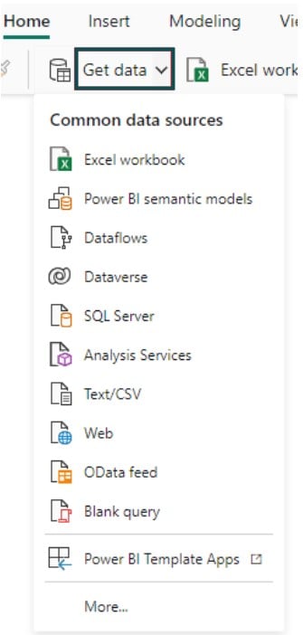
Step 2: Import the dataset into Power BI using the Get data option.
Step 3:
- Navigate to the Visualizations pane.
- Choose the Line chart visual.
- Map the data fields to the X-axis, Y-axis, and secondary Y-axis of the visual.

Step 4: Navigate to Add further analyses to your visual tab in the Visualizations pane. Turn the Forecast slider on.

Step 5: Expand the Forecast – Options section. Under the Options section, specify the parameters such as Units, Forecast length, and Ignore the last, Seasonality, and Confidence interval details.

Once the changes are done, click on the Apply button.
Step 6: Similarly, expand the Forecast line, Confidence band, and Tooltip title sections. Define the color, style, and Title as applicable

Step 7: Once the changes are specified, you will be able to view the Power BI Forecast in your visual.
Note: There may be a few scenarios where the forecast may not show up. To fix such issues, you can follow the below troubleshooting guide that includes:
- Ensure you have a date/time series dataset and use a line chart for your visual
- Consider the limitations of Power BI forecasts to ensure you work on the requirements
Examples
In this section, we will go through a few examples demonstrating forecasting in Power BI.
Example #1
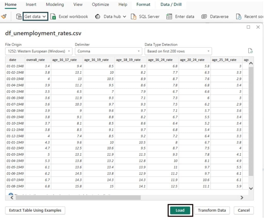
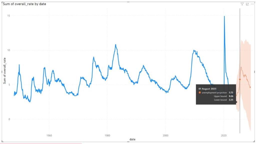
In this example, we will demonstrate the Power BI Forecasting feature using the Unemployment rates dataset. The Unemployment rates dataset contains the overall unemployment rate along with the detailed breakup for different age group categories.
To use the Power BI Forecasting, follow the instructions below:
Step 1: Import the dataset into Power BI using the Get data option and click on the Load button to load it into Power BI.
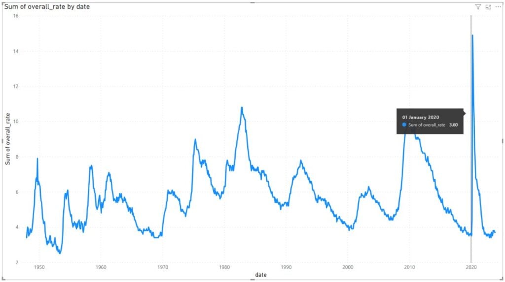
Step 2: Navigate to the Visualizations pane. Choose the Line chart visual icon and map the data fields from the Data pane to the X-axis and Y-axis.

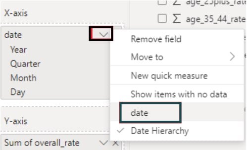
Step 3: Click on the down arrow next to the date field in the X-axis and choose date instead of Date Hierarchy.
It will create a Line chart in the report canvas, as shown below.
Step 4: Navigate to the Add further analyses to your visual tab in the Analytics pane under Visualizations. Turn the Forecast slider on.

Step 5: Expand the Options section under Forecast. Specify the details on Units, Forecast length, Seasonality, and Confidence interval details. Here we have specified the forecast units as Quarters and Forecast length of 22. This will enable Power BI to forecast for 22 quarters in the future using the underlying dataset.
We have kept the seasonality as Auto, which will enable Power BI to detect automatically. The confidence interval is a statistical term used to define the probability, which, in this case, we have defined as 95%.
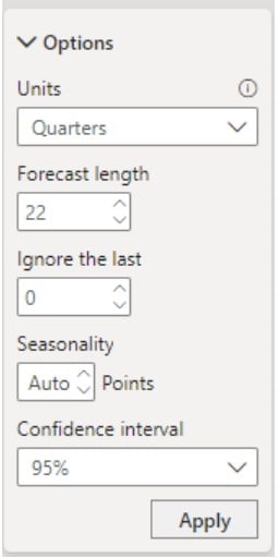
Once the changes are done, click on the Apply button.
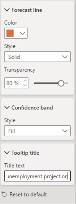
Step 6: Expand other sections such as the Forecast line, confidence band, and Tooltip title. Provide the relevant details and provide the title for the tooltip as shown below.
It will create a Power BI forecast line visual, as shown below.
Example #2
In this example, we will demonstrate the Power BI Forecasting feature using the Global Annual Population Growth (1951 – 2020) dataset. The Global Annual Population Growth (1951 – 2020) dataset contains the total population and urban population for each year (1951 – 2020) as well as the population growth rate as a percentage.
To forecast data in Power BI, follow the instructions below:
Step 1: Import the Global Annual Population Growth (1951 – 2020) dataset into your Power BI Desktop using the Get data option and load it into Power BI.

Step 2: Navigate to the Visualizations pane and choose the Line chart visual icon.
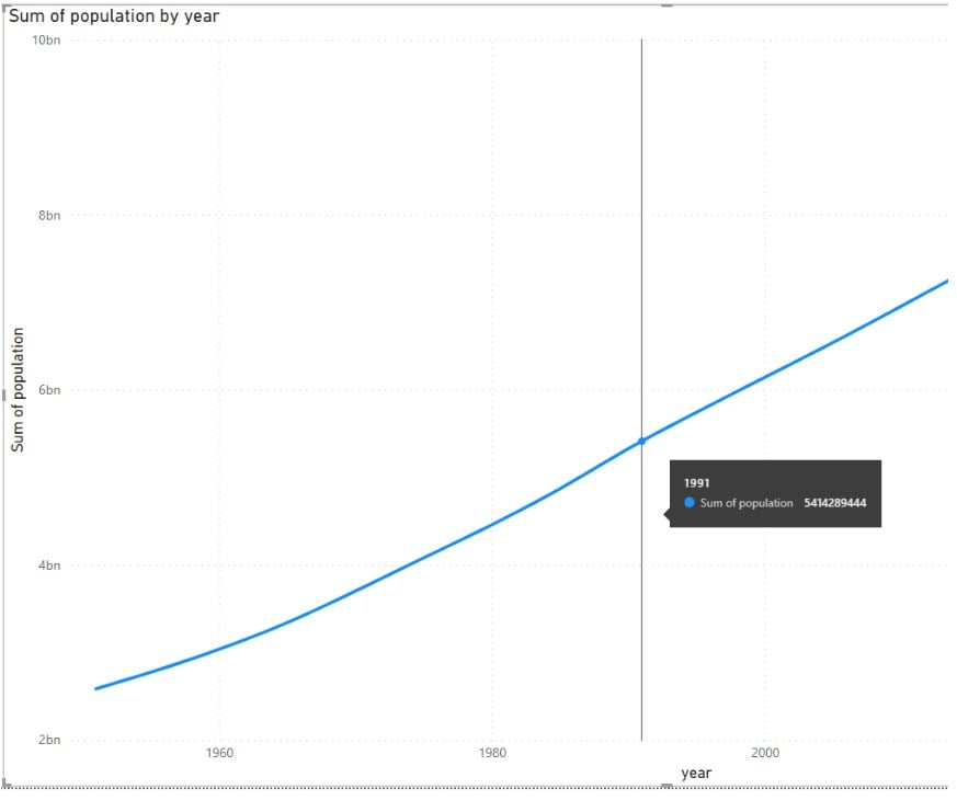
Map the data fields, i.e., date and overall_rate to the X-axis and Y-axis respectively.

You will see the line chart in the report canvas as shown below.
Step 3: Navigate to the Add further analyses to your visual tab in the Analytics pane under Visualizations. Enable the Forecast option.

Step 4: Expand the underlying sections under Forecast. Provide the details such as Units, Forecast length, and confidence interval for your visual. Click on the Apply button to save the changes.

Step 5: Expand other sections such as the Forecast line, confidence band, and Tooltip title. Provide the choice of color, style, and tooltip title for the visual, as shown below.

This will create a Power BI forecast line visual as shown below.

As you can see, when you hover the mouse over the visual, the tooltip will display the details for the forecasted period.
Example #3
In this example, we will demonstrate the Power BI Forecasting feature using the US Births by Year, State, and Education Level dataset. The US Births by Year, State, and Education Level dataset contains the total population and urban population for each year (1951 – 2020) as well as the population growth rate as a percentage.
To forecast data in Power BI, follow the instructions below:
Step 1: Import the US Births by Year, State, and Education Level dataset into your Power BI Desktop using the Get data option and load it into Power BI.

Step 2:
- Navigate to the Visualizations pane.
- Choose the Line chart visual icon.
- Map the data fields.
Here, we have mapped the Year and Number of Births to the X-axis and Y-axis, respectively.

Step 3: Navigate to the Add further analyses to your visual tab in the Analytics pane under Visualizations. Enable the Forecast option.

Step 4: Expand the underlying sections under Forecast. Provide the details such as Units, Forecast length, and confidence interval for your visual. Click on the Apply button to save the changes.

Step 5: Expand other sections such as the Forecast line, confidence band, and Tooltip title. Provide the choice of color, style, and tooltip title for the visual as shown below.

It will create a Power BI forecast line visual, as shown below.
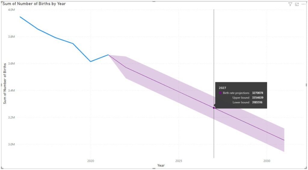
While the Power BI Forecast projection is based on the underlying dataset, ensure you have enough historical data to forecast accurate information.
Important Things to Note
- Power BI Forecast is available only for line charts. If you have multiple line charts, this feature may not work.
- Typically, Power BI Forecasting works in time series or gradually increasing datasets.
- The horizontal or X-axis has to be a date/time series data field.
- Ensure that the line chart you are using doesn’t exceed 1000 data values. Otherwise, forecasting will not work for your dataset.
- The forecasting feature requires a data interval of at least a day. Additionally, ensure that the interval is the same for each value.
- Consider remediating the data quality issues manually to ensure accurate forecasting for your reports.
- Review your Power BI forecast models and input parameters regularly to ensure the accuracy of the model.

Frequently Asked Questions (FAQs)
Yes, you can customize the forecasting parameters in Power BI. Once you select a Line chart visual, within the Analytics pane i.e. Add further analyses to your visual tab, you need to enable the Forecast option by switching the slider on. Now you can adjust the following parameters:
• Units: Forecast in Years, Quarters, Months, Days, Hours, Minutes, Seconds, Points.
• Forecast Length: Specify the units for which you want the prediction.
Ignore the last: Specify the units you want the prediction to ignore
• Seasonality: Specify seasonality detection automatically or you can even manually adjust its strength
• Confidence Interval: Set the confidence level for the forecast range (a wider interval represents higher uncertainty). You can specify a value of 75 – 99% interval
Yes, Power BI Forecast can handle irregular data patterns. However, the effectiveness of this process is very much dependent on the nature of data irregularity.
• Seasonality: Power BI has a built-in exponential smoothing model that automatically detects and applies seasonality to the Power BI forecast model.
• Outliers: Power BI has a feature to Find anomalies that can help you identify and amend the impact of outliers to enhance the forecast accuracy.
• Highly erratic patterns: Data with surprise or irregular peaks may not be easily remediated with Power BI.
Power BI Forecast primarily uses a well-known method called exponential smoothing for time series predictions. Exponential smoothing is quite an effective method for capturing the trends while addressing some of the key challenges around data seasonality, noise in datasets, and any availability of surprise or irregular peaks.
Typically, Power BI forecast algorithm uses the Seasonal algorithm (ETS AAA) model to address additive error, additive trend, and additive seasonality. Similarly, the non-seasonal algorithm (ETS AAN) is used to address additive trends and additive error and does not consider seasonality at all.
Power BI Forecast can handle missing data to a certain extent. However, a lot more depends on the values and distribution of missing values.
• For small numbers of missing values, i.e. if the total number of missing values is less than 40% of the total data points, Power BI Forecast can automatically fill in the data values for forecasting. It uses linear interpolation to forecast values in this scenario.
• For large numbers of missing values, i.e. if the total number of missing values is beyond 40% of the total data points, Power BI Forecast may not be that effective. It is recommended that you review the missing values and try to fill them as much as possible.
Recommended Articles
This has been a guide to Power BI Forecast. Here we explain how to use it in Power BI, with examples, features, benefits, and points to remember. You may learn more from the following articles –

Leave a Reply