What is the Sankey chart in Tableau?
A Sankey chart in Tableau is a data visualization tool that enables you to visualize data flows along with the relationships between different categories or groups. Using these charts, you can visually display the flow movement between two nodes or groups, the direction of flow, and the quantity or magnitude of flow. Such charts are very useful tools to perform analysis on transitional journeys or relationships.
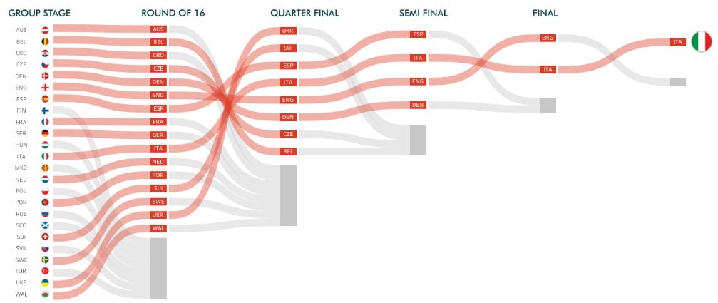
For example, user navigation through different pages on a website, the journey of different teams in a cricket or football tournament, interactions between different functions within an organization, etc. A sample Sankey chart is provided below. As you can see, this chart shows the progression of different football teams from the group stage to the final in UEFA Euro 2020.
📥Download the ready-to-use Excel template to practice this tutorial yourself.
Tableau Sankey Chart Excel TemplateTable of contents
Key Takeaways
- A Sankey chart in Tableau enables you to visualize data flows along with the relationships between different categories or groups.
- It allows you to display the flow movement between two nodes or groups, the direction of flow, and the quantity or magnitude of flow which is a useful tool to perform analysis on the transitional journeys or relationships.
- The key components of the Sankey chart include Node (representing groups or categories), Level (to provide clarity and context to the nodes), and Link (direction of flow).
- You can interact with the data in Tableau Sankey charts using the highlight feature.
- Currently, there is no built-in Sankey chart on the Tableau desktop available for users.
Components
The key components of a Sankey chart in Tableau include:
- Nodes
- It represents different categories or groups and has a start and end point of the flow
- For example, product segments, organization sectors, Food categories, etc.
- Link
- It represents the arrows that connect different nodes, highlighting the direction of the flow.
- The width of the link represents the magnitude of the flow.
- Levels
- Levels provide clarity and context to the nodes and links in the chart. These are texts you can add to the chart.
How to create a Sankey chart in Tableau?
To create a Sankey chart in Tableau, follow the instructions below:
Step 1: Connect your dataset to the Tableau interface using File – Open.
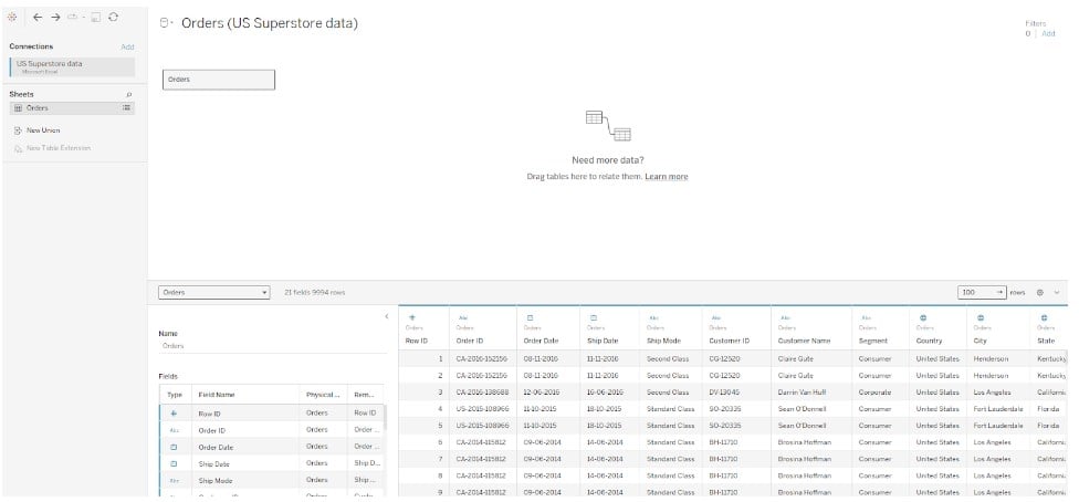
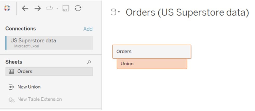
Step 2: Create a Union by dragging the dataset sheet to the dataset in the view.
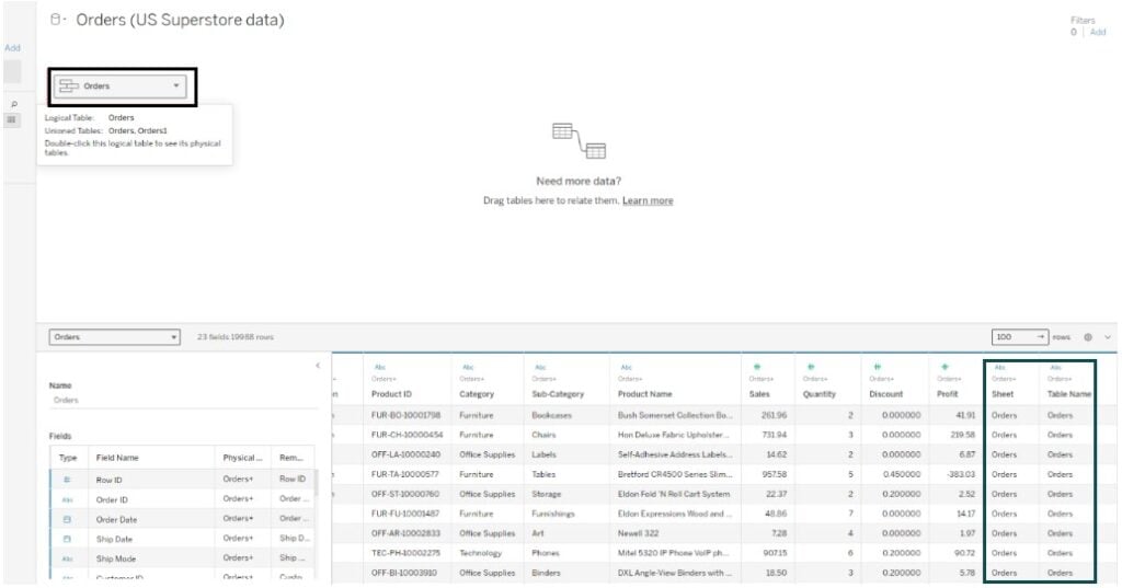
Note that post union, two additional columns, Sheet and Table Name, were added to the dataset.
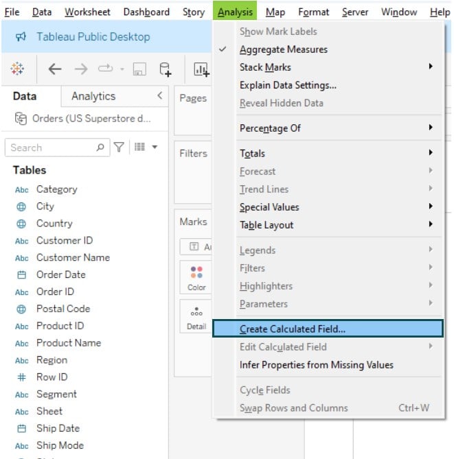
Step 3: Click on Analysis – Create Calculated Field…
Step 4: In the calculation editor, assign a name and calculation logic.
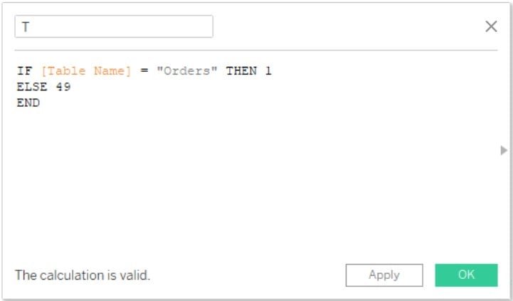
Step 5: Right-click on the newly created calculated field (T). Click on Create – Bins…

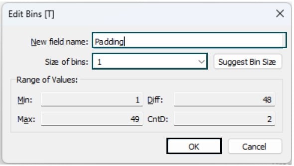
Step 6: In the Edit Bins screen, specify the new field name and size of bins to 1. Click on OK to save the changes.
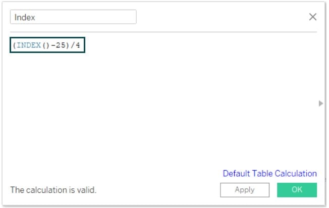
Step 7: Create another calculated field by specifying the logic in the calculation editor screen as shown below.
Step 8: Create a calculated field, and rank it as a 1 field, by defining the logic using the RUNNING_SUM and TOTAL functions.

Step 9: Right-click on the rank 1 field in the Data pane and select Duplicate.

Step 10: Right-click on the new field and select Rename from the context menu to provide a new name to the field.

The renamed field is now visible in the Data pane.

Step 11: Create a new calculated field Sigmoid by writing a formula as shown below.
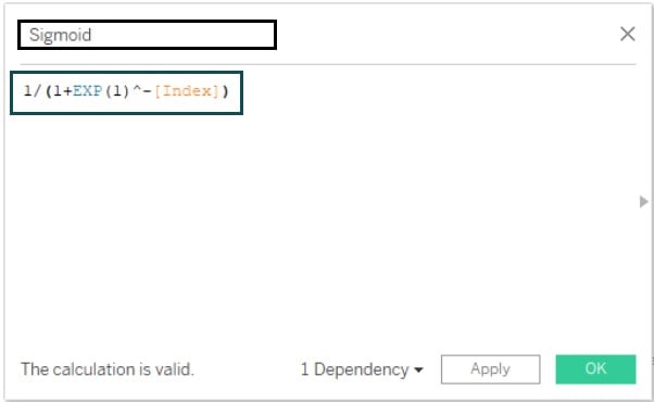
Step 12: Repeat similar steps to create another calculated field Curve as per the formula provided below.
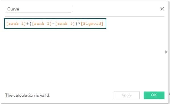
Step 13: Drag and drop the Index to the Columns shelf and Padding to Detail in the Marks card.

Step 14: Right-click on the Index field and select Compute Using – Padding.

Step 15: From the Marks card, select Circle.
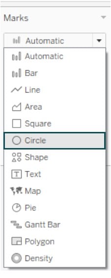
Tableau will update the view using the chosen Marks type.

Step 16: Drag and drop the Curve field to the Rows shelf.

Step 17: Drag and drop the Region and Category fields to the Detail in the Marks pane.
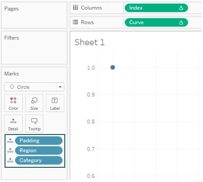
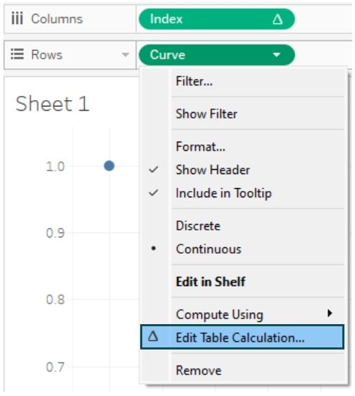
Step 18: Right-click on the Curve field in the Rows shelf and choose Edit Table Calculation from the context menu.
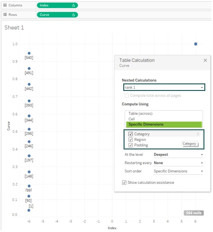
Step 19: In the Table Calculation screen, select rank 1 under Nested Calculations.
Select Specific Dimensions under Compute Using and then choose all the dimensions.
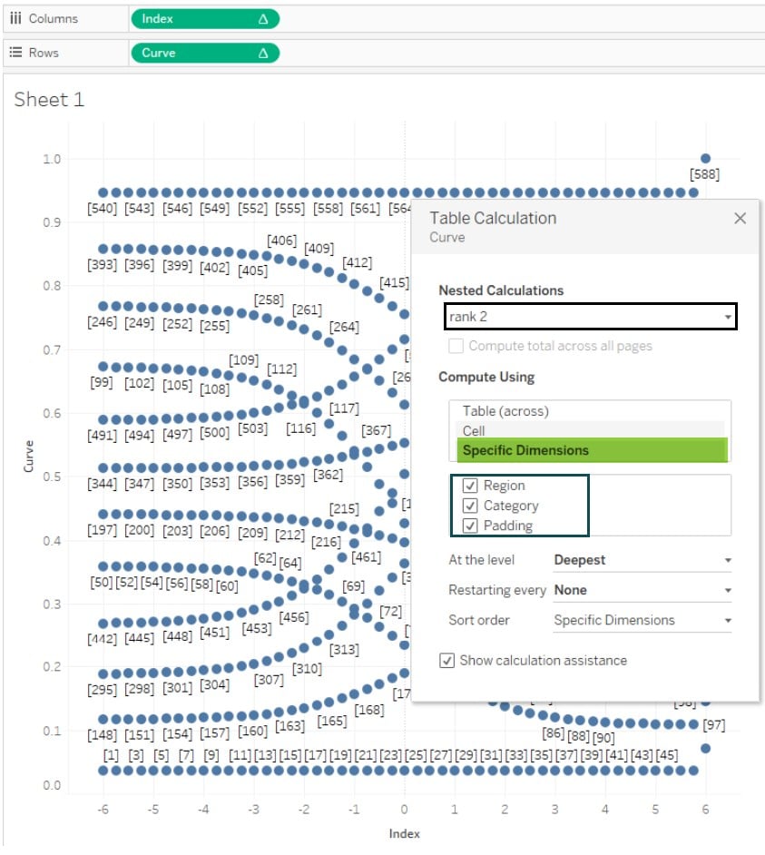
Step 20: Similarly, repeat the same process for rank 2. While choosing the dimensions, rearrange the order as shown below.
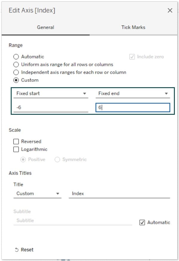
Step 21: Right-click on the horizontal axis and click on the Edit Axis.
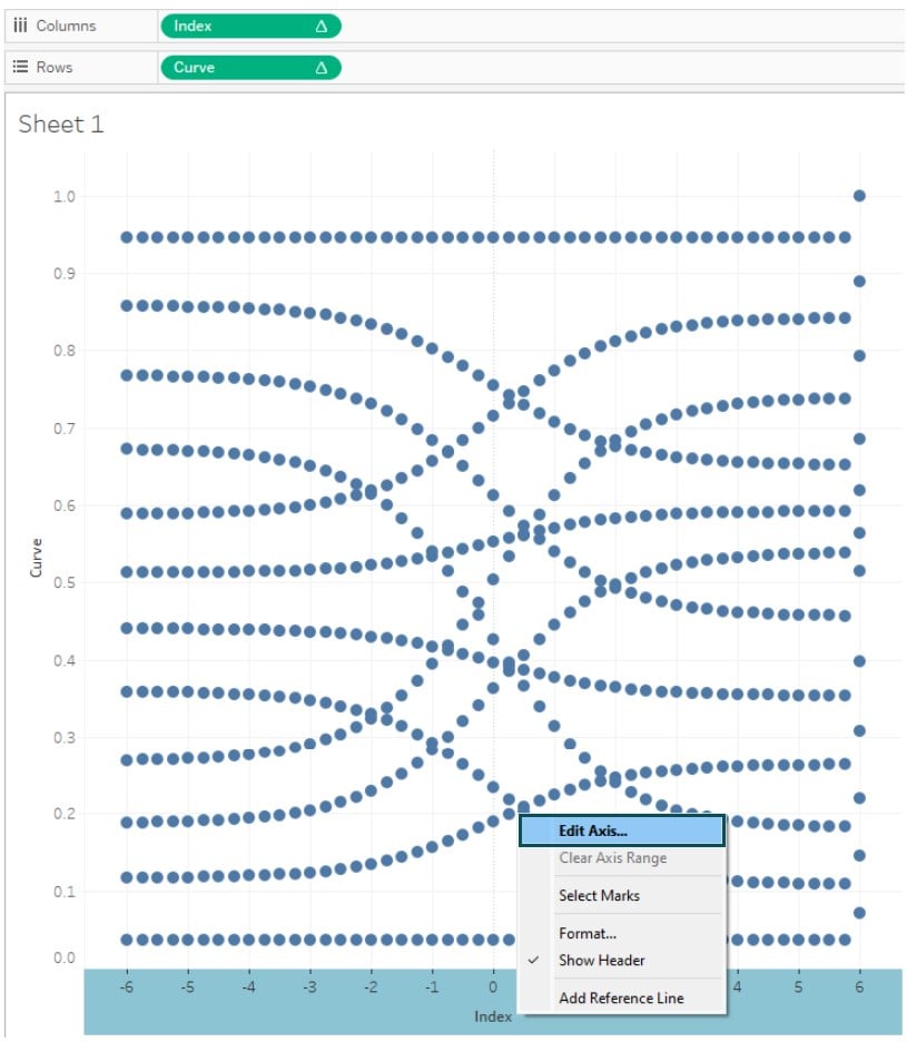
Step 22: In the Edit Axis screen, choose Custom Range. Specify the Fixed Start and End.
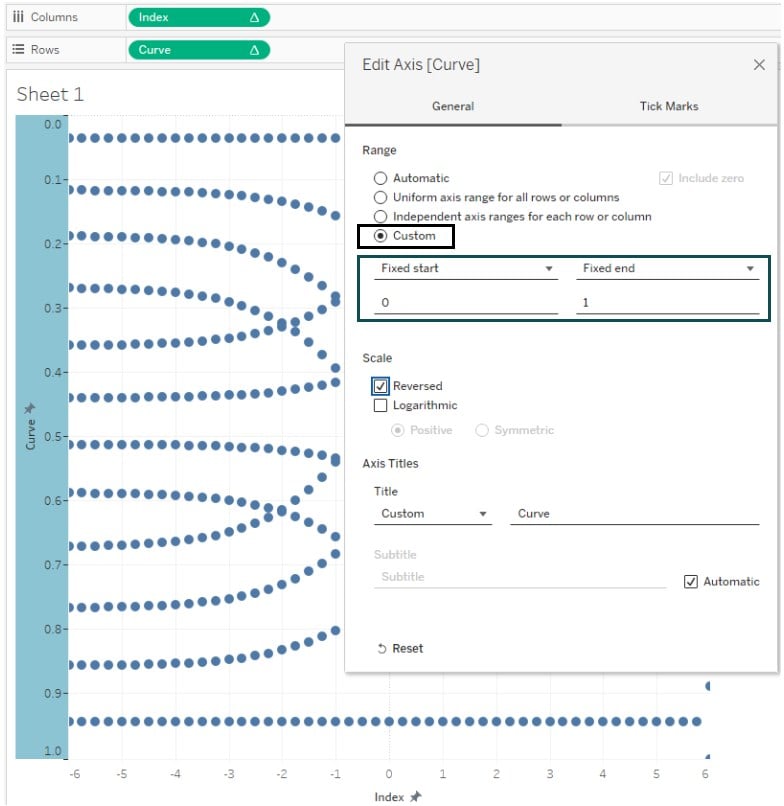
Step 23: Similarly, right-click on the vertical axis and select the Edit Axis option.

Step 24: In the Edit Axis screen, specify the Custom Range and define the Fixed start and end.
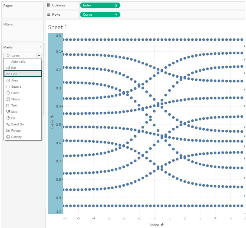
Step 25: In the Marks pane, select Line as Marks Type.
Step 26: Drag and drop the Padding field to Path in the Marks pane.

Step 27: Navigate to Analysis – Create Calculated Field… In the calculation editor, specify the logic for defining the size.
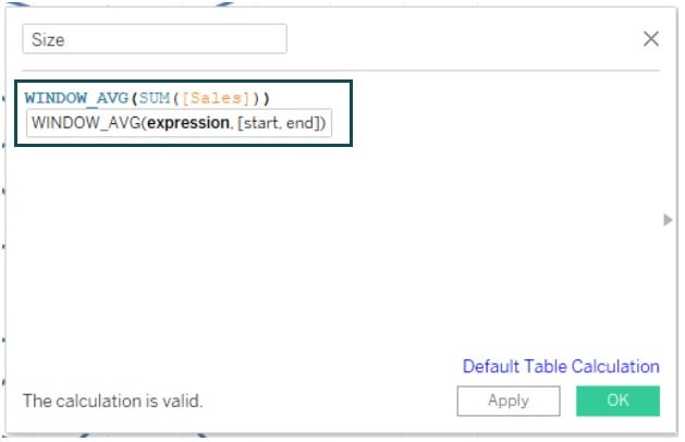
Step 28: Drag and drop the Size field to the Size in the Marks pane.
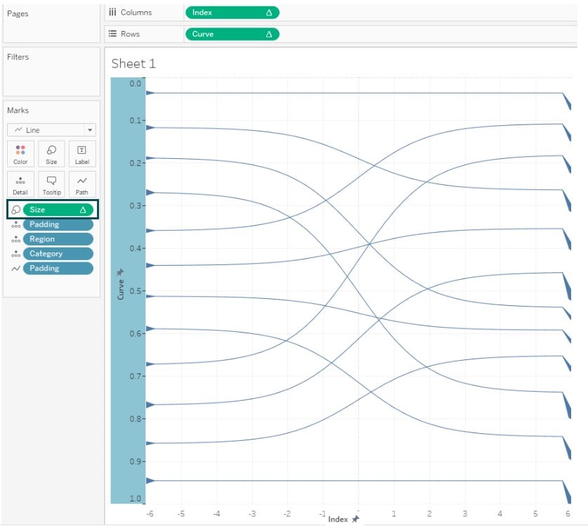
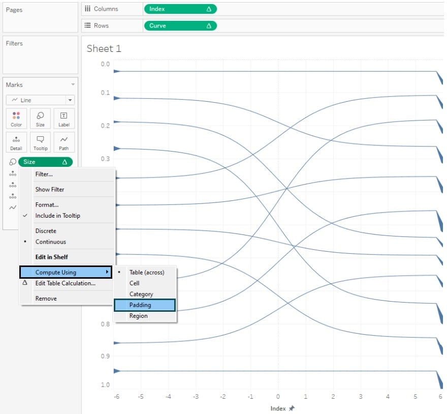
Step 29: Right-click on the Size and choose Compute Using – Padding.
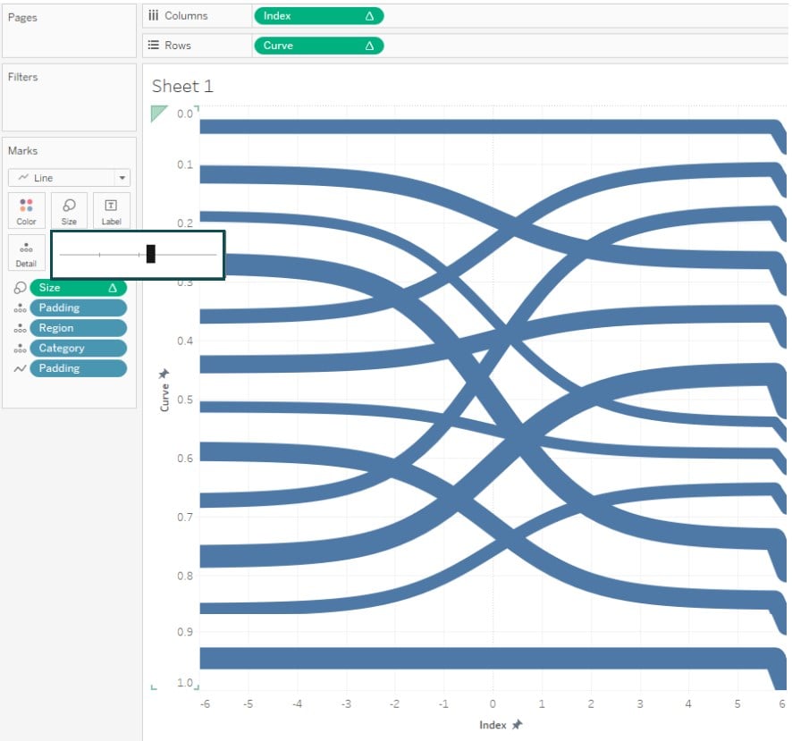
Step 30: Adjust the size as required. Tableau will create the chart as shown below.
Step 31: In the Marks pane, drag and drop Region to the Color.
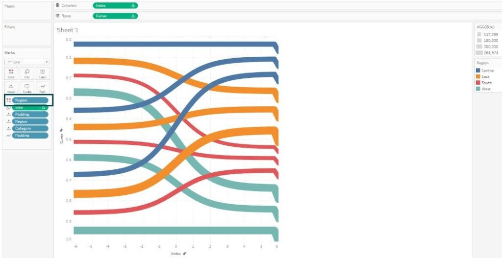
Step 32: Right-click on the Category and select Color in the Marks pane.
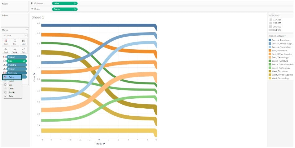
Step 33: Right-click on the horizontal axis and select Edit Axis.
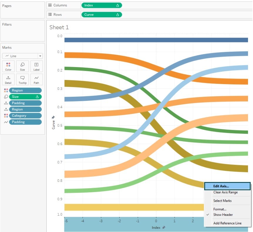
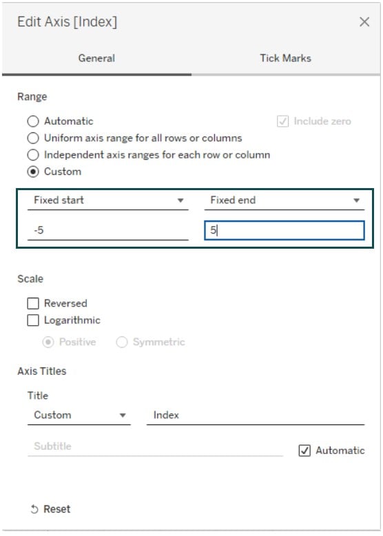
Step 34: In the Edit Axis screen, adjust the range as shown below.
Now, the Sankey chart is ready to be visualized.
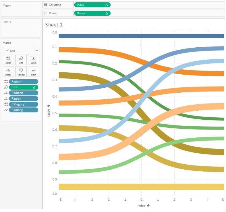
Note: Currently, Tableau doesn’t support any built-in Marks Type or visuals under Show Me for creating a Sankey chart. Initially, it was available in Tableau public as part of the beta program and is currently no longer available for public use.
Similarly, you can also create a polygon sankey chart in Tableau through workaround steps, which may require technical knowledge and multiple steps in Tableau.
Examples
In this section, we will demonstrate different scenarios where you can use the Sankey chart in Tableau.
Example #1
In this example, we will demonstrate creating a Sankey chart on the Tableau desktop using the Energy data – Sankey demo dataset. The Energy data – Sankey demo contains information such as Fuel Source, Fuel Type, Country of Usage, and Volume.
To create a Sankey chart in Tableau Desktop, follow the steps outlined below:
Step 1: Connect the Energy data – Sankey demo to the Tableau interface.

Step 2: Create a Union of your dataset in the Data Source tab.

Step 3: Repeat the steps outlined in how to create a Sankey chart in Tableau.
This involves creating the below-calculated fields.
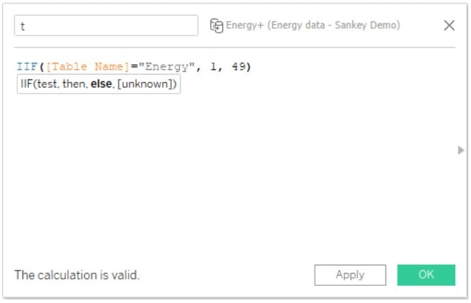

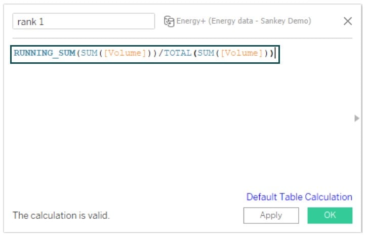

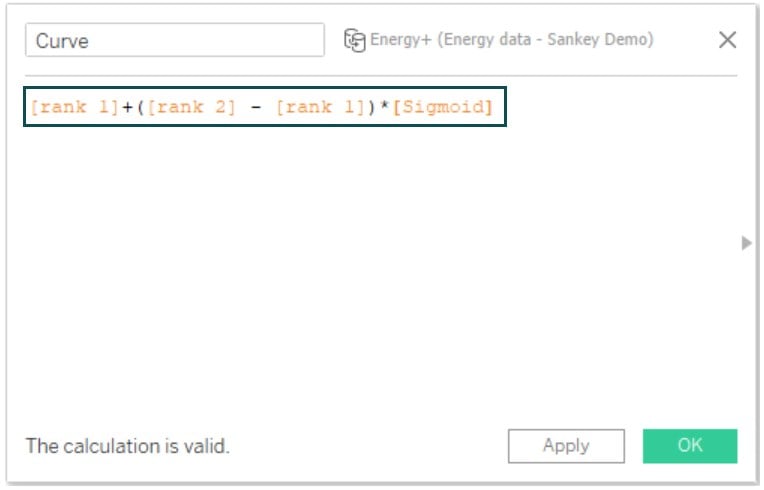
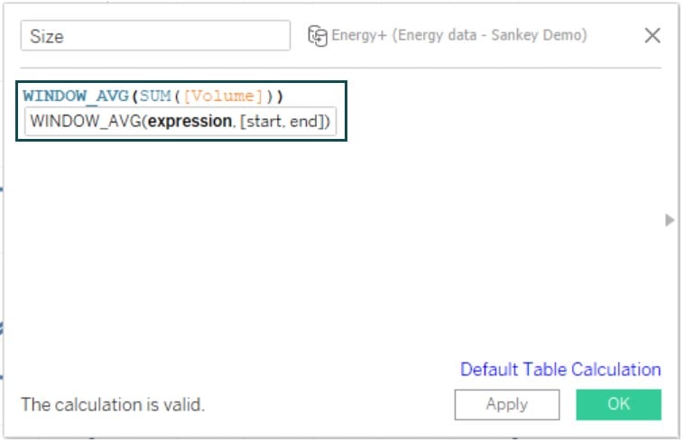
Also, create a bin for the view.
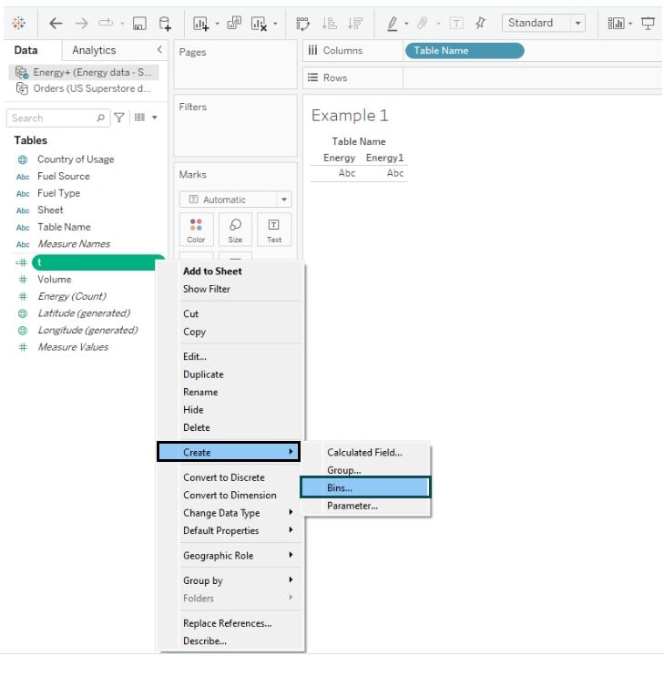
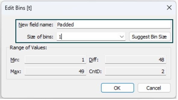
Step 4: Repeat the processes outlined in the previous section to create a Sankey chart as shown below.
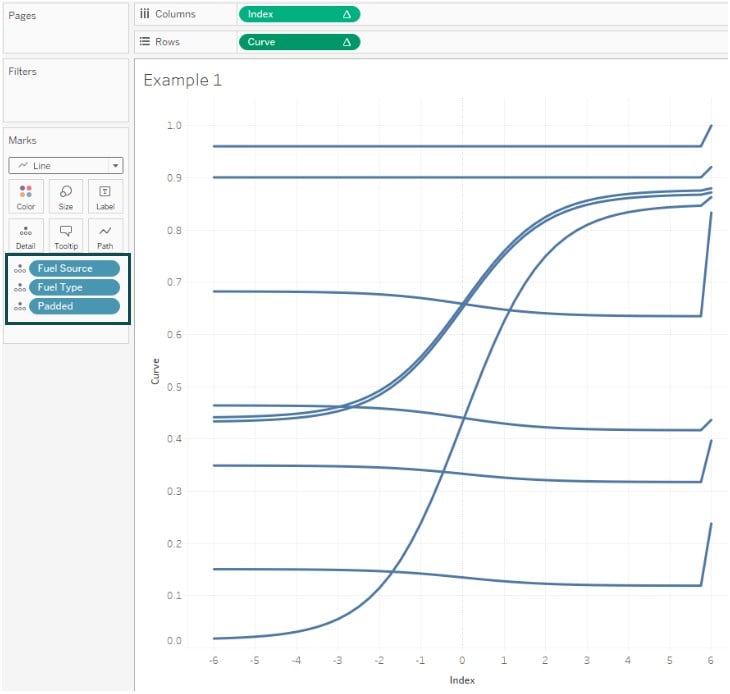
Step 5: Add Padded to Path.
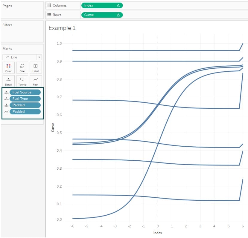
Step 6: Add the Size field to Size in the Marks pane.
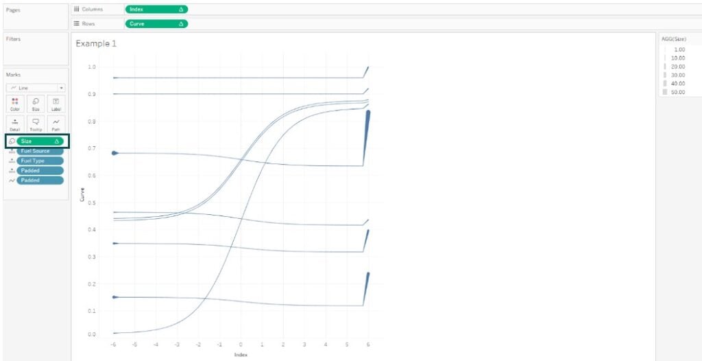
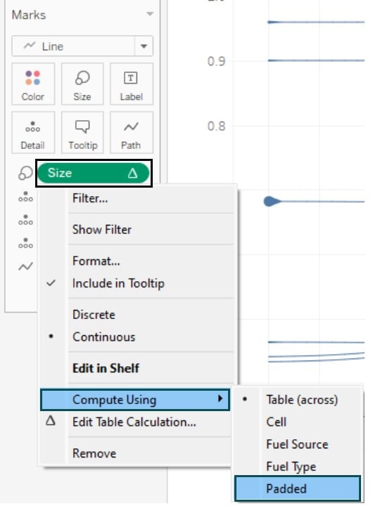
Step 7: Change the Size to Padded.
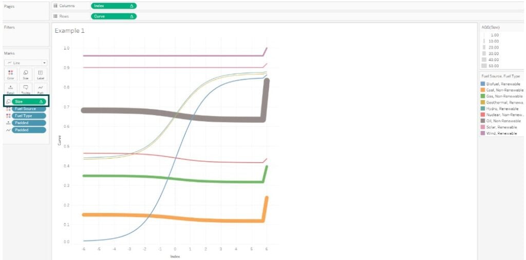
Step 8: Adjust the size and color in the Marks pane.
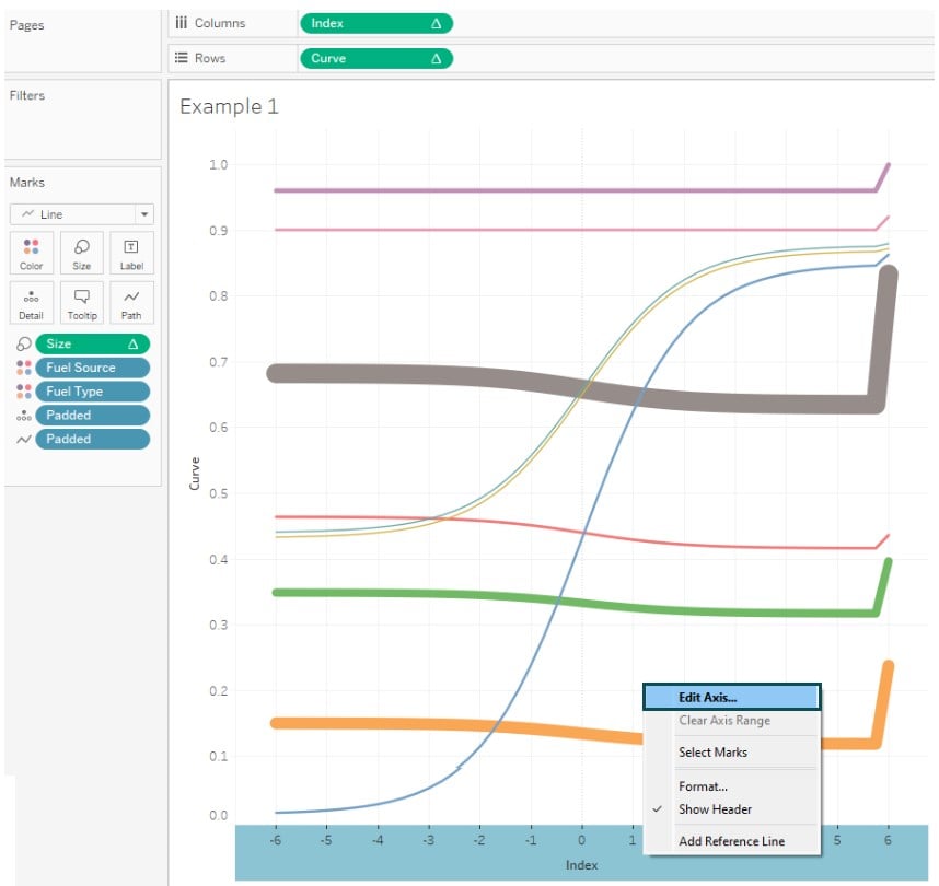
Step 9: Edit the horizontal and vertical axes
Step 10: Apply formatting to the chart.
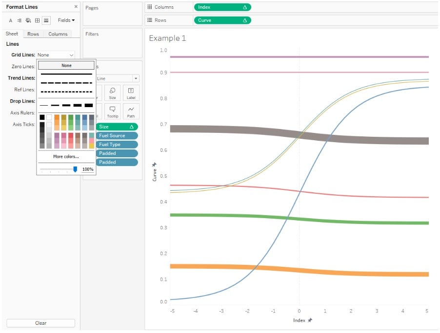
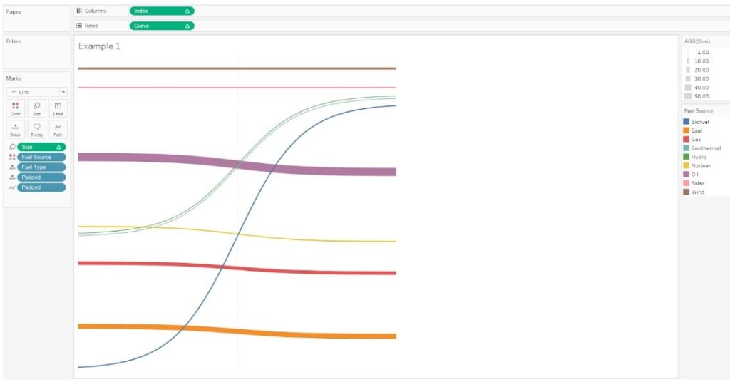
Post formatting, your chart looks like the one below.
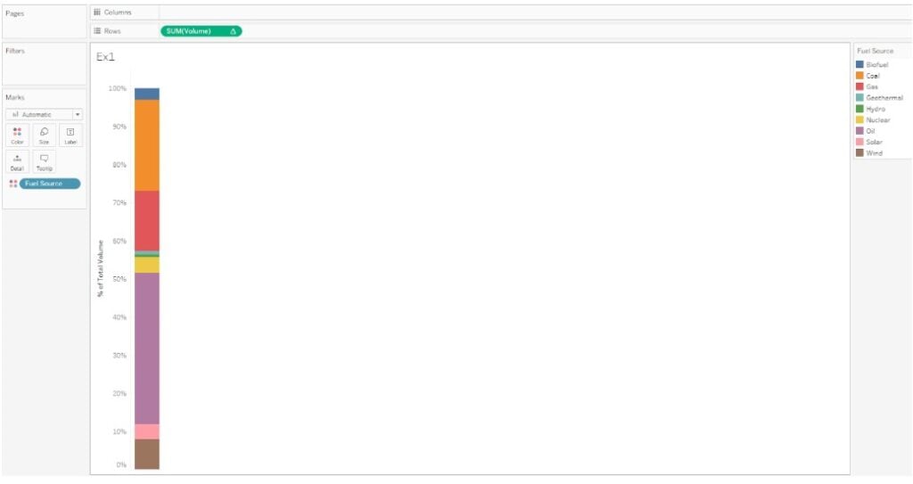
Step 11: In a new worksheet, create a visual by dragging the Volume to the Rows shelf and the Fuel Source to the Color in the Marks pane. Add Quick Table calculations.
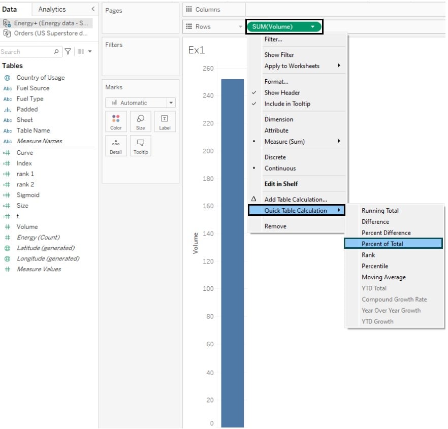
Tableau will create a chart as shown below.
Step 12: Similarly, create another visual in a new worksheet for Fuel Type.

Step 13: Adjust the Axis and header for each of these visuals, i.e., Fuel Source and Fuel Type.
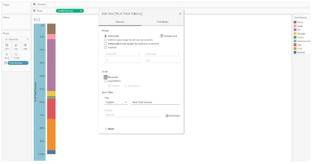
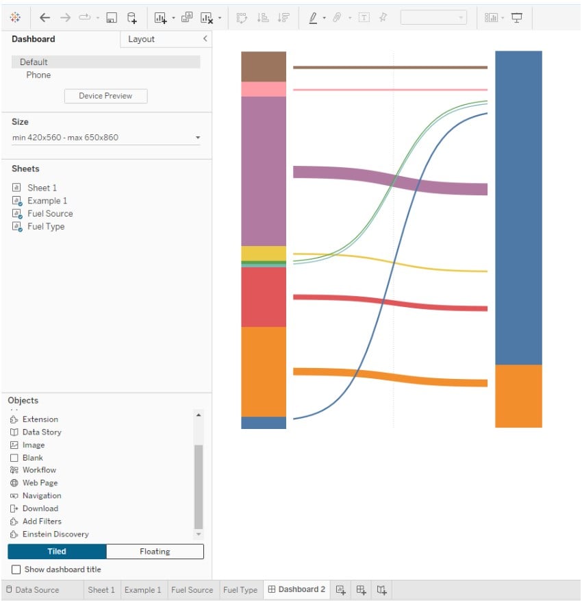
Step 14: Click on a New Dashboard. Drag and drop the worksheets as floating.
Adjust the shape and size of the sheets.
Step 15: Navigate to Dashboard and Actions. Specify the actions for your dashboard.
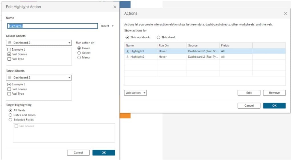
Now your Sankey chart is ready for use.
Example #2
In this example, we will demo creating a Sankey chart using the Web Authoring feature in Tableau public using Superstore sample data that contains the sales details across different superstores in the US.
The step-by-step guide is provided below:
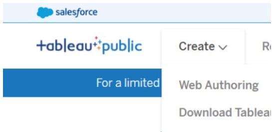
Step 1: Sign in to your Tableau public and select Web Authoring under Create.
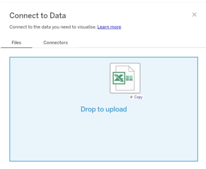
Step 2: Connect to Data using the Drop to upload feature.
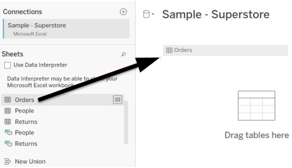
Step 3: Select the table to map in the Connections interface.
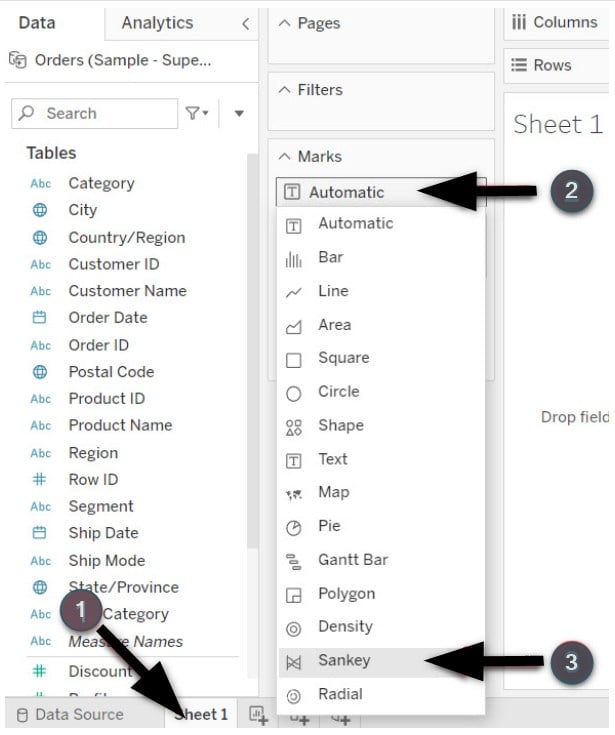
Step 4: In the new worksheet, do the following. Change the Marks Type to Sankey.
Step 5: Add the dimensions in the Data pane to Level in the Marks pane.
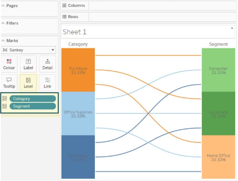
Step 6: Add measures to the Link. This is in the Marks pane.
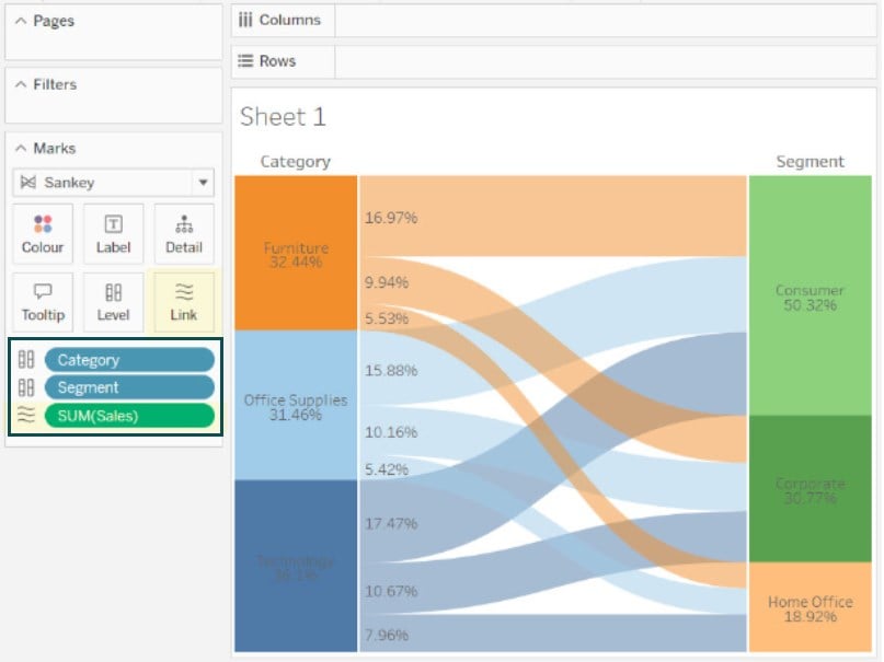
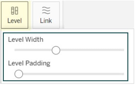
Step 7: Adjust the level width and padding as appropriate for your chart.
Example #3
In this example, we have expanded on example 2 to create a multi-level Sankey chart in Tableau public.
To create a multi-level Sankey chart in Tableau, follow the instructions below:
Step 1: Connect the dataset to the Tableau public.
Step 2: Change the Marks Type to Sankey. Drag Category, Segment, and Region to the Level, and total sales to the Link in the Marks pane.
You will see a multi-level Sankey chart in Tableau public view as shown below.

Important Things to Note
- Tableau Sankey charts require the data relationships to be accurately defined to represent a meaningful chart.
- If your dataset contains too many groups or categories, then Sankey chart is not recommended for visualization.
- Ensure that you understand the limitations associated with the Sankey chart before you recommend its use.
- Alternatively, consider using other data visualization tools that may be handy for displaying similar visualizations.
Frequently Asked Questions (FAQs)
Some of the best practices for designing effective Sankey charts in Tableau include:
Ensure the data is suitably transformed for use in the Sankey chart with source and target columns.
Focusing on data flow and relationships between the categories using the links.
Consider adding labels appropriately to the categories and links to clearly explain the magnitude and direction of flow.
Use color-coding judiciously for the data visualization.
Make sure you add tooltips to the visualization to display critical information to the end users.
Yes, you can interact with the data in a Tableau Sankey chart through the below features:
Highlighting a portion of the visual when you hover over a category or link and display additional information through tooltips.
Filtering your dataset to change the visualization as per the filtered dataset.
You can also create actions for your visualization that can interact with the Sankey chart in Tableau.
Yes, there are a few limitations to creating Sankey charts in Tableau. They include:
• Technical knowledge
• Tableau does not natively support creating a Sankey chart, and you need to have technical know-how to build such charts. Hence, creating such charts requires a certain amount of customization and technical expertise.
• Chart complexity
For large datasets, Sankey charts may not be ideal, as you may observe performance issues given the complexity involved in displaying the data flow.
Similarly, if there are multiple categories or groups, it may not be recommended to use the Sankey chart as it may clutter the visual.
Some of the alternative visualizations to Sankey charts include:
Treemaps for displaying the hierarchical data.
Flowcharts or flow diagrams for visualizing the relationship between different components.
Network diagrams for showcasing the relationship between the network nodes.
Chord diagrams for displaying the entity relationships in a circular layout.
No, Sankey charts are useful to visualize or describe any relationship between different categories or groups by displaying a direction of flow. Hence it can’t be for doing any predictive analysis.
Download Template
📥Download the ready-to-use Excel template to practice this tutorial yourself.
Tableau Sankey Chart Excel TemplateRecommended Articles
Guide to What is the Sankey chart in Tableau. We explain how to create Sankey chart with components, examples, and downloadable template. You can learn more from the following articles –

Leave a Reply