
What is Tableau Heatmap?
A type of visualization from which you can depict the contrasts through color as ‘heat signatures’ do is a heatmap in Tableau. You can use these heat maps to find the density of, say, a population or compare and contrast measures of a particular feature with different data points. You can depict a range of values with a Tableau heatmap table.
One of the most famous examples is to compare the petal lengths of various flowers available using a heatmap graph by differentiating the colors of each petal length to show the range of sizes in the graph.


Once you apply these examples, you can place both the species and the calculated field in the same row to see the result.
Using the Treegraph, you can select the Count of Petal Lengths and compare the length of the petals of all the flowers.
Key Takeaways
- Tableau heatmaps visually represent data density and patterns using color gradients.
- Heatmaps are used to identify hotspots, trends, and outliers within datasets, particularly in spatial or geographic data analysis.
- Tableau heatmaps support interactivity such as filtering, drilling down, and hovering over data points to explore specific areas or values.
- Users can customize color palettes, adjust aggregation levels, and incorporate additional dimensions or measures to enhance the heatmap’s clarity and relevance.
- They find applications in various fields including business analytics, market research, public health, and environmental studies, among others, for gaining insights and making data-driven decisions.

How to create a Tableau Heatmap?
See how to implement a Tableau heatmap table by following these steps.
Step 1: Create a new workbook to start building your heatmap.

Select the dataset that you want to work with. Here, the Sample-Superstore dataset is used due to its versatility.

Step 2: Select the “Order Date” from the data. Tableau will select the “Year” of the Order Date by default.

Step 3: Click on the plus icon on the “Order Date” and separate it into “Quartile,” “Month,” and then “Day” of the Order Date feature. Then, drag down the Day component to the Row component.

Step 4: Delete the “Quartile” and “Year” components from the Column, leaving only the “Month” part of the order date in the column.

This is how the table will look like.
Step 5: Select the “Profit” feature from the numerical features and drag it to the color section in the Marks tab as shown.

Now, the graph will look like this.

Step 6: Drag the “Profit” feature to the Text part of the Marks tab to show the profit values of each day in January.

Now, the table will look like this.

Step 7: In the “Marks” tab, click on the drop-down and select ‘Square’ to shade the cell instead of the numbers as shown in the previous step.

This is the graph.

Step 8: Change the color scheme of your choice. To do that, select the feature on the right corner of the worksheet. In the drop-down, select “Edit Colors”.

Select the color of your choice. Here, the red-green diverging scheme is chosen.

This is the final graph.

Examples
Learn how to use Tableau heatmap by row by following these steps.
Example 1: Color a Heatmap by dimension
Suppose you want to compare the sales of a product in one place. To improve its readability, you can use Tableau heatmaps to show what sells the most and what sells the least.
Step 1: Select the dataset you want to work with. Here, the Sample-Superstore dataset is used.

Step 2: Select the two features, Segment and Subcategory, from the features and place them in the column and row components, respectively.

Step 3: Place the SUM of the Sales feature in the Marks tab. It will aggregate to the Sum function by default.

Now, the table looks like this.

Step 4: In the Marks tab, select “Gantt Bar” by clicking on the dropdown.

The table will look like this.

Step 5: Place the “Category” feature in the color bar to color the sales by categorizing them.


The colors on the Gantt Bars have changed.
Step 6: Create a “Calculated parameter” to create a placeholder function.

Step 7: Name the field as one and declare it.

This placeholder field is used to color the entire cell in Tableau. You can also use the function MIN(0) alternatively.
Step 8: Place the placeholder function ‘1’ in the size component as shown. It will aggregate to SUM by default.

The table looks like this.

Step 9: To color the entire cell, change the statistic Measure of the placeholder field to MINIMUM.
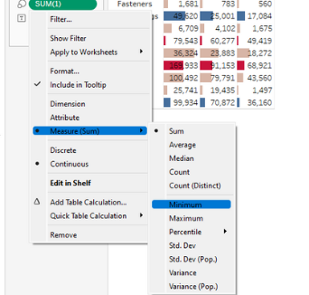
Now, the table looks like this.

Step 10: Click on the “Size” tab in the Marks tab and increase the size to the maximum.

The heatmap of the Sales based on Categories and places is shown successfully.

Example #2
Suppose you want to see how the sales fare in each city in the USA. You can do so by creating a Tableau heatmap on the map.
Step 1: Add the “Sample Superstore” dataset in a new workbook.

Step 2: Select the features “Country” and “City” in the “Marks” tab.

Step 3: Drag and drop the “Sales” feature in the color section.

Step 4: In the “Marks” tab, change from “Automatic” to “Density”.

The map will look like this.

Step 5: Change the color by clicking on the “Color” tab in the Marks section and increase the intensity to the maximum to see the changes even better.

Here, the color scheme is “Temperate Diverging”. It is the final map.

Example #3
The Tableau Heatmap can also be used to see how the heatmap changes over time. Suppose you have a time-series dataset of a product. You can use the Heatmap to change the Years and make it available using the Tableau Heatmap by column.
Step 1: Use the AirBnb dataset for the location of Austin, Texas.

Step 2: Select Latitude and Longitude on the dataset. This shows the location of Austin, Texas.

Step 3: Select the ID feature (every AirBnb) that is identified by their feature.

Step 4: Change the marking to density.
Step 5: Create a new Parameter called year.

Step 6: Edit the parameters and manually add the years from 2009-2023.


Simply click on “Click to Add” to add new values. Then, click “OK” and save it.

This is the parameter
Step 7: Create a calculated field to define the parameter.

Step 8: Edit the calculated field and write the function to make the parameter year less than or equal to the year since the place became an AirBnb host.

Select the parameter YEAR (the one with the # symbol).

Step 9: Change the color of the graph to “Red-Black diverging”.

Step 10: Add the Calculated Field to the filters.


Select only “True” in this case.
Step 11: Right-click on the Parameter and select “Show Parameter”.

Step 12: Right-click on the Parameter and select “Slider” in the options.

This is the final map.
The population of Airbnb in 2009

The population of AirBnbs in 2023

Important Things To Note
- Before creating a heatmap, thoroughly understand your dataset, including the range and distribution of values, to choose appropriate color scales and encoding methods.
- Select a color palette that effectively communicates your data. Use sequential color schemes for ordered data and diverging color schemes for data with a meaningful midpoint.
- Provide clear and descriptive titles and axis labels to help viewers understand the content and context of the heatmap.
- Implement filters and interactivity to allow users to explore specific data segments, enabling them to focus on areas of interest and gain insights dynamically.
- When working with large datasets, optimize the performance of your heatmap by aggregating data appropriately and leveraging Tableau’s features like data extracts and filters.
- Don’t overcrowd the heatmap with too many data points or dimensions, as this can make it difficult for viewers to discern patterns and trends.
Frequently Asked Questions (FAQs)
• Limited customization options for color gradients.
• Challenges with visualizing large datasets efficiently.
• Difficulty in representing hierarchical data structures.
• Potential for colorblindness accessibility issues.
• Inability to handle real-time data updates effectively.
• To visualize data density and patterns.
• When exploring spatial or geographic data.
• For identifying hotspots or areas of concentration.
• To highlight variations in data values across categories or dimensions.
• When comparing relative magnitudes or distributions within a dataset.
Yes, you can drill down into specific areas of your Tableau heatmap by implementing interactive features such as filters or actions. You can create parameters and show them in the graph to control them based on a value.