
What Is Excel 3D Plot Chart?
The 3D plot in Excel helps display the given dataset graphically in a 3-dimensional plane. And the program offers two options, 3-D Surface and Wireframe 3-D Surface charts, to create 3D plots.
Users can use the Excel 3D plot to determine the top combinations between two value sets. The plot also helps them make data-driven decisions. Also, the colors and patterns in the plot indicate the areas in the same value range.
Use this 3D Plot In Excel Template to follow along with the examples in this article.
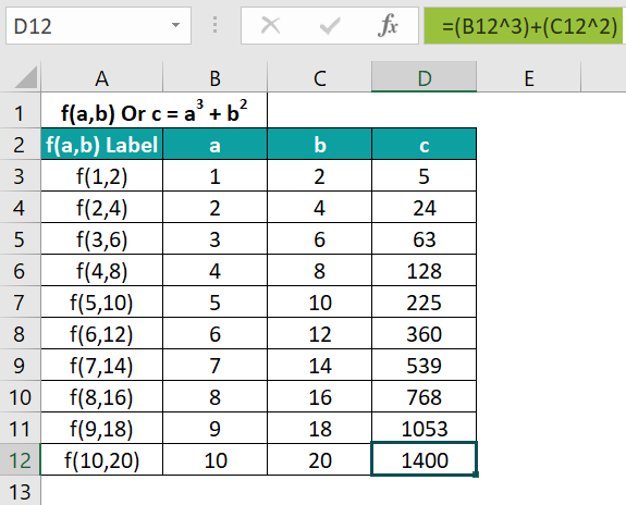
Download Excel TemplateFor example, the following table lists values for two independent variables, a and b. The variable c depends on the variables a and b. It represents the function f(a,b), with the formula specified in cell A1.
If the requirement is to make 3D plot in Excel for the given data. Then, we can insert the 3-D Surface chart from the Insert tab to achieve the desired plot.
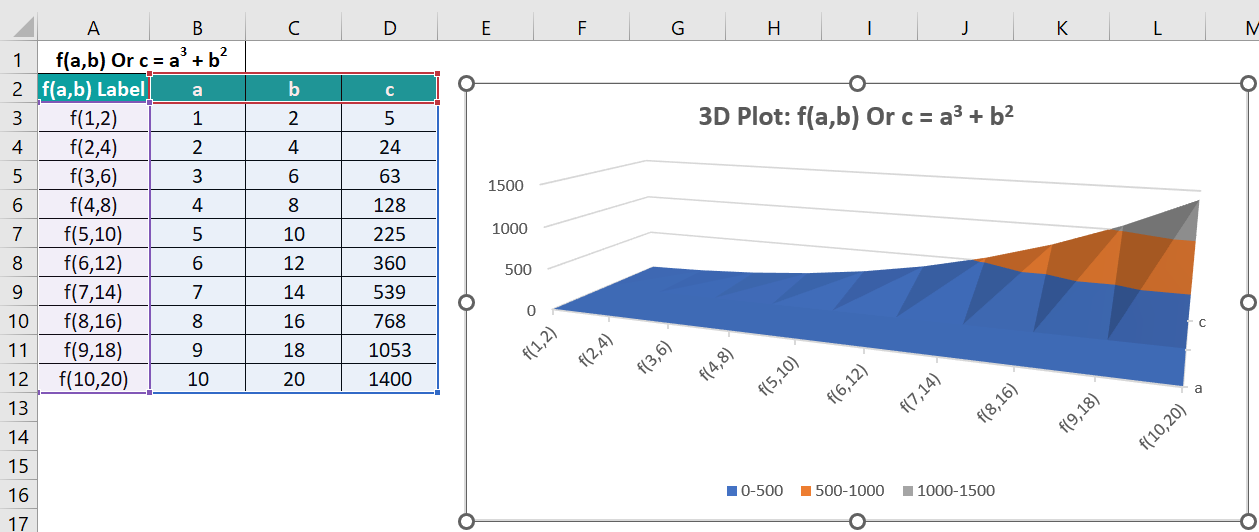
The highlighted 3-D Surface chart gives an Excel 3D plot with X-, Y-, and Z-axes.
The X- or Horizontal axis shows the row labels. The Y- or Depth axis shows the column headings, defining the 3-dimensional plane’s floor. And the Z-axis displays the two independent variables and function values, with the axis defining the plane’s side wall. The plot works on color coding, with each color representing a specific value range. It indicates the Legend in the plot area.
Key Takeaways
- The 3D plot in Excel plots the given data values on a 3-dimensional plane. While the X- or Horizontal axis and the Y- or Depth axis define the plane floor, the Z- or Vertical axis defines the side wall in the chart.
- Users can use the Excel 3D plots to review the optimal combinations between datasets. And it helps evaluate the areas in the same value ranges when studying aspects such as the climatic conditions of a region.
- We can use the 3-D Surface and Wireframe 3-D Surface charts to achieve 3D plots in Excel. And we can insert these charts from the Insert tab.
How To Create A 3D Plot In Excel?
The steps to make 3D plot in Excel are as follows:
- Select the required data range and choose the Insert tab → Insert Waterfall, Funnel, Stock, Surface, or Radar Chart → 3-D Surface chart. Otherwise, click the Wireframe 3-D Surface chart to achieve the 3D plot in Excel required to fit the needs.
Alternatively, we can choose the required data range and then the Insert tab → Recommended Charts option to open the Insert Chart window. Next, click the All Charts tab, where we must choose the Surface option from the menu on the left. The Surface Charts tab will open, where we can select the required 3D plot Excel X Y Z template and click OK to insert the chosen chart type.
Otherwise, we can choose the dataset and press Alt + F1. The default chart, the 2-D Clustered Column graph, will get inserted. And then, we must click the chart to get the Design tab in the ribbon and choose the Change Chart Type option from the Design tab.
The above action will open the All Charts tab in the Change Chart Type window, where we can click the Surface option from the menu on the left. The Surface Charts tab will open, where we can select the required 3D plot Excel X Y Z template and click OK to insert the chosen chart type. - Right-click the plot area in the inserted chart and choose the Format Chart Area option from the contextual menu to access the Format Chart Area pane.
We can then click the Effects tab and use the options under the 3-D Rotation option to set and enhance the desired 3-D effects for the inserted 3D Surface plot in Excel.
Examples
Check out the following examples of 3D plot in Excel to effectively create and use the Excel feature.
Example #1
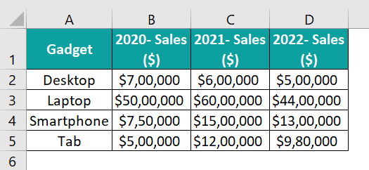
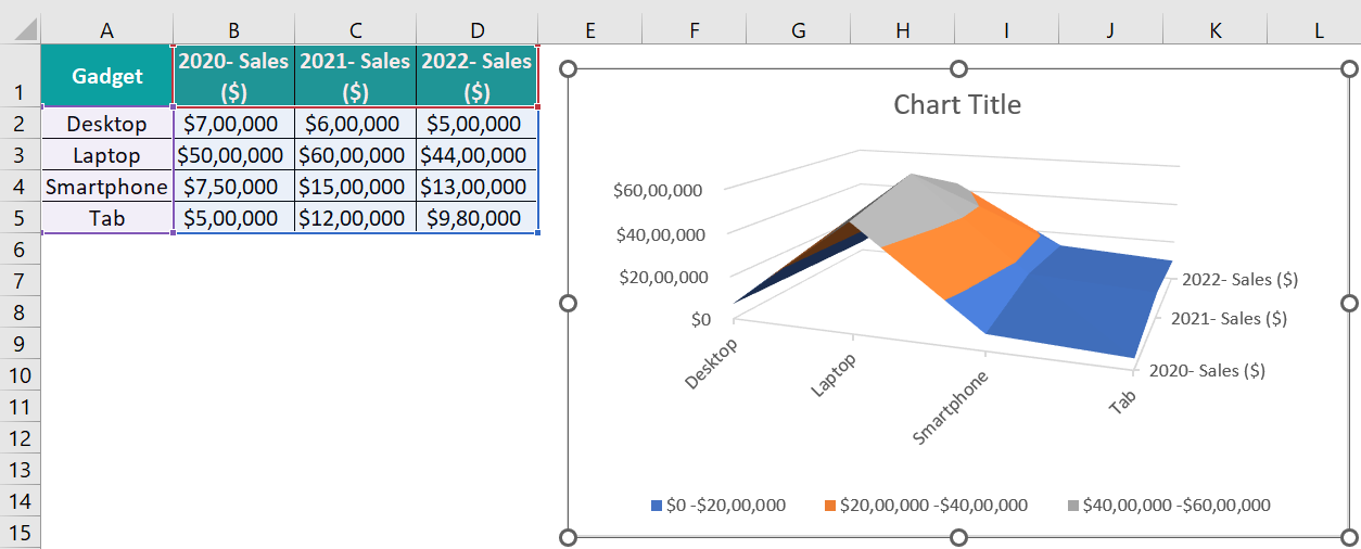
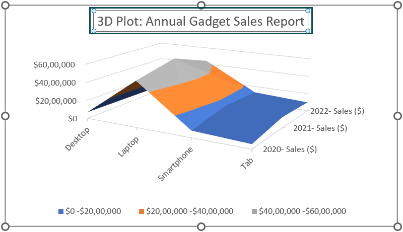
The following table lists gadgets and their annual sales data for 2020-22.
Here is how to create a 3D Surface plot in Excel for the above dataset.
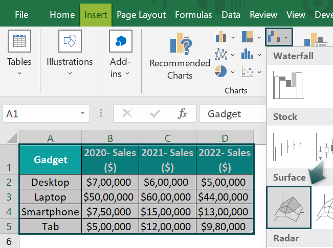
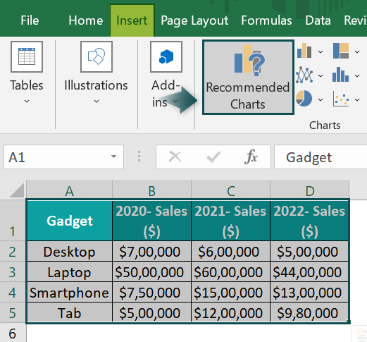
- Step 1: Select the dataset range A1:D5 and choose the Insert tab → Insert Waterfall, Funnel, Stock, Surface, or Radar Chart → 3-D Surface chart.
The required 3D plot in Excel gets inserted, as depicted below.
Alternative Method
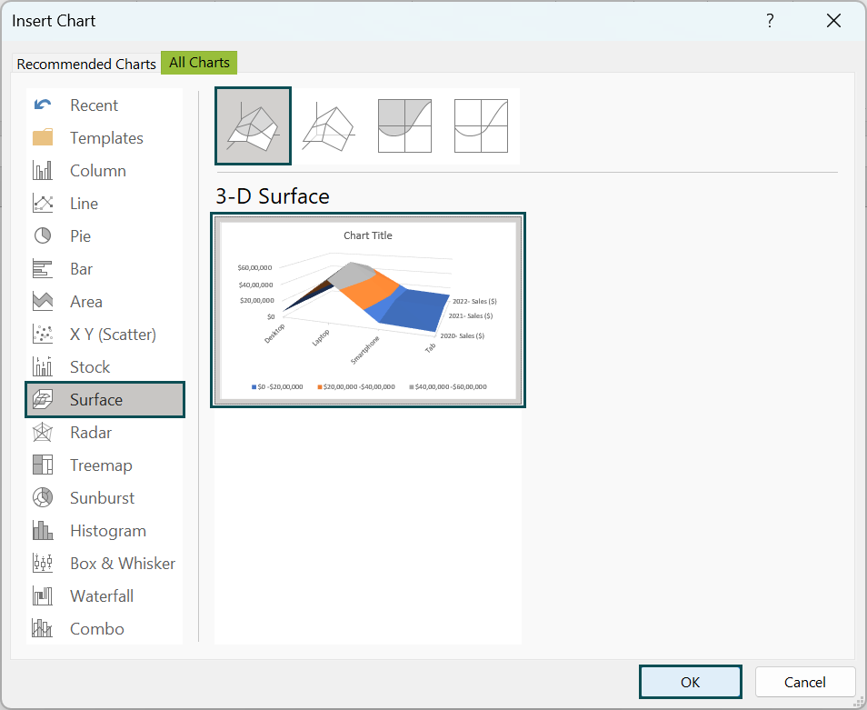
Alternatively, we choose the cell range A1:D5 and select the Insert tab → Recommended Charts option to access the Insert Chart window.
And then, choose the All Charts tab and click the Surface option from the left menu to open the corresponding tab.

We can then select the required 3-D Surface chart option and click OK to insert the required 3D Surface plot.
Otherwise, select the cell range A1:D5 and press Alt + F1 to insert the default chart, the 2-D Clustered Column graph.

Next, click the chart area to view the Design tab in the ribbon and choose the Change Chart Type option to open the Change Chart Type window.

And then, click the Surface option from the left menu to open the Surface Charts tab.
And once we select the required 3-D Surface chart option and click OK, the default chart changes to a 3D Surface plot.
Steps To Create 3D Surface plot
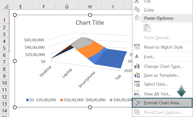
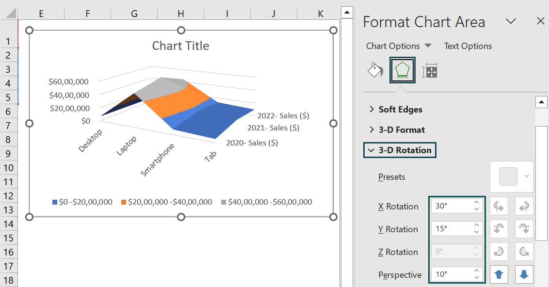
- Step 2: Right-click the chart area and choose Format Chart Area from the contextual menu to access the Format Chart Area window.
- Step 3: Select the Effects tab. And click the 3-D Rotation category to update the X and Y rotations and Perspective settings to ensure the plot becomes clearer.
And as we change the above mentioned parameter values, we will see the inserted plot’s rotation changing accordingly.
- Step 4: Double-click the Chart Title element in the plot area and update it, as depicted below.
And thus, the final 3D plot will appear as shown below.
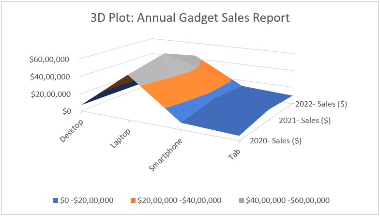
While the X-axis or the Horizontal axis represents the gadget categories, the Y-axis or the Depth axis shows the series, which are the specific years’ sales. And the Z- or Vertical axis shows the dataset values plotted in the chart area.
And the plot contains unique colors to represent the data ranges mentioned in the Legend. While they do not represent the different data series, they help find the best combinations between the different value sets.
Let us see the data points plotted for the gadget category, Laptop. The annual sales figures for laptops are $5,000,000, $6,000,000, and $4,400,000 in 2020, 2021, and 2022. The color Grey represents the data range of $4,000,000 to $6,000,000. It covers the category Laptop’s annual sales figures in the plot.
Example #2
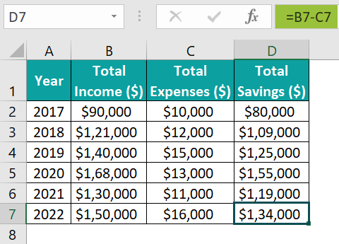
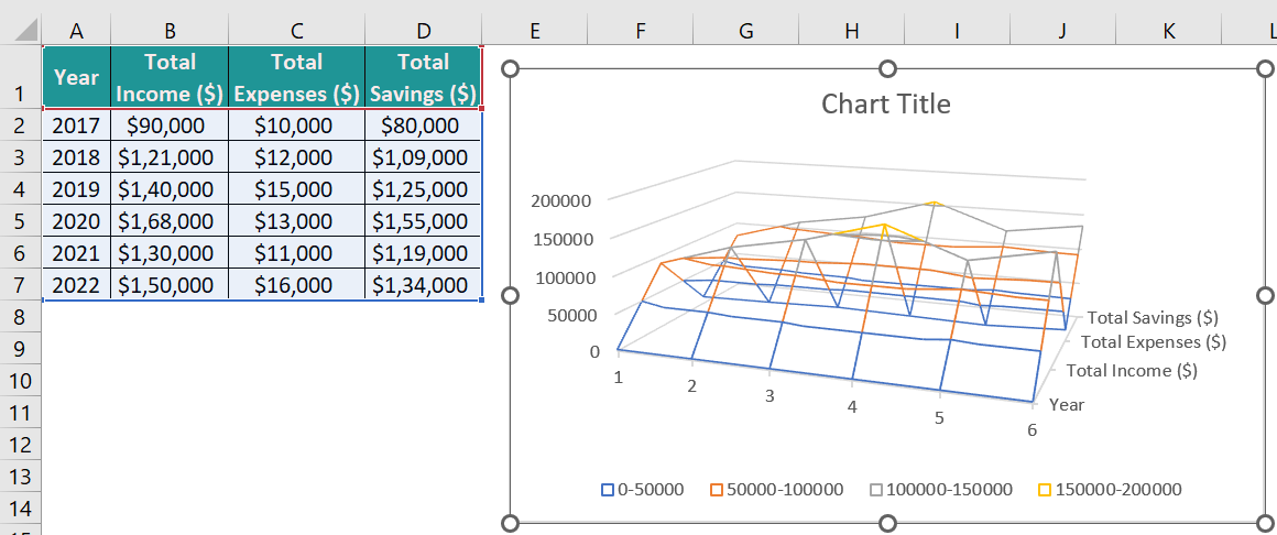
The table below contains the annual income, expenses, and savings data for 2017-22.
We can plot the Wireframe 3-D Surface chart for the above data using the following steps:
- Step 1: To plot the chart for the entire dataset, click on a cell in the given data range and select Insert → Insert Waterfall, Funnel, Stock, Surface, or Radar Chart. And then, choose the Wireframe 3-D Surface chart.

The required 3D plot in Excel gets inserted, as depicted below.
- Step 2: The horizontal axis must display the years. And for that, right-click the X-axis and choose Select Data from the contextual menu.
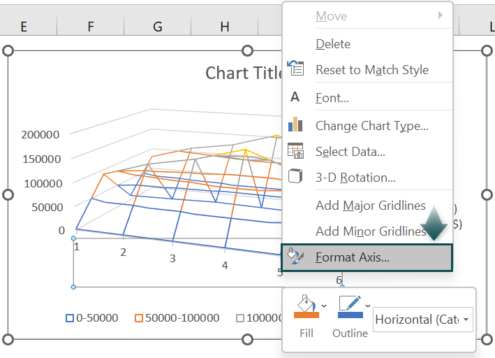
The Select Data Source window will open, where we must click the Edit option under the horizontal axis labels field.

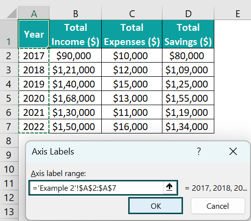
The Axis Labels window will open.

Next, enter the cell range A2:A7, containing the year values, in the Axis label range field in the Axis Labels window.
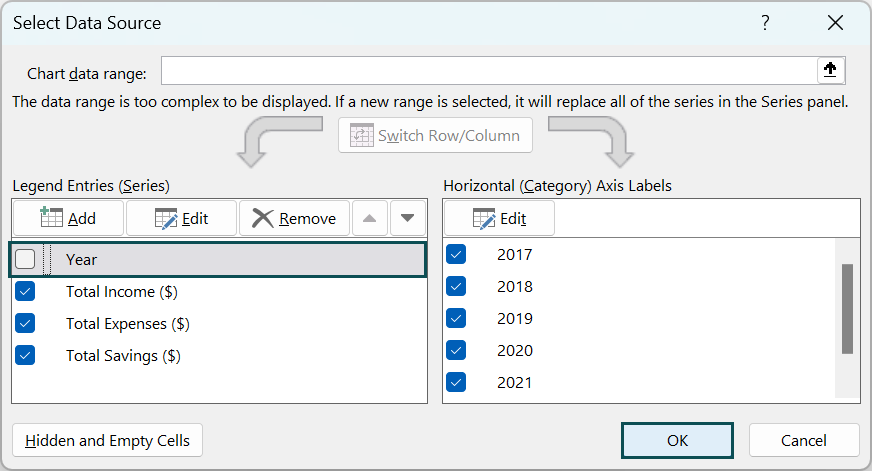
Clicking OK will close the Axis Labels window, and the horizontal axis labels field will show the years. And as we do not require to show the Year series in the Depth or Y-axis, we shall uncheck the Year series option under the Legend Entries field.
And click OK to obtain the following Excel 3D plot.
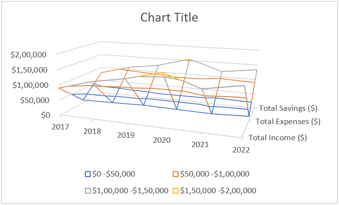
The Legend uses unique colors to show the value ranges that the lines in the plot represent.
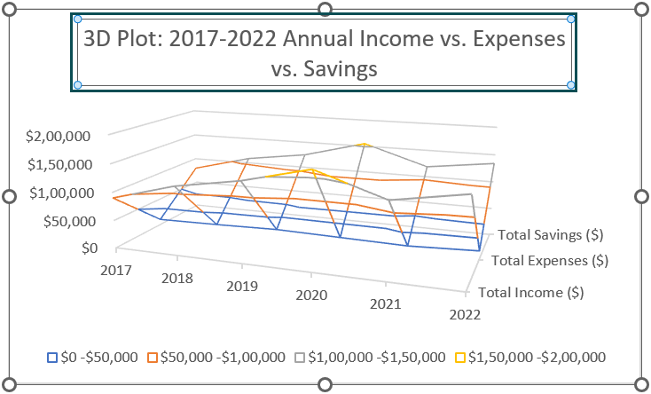
- Step 3: Double-click the Chart Title element in the plot area and update it.
- Step 4: Click the chart area to enable the Chart Filters option to open the corresponding pane, as depicted below.
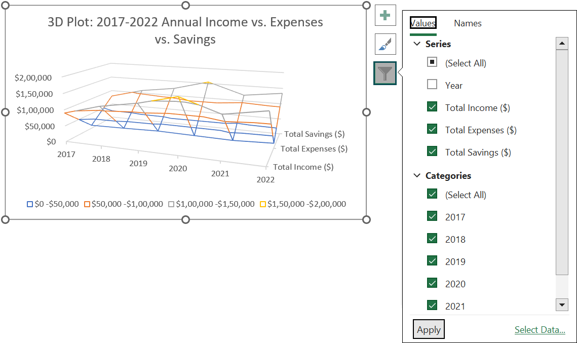
Assume we must compare the total expenses and savings for 2021-22. Then, we can make the appropriate selections in the Values tab in the Chart Filters window and click Apply to view the filtered data in the plot.
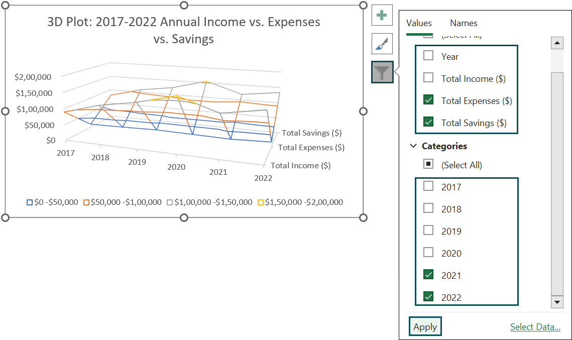

The above plot shows the data for the specific series and years. It shows that the expenses are slightly less in 2021 than in 2022, indicated by the Blue lines representing the data range of $0 – $50,000.
Furthermore, the savings are relatively less in 2021 than in 2022, indicated by the Grey lines representing the data range of $100,000 – $150,000.
And in both cases, the lines are closer to the floor in the plot for 2021 than for 2022, indicating an increase in expenses and savings in 2022.
Important Things To Note
- If the total number of Depth axis entries is below the number of Horizontal axis entries. Then, the axes in the 3D plot in Excel interchange.
- When the categories and series in the given dataset are numbers, use the 3-D Surface chart.
- Use the options under the 3-D Rotation category in the Effects tab of the Format Chart Area panel to set the required rotation settings and effects.
Frequently Asked Questions (FAQs)
The difference between 2D and 3D plot in Excel is that the 2D plot displays the given dataset in a 2-dimensional plane, with X- and Y-axes. On the other hand, the 3D plot displays the given dataset in a 3-dimensional plane, with X-, Y-, and Z- axes.
For example, the table below lists two independent variables, p and q, values. And the variable r varies with the variables p and q based on the specified equation, making it a dependent variable.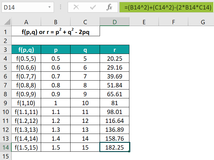
Then, here is how we can make a 3D plot for the above data.
• Step 1: With the entire dataset in the range A3:D14 selected, choose the Insert tab → Insert Waterfall, Funnel, Stock, Surface, or Radar Chart → 3-D Surface chart.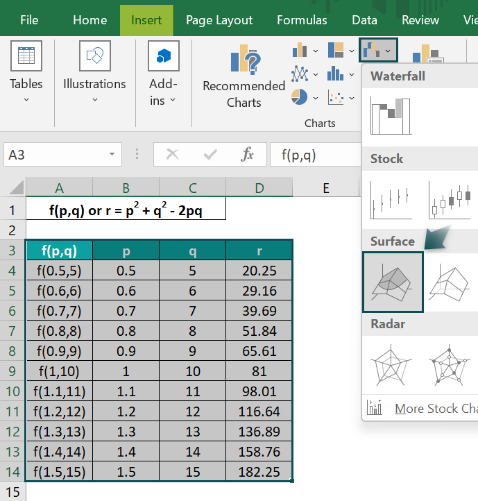
The above step will insert the required Excel 3D plot.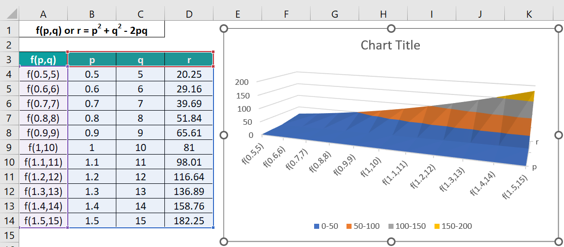
• Step 2: Drag the chart borders from the corners to expand it and view all the series names, p, q, and r, in the Depth axis.
• Step 3: Double-click the Chart Title element in the plot area and update it, as depicted below.
On the other hand, the steps to prepare a 2D plot for the given data are as follows:
• Step 4: Select the entire dataset and choose the Insert tab → Insert Line or Area Chart → 2-D Line with Markers chart.
The inserted 2D plot will appear as shown below.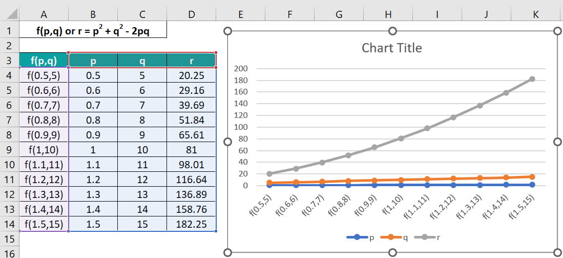
And the final 2D chart with the updated chart title will appear as depicted below.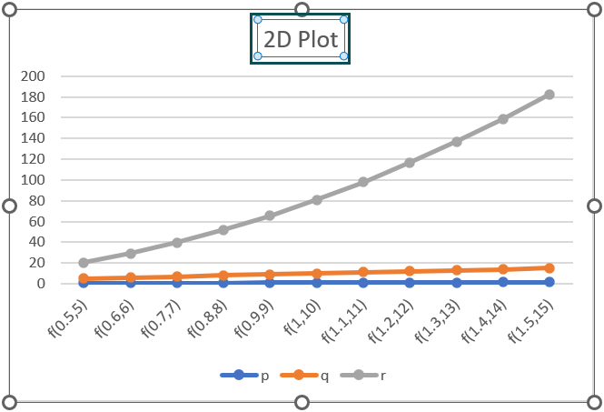
The first chart is a 3D plot representing the three variables in a 3-dimensional plane. And it helps review the areas in the same value ranges while determining the top combinations between the given datasets.
On the other hand, the 2D plot shows the three variables’ data in a 2-dimensional plane. And it does not help determine the best combinations between the given datasets.
We cannot make a 3D Scatter plot in Excel.
However, we can use third-party tools, like plotly.com, to create a 3D Scatter plot.
The advantages of creating 3D plot in Excel are as follows:
• The plot helps perform multivariate analysis. We can check for potential correlation between data clusters across 3-dimensions.
• The 3D plot can create a 3-dimensional visualization of the given dataset. And we can check for areas in the same value ranges.
Use this 3D Plot In Excel Template to follow along with the examples in this article.
Download Excel Template