
What is Comparison Chart in Google Sheets?
A comparison chart in Google Sheets is a chart that is used to compare data from different sources. We can create comparison charts using different charts such as bar charts, column charts, etc. These charts can highlight the differences, similarities, and relationships between two or more categories based on certain metrics. There are two ways to make a comparison chart in Google Sheets. You may use the default charts available in Google Sheets or use an add-on to use a third-party library for the charts.
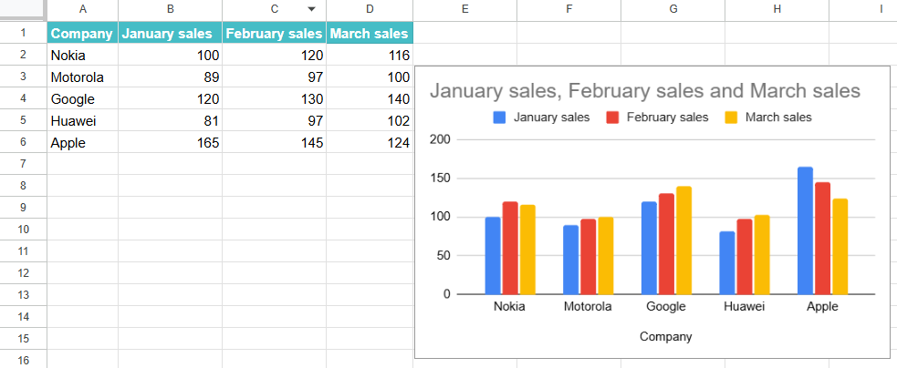
Usually, we choose from the different charts like bar charts, pie charts and column charts for the comparison charts to compare the similarities, differences, or patterns of the data being compared. These charts help businesses and individuals in decision-making, performance assessment and trend analysis. The charts can be easily customized so that users can create dynamic charts in Google Sheets to aid in their analysis and presentations. In the example below, we have a comparison column chart of the sales details of a few mobile phone companies across three months. It is noticed from the graph that only the sales of Apple phones have been falling over the three months.
Use this Comparison Chart in Google Sheets Template to follow along with the examples in this article.
Download Excel TemplateKey Takeaways
- A comparison chart shows the differences and relationships between various entities helping you compare them. We use a comparison chart to compare key data points in the dataset.
- Some of the best visualizations you can use in a comparison chart include bar/column charts, pie charts, stacked bar/column charts, radar charts, line charts and so on.
- Remember to choose the right chart for comparison when you are creating a comparison chart based on how you want to emphasize the comparison.
- A comparison chart in Google Sheets offers clear visualization to find the differences and helps identify patterns and trends in the data.
- You can customize the charts based on requirement and collaborate with others in real-time.
How to Create A Comparison Chart in Google Sheets?
A comparison chart is an effective way to compare some structured data visually. We have a very user-friendly interface and a simple method for creating Google Sheets comparison charts that help analyze data and present it in a clear, visual manner. Let us look at how to create a comparison chart in Google Sheets.
Step 1: The first step in creating a comparison chart is to organize your data clearly and structured. To explain this concept, let us consider the sale of two different products, Product A and Product B. We organize the data as shown below.

Step 2: Our next step is to select the data range. Ensure you include all the categories you will compare, including the sales details of both products and the months.

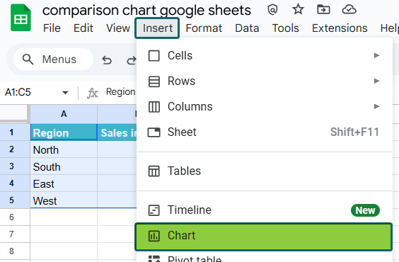
Step 3: Go to the “Insert” menu at the top to insert a chart. Click on the option “Chart” to open the Chart Editor.

Step 4: You get a default chart. In the Chart Editor, you can choose from various chart types. For a comparison chart, it is most suitable to select either a Column chart or a Bar chart, as they are very suitable for comparing different data points.

Step 5: A chart will be displayed. You can customize your comparison chart according to your requirements and preferences. Use options such as Chart & axis titles and Customize tabs in the Chart Editor to make these changes000.

Examples
When comparing data across categories, the goal is to clearly show the differences and similarities between them. Here are some examples of comparison charts, along with their chief uses. Let us look at the examples below.
Example #1 – Sales Comparison by Region
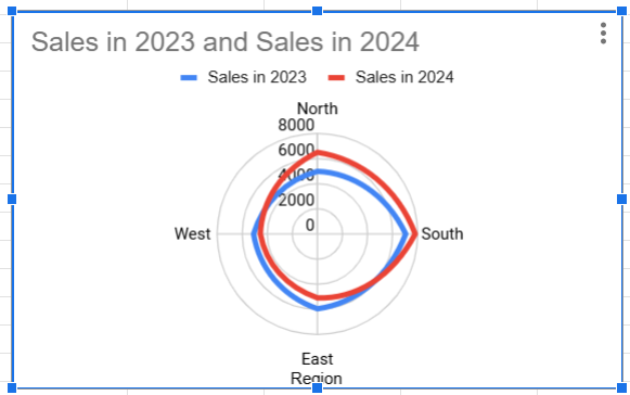
Here are the sales details of different regions in 2023 and 2024, which we wish to compare and study.
Step 1: Let us organize the sales data in a table.

Step 2: Now, we select the entire data range. In this case, select all the three columns with headers.
After selecting the range, go to the menu bar and click on Insert and choose the option Chart.
Step 3: We get a default chart automatically. We can change the chart type manually according to our requirements. To do so, in the chart editor, under Chart type, select the appropriate chart type for comparing sales across regions for the two years.
We choose Radar Charts as they indicate how various variables are placed in a dataset. It helps to display and compare the performances over the two years.

Step 4: You can customize the chart as per requirement. Under the Customize tab, you can adjust many parameters. Here, the chart lines are too thin. To increase them, go to Customize -> Series -> Format and choose the line thickness as needed.

Thus, we get an insight into the performance of different regions in 2023 and 2024. While the North and South have increased their sales from 2023 to 2024, the East and West need to buck up! Thus, a business might use a comparison chart to visualize sales figures for different regions to identify which areas are performing well and which need improvement.
Example #2 – Product Comparison by Features
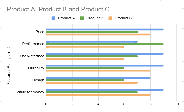
An electronics manufacturer can use a comparison chart to study the features of the various products he sells. The chart can display the various attributes in the same chart, helping customers make informed choices.
Step 1: Let us organize the data in a table. It is as shown below.

Step 2: Now, select the data range. From there, in the Google menubar, click Insert → Chart.

Step 3: We get a default chart. Change the chart type according to your requirements. Here, we choose a bar chart.
To do so, select the appropriate chart under Chart Type in the Chart editor.

Step 4: You can customize the chart as per your requirements. Therefore, a bar or column chart is very effective in comparing specific features of different products. As we saw above, each product will have a separate bar or column for each feature. It helps customers make better choices before purchasing a product.
Here, we choose a Bar Chart as it is one of the best ways to compare the features of different items.
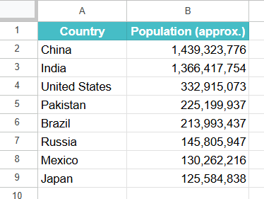
Example #3 – Population Comparison by Country
The steps above should guide you in creating a comparison chart in Google Sheets. Now that we have understood them let us look at one more example. Here, we have the distribution of population across different countries. Let us see how they can be studied visually.
Step 1: Organize the data regarding the country name and population in a Google Sheets table.
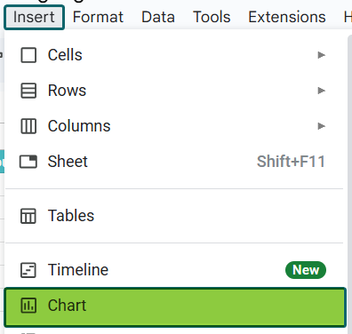
Step 2: Select the entire table. Now click on Insert → Chart.
Step 3: We get a default chart. Change the chart type according to your requirements. Here, we choose a bar chart.
To do so, select the appropriate chart under Chart Type in the Chart editor.

Benefits of Comparison Chart in Google Sheets
Some of the benefits of using a comparison chart in Google Sheets are as follows:
- It provides a clear visualization medium to visualize differences and similarities between different products.
- It helps identify trends and patterns easily.
- They are very easy to create once you arrange them in a table.
- You can easily share and collaborate with others in real time.
- Comparison charts are interactive and allow for filtering and dynamic changes.
- You can effectively compare multiple variables simultaneously.
Important Things to Note
- Google Sheets allows multiple users to access the charts in real time. Thus, they can easily update the chart from anywhere.0
- Google Sheets built-in feature of automatically selecting a comparison chart is very useful. You can change the type if required.
- You can compare multiple data series on a single chart in Google Sheets.
Frequently Asked Questions (FAQs)
We have different types of comparison charts. Let us see how they can be used in different scenarios.
1. Radar Chart: These charts are best for simultaneous visualization of multiple features of each product.
2. Bar/Column Chart: These are useful for comparing product features in a simple, side-by-side manner.
3. Stacked Column Chart: It is ideal for visualizing the contribution of each feature to the overall score.
1. Always remember to carefully choose the Right Chart Type. For instance, if you have to decide between the column and bar chart, you have to decide how you want to present your data. For limited space, a column chart may be more suitable.
2. Choose a chart that is easy to understand and visually appealing for your audience.
3. Limit to a manageable number of categories for easy analysis.
4. Use color schemes such that it helps viewers identify data points easily.
5. You should show key data points or trends using a different color or pattern.
If we wish to compare data over time or to show correlations, we can use line charts or scatter plots over bar charts as they show trends more clearly.
Use this Comparison Chart in Google Sheets Template to follow along with the examples in this article.
Download Excel Template