What Is Error Bars In Excel?
Error bars in Excel are graphical representations used to display the variability or uncertainty associated with a data set. They provide valuable information about the accuracy and reliability of measurements, making them essential tools for researchers, statisticians, and data analysts. Error bars consist of lines or rectangles that extend vertically or horizontally from each data point on a chart, indicating the possible range within which the true value might lie.
To analyze the data effectively, we must carefully choose the relevant data and create a line graph using the Insert tab. Additionally, we can enhance our line graph by incorporating error bars. We can do this by selecting the appropriate option.
In addition, error bars play a crucial role in representing the variability within a dataset. Specifically, the standard error (SE) measures the standard deviation of a sampling distribution.
📥Download the ready-to-use Excel template to practice this tutorial yourself.
Error Bars In ExcelTable of contents
Key Takeaways
- Error bars typically run parallel to the axis representing the quantitative scale. Consequently, the orientation of horizontal or vertical error bars depends on whether the quantitative scale is plotted on the X or Y-axis.
- When dealing with skewed data, it is important to note that the lengths on each side of the Error Bars may become unbalanced.
- This feature is particularly useful for analyzing and interpreting data, as it allows for a better grasp of the data’s dispersion and potential uncertainties.
- The purpose of indicating the estimated error or uncertainty is to provide a general understanding of the accuracy level of measurement.
How To Add Error Bars In Excel?
We can follow a simple step-by-step process to add error bars in Excel. First, select the data points we want to include error bars on our chart. Next, navigate to the Layout or Chart Design tab, depending on our version of Excel, and click on the Error Bars button. From there, choose the error bar we want to display: standard deviation, standard error, or custom. We can also specify the direction and end style of the error bars if desired. To customize the values of our error bars further, right-click on one of them and select Format Error Bars.
We can enter specific values or use formulas to calculate custom error amounts based on our data set. Additionally, we can display average deviation lines as an alternative representation. By adding accurate and visually appealing error bars to our Excel chart, we provide readers with crucial information about variability or uncertainty represented by our data points in a professional manner.
How To Add Custom Bars In Excel?
To add custom error bars in Excel, start by selecting the data series for which we want to add the error bars. Next, click the Layout tab and navigate to the Analysis group. Locate the Error Bars button and click the drop-down arrow next to it. From the options provided, select More Error Bar Options. This will open a dialog box where we can customize our error bars according to our preferences. We can choose from error bars in this dialog box, such as standard deviation or percentiles. We also control the error bars’ direction, length, and end style. By clicking on individual elements within the menu, such as vertical or horizontal axis values, we can fine-tune our customization further. Once satisfied with our settings, click OK. These custom error bars serve as visual aids that help represent data variability and enhance data analysis in Excel.
Examples
Example #1
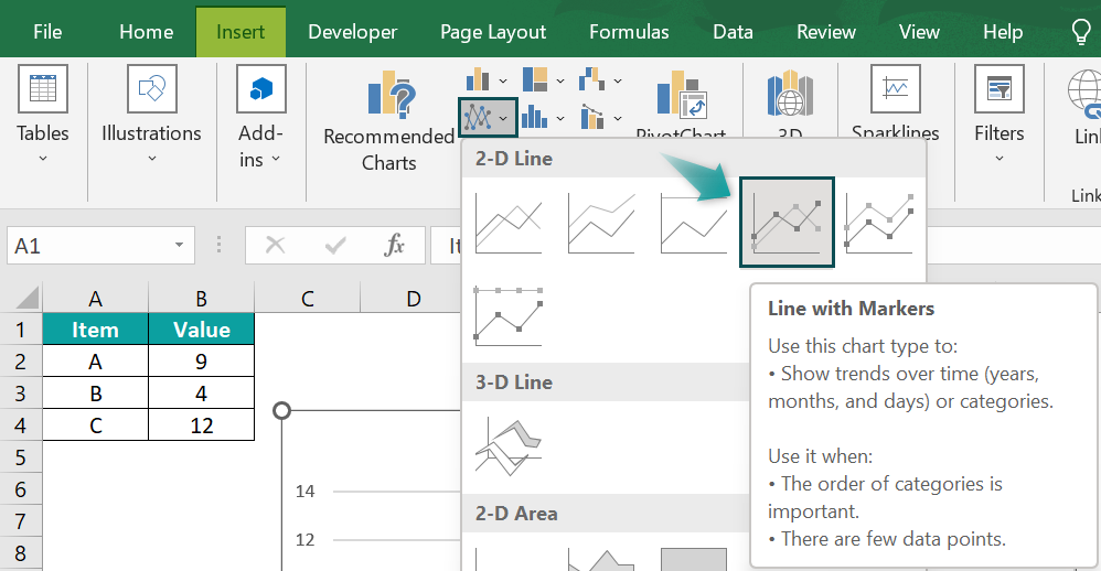
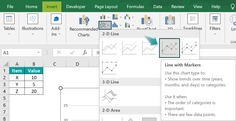
First, we must select the data and the line graph from the Insert tab.
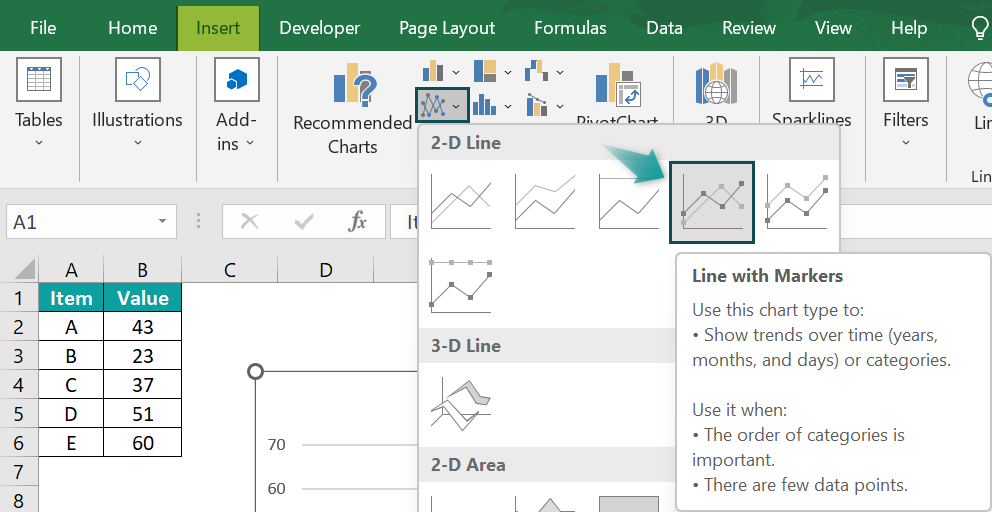
- Step 1: First, let us add error bars to our line graph by clicking the appropriate option.
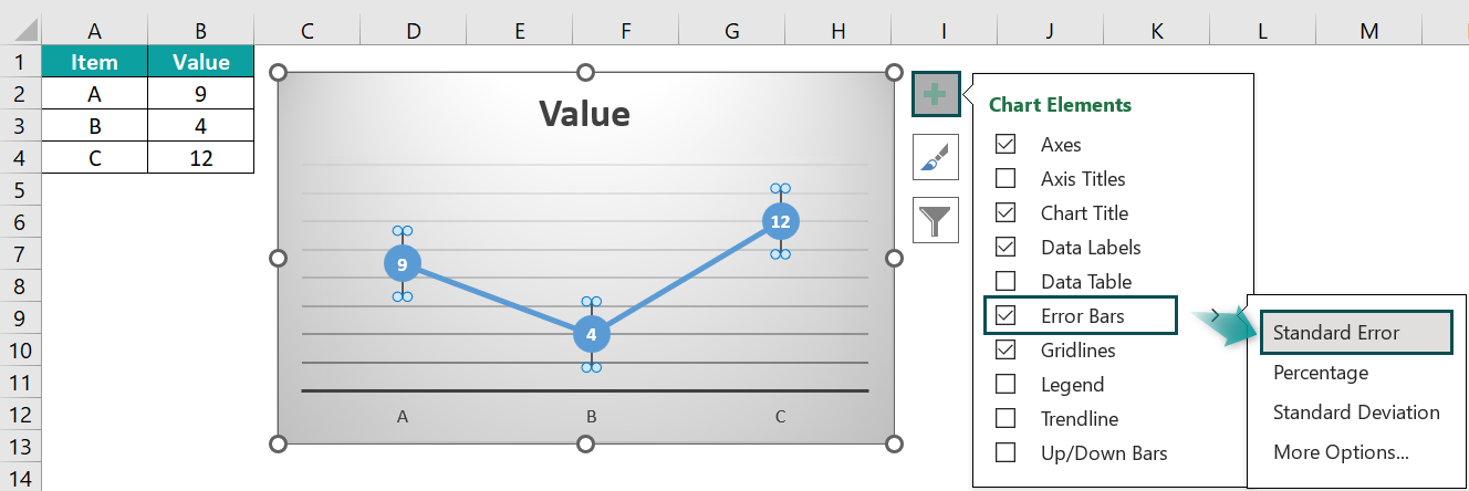
- Step 2: Next, to find the Error Bars option, click the + sign present on the top-right corner of the chart. The chart element list opens; select the Error Bar checkbox. Select the error options from the drop-right list of the Error bar.
- Step 3: Error Bars with Standard Error
One of the options is Error Bars with Standard Error. The standard error (SE) represents the standard deviation of a sampling distribution. The magnitude of SE indicates the precision of the parameter estimate. The standard error is inversely proportional to the sample size, meaning that smaller sample sizes result in larger standard errors.
In the screenshot below, you can see an example of error bars with standard errors. Each data point in the series displays the amount of error in height and width for Y and X error bars, respectively.

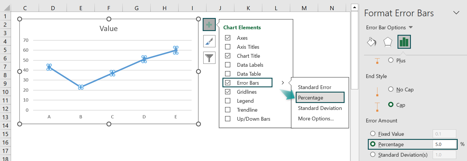
- Step 4: Error Bars with Percentage
Another option is Error Bars with Percentage. This option calculates the error amount for each data point as a percentage of that specific data point’s value. The size of the Y and X error bars varies based on the specified percentage. The percentage is set to 5% by default.
The default 5% value can be observed in the More Error Bars Options screenshot below.
- Step 5: Error Bars with Standard Deviation
Lastly, we have Error Bars with Standard Deviation. This option represents the average difference between the data points and their mean. Typically, a one-point standard deviation is used when creating error bars. The standard deviation is applicable when the data follows a normal distribution and the data points are usually evenly spaced.

Example #2
In addition to the three types of Error Bars available (standard error, standard deviation, and percentage), we also can create custom Error Bars.
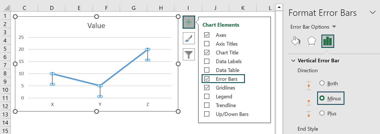
- Step 1: Remember, the minus display represents the error on the lower side of the actual value. So, first, to access this option, click on the minus tab.
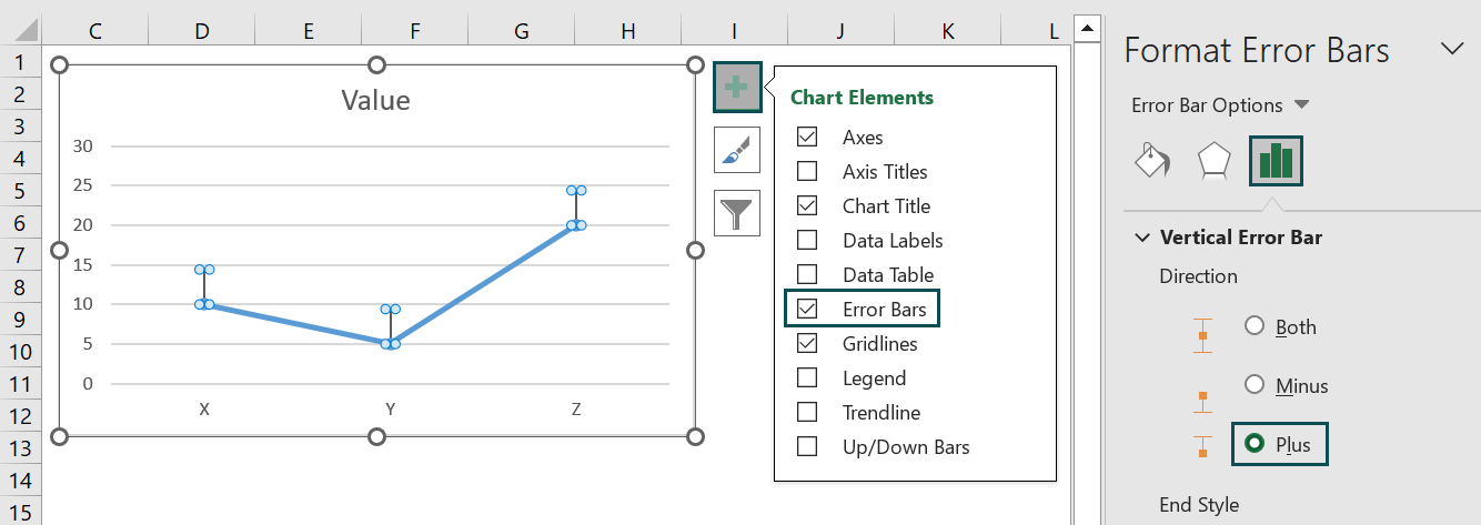
- Step 2: Similarly, the plus option allows us to represent the error on the upper side of the actual value. To select this, click on the plus tab.
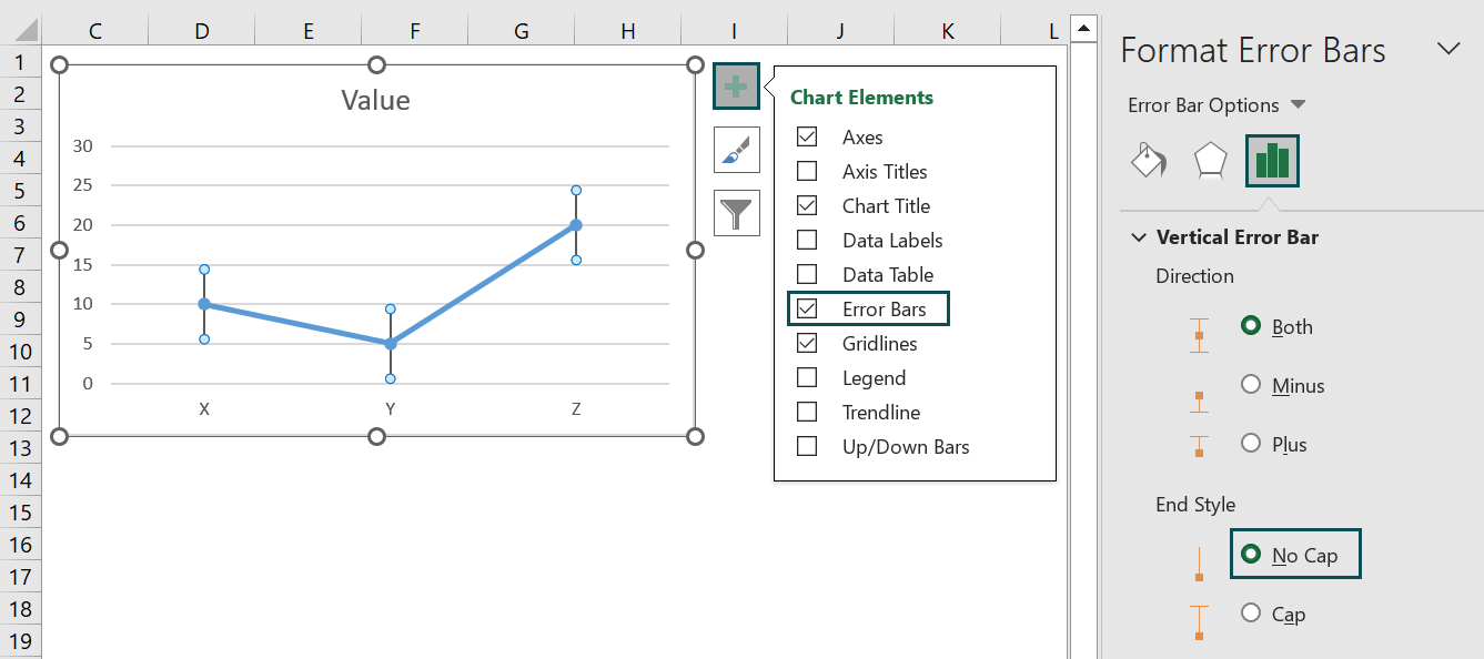
- Step 3: Furthermore, we can visualize Error Bars without the cap. For instance, in the vertical Error Bars tab, we can choose the direction as an end style and then, opt for no cap.
By offering these additional features, we provide users greater flexibility and customization options when working with Error Bars.
Important Things To Note
- The bars can be customized to represent statistical measures such as standard deviations in excel, confidence intervals in excel, or standard errors.
- The spread of data points around a mean or an average value; error bars assist in comparing different datasets and drawing conclusions from experimental results.
- A longer error bar signifies that the values are more spread out and less likely to be reliable.
- The Error Bars feature in Excel assists in understanding the variability of data presented on a two-dimensional platform. It visually represents the standard error, standard deviation, or percentage.

Frequently Asked Questions (FAQs)
While Excel offers a convenient and user-friendly way to create error bars, there are certain limitations and drawbacks to consider when using this feature. Firstly, Excel only provides one error bar type: the standard deviation. This restricts the diversity of error measurement options available, which can be problematic when different measures, such as confidence intervals or range bars, are required. Furthermore, Excel’s error bars cannot be easily customized beyond adjusting the length or cap style. This limitation can hinder data visualization and make it difficult to present complex information accurately. Additionally, there is a lack of transparency in how Excel calculates error bars, potentially leading to confusion or inaccurate data representations. Moreover, manually entering data for each point can be time-consuming and prone to errors when dealing with large datasets or complex experimental designs.
To effectively analyze the data, it is imperative that we meticulously select the pertinent information and construct a line graph using the Insert tab. Furthermore, we can elevate the quality of our line graph.
Error bars play a pivotal role in illustrating the variability within a dataset. More specifically, the standard error (SE) quantifies the standard deviation of a sampling distribution.
In data analysis, error bars convey uncertainty in measured quantities. While both vertical and horizontal error bars serve this purpose in Microsoft Excel, they differ subtly in their applications. Vertical error bars are commonly used to represent the variability or spread of data points along the y-axis, providing information on how much values may deviate from a central estimate. On the other hand, horizontal error bars depict uncertainty along the x-axis. They are often employed when measuring variables such as time or distance, where the objective is to understand how accurate measurements are around a specific point. By considering both vertical and horizontal error bars together, data analysts can understand the uncertainties and variations in their dataset, aiding effective interpretation and decision-making processes.
The purpose of error bars in a graph or chart is to measure the uncertainty or variability in the presented data. Error bars are typically used in scientific research, statistical analysis, and presentations to represent the precision and reliability of results visually. These error bars extend vertically from each point on the graph and indicate the range within which the true value is likely to fall. The length of the error bar may be determined by various factors such as sample size, variability of measurements, and statistical tests employed. Larger error bars suggest greater uncertainty, while smaller ones imply higher confidence in the measurements.
Download Template
📥Download the ready-to-use Excel template to practice this tutorial yourself.
Error Bars In ExcelRecommended Articles
This has been a guide to Error Bars In Excel. Here we learn how to add Standard Error, Percentage, Standard Deviation & custom error bars, with examples. You can learn more from the following articles –

Leave a Reply